352 S., 21x15 cm, ISBN/ISSN 9782915859416 Broschur mit Banderole, eingelegt ein Informationsblatt
ZusatzInfos
Originalausgabe erschienen bei Artists Press, Bern, 1980.
This book is the third and final version of the first artist’s book published in 1960 by herman de vries, who is currently the author of more than one hundred publications. The story of this book dates back to 1960. Closely associated with the Zero Group, but also drawn to the buddhist concept of emptiness, herman de vries had just produced a series of white monochromes when he self-published a twenty-page booklet in Arnhem. It had no title, its cover was blank and its pages were unprinted. It contained nothing but a short final poem celebrating, in four languages, the superabundance of white: “wit is overdaad”. In 1962, this manifesto appeared in another version, now entitled wit: two hundred blank pages, four white collages by the artist and an introduction, itself completely blank, by the poet J. C. van Schagen, published in arnhem in only five copies by M. J. Israel. It was followed in 1967 by a second “revised” edition, wit weiss: two hundred and fifty blank pages, pocket-sized, in five hundred copies, published by Hansjörg Mayer in Stuttgart. The only printed elements were the artist’s name, the title and the publisher’s name on the cover, the word “introduction” and the name of its author on the very first page and a colophon on the final page. In 1980 the Artists Press in Berne published the “third revised edition”, in a larger format and with more pages. The original title wit was translated into english and japanese and into sanskrit with a word that means “white” in the sense of bright, pure, immaculate. The title itself does not appear on the book, which remains completely blank. It is printed with the paratext on a broad strip of paper in the form of a detachable publicity strip. The inside flap contains a brief statement initially dating back to the 1962 edition, stating that this book incorporates all aspects of reality. Of the five thousand copies advertised, only a hundred were published. It is this last edition, the most radical, which is republished here, the only addition being the french translation of the statement.
On 1 april 2012, herman de vries wrote of his book, insisting on the importance of the final comma:
white is white
0 = 0
no name
no idea
not even emptiness,
CURRENT RESIDENT, a collaborative book by Kenny Komer and Marysia Gacek, comprises solely of computer generated imagery inspired by interior design catalogues and magazines. Based on interiors seen in Architectural Digest and Ikea catalogues, the book depicts a fictional, contemporary residence mimicking current tendencies to replace photography with 3D modeling computer software producing photo realistic images. Views of the apartment are generated via computer algorithms with the same techniques used in the advertising industry. A reader is invited to take a tour of the space while a number of mysterious activities unravel before her/his eyes.
Kenny Komer (b.1984) is an interdisciplinary multimedia artist who lives and works in Brooklyn, NY. He received a BFA from the School of Art, Cooper Union, New York, NY in 2006. He has exhibited at galleries in New York (Gavin Brown's enterprise, Rush Arts Gallery, Carriage House Center and White Box Gallery) and Tokyo, Japan (Motus Fort). Komer is a founding member of the guerrilla street-art collective, Concerned New Yorkers, whose work has been featured in the New York Times, New York Magazine, the Brooklyn Rail, the Village Voice, CNN, and the Daily Telegraph.
CURRENT RESIDENT, ein gemeinsames Buch von Kenny Komer und Marysia Gacek, besteht ausschließlich aus computergenerierten Bildern, die von Katalogen und Zeitschriften für Innenarchitektur inspiriert sind. Auf der Grundlage von Inneneinrichtungen aus Katalogen von Architectural Digest und Ikea zeigt das Buch eine fiktive, zeitgenössische Wohnung, die die aktuelle Tendenz nachahmt, Fotografien durch 3D-Modellierungssoftware zu ersetzen, die fotorealistische Bilder erzeugt. Die Ansichten der Wohnung werden mit Hilfe von Computeralgorithmen generiert, die auf denselben Techniken beruhen, die auch in der Werbeindustrie verwendet werden. Der Leser wird eingeladen, einen Rundgang durch den Raum zu machen, während sich vor seinen Augen eine Reihe mysteriöser Aktivitäten entfalten. Kenny Komer (geb. 1984) ist ein interdisziplinärer Multimedia-Künstler, der in Brooklyn, NY, lebt und arbeitet. Er erhielt 2006 einen BFA von der School of Art, Cooper Union, New York, NY. Er hat in Galerien in New York (Gavin Brown's Enterprise, Rush Arts Gallery, Carriage House Center und White Box Gallery) und Tokio, Japan (Motus Fort) ausgestellt. Komer ist Gründungsmitglied des Guerilla-Straßenkunstkollektivs Concerned New Yorkers, dessen Arbeiten in der New York Times, dem New York Magazine, dem Brooklyn Rail, der Village Voice, CNN und dem Daily Telegraph veröffentlicht wurden. Text von der Webseite
Text von der Webseite, übersetzt mit DeepL
Die Publikation erschien anlässlich der Ausstellung vom 10.07.-05.09.2017
"A House Without a Roof" ist ein Fotobuch und eine Bild- und Textinstallation, die sich mit den eng miteinander verflochtenen Geschichten von Gewalt und Vertreibung befasst, die Europa mit Israel und den palästinensischen Gebieten verbinden.
A House Without a Roof (Ein Haus ohne Dach) befasst sich mit den geschichtlichen Strängen, die die jüdische Diaspora aus Europa und die erzwungene Massenmigration aus Palästina nach dem Zweiten Weltkrieg mit der Gründung des Staates Israel verbinden. Das zur Ausstellung gehörende Buch zeichnet die Dreiecksbeziehung zwischen dem Großvater von Golfer - einem Überlebenden von Dachau -, seinem Vater - der in den frühen 1970er Jahren in einem Kibbuz lebte - und dem Künstler nach, der zwischen den Membranen der Geschichte gefangen ist, die die Unterdrückten zu Unterdrückern und die Bewohner zu Flüchtlingen machten. A House Without a Roof verhandelt die zersplitterten Erzählungen von Krieg und Vertreibung zwischen Europa, Israel/Palästina und den Vereinigten Staaten.
A House Without a Roof (Ein Haus ohne Dach) wurde 2011 begonnen. Das Gefühl der "Dachlosigkeit", der unzusammenhängenden Vertrautheit - die architektonisch, historisch und politisch das Gefühl der Verortung in Frage stellt - zieht sich durch Golfers Buch, seine Bildsprache und die Ungewissheit des Raums zwischen den beiden Figuren in Router. Wie bei der Lektüre des Textes des Buches wird eine Erinnerung oft durch die Hinzufügung einer anderen umgelenkt. Die Fähigkeit, die Epoche, das Subjekt oder den Sprecher zu lokalisieren (die Stimmen der dritten und der ersten Person gehen auseinander und überschneiden sich), wird durch die ständige Verlagerung der literarischen Mittel erschwert.
Text von der Webseite
Martin Parr has put together another wonderful book from his personal collection of cards. This time he celebrates the American Christmas card. These are a fascinating eye-opener into American culture, as proud families everywhere (pets included) pose before the camera to send their Christmas greetings across the nation.
Text von der Webseite
Katalog zur Ausstellung 08.06-04.07.2021
FOTODOKS ist ein internationales Festival für aktuelle Dokumentarfotografie, das sich seit 2008 als größtes Festival dieser Art in Deutschland etabliert hat und in zweijährigem Turnus in München stattfindet. Den Blick auf ein jeweils anderes Partnerland und Festivalthema gerichtet, werden in einer zentralen Gruppenausstellung im städtischen Kunstraum Lothringer13 Halle fotografische Arbeiten aus der jeweiligen Gastregion und dem deutschsprachigen Raum gezeigt.
Text von der Webseite
About the series: The For Everard zine series chronicles the 1977 fire at New York's Everard Baths, combining archival research with imagined narratives to re-focus attention to obscured histories. The series explores the media coverage of the subsequent investigation of the fire, and the lives of the nine men who perished. The zines bring together photographic images with primary news sources, as well as personal anecdotes collected from eyewitness testimonials.
About the individual zines:
For Everard, Vol. 1, 2013, ed. 100 (nr. 65)
This zine chronicles the May 25, 1977 fire at New York's Everard Baths and the media coverage of the subsequent investigation.
For Everard, Vol. 2 (Bloodbrothers), 2013, ed. 100 (Nr. 81)
In the second volume of his series chronicling the 1977 fire at New York’s Everard Baths, Anthony Malone focuses on Bellevue Hospital’s blood drive for the victims of the great bathhouse tragedy. Malone draws parallels between the 1977 restrictions placed on gay men for donating blood to their “brothers” and current FDA guidelines that indefinitely defer donations from men who have had sex with men since 1977. This black and white photocopied zine (ed 100) juxtaposes archival images, news clippings, and just a touch of fantasy.
For Everard, Vol. 3 (Remembering Jimmy), 2015, ed. 100 (Nr. 94)
Volume 3 of the series, For Everard is dedicated to the memory of Jimmy Stuard, who died in the tragic fire at the Everard Baths in 1977. Stuard was a rising star in the disco music scene. He spun records first at Boston’s 1270 Club, and later at New York’s 12 West, where he inspired an entire generation of musical artists and DJs. In this particular volume, Anthony Malone assembles images and archival texts that serve as a tribute to the great Jimmy Stuard.
For Everard, Vol. 4 (A Lovely Show), 2016, ed. 100 (Nr. 62)
For Everard, Vol. 4 (A Lovely Show) is a tribute to Kenneth Hill, one of the nine men who died in the devastating fire at the Everard Baths in 1977. Kenn played a vital role in the East Village/Lower East side countercultural movement in the late ‘60s and 1970s. He was a hippie, a bar tender at Phebe’s (a watering hole and salon for the experimental theater community in the 1970s), one of the founders of the Old Reliable Theatre Tavern, House Manager at La Mama Experimental Theatre Club, and a photographer. This zine celebrates Kenneth Hill by collaging archival documents with personal artifacts and pictures of Kenn from meaningful moments in his life.
For Everard, Vol. 5 (A Dearly Loved Man), 2017, ed. 100 (Nr. 95)
For Everard, Vol. 5 (A Dearly Loved Man) assembles images and stories from the life of Ira Landau, a gifted and dedicated teacher who died in the tragic fire at the Everard Baths in 1977. Ira left behind a devoted family (his mother, brother, niece, and lover) and is still greatly missed by his loved ones. This zine is a tribute to the life and accomplishments of a remarkable man who served in the Peace Corps and committed himself to educating young minds both abroad (in the Middle East) and at home in the US. It contains family photos and personal images generously contributed by Ira’s niece.
For Everard, Vol. 6 (Yosef’s Song), 2017, ed. 100 (Nr. 94)
Volume 6 of the series For Everard celebrates the life of a remarkable musical prodigy, Yosef Synovec. This zine tells the story of a young man with great aspirations who emigrated to the United States from Czechoslovakia to study classical violin. In 1976, Holly Woodlawn overheard Synovec vocalizing as he was painting the bathroom of his East Village apartment, and determined on the spot that she had discovered an emerging star. As a singer, Synovec used his extreme vocal range to imitate the voice and persona of Peruvian diva Yma Sumac. He performed Sumac’s exotic musical numbers at several New York City cabarets and show venues. Sadly, on May 25, 1977, Yosef perished in the tragic fire at the Everard Baths.
For Everard, Vol. 7 (Tony from the Bronx), 2017, ed. 100 (Nr. 86)
This zine brings together images and stories from the life of Tony Calarco, one of the nine men who died in the fire at the Everard Baths in 1977. Tony was only 26 when he died. He lived with his parents and siblings in a modest house in the Bronx. He had recently graduated from college and was working as a social worker in New York city at the time of his death. Tony had aspirations to become a lawyer and was scheduled to begin law school in September of 1977. This zine celebrates Tony Calarco’s memory through photos of Tony, artifacts from his high school and college years, and recent photographs of his home and final resting place.
For Everard, Vol. 8 (Looking for Amado), 2017, ed. 100 (Nr.84)
Amado Alamo, a young man only 17 years old, lost his life in the fire at the Everard Baths in 1977. In Volume 8 of For Everard, Anthony Malone documents his search for the identity of the youngest victim of the Everard fire. The zine is an abstracted portrait of Alamo that assembles the few extant fragments of his story culled from newspaper articles and documentary sources glued together with the artist’s imagination.
For Everard, Vol. 9 (Last Call), 2017, ed. 100 (Nr.72)
Life was difficult for Hillman Wesley Adams. He was born in Jacksonville FL in 1938. His mother died just a few months after his birth, and by the age of nine, he found himself in an orphanage with his older brother. Fast forward 30 years: Hillman moved to NYC, struggled to make ends meet while working on and off as a bartender, and he met his lover, Ralph, with whom he shared a modest apartment in New Jersey. On May 25, 1977, Hillman died in the fire at the Everard Baths. Vol. 9 of For Everard is an assemblage of newspaper articles and vintage photos chronicling the life and untimely death of Hillman Wesley Adams.
For Everard, Vol. 10 (In Memoriam: Patrick Nott), 2018, ed. 100 (Nr. 64)
Volume 10 of For Everard memorializes the life of Patrick Nott, one of the nine men who died in the fire at the Everard Baths. Nott, a native of Wales with a passion for theater, literature, and music, pursued a successful career in hairdressing. He fell in love with his pen pal (a young woman from Brooklyn) and after their marriage, they moved to New York City, where Nott worked at the Vidal Sassoon Salon. This zine weaves together elements from his story (shared with the artist by Patrick Nott’s wife), with photographs, newspaper clippings, and artifacts. It acts as a humble tribute, an “In Memoriam” for this greatly loved man.
For Everard, Vol. 11 (Thunderbird), 2019, ed. 100 (Nr. 79)
Brian Duffy was an aspiring artist. In 1966 he was accepted to Pratt Institute of Art and although he declined admission to the school, he seized the opportunity to move to NYC and start a new life for himself. In the city, he worked hard at various retail jobs and tried to break into the theater, but everything changed when he met the love of his life, Bradley. The couple moved to a “quieter life” in Boston. They worked in restaurants in the Back Bay area and created a community for themselves amongst their chosen family of friends. Volume 11 of For Everard celebrates the brief life of Brian Duffy, a young man who died in the fire at the Everard Baths in 1977. This zine compiles photographs and stories shared with Malone by Brian’s sister and dear friend. The pseudonym "Anthony Malone" comes from a novel by Andrew Holleran (Dancer from the Dance). In this novel, Malone is the protagonist and at the end he disappears. Some of his friends believe that he may have committed suicide, others feel that he may have run away from New York, while some say that they saw him at the Everard Baths on the night of the fire. I imagine that Malone survived the fire and he is now making books and zines telling the story of the tragedy.
Katalog anlässlich der gleichnamigen Ausstellung im Neuen Paffenhofener Kunstverein, 21.09.- 20.10.2013. Im Sommer 2009 machten sich Pusch und ein Künstlerfreund mit einem uralten Sattelschlepper des Typs ZIL 130 in Richtung Altai-Gebirge auf den Weg – um wie Nolde und Gauguin ein „neues Tahiti” zu finden – auf dem LKW eine blecherne Kunstgalerie, die sie White Cube Gallery Novosibirsk getauft hatten. 20 Ausstellungen in Dörfern, anarchische Feste und Stopps für die eigene Landschaftsmalerei folgten. In Pfaffenhofen sind nun vom 21. September bis zum 20. Oktober neben dem LKW mit der White Cube Gallery, die 2012 am Eingang der ART COLOGNE gezeigt wurde, Arbeiten des „feinen Herrn Pusch” (art magazin) aus dieser Zeit zu sehen, viele Bilder erstmalig, denn zahlreiche Werke befinden sich im Privatbesitz von Sammlern.
Text von der Website des Kunstvereins.
154 S., 29,3x23 cm, 2 Stück. ISBN/ISSN 9780981574516 Broschur mit eingelegte und angeklammerten Teilen auf diversen Papieren, einlegte CD mit Musik und Film
158 S., 29,3x23 cm, ISBN/ISSN 9780976164197 Broschur, diverse Papiere, teilweise zum Ausklappen, mit eingelegter CD und eingestecktem Heft von Kay Rosen
ZusatzInfos
As usual, the magazine contains a multidisciplinary mix of contemporary artists’ projects, critical writing, creative nonfiction, visual essays, and a themed CD of brand-new music. Some highlights include projects by Kay Rosen, Charlie White, and Sarah Malakoff, and a deconstruction of crossword-puzzle science by New York Times crossword genius David Quarfoot, as well as new installments in the magazine's regular series.
For our 9th CD, “Dreams,” readers submitted transcripts of their dreams, which were then passed along to musicians, each of whom picked one to serve as the basis for a song. The 11 musical acts, including White Whale, Ida, Dirty Projectors, Califone, and Paavoharju, chose from over 100 submissions. Transcripts of the selected dreams appear in Esopus 9 alongside five illustrations by New York–based artist Daniel Gordon.
Text von der Webseite
• Brief adressiert an Kattenstroth, 27.04.1986; Kurzmitteilung vom 10.03.1986, Graf Haufen lädt in seine Galerie ein, signiert
• Künstlerpostkarte "Mail-Art? Alles Käse...", "Neoist Propaganda Institut", bunte Stempel, Neon-Marker
• "A Piece of my Exhibition 84: NO. 049/112", A4 "Manifest zur Ausstellung von Riechbildern und Copy-Art, einmal gefaltet, dreifach geklammert als Umschlag für "Riechbild" 11,9x16,8cm, verschiedene Materialien, vermutlich Wachs auf Karton
• Briefmarkenbogen, signiert Monty Catsin, nummeriert 09/50, Schwarz-Weiß Kopie
• A4 Schwarz-Weiß Kopie, zweimal gefaltet, Artcore Gallery Graf Haufen, Begriffserklärungen zu "Monty", "Neoismus", "Smile-Magazin", "Akademgorod", grafische Illustration
• A6 Schwarz-Weiß Kopie, Informationen zur Artcore-Gallery
• Infozettel "Rockgruppe Hass auf den Kapitalismus", gegründet von Graf Haufen, Hapunkt Fliegenstrumpf, Guido Hübner, rückseitig handschriftliche Nachricht an Kattenstroth, signiert, vielfach gefaltet, Textmarker
• 2 A4 Seiten, zweimal gefaltet, Schwarz-Weiß Xerox, Artikel über "Neoism: Smile with Monty", signiert mit "Monty Cantsin"
• A4 Schwarz-Weiß Kopie "Manifest zur Ausstellung von Riechbildern und Copy-Art", zweimal gefaltet
• A5 Schwarz-Weiß Kopie, "Para-Graf", über Projekt der Galerie Paranorm und der Artcore Gallery von Graf Haufen
• A3 Schwarz-Weiß Kopie, Typografie, Grafik
• A4 Schwarz-Weiß Kopie, zweimal gefaltet, "64. Internationales Konspiratives Neoistisches Apartement Festival Berlin - 01.07.12.1986", Informationen zum Programm, Veranstalter: Stiletto Studios, Artcore Gallery, Neoist Propaganda Institute, rückseitig Schwarz-Weiß grafische Illustration.
Durch die Industrial-Szene kam Graf Haufen in Kontakt mit dem internationalen Netzwerk der Mail Art und wurde dort innerhalb kurzer Zeit ein bekannter Aktivist mit Kontakten auch zur subkulturellen Mail Art-Szene in Ost-Berlin. Von 1984 bis 1989 war er ein engagierter Mail Art– und Performancekünstler. Er betrieb eine eigene Version der Body Art, deklarierte seinen Körper als Kunstwerk, dokumentierte seine Anwesenheit an Orten mit Aufklebern und versuchte, seine Körperausscheidungen als Kunstobjekte zu verkaufen. Seine Wohnung richtete er als Wohnraum-Galerie mit wechselnden Ausstellungen internationaler Künstler ein, die teilweise auf die Situation der Wohnraumgalerie, die Artcore Gallery, abzielten. Später hat er auch die Galerie Paranorm mit betrieben. 1990 trat Graf Haufen in den Art-Strike, den Neoisten für die Jahre 1990–1993 ausgerufen hatten. Er ist seitdem nicht mehr künstlerisch tätig.
Text von der Website
115 S., 17x12 cm, keine weiteren Angaben vorhanden 115 Einzelblätter von 90 Künstlern lose eingelegt, im Pappkarton mit Leinenüberzug, mit Klappöffnung
Einladungskarte zur Ausstellung Written Room in der Galerie Karin Sachs vom 15.09.-27.10.2018. The Persian script is turned into an ornament. Covering thewhite walls of the museums, the characters serve Forouhar as “paper” for her own text. The room becomes a “written room”. Whereas thewhite walls of thegallery room are raised to a universal norm and an unmarked instance, the Oriental ornament stands for difference or the deviating. The writing is also strange, if not alien, because it is illegible for Western visitors – as an “incomprehensible” text it becomes a pure ornament. In defying attempts by Western visitors to assign its meaning, the script remains locked into its irreducible pictorial graphicness and indissoluble representation. The meaning cannot be grasped. at best, the inscribed ping-pong balls, which cover the base of the installation, can be grasped in the tactual sense. The legibility is made even more difficult by the movement of the ping-pong balls, which due to their spherical form also offer no stable vertical or horizontal reading axes. they form new patterns over and over again, are always in motion, and become incoherently disjointed.
Even if one has a command of Persian, the characters prove to be nothing more than word fragments and syllables, which are not subject to a linear order. The script ornamentation covers the whole room. Viewers entering the rooms are surrounded by patterns, forcing them to give up their sovereign, distanced standpoint.
Text von der Website der Künstlerin.
HORNBACH WERKSTÜCK Edition 002. Produktnummer 430-6-517-386849.
„Wenn wir Möbel besitzen wollen, die sich an unser Leben anpassen, müssen wir sie eben selbst bauen.“
Yo Shimada ist Architekt und Designer und arbeitet mit seinem Büro Tato Architects seit 1997 in Kōbe, Japan. Mit seinem Team entwarf er bisher vor allem Privathäuser in Japan und internationalen Standorten. In seiner Karriere wurde Shimada mit einer langen Liste japanischer und internationaler Preise ausgezeichnet: Unter anderem dem House of the Year Award für sein auf Stelzen stehendes Hamilton House in Brisbane, Australien.
Im zweiten Teil der WERKSTÜCK Edition greift Yo Shimada ein Thema auf, das derzeit in Metropolen überall auf der Welt aktuell ist: Immer knapper werdender Wohnraum, flexible Lebensrealitäten und die Sehnsucht nach Möbelstücken, die bleiben. Mit der Idee des WERKSTÜCK 002 findet sich auch hier wieder eine Antwort im Konzept des DIY: Denn wenn wir Möbel besitzen wollen, die sich an unser Leben anpassen, müssen wir sie eben selbst bauen.
Text von der Webseite.
[120] S., 28x21 cm, Auflage: Unikat, keine weiteren Angaben vorhanden Broschur, gefaltete und zusammengeklebte Farblaserkopien A3, Rücken von Hand mit Kleber überstrichen. Mit handgeschriebener Widmung für Hubert Kretschmer auf dem Titel und Notizen und Anmerkungen auf einigen Seiten mit schwarzem Faserschreiber. Beigelegte Postkarte mit handschriftlichem Gruß
[40] S., 29,7x21 cm, keine weiteren Angaben vorhanden Farblaserdruck, gefaltete Einzelblätter, mit Gummiband zusammengehalten. PDF-Download von der Webseite
“We want you to GO INSIDE — your house, and your self. Everything is about interiors now: the interior of your home, your mind, your archive, your hard drive. Mine it all for insight and purpose.
Once that’s done, show off what you find – just because you’re alone doesn’t mean you can’t share from within. There is no such thing as “too much information” now; COVID-19 took out “TMI.” In fact, there is no more “enough” — enough data, enough circulation, enough fodder. Binge on it. Burn out on it. Document it. Post it. Build a website for it. Get turned on by it. Get freaked out by it. Open up your screens, talk about your dreams, slide into those DMs. Get dressed up to go absolutely nowhere. Never go out, but leave nothing “behind the scenes” – there is no “behind,” and no “in front of” either. There is only “now,” and it is Big and Flat. Closeness happens at a distance here, but dialogue has never been this intimate. Your private hygiene is a matter of public health, your personal cloister backdrops community debate. Dualities — east and west, north and south, us and them, out and in — melt into each other and coat the old world like lava, like an act of god. In the New Interior isolation is a commons, the self that inhabits it is a collective. Historical moments stack vertically and occur simultaneously, around the globe. Welcome to the novel sanctum sanctorum, the single-occupant House of We.
Text von der Webseite
Es gibt nur wenige Fotografinnen und Fotografen, die noch vor dem Zeitpunkt ihrer „Mid career“ auf eine eigene Enzyklopädie verweisen können. ... Die Ausstellung „Our House“ wird dieses Universum der beiden Künstler ein Stück weit in die Torhäuser des Museums für Photographie Braunschweig übersetzen.
Gerade in ihren Porträts stellen Sieber und Stuke auf ihre Weise eine alte Frage neu: Welche Identität lege ich mir zu? In welche Figur verwandle ich mich, um anders zu sein, oder aber, um genauso zu sein wie die anderen? Dabei ist das Äußere, das Aussehen, Verhalten und Auftreten, stets der Schauplatz dieser Kommunikation mit dem Anderen – und die Fotografie ist Bühne und Spiegel.
In seiner Werkreihe „Imaginary Club“ unternimmt Oliver Sieber eine Reise durch die Nacht. Er porträtiert Jugendliche, die ihm auf Parties, Konzerten und Events begegnen und die sich die Freiheit nehmen, ihren Weg jenseits des Mainstreams zu gehen, darunter Punks, Psychobillies, Gothic Lolitas, Transgender oder Künstlerfreunde. Menschen, die ihn inspirieren und die sich nach außen den Habitus der Subkultur zulegen. Auf diese Under-ground-Figuren antwortet Katja Stuke in ihrer Serie der „Suits“ mit einem ganz anderen uniformierten Typus, dem man eher in Geschäftsstraßen begegnet: dem Anzugträger. Auch in dieser Arbeit begegnen sich unterschiedliche Bildtypen, Stukes filmische Stills von der Straße und von ihr gesammelten Bilder von Anzugträgern aus der Geschichte der Popkultur. Die Raster des Fernsehbildschirms und der Druckplatte machen diese zu öffentlichen Bilder und somit vergleichbar.
In ihren künstlerischen Arbeiten sind Katja Stuke und Oliver Sieber somit der Rolle und prägenden Kraft der Bilder und Vorbilder, der unterschiedlichsten kulturellen Zeichen und Codes auf der Spur. Innerhalb dieser Auseinandersetzung gilt nicht nur der westlichen, sondern vor allem der japanischen Populärkultur ihr besonderes Augenmerk. Ihre Faszination für dieses Land, aber auch für die gegenseitige kulturelle Beeinflussung von Ost und West, lässt sich aus einer Vielzahl von Arbeiten und Serien ablesen, die dort entstanden sind.
Dokumentiert sind diese Arbeiten in zahlreichen Ausgaben der „Frau Böhm“ (später Die Böhm), eines Fotoprojekts in Magazinform, das Sieber und Stuke seit 1999 herausgeben. Zu sehen sind sie, neben vielen anderen Dokumenten und Projekten, wie etwa die umfangreiche Arbeit zu den Schauplätzen des Kino „O.i.F“. und der Projektion „Japanese Lesson“, im südlichen Torhaus, das sich die beiden Künstler ganz zu eigen machen und, wie es der Titel der Ausstellung verspricht, in ihr Haus verwandeln.
Was bleibt ... von einer künstlerischen Arbeit und deren ursprünglicher Idee nach einer Ausstellung? Dieser Frage spürt die 2009 gegründete Institution what remains gallery nach und hinterfragt mit neuen Appropriations-Methoden Mechanismen des Kunstbetriebs. Ausgehend von zahlreichen Interviews mit den Initiatoren von what remains gallery, als auch mit partizipierenden Künstlern wie Fernando Sanchez Castillo, widmet sich die Publikation dem Material Kunst als Bedeutungsträger und untersucht somit Rahmenbedingungen, Denkprozesse und Diskurse von what remains gallery als alternativem Chronisten zeitgenössischer Kunstproduktion
New Yorker Kulturzeitung mit Artikeln u. a. über Barbara Krugers latest at Boone Gallery, Interview mit Einstrezeunde Neubaten (Einstürzende Neubauten), Mutants Anti-Gallery, Buchbesprechungen
Herbst Ausstellung 2006 in der Janos Gat Gallery, New York, NY.
Wolf Vostell's second exhibition at the Janos Gat Gallery consists of his complete works in video, from Sun in your head—produced at the Smolin Gallery, NY—to Sarajevo, 1993. Also included—and presented here for the first time—TV De-coll/age, an explosive series of fifty prints of photographs of distorted television broadcasts that the artist took of his own "Cuba" TV set between 1959 and 1967.
Text von der Webseite
A perfomative art-piece to raise questions about the very concepts of preservation, ‘heritage’, immateriality and meaning.
Symbolic values build the conceptual frame for the research on the relationship between words and images in the digitized world, transhistorical authorship, coded connectivness, digital diversification and the residues of the significant other. What remains gallery will focus the limits of perception through the digitized perspective of non-linear history.
DIRECTORS´S NOTE
Dear Viewer, dear Reader, the following issue of what remains gallery magazine focuses the artist´s role and his work through the lense of a public imagery and the needs of a visual culture. The series wants to sharpen the focus on different aspects of an exposure to art and its objects. The changing scenes and actions are taking place impromptu and exemplify the limits of control from an artists perspective, when a piece of art gets abandoned and the idea of originality gets fostered. The perspectives on the scenarios are fully invented and have nothing to do with any form of reality.
Der Inhalt bezieht sich auf diverse Kunstwerke aus den Jahren 2004 bis 2015.
Die amerikanische Künstlerin Romaine Perin analysiert in diesem kleinen Buch "Flecken" verschiedenster Art: Ungeziefer, Röntgen-Bilder, Computerausdrucke, Erdbeben, Ess-Flecken und mehr.
Dieses Buch ist die erste Künstlerbuch-Publikation des Verlages Hubert Kretschmer.
Von Romaine Perin selbst gestaltete Anzeige zu diesem Büchlein im ersten Verlagsprospekt von 1980.
Text: The wine spilled out of the bottle and stained the tablecloth
Stains are the effects of a cause, the proof of circumstance, the evidence of events. Stains are made by daylight, weather and natural disasters, on surfaces that reflect, and in the danger zone.
Daylight at sunrise, the stain of daylight soaked the brick wall of my house and dripped onto the side walk. I stood outside and turned my face to the sun. My shadow trickled into the dusty gutters and stained the street behind me.
Weather During the night the rain struck the roof. The pellets of water pockmarked the muddy ground and the swollen river entered the ocean and was stained with salt.
Natural Disasters. The stains of earthquakes in the broken stones.
Reflections of the gloomy tundra stain the mirror through the dusk.
Stains of War in the Danger Zone in a corner of the continent, on a treeless snow covered plain, armies laid down their guns. The whistling of the cold wind abruptly ceased. A white flag drooped in the still air and the silence was stained with the loud breathing of soldiers
One of the most well-known of Ruscha's books from his early period is Every Building on The Sunset Strip, showing a famous stretch of real estate along Sunset Boulevard in Los Angeles, published in 1966. In July, 1973 he followed the same procedure while documenting Hollywood Boulevard.
Loading a continuous strip of 33 feet of Ilford FP-4 black & white 35mm film into his motor-drive Nikon F2 and then mounting it on a tripod in the bed of a pickup truck, he drove back and forth across the 12 miles of the street shooting, frame-by-frame, both the north and south sides of its entire length. The negatives were developed, contact sheets were made, and the materials were placed in storage.
Thirty years later, in 2003, a digital record of Hollywood Boulevard was created and it served as a reference guide for the traditional film/still documentary of 2004. For this shoot, the same type of camera equipment was used to re-photograph the street on 35mm color-negative film. The resulting material of both shoots — 4500 black & white and 13,000 color images — have been scanned and digitally composed into four panoramics of the complete 12 miles. In THEN & NOW, the original 1973 North side view is shown along the top of the page and juxtaposed with its 2004 version underneath. Along the bottom of the page, you find the original 1973 South side view shown upside down, also juxtaposed with its 2004 version. The panoramics face each other and they are aligned.
Text von der Webseite
Spanning almost three decades, 'Moonshine' is a portrait of the American Appalachian folk, a mythologised region populated by ‘moonshiners’. Van Manen’s images are defined by a fierce intimacy with her subject, as the viewer teeters on the edge of the frame, perpetually trespassing on private moments: rollicking children practicing handstands on the couch. a kneeling daughter combing the hair of her grandmother.
Van Manen first visited the region in 1985, to the Appalachian areas of Kentucky, Tennessee and West Virginia, returning periodically up until 2013 to visit mining families with whom she lived: the Boggs family with their ten red-haired sons. miners Mavis and Junior. The intergenerational images subtly trace the insidious changes undergone by Appalachia – the slow and steady demise of the mining industry, and the migration of inhabitants from ramshackle wooden cabins to the city, or urban trailer parks. Van Manen intermixes black-and-white images with later colour work – another register of time passing and the inevitability of change.
Text von der Webseite.
Schwarz-Weiß-Drucke, Nr. 125 aus der Reihe 100for10
Sivan Karim ist ein in Berlin lebender Illustrator und bildender Künstler, der für seine Schwarz-Weiß-Ästhetik bekannt ist. Seine Arbeiten kombinieren häufig Porträts mit einer einzigartigen Linienstruktur. Nach seinem Bachelor of Arts-Abschluss begann er, seine Arbeiten in den sozialen Medien zu präsentieren und arbeitet seitdem für Verlage und Marken.
Text von der Website, übersetzt mithilfe von DeepL.
Vorhabenbeschreibung des circa 2007 gestarteten Projektes "balthaus, zero_gravity_cube, null schwerkraft_raum; berlin 2009/11", Ansichten und Pläne, Antwortschreiben der Förderer und Interessierten des Kunstprojektes. Trotz der zahlreichen Unterstützer/innen musste das Vorhaben wegen einer Unterdeckung bei den Produktionskosten 2012 aufgegeben werden.
Kurzbeschreibung: In einer Ilyushin wären in Vilnius die Piloten Parabelflüge (extremer Steig- und Sinkflug) geflogen: Dabei wären für 20 bis 30 Sekunden innerhalb des in das Flugzeug gebauten white cube die losen Museumsgegenstände schwerelos im Schwebezustand gewesen. Dieser Vorgang wäre gefilmt und als Installation (der weiße Aluminiumraum wäre aus dem Flugzeug ausgebaut und an den jeweiligen Ausstellungsort gebracht worden) mit einer Videoprojektion und Fotoinstallation gezeigt worden.
zum Video und zur Fototapete im BBK Berufsverband Bildender Künstler*innen München und Oberbayern E.V. Galerie der Künstler*innen bei der Ausstellung tacker, der Nachwuchsförderveranstaltung des BBK.
In der Videocollage "Die Finsternis der schwarzen Sonne" wurden die Ästhetik und Sprache der zeitgenössischen neofaschistischen Propaganda untersucht. Gefundenes Filmmaterial aus Social-Media-Kanälen von Neonazi-Gruppen und Verfechtern von Verschwörungstheorien wurde in eine inszenierte Kindernachrichtensendung eingebettet. video 12 Min, 1-Kanal, Farbe, Ton, 2022
Text von der Webseite
Die Fototapete zeigt eine auswahl von 196 Bildern, die mit KI gerechnet wurden. Der Auftrag lautete White Supremacy. Es zeigt sich, dass rassistische Vorurteile durch die gängigen KIs verstärkt werden.
Plakat mit einem Rezept für den "Alligator Gozaimasu Eintopf", also einem Plakat all der Stimmen, die Teil oder eben Zutat des internationalen Musiker- und Künstler*innenkollektivs Alligator Gozaimasu sind. Illustriert vom Mitglied Klaus Erika Dietl.
Vorlage aus der Ursula & Peter Wenzel Collection, www.no-institute.com
Es ist eine meiner ersten Copyart-Serien (1979), die aus Fundstücken besteht. Es sind alles Fehlkopien aus Papierkörben, die ich neben Fotokopierer in öffentlichen Räumen gestellt und dann regelmäßig geleert habe. All diese Kopien, bei denen im Prozess der Vervielfältigung von Informationen keine lesbare bzw. dekodierbare Information mehr entstanden ist, bilden das „Archiv der verlorenen Informationen“. Es besteht aus zehntausenden von Blättern, meist Schwarz-Weiß. Aus diesem Archiv heraus entwickle ich Installationen, bei denen ganze Wände bzw. Räume mit den Kopien vollflächig beklebt werden. Jürgen O. Olbrich
23,5x46x20 cm, keine weiteren Angaben vorhanden Box aus Karton, Textil und Kunststoff, Vorder- und Rückseite der Box ist bestempelt und beklebt, Innenseite der Box ist bestempelt und beklebt, Box enthält 20 Holzwürfel mit eingesägtem Muster, 5 Klebebänder, Katalog mit Ringbindung und Leder Umschlag, 15 quadratische Platten mit Motiven, beklebt von Vorder- und Rückseite mit Applikationen aus Kunststoff und Textil, Goldpapier, Metallringe, zusammengefalteter Pappaufsteller, Handschuhe in einer Plastikverpackung, Injektdruck
1 S., 29,7x21 cm, keine weiteren Angaben vorhanden Laserausdruck nach Webseite
ZusatzInfos
Eine Ausstellung von Alexander Campos, zusammen mit Johanna Drucker (UCLA), Jae Jennifer Rossman (Yale) und Tony White (MICA) über folgende Sammlungen:
Philip E. Aarons & Shelley Fox Aarons (NY), Mary Austin (CA), Duke Collier (MA), Jack Ginsberg (SüdAfrica), Arthur Jaffe (FL), Monica Oppen (Australien), Barbara Pascal (CA), Robert Ruben (NY), Marvin & Ruth Sackner (FL), Julia Vermes (Schweiz), Francis H. William (MA/NY), Martha Wilson (NY), Estate of Tony Zwicker (CT)
Die dritte Ausgabe des Bridge Journals, einer zweisprachigen Zeitschrift, die zwischen 2015 und 2018 sechsmal erschienen ist. Diese Ausgabe hat zum Thema: "Demokratie in Gefahr?". Neben verschiedenen Textbeiträgen ist außerdem das Kunstwerk "White Pride" (2000) der Künstlerin Beate Passow präsentiert. In ihrer seriellen Installation setzte sich die Künstlerin mit der immer größeren Verbreitung rechten und rassistischen Gedankenguts auseinander, ein Thema, das selbst 24 Jahre später nicht weniger aktuell und weniger problematisch die demokratische Gesellschaft herausfordert.
[32] S., 19x13 cm, Auflage: 500, keine weiteren Angaben vorhanden Drahtheftung, Schwarz-Weiss Offsetdruck
ZusatzInfos
The William Crawford Estate is owned and represented by Ampersand Gallery. William Crawford's drawings were discovered in an abandoned house in Oakland, California. His work brings to mind characteristics of prison drawings, an impression confirmed by the fact that several were made on the backs of prison roster sheets dated 1997. These printouts, however, were cut down the middle, so the exact prison from which they originate is unknown. But given their origin in the Bay Area and the fact that several drawings include San Francisco landmarks, it's possible that Crawford made the work in a California state prison. Other than this information drawn from the archive itself, nothing is known about Crawford's life. Indeed, we only know his name because he signed just a few of the drawings, either as Bill, William or WM Crawford. The archive appears to have consisted of several books, with individual drawings in sequences of 30 or more adding up to tell complex visual stories. Several include written captions or fragments of conversation between male and female characters. These sequences, however, have been broken up over the years and reach us now in a fragmentary and fascinating collection of hundreds of delicate pencil drawings. The work conveys the intense sense of sexual longing of a man with an urge to tell dynamic stories. The drawings, which resemble the eroticism of Eric Stanton, the exaggerated male anatomy of Tom of Finland or the ample breasts of a John Currin, show scantily dressed women, drug use, cuckolding and orgies. The details of his interiors, the hairdos and style of dress suggest that Crawford might have come of age in the late 70s or early 80s. A cast of recurring figures populate the drawings, notably one man with a short afro and a moustache who often figures at the center of events, presumably the artist William Crawford himself. Remarkably, given the number of drawings, there is little to no repetition in the work. Crawford’s inventive eye for sexual positions, facial expressions and gestures of hand and body was vast and masterful. Simple geometric details and architectural subtleties define the unusual settings where the action unfolds. We see rooms shown from unusual angles, features that are hinted at, erased or altogether omitted and articles of clothing that are drawn with obsessive precision. This singular and original drawing style compels us to immerse ourselves in the world William Crawford created, more dream than documentation, more fantasy than perversion. Crawford's drawings have been widely exhibited, notably at Galerie Susanne Zander (Cologne and Berlin), Zieher, Smith and Horton (New York), Freddy (Baltimore) and upcoming solo exhibitions at FARAGO (Los Angeles) and Richardson (New York). His work is also featured in the latest issue of Richardson Magazine and was included in "System and Vision" at David Zwirner, an exhibition organized in collaboration with Delmes & Zander. Reviewing it, The New Yorker wrote, "William Crawford's orgiastic illustrations on the backs of prison rosters haven an erotic intensity that rivals anything by Hans Bellmer or Pierre Klossowski."
Text von der Webseite
A Scottish Photography group exhibition:
12.08.-16.09.1978, Stills, the Scottish Photography Group Gallery, Edinburgh,
22.09.- 20.10.1978, Aberdeen Art Gallery and Museum, Aberdeen,
19.11.- 24.12.1978, Museum of Modern Art, Oxford,
17.01. 18.02.1979, Kelvingrove Art Gallery and Museum, Glasgow
Erschienen als Katalog der Ausstellung "momentum -7 times crossing line circle" in der Gallery Gloria in Nikosia 22.09.-29.09.1986. Weierstall kam 1981 nach Zypern, wo er lange als Installationskünstler arbeitete.
Weiherstall kam 1981 von Wuppertal nach Zypern.
[300] S., 28,5x21,3 cm, Auflage: 100, numeriert, signiert, keine weiteren Angaben vorhanden Hardcover mit Schnürsenkel verschlossen, Digitaldruck, 11 eingelegte Risodrucke, gedruckt bei Extrapool/Nijmegen, mit handschriftlicher Widmung
ZusatzInfos
So what was it like before everything went hell-bent batshit crazy? Enter Prof. Dr. of Pseudology, Anna McCarthy, with her HOW TO START A REVOLUTION book and its endless footnotes and twists and turns. She explains to us the chronology of politics and personal occurrences through this haze of a microcosm.
HOW TO START A REVOLUTION is a multi-layered work that deals with clichés of rebelliousness. It is embedded in socio-political events from 2007 to 2015 and their mediated and subjective reception. It deals with rebellion in limbo, in which change seems ominent, mirroring the current political atmosphere. Geographically anchored in Munich and Bavaria, it reaches beyond the local peculiarities and relocates them into the context of historical global events. A microcosm of reoccuring people and places stand in as exemplary figures for global events in a humorous, absurd, and critical manner. Examples are documentaries such as 'Bored Rebel in Oberpfaffenhofen' or ridiculously provocative political actions in public spaces, numerous "in-flux" archives, a pathetic musical, which was first performed in 2013 at Haus der Kunst, and even a permanent installation in Tito’s ex-Bunker in the hills of Bosnia and Herzegovina. The project has been exhibited internationally, including at Nottingham Gallery for Contemporary Art, Chisenhale Gallery London, Schloss Ringenberg, Galleribox Akureyri Iceland, Goethe University Frankfurt, D-0 Ark Underground, Konjic, and at Transmission Gallery in Glasgow, amongst other locations. ...
Text von der Website
Buch erschienen anlässlich der Ausstellung "working drawings" von Sol LeWitt, in der John Weber Gallery, New York, 25.03-22.04.1995, und in der Rhona Hoffman Gallery, Chicago, 28.04-09.06.1995.
21,5x16,5 cm, ISBN/ISSN 9783940907141 Vorder- und Rückseite ausklappbar
ZusatzInfos
Christian Gfeller's new book Naked in theGallery was born out of the exhibition Naked in theGallery, held for Bongoût's 15th anniversary in April 2010.
Text von der Webseite
Bongoût heißt jetzt Re:Surgo!
20 S., 29,6x24 cm, Auflage: 60, numeriert, signiert, keine weiteren Angaben vorhanden Vorzugsausgabe, Fadenheftung, Siebdrucke auf schwarzem Karton, Rückseite handschriftlich betitelt, datiert, signiert und nummeriert
ZusatzInfos
Christian Gfeller's new book Naked in theGallery was born out of the exhibition Naked in theGallery, held for Bongoût's 15th anniversary in April 2010.
Text von der Webseite
Bongoût heißt jetzt Re:Surgo!
keine weiteren Angaben vorhanden Flyer zur Ausstellung in der AkademieGalerie in der U-Bahn Station Universität, gefaltet
ZusatzInfos
Darboven's emphasis on the representation of time, though, seems crucial. I'm presenting the time she is representing. Statement from Andrew Blackley.
what remains gallery von LANDSPERSKY&LANDSPERSKY
mit Andrew Blackley
Öffnungszeiten: DI 28 3 2012 - 13 4 2012
mit Soundballett und Kiesbettmusik. Künstlergespräch mit Susanne Kaufmann. Vortrag: Blütenlesen von Georg Schneider
AkademieGalerie, Ubahnstation Universität
Die what remains gallery wurde 2009 von LANDSPERSKY&LANDSPERSKY ins Leben gerufen. Das Künstlerduo arbeitet mit temporären Interventionen im öffentlichen Raum. Dabei verwenden sie Materialien und Konzepte, die bereits in Ausstellungen zu sehen waren. Die Frage, nach dem Essentiellen in der Kunst und ihren Wertvorstellungen steht dabei im Vordergrund. Mittels der Idee des „Aufbereitens“ versuchen sie diese zu bewahren.
Text von der Webseite
59x42 cm, keine weiteren Angaben vorhanden Plakat,
ZusatzInfos
The Office gallery is delighted to present the most recent work from the controversial, British artist/taxidermist Polly Morgan titled ‘FOUNDATIONS AND REMAINS’. Since 2005 the London based artist has managed to create a visual language of her own through the use of animals as raw materials of her work and their placement as protagonists in scenes that are unnatural to them.
Though her peculiar work, she is forcing us to look at the animals used, as if for the first time, free from previous associations, deliberately challenging the fragile relationship between humans and animals. The major work of the exhibition titled ‘FOUNDATIONS/REMAINS’ has been made using 2428 cast crow femurs that are each painted by hand. The glue used is identical in colour to the fat present in the joints of bones, so it bears the same colour and consistency of a real animal skeleton. This work is inspired by Charnel Houses (Ossuaries) which were decorative buildings essentially used to pile high skeletons in order to save space. The structure was built using plans from Sol Lewitt's spiral tower “Untitled” 1989.
Text aus der Presseerklärung
Deepti Barth presents TRANSGRESSION at the home of the Cyprus Visual Artists Association (24.10.13–16.11.13), the Phytorio, located within the Nicosia Municipal Gardens and at the Office gallery, just a few metres from the Buffer Zone. The work explores issues of restriction. The material was shot and filmed in November of 2012 at the Nicosia International Airport. The lens follows the movement of a paraplegic Greek-Cypriot through this location: an area within the Buffer Zone controlled by the United Nations Peacekeeping Forces in Cyprus. Photographs and video narrate the progression of the protagonist in a fragmented, often non-linear way, beginning on the runway, continuing on the uphill ramp of the terminal building. The paraplegic breaks though barbed wire and a locked entrance door, advancing through the corridors of the main building to reach what used to be a departure lounge – transgressing a decision that was taken by the UNFICYP six months before filming, to strictly prohibit access to the terminal building “for safety reasons” (sic).
Text von Website
59x42 cm, keine weiteren Angaben vorhanden Plakat,
ZusatzInfos
The Office gallery presents new works by the Austrian artist Bernhard Hosa in his exhibition Hyperkinesia, starting on June 30, 2016.
Hosa's photo collages, objects and installations are reduced, almost minimalist in appearance and usually based on concrete themes. His starting point is the tension between the individual and a normative society. Based on an engagement with the biological view of the inside and of the outside, on man as an object of scientific study and on the measurement of the human body, he develops his own formal language on the interface between conceptual art and an aesthetic approach. Hosa deconstructs his reflections with artistic strategies such as reproduction, variation or sequence, and practices such as dissection and the creation of new compositions. The resulting series of collages or objects and stringent arrangements of the space adopt the character of the contents of his research.
Text aus der Presseerklärung
Infoblatt zur Ausstellung mit Arbeiten des peruanischen Künstlers Fernando Bryce anlässlich des Gallery Weekends 2018, 28.04.-16.06.2018 in der Galerie Barbara Thumm, Berlin.
On the occasion of theGallery Weekend Berlin 2018 Galerie Barbara Thumm is pleased to present an overview of recent works by Fernando Bryce. His solo exhibition will premier a new body of works which consists of large scale single drawings for which Fernando Bryce developed a collage approach. These new drawings will be shown alongside the recently accomplished large scale drawing series which is entitled Freedom First. With this series and typically for his oeuvre, Fernando Bryce depicts a cultural and political panorama of the 1950s and 1960s.
Text von der Webseite
[8] S., 17x29,7 cm, 2 Teile. keine weiteren Angaben vorhanden 2 handgefaltete Bögen, 65 x 118 cm, A4-Blatt mit eingeprägtem Signet als Umschlag, Spanngummi, Vorderseite Fotos Schreibtisch/Computer, Rückseite Collage aus Texten, Zeichnungen
Herausgegeben von Ruine München, die AutorInnen gehören dem Komitee der Transmission Gallery Glasgow 2018 an.
Erschienen in der Publikations- und Ausstellungsreihe Ruine München, in Verbindung mit Galerie-Austausch various others. 14.09.18: ZINE Release, Königsplatz, München
On the occasion of Various Others we are glad to announce that Transmission Gallery Glasgow will do the next issue of Ruine München. Transmission Gallery has existed since 1983 and it is managed and programmed by a voluntary committee of six people, each of whom joins successively and may serve for a maximum of two years. For Ruine München the current commitee (Thulani Rachia, Adam Benmakhlouf, Myriam Mouflih, Alberta Whittle, Alaya Ang and Katherine Ka Yi Liu) developed a mapping of their space trying to include all their current changes, reflections and workflows using the principles of painterly abstraction as a means of institutional reflection and critique.
Text von der Webseite
Anlässlich der gleichnamigen Ausstellung in der Queensland College of Art Gallery, Griffith University, 24.04.-12.05.1995 und der Toowoomba Regional Gallery, 07.06.-02.07.1995. Mit einem Beitrag von Klaus Groh.
Loose Associations is a periodical, book format publication from The Photographers’ Gallery offering a diverse set of reflections on photography and image culture. Loosely inspired by thegallery’s exhibition programme, LA includes essays both written and visual, artist pages, images, interviews, fiction and philosophy from a wide range of contributors.
In this issue, the first to focus on the work of a single artist, we have brought together a selection of Roger Mayne’s photographs, alongside newly commissioned writing by Anna Douglas, Owen Hatherley and Bob Stanley. This publication is an accompaniment to our exhibition Roger Mayne, 3 March – 11 June 2017.
Text von der Webseite
The Museum of Lost Public Notices (24.05.-02.06.2017) is a community noticeboard installation consisting of posters which explore the role of art in relation to the individual and society. Contributions from local and international artists from all stages of their careers are invited. The Museum of Lost Public Notices is anopen exhibition that both celebrates and critiques the role of conventional gallery spaces and public noticeboards as sites which use a community space to promote, herald and advertise personal and group concerns.
Text von der Website.
Erschienen anlässlich der Ausstellung in der Telfer Gallery Glasgow, 09.02.-04.04.2018.
Physical or Otherwise: Suggestions and Encounters was published on the occasion of Leontios Toumpouris’ solo exhibition titled Suggestions and Encounters: Physical or Otherwise at The Telfer Gallery, Glasgow. The publication features commissioned and re-edited essays spanning academic, theoretical and experimental responses to notions associated with Toumpouris’ practice. It claims to shed light upon areas of interest of the artist, thus resulting in a collection of propositions rather than an exhibition catalogue.
Text von der Websteite
Ungewöhnliche Geschenkideen, der Anfang einer Sammelleidenschaft oder einfach etwas Neues. Dort, wo Glühwein, Bratwurst und Krippen verkauft werden, ist dieses Jahr auch Kunst anwesend. PLATFORM präsentiert eine Pop-Up Gallery für kleinformatige Kunst aus München. Über 90 Künstler*innen der Stadt zeigen und verkaufen ihre Werke während des Christkindlmarkts am Marienplatz. Die Kunstwerke können im Rathaus betrachtet, gekauft und direkt mitgenommen werden.
100% des Verkaufspreises gehen an die Künstler*innen.
Die temporäre Galerie befindet sich im Erdgeschoss auf der linken Seite des Rathauses im umgestalteten Pförtnerraum.
Text von der Webseite
Living Sculpture Performance für die Gwangju Biennale René Landspersky.
A perfomative art-piece to raise questions about the very concepts of preservation, ‘heritage’, immateriality and meaning. Symbolic values build the conceptual frame for the research on the relationship between words and images in the digitized world, transhistorical authorship, coded connectivness, digital diversification and the residues of the significant other. What remains gallery will focus the limits of perception through the digitized perspective of non-linear history.
MATERIAL LAURE PROUVOST. ... Die französische Turnerpreisträgerin Laure Prouvost nimmt sich in ihrer unnachahmlich direkten Art dieses historische Mauerwerk zum Anlass, um einen Blick unter die martialische Oberfläche des Marmors der Ehrenhalle des heutigen Haus der Kunst zu werfen [2015-2016]. Gleich einem chirurgischen Eingriff hebt sie die äußere Hautschicht des fleischfarbenen Marmors zeltartig empor und gewährt dem Besucher den Blick in eine dunkle Vergangenheit des Materials, in dessen eingeschriebene Erinnerung. ...
Text aus dem Magazin
Das Buch erschien im Rahmen der gleichnamigen Ausstellung "Streetopia" (2012) die in der Luggage Store Gallery in San Francisco eröffnet wurde und sich gegen ein geplantes Bauprojekt und damit gegen die Gentrifizierung der Stadt richtete.
After San Francisco’s new mayor announced imminent plans to “clean up” downtown with a new corporate “dot com corridor” and arts district - featuring the new headquarters of Twitter and Burning Man - curators Erick Lyle, Chris Johanson, and Kal Spelletich brought over one hundred artists and activists together with neighbourhood residents fearing displacement to consider Utopian aspirations and to plot alternate futures for the city. Opening in May 2012 at the Luggage Store Gallery, the resulting exhibition Streetopia was a massive anti-gentrification art fair that took place in venues throughout the city. For five weeks, Streetopia featured daily free talks, performances, and skillshares while operating a free community kitchen out of thegallery.
This book brings together all of the art and ephemera from the now-infamous show - featuring work by SWOON, Barry McGee, Emory Douglas, Monica Canilao, Rigo 23, Xara Thustra, Ryder Cooley, and many more. Using the format of an exhibition catalog as a jumping off point, the book also includes essays and interviews with key participants that consider the effectiveness of Streetopia’s projects while offering a deeper rumination on the continuing search for community - and for Utopia - in today’s increasingly homogeneous and gentrified neo-liberal cities in an era of unprecedented wealth disparity.
Text von der Website
Produced for following exhibitions at the Archtectural Association PhotoLibrary, London, and the Urbanissue Gallery, Berlin.
Over a period of twenty-eight minutes and thirty-eight seconds, the artists photographed pedestrians with a camera "adapted so that it had an open slot of one millimetre as its aperture. Behind this the film is run in a single exposure over a set time, that is at a set speed, usually about fifteen to forty seconds. the camera is still, only the film moves. How should one describe the results?" asks Mark Cousins in the essay included in this paperback book of unusual black and white photographs. 29 June 2009 (printedmatter.org)
[124] S., 18x13,5 cm, ISBN/ISSN 9782954197401 Broschur, Buchrücken aufklappbar, gefaltetes Plakat in eingeklebter Papierhülle, Posterformat 85,4x64cm, in Schutzhülle mit Aufkleber
A journal written at the third person that seeks to depict Antoine d’Agata’s quest – the inexorable course from void to void.A literary and photographic experiment where words, sometimes descriptive, sometimes poetic, intersect with images in a narrative continuity. An example of the photographer’s existential choice and form of resistance which leads toward the subject’s disappearance and the ego’s negation within the neutral spectrum of the image while insisting on an intimate involvement with its matter and a perfect superposition of art and life. The pictures have been treated and reduced to the simple black and white contrast, following the main axis of this editorial project: shaplessness and the sense of fading-out. This flattening to a drawing effect releases the image as a shadow, a border between a recognizable sign and a blurry, ambiguous one, so that the photograph is both “trace” and “other”. The book, whose main language is English, also foresees a separate and folded poster, including texts in French on one side and, for the first time, in Italian on the other printed on a background colour image. The two languages allow to include texts in their original version, but allude as well to the artist’s double origins. In line with the book, the poster also reflects d’Agata’s search direction towards the interlacing of word and image and it finally refers to the idea of a topographic description of passions. Member of the Magnum agency, Antoine d’Agata (1961) is one of the most influential photographers of his generation. He lives in both Paris and Marseilles and he works around the world. He is represented by thegallery Les Filles du Calvaire, Paris.
Text von der Webseite.
Heft mit einem "fotografischen Alphabet" bestehend Schwarz-Weiß Bildern, die bei der Buchstabensuche als erstes Ergebnis bei Google Bildern erschienen sind.
"Nowadays the alphabet, like other cultural paradigms and communication evolutions, hosts a new series of menaings. The digital era, despite it being liked by some and not by others, has arrived and not only that, but is there to stay. The following document tries to be an object of reflection, and the same time, a file for the posterity, as this precise digital era raises doubts about the sustainability of our culture over time that is to come, and the intangibility of it. With this document we capture the past in order to project it into the future. Based on a series of temporary parameters (pictures uploaded in the last 24 hours) and a format (black and white photography, medium size) we extract the following pictures to create the photographic alphabet of Google Images. This confirms the initial concept; the documentation which is exhibited here never again belonged to the momentary alphabet on the 3th of December in the present year, so we manage to capture the present (already the past as you read these precise words) and we leave it physically alive in the future, making the common belief of printing as old fashioned and didgital as actual lose its sense, finding the way to make contemporary, in other words, tangible or visible today, something which doesn't exist on the web anymore."
Text aus dem Heft
• 18,5x28cm Brief adressiert an Kattenstroth, Acrylfarbe orange, Stempel
• Briefumschlag transparent, Collage, gefaltetes Papierobjekt, handschriftliche Nachricht
• Kopie Schwarz-Weiß, 21,3x35,7cm, "Orange Issue" Afzet, Buntstift orange, Dezember 1984
• 11.12.1984; "About Afzet's Palmbank", 29x14,9cm, Schwarz-Weiß Xerox auf blauem Tonpapier, Stempel, gelber Aufkleber, zweifach gefaltet
ABOUT AFZET'& PALMBANK
This bimonthly publication is edited and mailed by Sonja van der Burg and Margot van Oosten.
Our alm lo to exchange ideas related to the theme of the Issue, or to your interests of the moment, and to supply information on (mainly mail-art) projects.
TABLE OF CONTENTS
As for now each issue can be divided into the following chapters:
- Afzet's contribution (part of the editora)
- Portraitgallery (work related to your portrait)
- 5 х 5 раgе (advertisements and notes)
-VisitorsPalmbank (works related to the theme, or free).
YOUR CONTRIBUTION
So what to do if you would like to participate...
-Portraitgallary : send 60 copleß or originals that have something to do with your most recent portrait, max, size A5 (74,5 x 20,5 cm).
-5 x 5 page: send a design for your advertisement special note, and we copy 1t (black/white).
-VisitorsPalmbank: send 60 copies or originals concerning the theme, or something you are concerned with, max. size A5/folded A4.
Participants of the PORTRAITGALLERY & VISITORSPALMBANK will receive the edition that contains their contribution automatically.
SUBSCRIPTIONS
If you don't want to participate, but like to receive the publications ...or if you like to support ...:
Please send an International Money Order addressed to :
Sonja van der Burg/Margot Van Oosten (Afzet's Palmbank)
Postbox I4864 , 250I GW the Hague the Netherlands
Subscribera in Holland can transfer directly to our account: Giro 4231869 (addressed as above).
Prize : for one year (6 numbers: Jan-Dec) 60
Dutch Gullders
for one number- I5 Dutch Guilders.
I984-themes and deadlines
Nr. 4a - yellow - Feb. 9
Nr. 4b - green - March 28
Nr. 4c - blue - May 30
Nr. 4d - purple - August I
Nr. 4e - red - Oct.3
Nr.4f - orange - Dec. 5
Average Places uses the souvenir genre to examine and document the seemly ordinary locations within cities where something historic happened. This ongoing multi-city project is a joint venture by designer Tim Hossler and photographer Silvia Ros.
Text von den Postkarten.
U.a. mit Miami Municipal Airport, Sunny Isles Bidge, Hampton House Motel and Villas.
no one should call you a dreamer / 60 Minutes Later - A Collaborative Zine about Identity / ok werner / We Need Our Days To Be Quiet / days of each other,
[20-36] S., 21x14,8 cm, 5 Teile. keine weiteren Angaben vorhanden Drahtheftung, Schwarz-Weiß-Fotokopien
ZusatzInfos
"Ok Werner" is a handmade fanzine made in collaboration with my brother, Glasgow-based musician Brian McEwan about our favourite filmmaker, Werner Herzog. The zine was made over a period of 4 days in late July 2012 at my house in Yorkshire on a self appointed 'Herzog holiday' and contains our personal and collaborative responses to Herzog and his films via interviews, quotes, images and writing.
"We Need Our Days To Be Quiet" is a sketchbook in zine format, containing collected drawing and collage, text and photography and thoughts, reading and findings from summer 2012.
Text von der Webseite
[70 ca.] S., 28,3x22 cm, Auflage: 2000 ca., keine weiteren Angaben vorhanden Hardcover mit montierter 3-D-Folie auf dem Cover, Fadenheftung, schwarzer Leinenstreifen, Pop-up-Burg, aufklappbare Seite mit roter Papierziehermonika, Pop-up-Doppeldecker-Flugzeug aus Papier, auf Metallfeder montierte Papierscheibe, ausklappbares Doppelblatt mit montierter roter Nase und geschnittenen farbigen Papiersteifen, Pop-up-Konserverndose von Hunt's Tomatenpaste, 5 von 8 Abreißpapiere zum Eintauchen in warmes Wasser, roter Luftballon verklebt zwischen den beiden Seiten
Gedruckt in Japan, alle Fotografien Schwarz-Weiß, Pop-ups in Farbe, mit einem Interview von Andy Warhol mit einem deutschen Reporter (gesetzt in Fraktur) über Musik und die Rockgruppe Velvet Underground
Werbekarte von Cultural Association POOL publishing. The Vienna-based cultural association „POOL publishing“ is a contemporary publishing house. The association, whose activities are not aimed at profit, pursues exclusively non-profit purposes, Promotion of art and culture, promotion of cultural activity, mediation of culture, enrichment of cultural life.
Text von der Webseite
Infoblatt zu Büchern und Zines von Philip Tomaru, vor allem über das Highfield House von Mies van der Rohe in Baltimore von 1965, und andere Titel zu architektonischen Themen.
Printed in Berlin
The St Mary’s Mother and Baby Home was run by the Bon Secours Sisters on behalf of the Irish State to house unmarried mothers and their children. The location of the graves of 796 infants and children who died in the Home between 1926 and 1961 is unknown, though local knowledge, the research of local historian Catherine Corless, and recent excavations point to a field near the old site of the Home, as well as the likelihood that some children were illegally adopted. International media attention in 2014 led to the Irish government’s Commission of Investigation into Mother and Baby Homes, which is still underway.
MOTHERBABYHOME is a 796-page ‘report’ comprising conceptual and visual poetry. An excavation of voices, the poems are composed entirely of text taken from historical archives and contemporary sources related to the Home.
Text von der Webseite
Mit Beiträgen u.a. über Aufwertung und Verdrängung, Gender und Sprache, House of Hospitality in der Grenzregion El Paso, Audio Zines, Punkrock-Releases aus München 2019
[240] S., 30x24,1 cm, ISBN/ISSN 9783000697630 Softcover, Impressum als Leporello gefaltet beiliegend, Postkarte BBK - einseitig bedruckt - mit allen Kontaktdaten des BBK beiliegend.
Die Publikation erscheint anlässlich der Ausstellung DEBUTANT*INNEN 2021 in der Galerie der Künstler*innen vom 07.09-02.10.2021 des BBK München und Oberbayern e. V. in Zusammenarbeit mit dem Kulturreferat der Stadt München.
14,8x21 cm, Auflage: 250, 5 Teile. keine weiteren Angaben vorhanden Konvolut bestehend aus einer blauen Mappe, einem Riso-Informationsheft, einem Nachdruck einer geklammerten, siebenseitigen Informationsbroschüre in DIN A4, einem Nachdruck eines Zeichenbuchs und einem Sticker-Bogen in DIN A4.
"Teach or Go to Jail!" ist ein facettenreicher Rückblick auf den Lehrerstreik an öffentlichen Schulen in Franklin, Massachusetts, im Jahr 1977. Anhand einer Reihe von Veröffentlichungen und gedruckten Ephemera versucht Josh MacPhee, den Streik zu entschlüsseln und sich mit der Frage zu befassen, was er uns über die heutigen Kämpfe im Arbeits- und Bildungswesen sagen kann. MacPhee verfolgt seine familiäre Verbindung zu dem Streik über seinen Vater, der als Schatzmeister der Gewerkschaft zu einer Gefängnisstrafe verurteilt wurde, weil er sich weigerte, wieder zur Arbeit zu gehen. Die Publikation enthält ein Notizbuch mit Zeichnungen, die der ältere MacPhee in seiner Zelle anfertigte, Presse- und Fotodokumente über den Streik, Ephemera sowie ein neues Interview mit drei der Streikenden. Obwohl der Streik in vielerlei Hinsicht nur ein kurzes Kapitel in der Geschichte der Arbeiterunruhen in den USA darstellt, sollte seine Bedeutung nicht unterschätzt werden - nicht nur, weil es der erste Streik in der modernen US-Geschichte war, bei dem die Belegschaft wegen Arbeitsverweigerung inhaftiert wurde, sondern auch, weil die Gewerkschaft stark blieb, solide Beziehungen zur Gemeinde aufbaute und schließlich fast alle ihre Forderungen durchsetzte.
Text von der Webseite, übersetzt mithilfe von DeepL.
Wah-Ming Chang erhielt Stipendien für Belletristik von der New York Foundation for the Arts (zweimal), der Urban Artist Initiative, dem Bronx Writers' Center und der Saltonstall Foundation for the Arts und bekam Residenzen am Center for Book Arts, Byrdcliffe, Yaddo, Dickinson House (Olsene, Belgien), Saltonstall und Callie's (Berlin, Deutschland). Schreiben begann sie 1986 und ihre Texte erschienen u. a. in The Brooklyn Rail, The Literary Review und Joyland; das Fotografieren und Reisen begann 2009. Sie lebt in Brooklyn.
Die Publikation ist ein Flyer für "Hand, Held", ein Buch über die Kunst ihres Vaters. Dieses wird 2024 bei Bored Wolves erscheinen. Das umfassendere Projekt von Hand, Held - haptische Spuren als Zines und Installationen - ist noch nicht abgeschlossen.
[26] S., 10,5x7,4 cm, Auflage: 89, numeriert, keine weiteren Angaben vorhanden eingeklebter Leporello in schwarzem Umschlag mit Binderclip zusammengehalten.
Wah-Ming Chang erhielt Stipendien für Belletristik von der New York Foundation for the Arts (zweimal), der Urban Artist Initiative, dem Bronx Writers' Center und der Saltonstall Foundation for the Arts und bekam Residenzen am Center for Book Arts, Byrdcliffe, Yaddo, Dickinson House (Olsene, Belgien), Saltonstall und Callie's (Berlin, Deutschland). Schreiben begann sie 1986 und ihre Texte erschienen u. a. in The Brooklyn Rail, The Literary Review und Joyland; das Fotografieren und Reisen begann 2009. Sie lebt in Brooklyn.
"Hand, Held", ein Buch über die Kunst ihres Vaters wird 2024 bei Bored Wolves erscheinen. Das umfassendere Projekt von Hand, Held - haptische Spuren als Zines und Installationen - ist noch nicht abgeschlossen.
[80] S., 14,2x19 cm, ISBN/ISSN 9783037640838 eingelegt ein kleinerformatiges, geklammertes Heft
ZusatzInfos
"Odessa Staircase Redux" is a kind of flipbook revisiting the well-known film sequence from Sergei Eisenstein's "Battleship Potemkin." The first frame of every cut is drawn in black ink by hand. The ensuing series of 158 ink drawings is organized to form a typology of camera angles and subject matter that in turn creates a new animation of the scene in the mind of the viewer. The book comes with a 16-pages saddle-stitched bonus booklet of archival films stills depicting a protest by UC Berkeley students against a House Un-American Committee meeting at San Francisco City Hall in 1961.
Text von der Webseite
"For the first thirteen years of my life I lived with my parents in the Auckland suburb of Mt Roskill. Our family home was a modest, two bedroom, flat roofed, weather-board house, which my father had built around 1940. The suburb is known for its volcanic peak, 110 metres in height, one of the many extinct volcanic cones that dot the Auckland isthmus. Mt Roskill has been referred to as the Bible Belt of Auckland with more churches per capita than any other New Zealand suburb. Now, after more years than I care to think about I've gone back to look at my past. Where I grew up. So much has changed. Other things, very little. Here are some photographs. Against forgetting." - Harvey Benge
Buch mit den Arbeiten von Ignacio Uriarte, veröffentlicht unter dem Titel "Four Geometry Sets" . Der Künstler arbeitet mit alltäglichen Gegenständen aus dem Büro, in diesem Falle Linealen, Winkelmessern und Geodreiecken, und ordnet diese so an, dass er 72 symmetrische Kompositionen schafft. The Flames #1, Flames is Folch Studio's independent publishing house
The artists Claudio Wichert & Clemens Wilhelm spend 90 days in a house to make a book. Each day they produce one page. Like in a match of ping-pong, each page is a reaction to the other artist's work from the day before. The two resulting storylines are presented in this book full of duels and duets. The media mix and only one thing is for certain: it's all or nothing.
Text von der Webseite
Briefmarken zu AARPEX 2012. AARPEX is taken from AARP or American Association of Retired People. We've changed the meaning to Artistamp Artists Reunion and Philatelic Exposition, but this gathering will take place at Univesity House, a retirement residence where C. T. Chew's parents live.
Text von der Website.
[36] S., 27,5×20 cm, Auflage: 99, keine weiteren Angaben vorhanden Drahtheftung mit innen angebundenem Heftchen (ebenfalls Drahtheftung, Titel "Selfie oder nicht?"H13xB9cm, 16 Seiten), Risographie, Cover Screenprint
Das Heft besteht aus Fotografien von Nuria G. Gabriel und einer Notiz von Anna Dot bzw. einmal dem Wort "blank", jeweils auf ein Stück Transparentpapier gedruckt, die zwischen Seiten angeheftet sind. Gemeinsames Projekt der beiden Künstlerinnen. Anna Dot schreibt zu den Fotografien von Núria G Gabriel kurze Texte. Insgesamt gibt es drei Hefte, die das Thema Reise gemeinsam haben.
24 S., 21x15 cm, keine weiteren Angaben vorhanden Drahtheftung, Schwarz-Weiß-Fotokopien, Auszug aus der Ausstellung, beigelegt Infoblatt des Kunstraumes
ZusatzInfos
verteilt bei der Abschlussperformance von Manuela am 14.03.2015
Dritte Auflage.
Consider these facts. In Italy the right to worship, without discrimination, is enshrined within the constitution. There are 1.35 million Muslims in Italy and yet, officially, only eight mosques in the whole country. One consequence is that the Muslim population have accumulated a huge number of makeshift and temporary places of worship. These are housed in a variety of buildings including lock ups, garages, shops, warehouses and old factories. This shortage of places to worship is particularly acute in north east Italy – where the photographer Nicolò Degiorgis lives – home to many anti-Islamic campaigns headed by the right wing party Lega Nord. The dull images of the many and diverse buildings that housethe makeshift mosques are printed on folded pages. You open up the gatefold to reveal the scenes inside the mosques, shot in full colour. The size of the gatherings varies, from large crowds who sometimes pray outside to a small room full to bursting, or to intimate groups of two or three Muslims. Degiorgis provides a fascinating glimpse of hidden world and leaves the conclusions about this project entirely in our own hands.
In 2014 Hidden Islam was awarded the Gold Award - Deutscher Fotobuchpreis, First Book Award - Paris Photo/Aperture Foundation and Author Book Award - Les Rencontres des Arles.
Text aus dem Vorwort von Martin Parr.
2 S., 11,5x8 cm, Auflage: 500, keine weiteren Angaben vorhanden Blindprägung auf Vorder- und Rückseite. Auf beiden Innenseiten mehrfach gefaltetes Papier eingeklebt, das ausgefaltet ein baumartiges Gebilde ergibt.
Livro Árvore (dt. Baumbuch) besteht aus recycelten Materialien und ist ein manuell angefertigtes Büchlein, das sich zu einem kleinen Baum entfalten lässt. Der Verlag AH! - Alice's House wurde von der mitwirkenden Künstlerin Júlia Garcia gegründet.
Katalog zur Ausstellung "cutting edge - stencil art exhibition" des Künstlers Erdogan Ergün, die vom 04.-24.05.2015 im ArtRooms in TheHouse in Kyrenia stattfand.
Makulatur, a German word that derives from lat. maculatura ’something stained’, refers to misprinted paper that is discarded at the beginning of the printing process as use- and worthless. In 2010, the graphic designer Manuel Raeder started to collect and preserve misprinted sheets of all the publications he designed not only for his own publishing house BOM DIA BOA TARDE BOA NOITE but also for fellow artists and institutions.
Text von der Website.
Buch erschien anlässlich der Ausstellung, in der Berlinischen Galerie, 15.04.–22.08.2016.
Der österreichische Künstler Erwin Wurm (*1954) war 1987 als Stipendiat des DAAD-Künstlerprogramms in Berlin. In diese prägende Phase fällt eine grundlegende Veränderung seiner Arbeitsweise: Er beginnt, die Grenzen zwischen Skulptur, Objekt und Performance auszuloten. Erwin Wurm wird nun erstmals in einer monografischen Ausstellung in einem Berliner Museum präsentiert. Die Berlinische Galerie zeigt zentrale Werkbereiche, darunter jüngst entstandene Arbeiten. Im Mittelpunkt steht der menschliche Körper und Wurms partizipatorischer Ansatz, den Betrachter zu einem Teil seines Kunstwerkes werden zu lassen. Ausgangspunkt ist das Narrow House, ein detailgetreuer, begehbarer Nachbau von Wurms Elternhaus, gestaucht auf die Breite von 1,10 Meter. Die Enge der Provinz wird so sprichwörtlich für den Besucher physisch erfahrbar. Ergänzt wird dieses Werk durch die One Minute Sculptures. Mithilfe alltäglicher Objekte soll der Besucher ungewöhnliche Posen einnehmen. Folgt er den Handlungsanweisungen des Künstlers, wird er für eine Minute zur lebenden Skulptur. Die Ausstellung widmet sich mit rund 80 Arbeiten außerdem erstmals ausführlich dem zeichnerischen Werk und zeigt auch jüngst entstandene, skulpturale Arbeiten: Nachgebildete verbeulte Kühlschränke, riesige deformierte Telefone und eingeknickte Sideboards.
Text von der Webseite
Schwarz-Weiß-Drucke
monoperro is a self-taught artist as he has no academic education in art. In addition to being an illustrator, he is a writer, and, as an important part of his artistic activity, he performs Tarot readings created by him called Tarot del Espejo (Tarot of the Mirror). He also offers artistic and vital services such as workshops and talks, under the name ‘Ultralkymia’. In 2015 he published his first book ‘Gran Fin’ (in the publishing house jekyll and jill (jekyllandjill.com). He also has another publication ‘Dibujo Mágico’ which is a guide to the practice of drawing as self-knowledge. You can follow his daily activity on his instagram account: @monoperro
Begleitbuch zur gleichnamigen Austellung vom 31.03.-29.07.2017 in Athen.
Zwischen der Geste der Herstellung und der Geste der Nutzung schlägt die Künstlerin ein System der narrativen Produktion vor. Der Vorschlag des déshabillé wird durch ein Buch, eine Audio-Interaktion und die Arbeit der Künstlerin und des Kurators als Verwalter des Innenraums aktiver Leichtindustrie-Textilproduktion artikuliert.
Sie zwingen sich selbst diese einschränkende Bedingung auf, um als Werkzeug für die Verständnispraxis zu dienen und dem Betrachter das Eintauchen in die angesammelten Schichten der Textil-Produktion während der einhundertvierundvierzigjährigen Tätigkeit der Leichtindustrie von Mentis zu erleichtern.
Das Buch hat die Form eines "cahier français", eines Protokollbuchs, in dem der Tagesablauf festgehalten wird. Ein persönliches Alphabet, ein alternatives abécédaire, wie die, die im Raum gestapelt sind. In einer Choreographie zum Klang der Produktionsmaschinen verweist der Stoffstreifen, eine neue Kreation der gleichen Technik, auf eine verdrahtete Antenne, die uns mit vertrauten Klängen und dem Klang des Anderen in Verbindung bringt.
Text von der Website, übersetzt mit DeepL.
Schwarz-Weiß-Drucke
C100 is a creative studio working for global brands, small businesses and private projects. It is headed by Christian Hundertmark who founded the studio in 2003. Specialised in delivering inventive and precise visual solutions C100 Studio implements each project with enthusiasm, dedicated hands and a individual style which is evident in the diverse output. Over the years C100 Studio’s work was published in many books and magazines. French publishing house Pyramyd released an edition in their ‘Design & Designers’ book series. From 2007-2011 C100 Studio was European correspondent for Hong Kong based IdN design magazine.
416 S., 31,3x25,3 cm, ISBN/ISSN 9783775733182 Begleitbuch zur ausstellung im Institut Mathildenhöhe Darmstadt
ZusatzInfos
Zum 100. Geburtstag von John Cage im September 2012: das Grundlagenwerk der elementaren Wechselbeziehungen zwischen Kunst und Musik. Wie kaum ein anderer vor ihm hat John Cage (1912 1992) die Frage nach den Grenzen der Musik und ihren Verbindungen zu anderen Kunstfeldern und der Alltagswelt immer wieder neu gestellt. Gemeinsam mit Erik Satie, Marcel Duchamp, Nam June Paik, und Joseph Beuys zählt er zu den großen Strategen und Pionieren der Musik und Kunst im 20. Jahrhundert. Ausgehend von diesen Schlüsselfiguren lotet die Publikation erstmals zwölf grundlegende Strategien der Kunst und Musik seit 1900 aus: speichern, collagieren, schweigen, zerstören, rechnen, würfeln, fühlen, denken, glauben, möblieren, wiederholen, spielen. Interdisziplinäre Essays von Kunst- und Musikwissenschaftlern sowie beispielhafte Werk- und Quellentexte von Künstlern, Musikern und Komponisten zeigen neben Bilddokumenten die beeindruckende Vielfalt paralleler Aktivitäten und Überschneidungen zwischen Musik und Kunst auf von Laurie Anderson über Robert Filliou und Anri Sala bis zu Iannis Xenakis.
Infotext des Verlages
Atem Books is an independent publishing house based in Catalunya focused on photography & illustration, contemporary drawing and thinking created by emerging artists from around the world. Our aims are: to help emerging artists to get their work more known, create a collection of contemporary works, to gather illustrators, photographers & art lovers. Atem Books has been publishing Carpaccio Magazine since April 2009. Atem Books is a non-profit organization, so all the money earnt is always invested in new publications.
Why ‘Atem’?
‘Atem’ stands for “wind, breath” in german. This word is inspired by an illustrated poetry book published by Paul Celan (poet) and Gisèle Celan (illustrator) called Atemkristall.
Who we are
Atem Books curators are María Cerezo and Emma Llensa. We both do all the works involved with mantaining Atem Books.
What we can do
We’re also offering our services to help you self-publish your book (both digital -pdf, epub, mobipocket-, Ipad and Iphone apps and print). Whether if you need advise on how to start self publishing a book or you need our services as curators, designers, layouters and image retouchers, just ask us what we can do for you.
We’re also offering our services to help you create your own website and, if you need one, how to create an e-commerce to sell your own goods. And, of course, we can give you marketing and self-promotion advises and guidelines.
Atem Books is 100% independent!
We don’t receive any external money. This project survives with the earns we do selling our publications.
Von der Webseite
16x11,5 cm, keine weiteren Angaben vorhanden Einladungskarte des Studienzentrums für Künstlerpublikationen, Klappkarte
ZusatzInfos
John Cage hat bei seinen vielen Besuchen in Bremen und Oldenburg zahlreiche Werke und Spuren hinterlassen. Der Komponist Hans Otte, Hauptabteilungsleiter Musik bei Radio Bremen, und Gertrud Meyer-Denkmann, Musikkritikerin und -pädagogin in Oldenburg, kannten Cage schon seit den 1950er Jahren und haben ihn immer wieder zu Veranstaltungen und Konzerten eingeladen oder ihn mit Kompositionsaufträgen bedacht.
John Cage war bereits 1960 für Aufnahmen bei Radio Bremen das erste Mal in Bremen, 1972 führte er mit David Tudor die Stücke „Rainforest II“ und „Mureau“ simultan auf. Anlässlich seines 70. Geburtstags realisierte er dann 1982 mit mehr als 800 Kindern und Jugendlichen „A House Full of Music“. Die Ausstellung zeichnet die Stationen von John Cage in Bremen und Oldenburg nach und bringt sie mit Werken aus dem Studienzentrum in Verbindung.
Text von der Webseite
34 S., 29,7x21 cm, keine weiteren Angaben vorhanden Verkaufsprospekt, Farbloserkopien nach PDF, Blätter lose ineinander gelegt
ZusatzInfos
Zur Ausstellung Guy Schraenen Editeur 13 Mars 2014.
Guy Schraenen is the founder of the publishing house Guy Schraenen éditeur and the Archive for Small Press & Communication (A.S.P.C.) and an international known curator, publisher and advisor. Furthermore he is the author of essays and various publications. His many activities are mainly focused on Artists' publications of the various international Avant-garde and independent art movements from the late 1950s until the 1980s. mehr auf der Webseite der Buchhandlung
Following the example of French and British railway companies, C.P. (Portuguese Railways) built houses and social facilities between 1910-20, to support its employees and their families. Key projects implemented during the first quarter of the twentieth century included the Boneca neighbourhood, for retired railway workers, and the Vila Verde neighbourhood, in the alignment of the Bairro Camões neighbourhood. The latter was built in 1926 designed by Cottinelli Telmo and Luís da Cunha. All these neighbourhoods are located in the city of Entroncamento. The city itself was created because of the railways. The station was the first dwelling - at the time a small tent (1862). This new venture provoked major migration from the interior of Portugal, of those who wanted to work for the Company. As a consequence, C.P. (Portuguese Railways) developed a plan, involving a series of ambitious social support structures, perhaps unique at the national level. The company built neighbourhoods for employees, a school, a supplies warehouse, an anti-tuberculosis dispensary that operated as a health centre and also encouraged the development of sporting activities. In parallel with technological evolution and development of railway activities, the workshop area was expanded, included reinforced staff training, which reached a peak when a training centre was built, that is today called FERNAVE, house in a huge building, built from scratch for these functions and which formerly housed the Instituto Superior de Transportes (Higher Transport Institute).
Text von der Webseite
Anlässlich der gleichnamigen Ausstellung im Canadian Centre of Photography and Film, Toronto, kuratiert von Jyce Salloum. Cover von Francis Coutellier und Serge Morin
Uniformbooks is an imprint for the visual and literary arts, cultural geography and history, music and bibliographic studies. The uniformity of the format and the expansive variety of the list and its subjects, is characteristic of our open approach to publishing. The printed quarterly Uniformagazine gathers contributions by the writers and artists that we work with, sometimes thematically, as well as slighter or singular content.
Mit: Squint David Matless, A Tips Alphabet Stephen Duncalf, The Green Man Ronald Johnson, Beginning and ending with trains on a table Steve Roden, Transmitter Masts Theo Simpson, Field Signals Angus Carlyle & Chiara Caterina, CapitalNY @CaptialNY, In House Publishing @Unpublishedwork, Bridge/Tunnel Colin Sackett
2 S., 21x10 cm, keine weiteren Angaben vorhanden Einladungspostkarte
ZusatzInfos
Einladung zur Vernissage im Rahmen des internationalen Kunstsymposiums der Künstlerassotiation Karlovy Vary und Spa Resort Sanssouci in Karlsbad, Galerie Green House. 14.11.2016
The small publishing house is specialized in high quality artist books that are conceived as an integral part of an art work or as the art work itself that, often, plays with the format of the book and reflects its medium. In 2014, the first book of Bom Dia Kinder, a new series of children books made by artists, was launched.The books of Bom Dia are produced in close collaboration with a group of fellow artists.
Text von der Webseite
Werbekarte zum Festival vom 01.-04.09.2016 in New York. The festival is run by the Brooklyn based experimental audio/video project Pas Musique and Alrealon Musique. The festival focuses on new and innovative techniques of sound technique and performance. We are focused in developing a network of experimental arts that are supportive of their peers. It is not about ego but about community.
Text von der Webseite
17.-19.08.2018.
Suture means sewing. This is the idea we will be following on each and every level of our festival. Suture Soven Music Festival emerged out of the wish and the need to bring musicians and their audience together in a way that enhances deep listening and watching musical appearances that provide the potential for creating something new in a cheerful and caring atmosphere. We will watch and hear the beautifully radical positions and ideas of international musicians. In terms of musical style, we are situated at the intersection of jazz, free improvised music, classical modernism and new music. The first Suture Soven Music Festival will take place in an old farm house in the countryside. the concerts will be held in the barn and in the attic of an old stable. By locating the genre defying music in the beautiful countryside of Lower Saxony (Wendland) we invite local people from the area as well as from the cities to make the connection between different worlds and points of views for three days in Suture Soven. We are striving to shape the surrounding area of the festival and make it as sustainable as possible, while working with local farmers and craftsmen. We offer a space and time that taps on an urge to create a sensual narrative. The music we listen to, the words we hear and speak, the food and drink we are provided with, in a setting that will be home to us for three summer days offer us the possibility of making sense.
Politics and the dance floor make for uneasy bedfellows, and it is this uneasiness that drives most of the work of Terre Thaemlitz, confronting head-on issues that are usually off limits in electronic music. Thaemlitz is a producer and DJ, also known under their monikers of DJ Sprinkles, Social Material, and K-S.H.E, among others. But they are also a writer, educator and activist of sorts, with very fluid notions of gender, switching continuously between male and female drag. Born in 1968, Terre Thaemlitz left the rigidly conservative and violently homophobic environment of their home state, Missouri, in the mid-1980s for New York. They became involved in the queer and transgender scenes both socially and musically at a time when house music was not a genre but simply the wide open sound of a specific social and political space. As New York’s underground queer music scenes dissolved under gentrification, Thaemlitz eventually relocated to Tokyo at the beginning of the ’00s. In a challenging interview with mono.kultur, Terre Thaemlitz talked about the politics of sexuality, his disillusion with the music industry, and why roller disco was so amazing. Visually, the issue is a dark affair, steeped in a dirty, gritty black. Printed on no less than six different paper stocks and juxtaposing several grids and graphic systems, it creates its own visual logic – only to disturb our most fundamental habits of reading and navigating a magazine by opening backwards, from right to left.
Text von der Website.
Das Projekt wurde von der Künstlerin Maj Horn und der Forscherin Signe Rom initiiert. Die zwei untersuchten im Zeitraum von 2021-2014 den öffentlichen Raum Kopenhagens und versuchten einen Stadtplan zu erstellen, die Aspekte wie Sprache, Kultur und soziale Milieus integriert. Vieles entstand im Dialog mit Geflüchteten und Menschen mit Migrationshintergrund und deren Eindruck von Kopenhagen, wie sie mit der Stadt interagieren und wie sie sich bewegen.
Druckmaterial zur Ausstellung "The Night Will Drive a Heart - Hommage to David Wojnarowicz".
David Wojnarowicz' Erfahrung des Künstlers als Ikone von Ausgrenzung und sozialer Zensur wurde im Laufe der Jahre vergemeinschaftet, und seine Praxis ist Gegenstand einer sukzessiven Aneignung geworden. Die analoge, singuläre Natur des Drucks, die durch the Machine (Lotny Dom Wydawniczy - Flying Publishing House) realisiert wird, ist ein Versuch, die singuläre Perspektive des Künstlers (Menschen) aus der offenen, digitalen Zirkulation zurückzuholen. Als Vorlage dienten ein Bild, das Wojnarowicz selbst aus einem Diorama im Museum of Natural History in New York entliehen hatte, sowie ikonische Zitate aus seinem Werk.
Text von mariia Lemperk
In der römischen Mythologie verkörperte die Göttin Venus Liebe, Schönheit, Verlangen, Sex, Fruchtbarkeit, Wohlstand und Sieg. Venus hatte einen magischen Gürtel, und wer ihren Gürtel trug, konnte jeden anziehen, den er wollte. Trotz dieses mächtigen Objekts brauchte Venus selbst dessen Eigenschaften nicht, um von anderen begehrt zu werden. Sie benutzte ihn nur einmal, um von ihrem Ehemann vergeben zu werden, und gab ihn denen, die ihn brauchten. Der Gürtel der Venus veränderte Ihre Vorzüge nicht, er verwandelte Sie nicht, sondern er hob Ihre eigenen Eigenschaften und Ihr Selbstvertrauen hervor und stärkte sie. Die römische Theologie stellt Venus als das nachgiebige, wässrige weibliche Prinzip dar, das für die Entstehung und das Gleichgewicht des Lebens unerlässlich ist. Wir näherten uns dieser Figur, indem wir Aspekte repräsentieren, die auch heute noch mit der weiblichen Figur in Verbindung gebracht werden. Verlangen, Sinnlichkeit und Sex werden oft mit der weiblichen Welt in Verbindung gebracht, also ist die Macht (ob vorhanden oder nicht) mit ihnen verbunden. Im Laufe der Zeit wurden diese durch die Augen der Gesellschaft geformt und verwandelt, jetzt nehmen wir sie durch unsere eigenen Augen zurück. Wir beanspruchen diese Macht, tragen sie, nutzen sie, teilen sie.
Katalog, der anlässlich der gleichnamigen Ausstellung, die vom 25.09.2003-11.01.2004 im Städelschen Kunstinstitut in Frankfurt am Main stattfand, erschien. Mit Abbildungen der ausgestellten Arbeiten, Essays und Kommentaren verschiedener Autor*innen.
18 S., 21,7x14 cm, keine weiteren Angaben vorhanden Drahtheftung, Schwarz-Weiß-Fotokopien, 3 farbige Stempel auf dem Cover.
Aus dem Kattenstroth Konvolut "Perpetual Motion"
PERPETUAL MOTION is a publication of Circle Arts, Inc., a non-profit arts organization serving as a resource for the creative effort of the public.
CIRCLE ARTS InC.
M. Jankowski 1439 Ocean Ave 2F Brooklyn New York 11230
...is a non-profit, tax exempt public arts resource organization dedicated to providing an open forum for the promotion and nuturing of creative talent and art. Launched in 1982 and incorporated in 1983. Circle Arts activities include monthly performance parties and a quarterly arts journal. In addition, Circle Arts has acted as a clearing house for information for the arts and artists in the New York community. We are currently searching for contributions for the next issue of Perpetual Motion. Please send your contributions of poetry. fiction, reviews, statments-on-the-arts, graphics, photography, etchings, music scores, screen adeptations.
HAVING A GREAT TIME
WISH YOU WERE HERE
There's no deadline yet for this mail art project sponsored by Matty Jankowski at Circle Arts Inc., which is a non-profit arts resource organization.
If you send to the address below, you will receive a mail art kit with a blank post card, a gummed label in a celo-phane envelope and a sheet of in-structions. Matty also asks that you contribute - "perpetual motion, public property, circular commotion, video art, mail art and last but certainly not least, rubber stamp art...."
PERPETUAL MOTION ist eine Veröffentlichung von Circle Arts, Inc. einer gemeinnützigen Kunstorganisation, die als Ressource für die kreativen Bemühungen der Öffentlichkeit dient.
CIRCLE ARTS InC.
M. Jankowski 1439 Ocean Ave 2F Brooklyn New York 11230
...ist eine gemeinnützige, steuerbefreite Organisation, die ein offenes Forum für die Förderung und Pflege von kreativen Talenten und Kunst bietet. Sie wurde 1982 gegründet und 1983 eingetragen. Zu den Aktivitäten von Circle Arts gehören monatliche Performance-Partys und eine vierteljährlich erscheinende Kunstzeitschrift. Darüber hinaus fungiert Circle Arts als Clearingstelle für Informationen über Kunst und Künstler in der New Yorker Gemeinschaft. Wir suchen derzeit nach Beiträgen für die nächste Ausgabe von Perpetual Motion. Bitte senden Sie uns Ihre Beiträge in Form von Gedichten, Belletristik, Rezensionen, Stellungnahmen zu Kunstwerken, Grafiken, Fotografien, Radierungen, Musikpartituren und Bildschirmdarstellungen.
HAVING A GREAT TIME
WISH YOU WERE HERE
Es gibt noch keinen Abgabetermin für dieses Postkunstprojekt, das von Matty Jankowski von Circle Arts Inc. gesponsert wird, einer gemeinnützigen Organisation für Kunstressourcen.
Wenn Sie an die unten angegebene Adresse senden, erhalten Sie ein Mail Art Kit mit einer leeren Postkarte, einem gummierten Etikett in einem Zellophan-Umschlag und einem Anleitungsblatt. Matty bittet auch um Beiträge zu den Themen „Perpetuum Mobile, öffentliches Eigentum, kreisförmiger Aufruhr, Videokunst, Postkunst und nicht zuletzt Stempelkunst....“.
Das Festival: Drei große Abendlesungen präsentieren jeweils 6–7 Autor*innen aus unterschiedlichen Kontexten. Formexperimente, riskantes Schreiben und Denken, performative Statements, Verspieltheit, Widerstand und Kitsch treffen aufeinander. Am Festivalwochenende findet das Open House der Freien Szene statt, mittlerweile fester Bestandteil der Münchner Schiene. Außerdem stehen Stadtspaziergänge und eine Matineelesung auf dem Programm. Zum Abschluss der Münchner Schiene lädt eine Live-Hörlounge dazu ein, Texte aus der Geschichte der Freien Szene zu hören.
Text von Website übernommen.
Auflage: Unikat, keine weiteren Angaben vorhanden zerissenes und mit Tesa zusammen geklebtes Blatt, unterer Teil, mit Anleitung für ein Mail Art-Projekt
ZusatzInfos
1981 wurde Ulises von der Print Gallery Pieter Brattinga eingeladen, ein Mail Art Projekt zu realisieren. ... Indem die Teilnehmer die Einladung rekonstruieren mussten, hatte das Projekt eine zyklische Komponente, die durch das Wort "Feedback" im Titel des Projekts
betont wurde. Auf diese Weise geht Feedback Pieces einen Schritt weiter als Carrións Intentionen, nicht nur das Kunstwerk neu zu formulieren, sondern auch das Kommunikationssystem (Mail Art), das es durchläuft.
12,5x12,5 cm, keine weiteren Angaben vorhanden DVD in tranparenter Hülle mit 5-minütigem Video, Interview mit der Künstlerin, Video-stills und Fotografien von "Saphir" (2006)
ZusatzInfos
anlässlich der gleichnamigen Ausstellung, 29. September - 26 November 2006, The Photographers' Gallery, London
Zur Ausstellung in der Hatton Gallery, Newcastle Upon Tyne vom 27.09.-27.10.1974 und bei Annely Juda Fine Art, London, 12.11.-21.12.1974
Zeichnungen, Fotos und Konstruktionspläne: 242,945 Ölfässer. Höhe: 25 Meter. Breite: 63,2. Meter. Tiefe: 52,4 Meter
Anlässlich der gleichnamigen Ausstellung in der Matthew Marks Gallery, New York, 21.01.-11.03.1995 und der Jablonka Galerie, Köln, 24.03.-13.05.1995. Mit einem Text von Lynne Tillman
Anlässlich der gleichnamigen Ausstellung in der Ira D. Wallach Art Gallery, Columbia University, New York, 24.04.-09.06.2001. Kuratiert von Suzuki Sarah J.S
Zeitschrift der Gallery Taik Persons mit Ankündigugen zu verschiedenen Ausstellungen, Messebeteiligungen und Porträts und Texten zu von der Galerie vertretenen Künstlerinnen und Künstlern. Die Galerie wurde 1995 in Helsinki gegründet und zog 2005 nach Berlin um. Sie repräsentiert VertreterInnen der sogenannten "Helsinki School".
Die Zeitschrift steht auf der Webseite der Galerie zum kostenlosen Download zur Verfügung.
Erschienen anlässlich der Ausstellung "Matthew Barney: DRAWING RESTRAINT" in der Kunsthalle Wien, 07.03.-08.06.2008 und in der Serpentine Gallery, London, 20.09.-11.11.2007.
Zur Ausstellung des peruanischen Künstlers in der Galerie Barbara Thumm, Berlin, 28.04.-23.06.2018
On the occasion of theGallery Weekend Berlin 2018 Galerie Barbara Thumm is pleased to present an overview of recent works by Fernando Bryce. His solo exhibition will premier a new body of works which consists of large scale single drawings for which Fernando Bryce developed a collage approach. These new drawings will be shown alongside the recently accomplished large scale drawing series which is entitled Freedom First. With this series and typically for his oeuvre, Fernando Bryce depicts a cultural and political panorama of the 1950s and 1960s.
Video zum Ausstellungsaufbau, gefilmtes Künstlerporträt, Interview zur Ausstellung 20.04.-17.06.2007 in London
Die erste britische Retrospektive des deutschen Fotografen Joachim Schmid in der Mitte seiner Karriere wird in der Photographers' Gallery zu sehen sein. Die Ausstellung zeigt sieben Projekte Schmids, die zwischen 1982 und 2007 entstanden sind. Zu sehen ist unter anderem die für ihn typische Serie Bilder von der Straße. Schmid arbeitet seit 1982 an dieser Serie und hat für die Ausstellung 100 Bilder aus einer Sammlung von (bis heute) 900 Bildern ausgewählt.
Hans Ulrich Obrist über sein Elternhaus, seine Kindheit, sein Weg zur Kunst, sein Studium, seine Reisen, seine Arbeitsbessenheit, seine tausende von internationalen Kontakten zu Künstlern, seine Arbeit in der Serpentine Gallery und seine unrealisierten Projekte
Begleittext, Werkliste und Flyer zur Ausstellung "Peter Lyssiotis; "Outside of a dog..." - A Survey Exhibition", die vom 03.10.-07.12.2007 in der Art Gallery of NSW in Sydney stattfand.
Produced in consultation with Garry Neill Kennedy, this publication includes printed matter designed by, or in collaboration with, the artist and incorporates formats such as books, pamphlets, leaflets, sheets, cards, pageworks, posters, and wallpaper. Each entry, arranged chronologically, includes a photograph of the item and a physical description with the title, date, format, binding (where applicable), printing method, pagination, dimensions, publisher, and place of publication.
Text von Printed Matter
In the context of a continuous and persistent spiritual quest in the field of Greek art and its history, the artist Christos Bokoros appears —through simple themes and earthy, warm materials— to win an important battle. He has silently found a subtle and significant way of stripping bare certain symbols—his own ‘signs’: a way of isolating those symbols from anything unnecessary and superfluous, and of drawing the community’s attention to them by revealing them to be purified, resurrectional and full of fire.
Through the presentation of a series of paintings entitled ‘ODOS ELEFTHERIAS’, Bokoros ventures a direct discourse of these ‘signs’ with buildings and streets that are adjacent to, or end up at, Lefkosia’s Green Line. Many of these buildings have suffered damages and decay. One could say that in their own way they constitute a second crevice near the Green Line that divides the state. It is in these fissures that the artist sets up - plants - his ‘ODOS ELEFTHERIAS’, in the hope of giving the city’s centre new fruits and joyous vibrations—in a silent and honest alliance with all the indigenous revitalizing forces
Katalog anlässlich der gleichnamigen Ausstellung in der Hayward Gallery, London, 24.09.-15.12.2013 und im Museum der Moderne Salzburg, 29.03.-06.07.2014.
Eine umfangreiche Anthologie mit Briefen, Fotodokumenten und Zeichnungen der Künstlerin sowie Karten ihrer Reisen, Ausstellungsverzeichnis und Inspirationsquellen! Voller Einfallsreichtum und Provokationslust schuf Ana Mendieta (1948–1985) während ihres kurzen Lebens ein innovatives und radikales Werk, in dem sie ihren Körper mit elementaren Stofflichkeiten wie Blut, Feuer, Erde oder Wasser verband und in Performances zu organischen Skulpturen formte. Leben, Tod, Wiedergeburt und spirituelle Wandlung sind zentrale Sujets im Schaffen der Künstlerin, die, in Kuba geboren und früh nach Amerika geschickt, an den Brüchen des Exildaseins und kultureller Heimatlosigkeit litt. Ihre »earth-body works« sind von mysteriös-poetischer Anmutung. In der Symbiose mit der Natur wird ihr Körper zur gespenstischen Silhouette aus tobenden Flammen oder schäumenden Wellen. Gottheiten erscheinen in Sand gemalt, auf Stein geritzt oder in Erde gezeichnet.
Neben Zeichnungen, Foto- und Filmarbeiten werden erstmals Schriften und Originaldokumente der Künstlerin veröffentlicht.
Text von der Webseite
[20] S., 20,7x14,7 cm, Auflage: 100, numeriert, keine weiteren Angaben vorhanden Drahtheftung. Postkarte eingelegt. Preis handschriftlich auf gelbem Klebezettel auf der Rückseite. Sticker mit Logo auf Einband. Verpackt in Plastiktüte mit beigelegter Visitenkarte der Galerie.
ZusatzInfos
Pick ist ein Zine-Projekt aus dem Jahre 2013 der "Pickpocket Gallery" in Lissabon. Jedes Heft entstand parallel zu den Fotoausstellungen in der Galerie und stellt den/die Künstler*in vor bzw. einige ausgewählte Fotografien. Die Zines sind immer Schwarz-Weiß und bestehen nur aus Fotografien - keinen Worten - und erscheinen in einer Auflage von 100 Stück. Insgesamt besteht die Sammlung aus 15 unnummerierten Heften.
Dieses Heft zeigt eine Auswahl an Fotografien des Künstlers Jordi Burch, geboren in Barcelona, der mittlerweile in São Paulo lebt.
[20] S., 20,7x14,7 cm, Auflage: 100, numeriert, keine weiteren Angaben vorhanden Drahtheftung. Preis handschriftlich auf gelbem Klebezettel auf der Rückseite. Sticker mit Logo auf Einband. Verpackt in Plastiktüte mit beigelegter Visitenkarte der Galerie.
ZusatzInfos
Pick ist ein Zine-Projekt aus dem Jahre 2013 der "Pickpocket Gallery" in Lissabon. Jedes Heft entstand parallel zu den Fotoausstellungen in der Galerie und stellt den/die Künstler*in vor bzw. einige ausgewählte Fotografien. Die Zines sind immer Schwarz-Weiß und bestehen nur aus Fotografien - keinen Worten - und erscheinen in einer Auflage von 100 Stück. Insgesamt besteht die Sammlung aus 15 unnummerierten Heften.
Dieses Heft zeigt Fotografien der Künstlerin Maria Louceiro.
[20] S., 21x14,7 cm, Auflage: 100, numeriert, keine weiteren Angaben vorhanden Drahtheftung. Preis handschriftlich auf gelbem Klebezettel auf der Rückseite. Sticker mit Logo auf Einband. Verpackt in Plastiktüte mit beigelegter Visitenkarte der Galerie.
ZusatzInfos
Pick ist ein Zine-Projekt aus dem Jahre 2013 der "Pickpocket Gallery" in Lissabon. Jedes Heft entstand parallel zu den Fotoausstellungen in der Galerie und stellt den/die Künstler*in vor bzw. einige ausgewählte Fotografien. Die Zines sind immer Schwarz-Weiß und bestehen nur aus Fotografien - keinen Worten - und erscheinen in einer Auflage von 100 Stück. Insgesamt besteht die Sammlung aus 15 unnummerierten Heften.
Dieses Heft zeigt Fotografien der portugiesischen Künstlerin Susana Chaby Lara.
[20] S., 19x13,7 cm, Auflage: 100, numeriert, keine weiteren Angaben vorhanden Drahtheftung. Postkarte eingelegt. Preis handschriftlich auf gelbem Klebezettel auf der Rückseite. Sticker mit Logo auf Einband. Verpackt in Plastiktüte mit beigelegter Visitenkarte der Galerie.
ZusatzInfos
Pick ist ein Zine-Projekt aus dem Jahre 2013 der "Pickpocket Gallery" in Lissabon. Jedes Heft entstand parallel zu den Fotoausstellungen in der Galerie und stellt den/die Künstler*in vor bzw. einige ausgewählte Fotografien. Die Zines sind immer Schwarz-Weiß und bestehen nur aus Fotografien - keinen Worten - und erscheinen in einer Auflage von 100 Stück. Insgesamt besteht die Sammlung aus 15 unnummerierten Heften.
Dieses Heft zeigt eine Auswahl an Fotografien der Künstlerin Erica Lou.
[20] S., 20,8x13,7 cm, Auflage: 100, numeriert, keine weiteren Angaben vorhanden Drahtheftung. Postkarte eingelegt. Preis handschriftlich auf gelbem Klebezettel auf der Rückseite. Sticker mit Logo auf Einband. Verpackt in Plastiktüte mit beigelegter Visitenkarte der Galerie.
ZusatzInfos
Pick ist ein Zine-Projekt aus dem Jahre 2013 der "Pickpocket Gallery" in Lissabon. Jedes Heft entstand parallel zu den Fotoausstellungen in der Galerie und stellt den/die Künstler*in vor bzw. einige ausgewählte Fotografien. Die Zines sind immer Schwarz-Weiß und bestehen nur aus Fotografien - keinen Worten - und erscheinen in einer Auflage von 100 Stück. Insgesamt besteht die Sammlung aus 15 unnummerierten Heften.
Dieses Heft zeigt eine Auswahl an Fotografien der Künstlerin Catarina Domingues, die ihre Schwarz-Weiß-Fotografien mit filigranen Strichen übermalt und erweitert.
[20] S., 20,9x14,7 cm, Auflage: 100, numeriert, keine weiteren Angaben vorhanden Drahtheftung. Postkarte eingelegt. Preis handschriftlich auf gelbem Klebezettel auf der Rückseite. Sticker mit Logo auf Einband. Verpackt in Plastiktüte mit beigelegter Visitenkarte der Galerie.
ZusatzInfos
Pick ist ein Zine-Projekt aus dem Jahre 2013 der "Pickpocket Gallery" in Lissabon. Jedes Heft entstand parallel zu den Fotoausstellungen in der Galerie und stellt den/die Künstler*in vor bzw. einige ausgewählte Fotografien. Die Zines sind immer Schwarz-Weiß und bestehen nur aus Fotografien - keinen Worten - und erscheinen in einer Auflage von 100 Stück. Insgesamt besteht die Sammlung aus 15 unnummerierten Heften.
Dieses Heft zeigt eine Auswahl an Fotografien der Künstlerin Ana Vijeda.
Einladung zur Eröffnung der gleichnamigen Ausstellung in der Opus 39 Gallery am 29.09.2014.
Der Mut Sarkissians zeigt sich in einer erneuerten Verbindung des Realen und des Fantastischen, des Menschlichen und des Unmenschlichen, des Kulturellen und des Wilden. Seine Zeichnungen weisen eine Komplexität und Subtilität auf, die die Vorstellungskraft übersteigt; er ist einer der wenigen Künstler, die in der Lage sind, große Leinwände mit zahlreichen Figuren und komplexen Strukturen zu schaffen. Als Maler ist er gleichzeitig ein Anthropologe von Geisteszuständen. Der Künstler stellt oft Tiere zusammen mit seinen Figuren dar, eine Tatsache, die auch physiognomisch verwirrende Interpretationen zulässt.
Neben Gemälden und Grafiken nimmt auch die Bildhauerei einen wichtigen Platz in Sarkissians Kunst ein. Sarkissians Skulpturen sind aus seinen Gemälden und Grafiken "hervorgegangen", und auch sie müssen auf eine andere Weise betrachtet werden. So kann zum Beispiel eine einzigartige Figur, die aus einem grafischen Werk hervorgeht, anschließend in die Malerei übertragen werden und schließlich zu einer Skulptur werden. Während dieser Verwandlungen werden diese Figuren lebendiger, weil das Thema das Geheimnis des Lebens ist, das aus seinen eigenen Grenzen herauskommt.
Die Ausstellung fand bis zum 11.10.2014 statt.
Text von der Webseite, übersetzt mithilfe von DeepL.
Erschienen zur Ausstellung vom 16.01.-15.03.2015 in der Galleri Susanne Ottensen Kobenhagen. (Anm. Im Katalog werden drei verschiedene Daten für die Dauer der Ausstellung angegeben).
Text von Magnus Thorø Clausen. Interviews von Hans Ulrich Obrist.
Per Kirkeby and Lawrence Weiner have known each other for many years. The idea of making a collaborative work and an exhibition together already evolved in the mid eighties, but due to practical reasons the project was not realized back then. Last year during the fall, the idea returned to us in a new form, and we decided together with the artists that now was the time to make it happen. Per Kirkeby shows two brick works built directly within thegallery space. One work is a tall stele with a deep niche, a black line or a "metaphysical shadow" running vertically through it. The other piece is a monumental quadrangular block, an open/closed building or, if you will, a hollow slightly rotten tree. This new installation is made in collaboration with Lawrence Weiner, who has contributed with texts across the inner and outer brick walls, so that words, matter and space overlap and transform the whole. Lawrence Weiner is also showing two other textbased sculptures made site specifically for thegallery space.
Text von der Webseite
2 S., 21x9,8 cm, keine weiteren Angaben vorhanden Postkarte zur Ausstellung
ZusatzInfos
Die Ausstellung (02.07.-31.07.2016) in der Galerie FOE156 widmet what remains gallery dem Künstler Tobias Rehberger und seinem Beitrag zur 53.Biennale di Venezia „Was du liebst, bringt dich auch zum Weinen“. Rehberger lässt dazu ein Café unter einem Tarnmuster verschwinden und erklärt so diesen Ort der Begegnung und die darin befindliche Wirklichkeit zum Gesamtkunstwerk.
Bemerkenswert dabei ist, dass Rehberger mit seiner Arbeit nicht nur die Koordinaten des Raumes kaschiert, sondern auch den Ursprung seines Kunstwerks, dessen Erscheinungsbild frappierende Ähnlichkeiten zu den Rauminstallationen des Münchner Designers Markus Benesch aufweist. Durch wenige formale Eingriffe tarnt Rehberger im doppeldeutigen Sinne nicht nur das Kunstwerk, sondern auch dessen künstlerische Herleitung und wird aber letztlich durch die prominente Auszeichnung des Goldenen Löwen (durch seinen Arbeitskollegen an der Städelschule und damaligen künstlerischen Direktor der Venedig-Biennale Daniel Birnbaum) ohne Quellenangabe in die jüngere Kunsthistorie eingeschrieben.
Text von der Website
Flyer zur gleichnamigen Ausstellung und Buchveröffentlichung vom 16.-30.04.2016. in der Rouan Gallery in Limassol.
"Urban Legends" manifestiert eine mitreißende Kraft, die die Dynamik der Machtverhältnisse zwischen Agent und Sündenbock, Kolonist und Vertriebenem, Eingeborenem und Bizarrem verschiebt. Ishmael von Heidrick-Barnes' achtzehn zusammenhängende Gedichte tragen diese Veröffentlichung anmutig. Inspiriert wurden die Gedichte durch die Zeichnungen von Tatiana Tavoukjian Ferahian. In dieser synergetischen Angelegenheit umhüllen sowohl der Künstler als auch der Dichter soziale Merkwürdigkeiten und politische Pathologie, als wären sie fantastische Orte, die uns dazu auffordern, dort zu verweilen, wie immer es die Kontinuität erlaubt.
Text von der Webseite, übersetzt mithilfe von DeepL.
2 S., 10,5x14,8 cm, keine weiteren Angaben vorhanden Einladungskarte
ZusatzInfos
Zur Präsentation am 17.01.2017 um 19 Uhr, Ludwigskirche 2ter Altar Rechts" 10:05 min, 2016. Flurstraße 2, 12:30 min, 2015, 2016.
FULLSCREEN is a dynamic curated video art program which supports Munich based digital and media artists. Each month Nir Altman Galerie features one significant video during a special event in thegallery space. In addition the video is screened on thegallery's website during the entire month.
Text von der Webseite
Zur Ausstellung von Christian Landspersky und René Landspersky, What Remains Gallery: Analog Tetweet of @aiww in der Artothek & Bildersaal, 24.02.-01.04.2017 mit rund 80 Ölgemälde mit Motiven von Instagram-Veröffentlichungen des chinesischen Künstlers Ai Weiwei. ...Das Projekt stellt die westliche und chinesische Copyright-Idee gegenüber und lotet das Verhältnis der Kopierkultur des Internets neu aus
Erschienen anlässlich der Ausstellung "Wade Guyton - Das New Yorker Atelier, Albridged" in der Serpentine Gallery, London, 29.09.2017-04.02.2018.
Wade Guyton fotografiert einen Stapel bedruckter Papiere Stück für Stück ab bis am Ende nur noch der Fußboden zu sehen ist
Flyer mit Informationen der gleichnamigen Ausstellung der Charalambous Gallery vom 29.05.-21.06.2017.
Darüber hinaus wird auf die dortigen Dauerausstellungen von Svetlana Liushina Charalambous, Andreas Charalambous, Fakhreddin Mokhberi und diversen russichen Künstlern und Künstlerinnen hingewiesen.
The Ecart Group published artists’ books, presented exhibitions and performances, and opened a bookstore/gallery that is considered to be “one of the most important alternative spaces in Europe in the 1970s” (Ken Friedman). Ecart worked with many artists. The exhibition features artworks made by Armleder and Ecart and includes a complete set of Ecart publications, works on paper, mail art projects, films, and sound works created for Paul McCarthy’s Close Radio.
Text von der Webseite
21x15 cm, signiert, keine weiteren Angaben vorhanden Einladungskarte zur Ausstellung, mit Gruß und Text von Annegret Soltau
ZusatzInfos
Francis Bacon e la condizione esistenziale nell’arte contemporanea (5 ottobre 2012-27 gennaio 2013), a cura di Franziska Nori (direttore CCC Strozzina, Palazzo Strozzi, Firenze) e Barbara Dawson (direttore Dublin City GalleryThe Hugh Lane, Dublino), propone il lavoro di artisti contemporanei che investigano il tema dell’esistenza nel rapporto tra individuo e collettività. Le loro opere danno forma a stati d’animo e interrogativi che l’essere umano si pone nel rapporto con la sfera personale, il corpo e il mondo. La mostra trova il suo punto di partenza in un nucleo di dipinti del grande maestro Francis Bacon, la cui opera entra in dialogo con il lavoro di cinque artisti internazionali contemporanei (Nathalie Djurberg, Adrian Ghenie, Arcangelo Sassolino, Chiharu Shiota, Annegret Soltau) che condividono l’interesse di Bacon nella riflessione sulla condizione esistenziale dell’uomo e la rappresentazione della figura umana.
I dipinti di Bacon in mostra sono affiancati da una selezione di materiali provenienti dall’archivio dell’artista: ritratti fotografici, riproduzioni di grandi capolavori del passato, still da film, immagini tratte da libri e riviste. Questo materiale, utilizzato da Bacon come strumento di lavoro per la creazione delle sue opere, è presentato in mostra grazie alla collaborazione del CCC Strozzina con la Dublin City GalleryThe Hugh Lane, che dal 1998 possiede la ricostruzione autentica e perfettamente conservata dell’ultimo studio londinese dell’artista.
La commistione tra figurazione e astrazione, i corpi trasfigurati, il riferimento a elementi autobiografici, l’utilizzo di diverse fonti iconografiche, la tensione e l’isolamento come metafore della vita dell’essere umano si ritrovano come parti fondamentali nel lavoro dei cinque artisti contemporanei posti in dialogo con Bacon per una riflessione di carattere esistenziale sul vivere contemporaneo.
Text von der Webseite
158 S., 27x21,2 cm, keine weiteren Angaben vorhanden Softcover
ZusatzInfos
zu Ausstellungen mit Jeff Koons, Jean-Michel Basquit, Cecily Brown, Rechard Serra, Rachel Whiteread, Howard Hodgkin, Thomas Houseago, Dennis Hopper u. a
12x16,6 cm, keine weiteren Angaben vorhanden Postkarte, gefaltet, beidseitig bedruckt
ZusatzInfos
Einladungskarte zur Ausstellung Visueller Literatur, anlässlich des 5. Bielefelder Colloquiums "NEUE POESIE", am 26.April 1982 in der DADA art gallery, Goethe-Institut Athen
78 S., 29.6x21 cm, keine weiteren Angaben vorhanden Drahtheftung. Zwei Plakate, gefaltet inneliegend
ZusatzInfos
Printmagazin der Browse Gallery 2014/2015 begleitend zum Jahresprogramm des Ausstellungszyklus: Inside Out I - die Kreuzberger Bohème 50er bis frühe 70er Jahre.
Text von Website
32 S., 29,7x21,2 cm, Auflage: 100, numeriert, signiert, ISBN/ISSN 9789963748204 Blätter lose ineinander gelegt. Risographie. Beigelegt An Activist Pamphlet 05.2012 auf grünem Papier
ZusatzInfos
Published as part of The Laughter exhibition at Omikron Gallery, Nicosia. Limited edition prints: 150 Greek and 100 English. All texts and artworks by Peter Eramian and collaborators. Designed by Think Work Observe. English to Greek translation by Philip Philippou. Black soya based ink, risograph printed, Cyclus 115gsm paper, Hato Press, London. Cover illustration by Philippos Vasiliades, based on the cover of The Laughter issue 01, 1 December, 1928
Infoflyer zum Mailart-Project, ausgestellt in der Skuc Gallery, Ljubljana, 11.03.-13.04.2015 und im MMSU, Rijeka, 23.04.-14.05.2015. Mit einem Artikel von Vittore Baroni: cronicle of a mail art project
Mit Entwürfen von Acconici Studio, Franz Ackermann, EMPFANGSHALLE, Peter Kogler, Olaf Metzel, M+M, Olaf Nicolai, Eva Schlegel, Szuper Gallery u. a.
Dokumentation der Ausstellung und Statementreihe QUIVID I - im öffentlichen Auftrag vom 10.-31.01.2002 im Technischen Rathaus München. Gestaltung Christian Topp
42x59 cm, keine weiteren Angaben vorhanden Plakat,
ZusatzInfos
As a possible – perhaps – reaction to all those who love the comfort and permanence of the status of their position, I have gathered a series of unusual chairs, personas that are characterised by a sensitive nervous system. I believe their creators foresaw for the visitor not to forget and become complacent while seated, as would someone when sitting on any chair and shortly thereafter forgetting the very action of sitting. The visitor is called upon to reflect on the condition that the chair’s form presents them with. I would not argue that they are pleasant or comfortable to sit on, seeing as their construction does not allow the sitter to acquaint himself immediately. Note that the chair’s presence is not always obvious but it is implied, as for example in Mario Carbone’s photograph Donna in Osteria 1956. Different in style, they all meet in this exhibition to converse.
Text aus der Presseerklärung
1 S., 64x42 cm, keine weiteren Angaben vorhanden Plakat,
ZusatzInfos
Ausstellung der Privatsammlung Anastasios Gkekas bei VOLKS 10.09.-13.10.2015.
A key to a potential approach is possibly the innerness, the esoteric and sometimes confessional character of the works, but also the place they occupy in the collective work of the artists - as I am of the opinion that one can find more comprehensible examples within their work. It seems that as if from a recurring tic, I wanted to catch them red-handed, naked I would say, within their own work. To a lesser extend, it is perhaps a sort of innocence.
Text aus der Presseerklärung
72 S., 13,8x21,5 cm, keine weiteren Angaben vorhanden Drahtheftung, farbiger Einband, Exlibris und braune Papiertüte mit Einstecker eingeklebt
ZusatzInfos
Katalog und Lieferverzeichnis zur Ausstellung in der Art Gallery of Southwestern Manitoba, 02.07.-21.08.1998.
Renegade Library was a major mail art project that challenged artists in the networks to collaboratively use postal systems to produce and circulate books, zines, book-objects, artists books, multiples and more. Over 700 artists participated, and over 500 artists books were produced.
Text von der Website
Dokumentation von The Mercer Gallery of Monroe Community College of the State University of New York, 5th Mail Art Exhibition in the Montage 93 International Festival of the Image, 11.07.-07.08.1993, u. a. mit Einladungen zu anderen Mail Art-Projekten
Anlässlich der gleichnamigen Ausstellungen in der Macquarie University Art Gallery, 31.07.-07.09.2013 und dem Macquarie University Library Exhibition Space, Sydney.
Einladung zur Ausstellung und Eröffnung in der "gallery without a gallerist", Köln, am 5.10.1984. Titel der Postkarte ist ein als anonym ausgegebenes Foto, das August Sanders "Jungbauern auf dem Weg zum Tanz" nachstellt.
Lieferverzeichnis des Backworks Buchladen 1976. Documents and Relics of Experimental Art 1952-1970. Table of contents: Fluxus and related objects and documents, Reuben Gallery, other performances and events (Musik, Dance, Happenings).
Co-owners Moore and Hendricks established Backworks in SoHo in 1976, based on their mutual curatorial interest in the objects and events of the downtown art and performance scenes, particularly by artists associated with the Rueben Gallery, Judson Memorial Church, Happenings and Fluxus, with which they were both connected as collaborators and curators. Moore and Hendricks, each of who has written extensively about figures such as George Maciunas, Yoko Ono, Allan Kaprow and Ben Vautier, among others, have been instrumental in the development of major collections, including the Gilbert and Lila Silverman Fluxus Collection at MoMA, and the Barbara and Peter Moore Fluxus Collection at Harvard. Backworks closed in 1983.
Text von der Website.
AAP Archiv Künstlerpublikationen / Archive Artist Publications - Haus der Kunst, Archiv Galerie 2018-2019, Archives in Residence - Vitrine 2 Künstlerpublikationen mit Münchenbezug
[2] S., 29,7x42 cm, Auflage: 300, 2 Stück. keine weiteren Angaben vorhanden Techn. Angaben, Infoblatt zur Wandpräsentation und zur 2. Vitrinenausstellung mit Künstlerpublikationen mit Münchenbezug
Listen der Titel zur Vitrine 2, Münchner Künstlerpublikationen, Ausstellung in der Archiv Galerie im Haus der Kunst, ab 18.12.2018, 76 Titel aus den Jahren 1968-2018, kuratiert von Sabine Brantl.
Bücher aus den Verlagen agoodbook, Anderland Verlagsgesellschaft, BBK München und Oberbayern, bizarrverlag, Carl Hanser Verlag, Edition Galerie Seevorstadt, Edition Nusser & Baumgart, Edition Taube, edition UND, Francoise Heitsch Galerie, Galerie der Künstler, Gina Kehayoff Verlag, Goethe Institut, Hammann & von Mier, Hammann von Mier Verlag, Hanser Verlag, Hirmer Verlag, icon Verlag Hubert Kretschmer, Jürgen Willing Verlag, Kasino, Kulturreferat der Landeshauptstadt München, Kulturzentrum am Gasteig, Künstlerverbund im Haus der Kunst München, Kunstraum München, Kunstverein München, Lenbachhaus München, Lothringer13, Ludwig Verlag, mlein press, Museum Villa Stuck, Musikverlag Stephan Wunderlich, National Centre for the Performing Arts, Oberste Baubehörde, Ottenhausen Verlag, Parabel Verlag, Peter Seyferth Verlag, Piramal Gallery, Prestel Verlag, Raben Verlag, Rogner & Bernhard, Schirmer/Mosel, Selbstverlag, Städtische Galerie im Lenbachhaus, Sternberg Press, Verlag Hubert Kretschmer, Verlag Kretschmer & Großmann, Verlag Silke Schreiber, Walter Zürcher Verlag
14,8x10,5 cm, 4 Teile. keine weiteren Angaben vorhanden 1 Visitenkarte im Postkartenformat, beidseitig und schwarz-weiß bedruckt & 3 Sticker, in T.S.M.-Tüte
Unfinished Memories: 30 Years of Exit Art is an intimate portrait of an institution that from 1982 to 2012 challenged social, political, aesthetic and curatorial norms. Committed to experimenting at the intersection of disciplines, publications and design, thegallery Exit Art remained steadfast in its mission to provide new possibilities and opportunities for artists, curators and viewers through its expansive historical shows, exhibitions of emerging and under-recognized artists, experimental theatre and performance works, as well as national and international film and video programs.
Conceived by Exit Art’s founders, Jeanette Ingberman and Papo Colo, this volume is a resource on more than 200 exhibitions, events, festivals and programs featuring more than 2,500 artists, presented within the larger context of the art world. More than seventy eyewitness accounts and idiosyncratic recollections from artists, curators, critics and friends create a vivid sense of the exhibitions, performances, screenings, discussions, ideas and people that were part of Exit Art during its three-decade run.
Text von der Webseite
„Am 26.11.1969 wurden in Antwerpen von diesem Bild 10 Exemplare, die von I bis X nummeriert sind, auf anodisierendes Aluminium, und 90 von 1 bis 90 nummerierte Exemplare auf durchsichtiges mechanographisches Papier gedruckt. Dies alles bildet eine Originalauflage. Das Modell für dieses annähernde Bild ist die Originalauflage des Gedichtes „Ein Würfel kann den Zufall nicht abschaffen“ von Stéphanie Mallarmé, herausgegeben 1914 vom Verlag Gallimard.
Die auf durchsichtiges Papier gedruckten Exemplare sind mit zwei auf Seitengröße zugeschnittenen Karton ausgestattet, die es dem Leser ermöglichen, nach Belieben eine oder zwei Seiten von den anderen abzusondern. Neben der Originalauflage ist ein „Katalog-Auflage“ von 300 Exemplaren auf durchsichtigem Papier erschienen.
Text printed matter, Das Kunstbuch
Dressed as the American flag, in red, white and blue, EVIL KNIEVEL is the self-proclaimed incarnation of the American hero. Braveness, self-reliance, and independence are among the best of his virtues, virtues harnessed skillfully in a career driven by the unchallenged will to succeed. In an ever-developing series of lethal stunts EVIL KNIEVEL constantly proves his outstanding qualities. Celebrated today as the greatest daredevil in the history of American thrill shows, he is known not only for his deadly crashes, his numerous injuries, but equally for his never-say-die attitude. (Vorwort)
Mit Textbeiträgen von Peter Hush und Jefferson Smith sowie einem Interview mit Evil Knievel von Ken T. Evans.
Text von der Webseite
108 S., 13,5x20,4 cm, Auflage: 25, numeriert, keine weiteren Angaben vorhanden Broschur. Offset, Fotokopie, Cover Siebdruck
ZusatzInfos
Accounted For, 2006 collects 54 train receipts in order to document, in chronological order, the trips a railway traveller took in 2006. The blue-and-white pattern found on Belgian Railways tickets is printed offset over photocopies of one year’s worth of travel expenses (the individual receipts record the date and destination of each trip), thus giving the impression of continuous movement. Accounted For, 2006 was printed in downtown Lima, Peru in 2009, some three years after the train trips actually took place.
Text von der Webseite
[224] S., 23x15,2 cm, ISBN/ISSN 9781908452610 Paperback mit Klebebindung, Blätter rückseitig in Spiegelschrift bedruckt, so dass sie durch das dünne Papier lesbar sind.
a non-complete and subjective collection of english weather forecasts- edited out of 28 random newspapers during 4 ifferent London visits betweem october 2012 and september 2013. read in those small excerpts, the english weather appears like poetry. this book is a twin. whereas weather forecast (1) shows the "weather poems" one after another, page by page, black on white, weather forecast (2) uses the book format differently: every "poem" is printed side-inverted on the backside of front page. due to transparency of the paper, the text can be read "through" the page. every "weather poem" also exists as fine hand letterpressed sheet in A4 format.
Text von der Webseite.
Errata contains 24 pages of the pen-and-ink drawings, plus assorted captions and aphorisms. Tangential from main-stream panel cartoons, the point of many of these drawings is as much about the conventions of graphical language as about human folly. The pages are printed in black ink on white 20-pound bond paper - the type of paper used in copy machines at your corner quick-print shop. But the lithographic ink used is more permanent than the toner used in electrostatic processes. The 2-color cover, on cover stock, is also offset lithography.
Text von der Website.
Bass, Walter Kranl - Drums, Bernhard Wicke - Guitar, Rüdiger Jestel - Rhythm Guitar, Hans-U. Dietzel - Vocals, Saxophone, Christoph Anders.
Sind beim Shvantz-Festival 02.11.1979, Schädel-Schule Frankfurt, aufgetreten
A, White Walls, 4:15 - B1,Cut A Slice, 2:30 - B2, Lyrics By – G.Kaul 1:05
20 S., 14,8x14,8 cm, ISBN/ISSN 9783940548108 Digitaldruck, Drahtheftung, in Transparenthülle
ZusatzInfos
´NYC2001´ is a small photobook by the artist Claudio Pfeifer.
All pictures were taken with an especially manipulated camera in New York in 2001. Energetic multi exposed black and white photographs capturing the vibrating and exciting atmosphere of New York City
'a trailer' does contain slintered highlights and fragmentary glimpses of the longer work: it is a black and white digest of a technicolor original. 'a humument' (begun december 27th 1966) is a treated version of a victorian novel. [...] however, the book is meant to be considered as a selfcontained work.
Text aus dem Vorwort
• Postkarte adressiert an Kattenstroth, rückseitig beklebt mit Schwarz-Weiß Xerox, weiße Farbe, Marker, Poststempel 1984
• Brief adressiert an Kattenstroth, Umschlag Collageartig gestaltet; ärztlicher Mitteilungsschein; A4 beidseitig handschriftliche Nachricht an Kattenstroth, Poststempel 1984
• 2 A4 Schwarz-Weiß Kopien Einladung, Infos und Ausstellungseinladung zum internationalen "Work/study camp 16.121984-06.01.1985"
• Brief adressiert an Kattenstroth, Künstlerbriefmarken, Stempel, Künstlerstempel von Rehfeldt und Jupitter-Larssen; 15 postkartengroße Kopien über das "Anthroart Ghana Project" mit umfassendem Material über teilnehmende Künstler*innen, Erklärungen, Dokumentation. Poststempel 1986
• A4 Schwarz-Weiß Xerox von Fotografie
• A4 Schwarz-Weiß Xerox "Anthropology"
• 2 A4 Schwarz-Weiß Kopien Zeitungsartikel von Volker Hamann aus der Berliner Szene
• Postkarte "Anthro Art" beklebt mit Info über verbindendes Projekt des Austauschs, Stempel, gelocht
"ANTHROART GHANA PROJECT
Seit 1979 experimentiere ich mit Anthroart, einem weltweiten Netzwerk von Menschen in verschiedenen kulturellen Situationen, die schöferisch zusammenarbeiten wollen. Viele von ihnen sind Mailartisten, denn die Konzepte von Mailart/Correspondenceart und Anthroart überschneiden sich. Die intensivste Begegnung im Anthroart Netzwerk hatte jedoch nichts mit Mailart zu tun. 1981 antwortete ich Ayah Okwabi auf seinen in "Fourth World Review" (For Small Nations, Small Communities & The Human Spirit) veröffentlichten Brief aus Ghana. Avah und ich entwickelten die Idee eine Mailartausstellung mit einem Workcamp in Ghana zu verbinden.
Die Ausstellungen in Ghana, vielleicht die ersten dieser Art in Afrika, verbanden teils symbolisch, teils ganz praktisch Menschen in verschiedenen Netzwerken (Mailart/Correspondenceart/Anthroart/The Fourth World), Institutionen (Ghana Institute of Journalism/Mfantsi-man Secondary School, GUNSA), Menschen in Ghana und die Freiwilligen des Workcamps (VOLU). Die zur Ausstellung gesendeten Konzepte für Künstlerische- und Netzwerkarbeit waren unter den gegebenen Umständen nicht realisierbar (zu intellektuell, technisch zu anspruchsvoll, politisch unpassend für die Situation in Ghana), obwohl sie mit zu den reizvollsten Einsendungen gehörten?
Die Abteilungen der Ausstellung: APARTHEID - BLACK&WHITE - AFRIKA TOKOKOE PROJECT - PEACE AND POLITICS - MAILART - ABOUT MAILART - JUNKMAIL - MAILART PUBLICATIONS - NETWORKING ADRESSES - ANNOUNCED SHOWS - OTHER NETWORKS"
"VORSCHLAG FÜR EIN "FOURTH WORLD NETZWERK GHANA"
In Ghana gibt es viele Selbsthilfe Initiativen. Kreative Menschen, die Probleme aus eigener Kraft lösen wollen müssen jedoch ihre Energie meist schon für die Beschaffung der einfachsten Materialien verschwenden. In Schulen fehlt es an Kreide, Füllern, Heften, Papier; Musikern fehlt das Zubehör für Instrumente; Malern fehlen die Pinsel und Farben, Kinder die lesen lernen wollen finden keine Bücher. Diese Dinge sind in den materiell reichen Ländern oft im Überfluss vorhanden und werden weggeschmissen statt sie dorthin zu schicken wo sie wirklich gebraucht würden. Es ginge nicht darum ein schlechtes Gewissen durch Almosen zu erleichtern. Der Austausch von Dingen ist nur EINE Möglichkeit freundschaftliche oder solidarische Beziehungen entstehen zu lassen.
Entscheidend ist ein immaterieller Austausch in beide Richtungen."
Text aus dem Brief mit Material zum "Anthroart Ghana Project"
28x20 cm, Auflage: 150, numeriert, 4 Teile. keine weiteren Angaben vorhanden 3 Hefte, geklammert, je 20 Seiten, eingelegtes, etwas längeres Papier mit Titel und Angaben u. Nummerierung rückseitig, alles in Klarsichthülle. Zeichnungen Schwarz-weiß, Riso-Print
This trilogy by Julien Gobled and Moritz Grünke shows vector and dry transfer drawings. The package comes with three stapled artzines, 20×28cm, 20 pages each, Risograph printed in Black and Medium Blue on 100 g/m² Werkdruck white. First edition.
Text von der Webseite
“We Are Cypriots” is a chronicle that takes us behind the scenes sharing personal histories that official histories often ignore.
Between 2015 and 2018, during the reunification talks and after they failed, the author Lisa Fuhr visited Cypriots from both communities and photographed them in their surroundings. These intimate photographs and accompanying in-depth conversations shed light on life in Cyprus today.
Travellers, Cypriots living abroad, foreigners who have chosen to settle there, and last but not least, the people of Cyprus itself just might discover in these pages something they did not expect.
This book, furthermore, is intended as a contribution to the current European-wide discussion on national identity, separatism, nationalism or unification, and reconciliation.
In his comprehensive preface, the Berlin journalist, Klaus Hillenbrand, traces the historical and contemporary, as well as the social and political developments that have so profoundly shaped this island and Cypriots today.
Photo Exhibition and Book Launch at Goethe-Institut Nicosia, Cyprus, in the buffer zone next to Ledra Palace. Opening Wednesday 15 May 2019. Duration of the exhibition until 11 June 2019
Einladung zur Ausstellung in der Galerie Heldenreizer 18.11.2022-14.01.2023.
Das neue Werk von Krištof Kintera ist ein Experiment, geprägt durch Paradoxien. Zwischen stilisierten Hochglanz-Kunstwerken im stereotypen White Cube werden die Fäden des Denkprozesses des Künstlers sichtbar, die wie Neuronen die Werke mit Leben erfüllen. Kintera stellt Natur und Technologie, Energie und Denken sowie die Präsenz und Absenz des Künstlers gegenüber und legt so die innere Widersprüchlichkeit als eigentlicher Triebfeder schöpferischer Kraft frei. Indem er zugleich einen Blick in das Atelier des Künstlers gewährt, entzaubert er den Schöpfungsakt und stellt er den Geniekult zur Disposition
Text von der Webseite
In Kooperation mit Tschechischen Zentrum München
An experimental body of work conducted over ten days that explores themes of femininity, intimacy, nudity, eroticism, beauty, and body image through self-portrait photography as a medium of expression and a creatively printed zine as its format. The visuals capture the beauty and sensuality of femininity, intertwining the author’s personal interpretation of the sensory experience of her body and the sensitivity of her mind with a critique of societal perspectives over the last hundred years. These perspectives, though influenced by ethical progress, have often ridiculed and degraded the essence of femininity, reducing it to trivial, denaturalized, or even grotesque aspects. The black-and-white veil symbolizes the timelessness of the theme, while the zine’s format mimics a vintage erotic videotape, complete with "bonus visuals" reminiscent of retro collectible postcards. This design evokes the commodification of a natural human characteristic and critiques the enduring, market-driven objectification of femininity.
2004 winner of I.D. Magazine's Design Distinction award, Absence is the third book to come out of Printed Matter’s Publishing Program for Emerging Artists, a program made possible through the generous support of New York City's Department of Cultural Affairs, The Andy Warhol Foundation for the Visual Arts, the Elizabeth Firestone Graham Foundation, and the Heyday Foundation. The generosity of Whitney trustees Melva Bucksbaum and Raymond J. Learsy was instrumental to the Museum’s participation in the publication of this exciting new work.
Both a book and a sculptural object, Absence is a memorial to the twin towers of the World Trade Center. Yoon, an architect and designer who is currently an Assistant Professor of Architecture at the Massachusetts Institute of Technology, chose not to produce a traditional design proposal for the World Trade Center Memorial Competition. Instead she created a non-architectural, non site-specific space of remembrance: a portable personal memorial in the form of book.
At almost two pounds, Absence has a considerable physical presence, but it is in every way the ghost of a presence, and it is this ghostliness that gives it its particular emotional weight. A solid white block of thick stock cardboard pages, the book’s only "text" consists of one pinhole and two identical squares die-cut into each of its one-hundred-and-twenty pages – one for each story of the towers including the antenna mast. These removed elements lead the reader floor by floor through the missing buildings towards the final page where the footprint of the entire site of the World Trade Center is die-cut into a delicate lattice of absent structures.
Of all of the proposed monuments and grand designs for the twin towers to emerge in the last two years, Absence is remarkable for its employment of an under-used strategy: restraint. The simplicity of Yoon’s materials and her use of repetition speak, without words, about unspeakable loss. Quiet, respectful, mournful, the book does not aim to represent the magnitude of the disaster. Instead it appeals to the vastness of the reader’s imagination and capacity to grieve. The human scale of her memorial operates on a personal level – it delivers the memory of lives lost into the reader’s hands. At the same time, as a scale model of a vanished architectural site, it operates on a larger cultural level by commemorating the site itself.
Text von der Webseite. Fotos Xenia Fumbarev
Anlässlich der gleichnamigen Ausstellung von Paulo Nozolino im Museu de Arte Contemporanea de Serralves, Porto, 07.05.-10.07.2005.
Paulo Nozolino only makes black and white photographs and they are dominated by an impossible darkness that seems impenetrable to light. The photographs were made all over the world - notably in countries of the Arab world - but in the majority of cases it would be difficult to attribute a specific location to them.
Photographs from Auschwitz are the decisive exception. Auschwitz appears as the absolute place and time that orientates everything else. In thirty years of a career as a photographer, Nozolino has constantly intensified his tragic vision of reality: this is visualised in pictures that originate from his own biography and travels. in pictures of men, women and children. in pictures of birth, love making and death.
This publication assembles for the first time photographs from Nozolino's different projects over the years, to form a new narrative, untold until now: the narrative of beginning and ending, and at the same time the narrative of his life's work.
Text von der Webseite
Begleitheft anlässlich der Verleihung des Adaline Kent Preise im Jahre 2005 an Scott Williams.
Seine Werke waren in diesem Zusammenhang vom 17.06.-30.07.2005 beim San Francisco Art Institute ausgestellt.
Das Studio Vier5 beschäftigt sich insbesondere mit der Außendarstellung und dem Erscheinungsbild verschiedener Museen und Ausstellungen. Ein Schwerpunkt des Studios liegt in der Entwicklung und Erforschung zeitgemässer Typografie sowie deren Anwendung.
So entwickelten die Designer das Logo und das Erscheinungsbild für die Außendarstellung des Museums Angewandte Kunst Frankfurt,[3] Deutschland, wo sie 2005 auch eine Einzelausstellung hatten. Ebenso zeichnete das Büro für die Außendarstellung des Centre d’art contemporain de Brétigny (CAC Brétigny), Frankreich, verantwortlich. Von 2009 bis 2014 waren VIER5 Artist in Residence am CAC Brétigny.[4] Für die documenta 12 (2007) entwarfen VIER5 das Leitsystem (Schilder, Containerbeschriftungen, sowie einfach verständliche Informationen und Zeichen).[5] 2011 entwickelten sie das Erscheinungsbild sowie das Leitsystem für das 22E Festival International de l'Affiche et du Graphisme de Chaumont, Frankreich. Weiter waren sie verantwortlich für das Erscheinungsbild und Interventionen im öffentlichen Raum der Busan Biennale 2012, Südkorea. Von 2013 bis 2017 waren sie verantwortlich für das Erscheinungsbild des Johann Jacobs Museum in Zürich, Schweiz. 2014 wurden sie in das Designteam der documenta 14 berufen. Sie waren verantwortlich für den grafischen Gesamtauftritt der documenta 14 in Athen, Griechenland.[6] Im Jahr 2016 betreuten sie das Erscheinungsbild der Kunstbiennale Suzhou Documents in Suzhou, China[7].
Arbeiten von VIER5 befinden sich in verschiedenen internationalen Museumssammlungen, wie z. B. der Bibliothèque Nationale de France, dem Centre national des arts plastiques[8], dem Les Arts Décoratifs, dem Museum für Gestaltung in Zürich, dem documenta-Archiv in Kassel, der Neuen Sammlung in München.
2021 hatte das Studio eine retrospektive Einzelausstellung seiner Arbeiten im Macro, Museum for contemporary art of Rome, Italien.
aus Wikipedia
Zur Ausstellung in Paris 09.06.-17.09.2006, im Lenbachhaus München 25.11.2006-25.02.2007, publiziert mit der Unterstützung durch White Cube London.
... Für den Kunstbau der Städtischen Galerie im Lenbachhaus hat Cerith Wyn Evans eine Choreographie von fünfzehn Chandeliers entwickelt, in der er die in unterschiedlichen Rhythmen blinkenden und unterschiedlichste Botschaften vermittelnden Kronleuchter zu einem illuminierenden Gesamtereignis verdichtet. Begleitet wird diese Ereignis von drei Neonschriftzügen des Künstlers sowie einer Komposition des Sounddesigners Florian Hecker, der in seiner Arbeit sprachliche Systeme in akustische Signale übersetzt. Die Münchner Präsentation im unterirdischen Kunstbau ist das "dunkle" Pendant zu einer "hellen" Ausstellung in den Tageslichträumen des Musee d�Art Moderne de la Ville de Paris, die im Frühsommer dieses Jahres stattfand. In Zusammenarbeit mit Paris ist ein von den Pariser Grafikern M/M gestalteter Katalog zur Ausstellung entstanden. ...
Text von der Webseite
[2] S., 10,5x14,8 cm, Auflage: unlimitiert, signiert, keine weiteren Angaben vorhanden Aluminiumschild, geprägt, rückseitig mit Aufkleber, in transparenter Kunststoffhülle
An der versperrten Eingangstür hängt das Plakat „Betreten der Ausstellung verboten!“ (Kabinett für aktuelle Kunst, Bremerhaven 1970). 1969 gibt es einen Prototyp des Schildes (Sprengel Museum, Hannover). 2007 kommt die große limitierte Sammlerausgabe heraus, gefolgt von der postkartengroßen Variante für Museumsshops. Timm Ulrichs’ Vorschlag, Kunst aus der Klausur der „keimfreien“ White Cubes der Galerien und Museen zu befreien, ist damit aktuell bekräftigt.
Text von der Webseite
Der Text von Bruckner zur Arbeit von Meier ist auf neongelbem Papier gedruckt. In einer Ausstellung aufeinander gelegt, wird der Text über das Schaffen des Künstlers selbst zum Kunstwerk und Meier nannte es: untitled (verb sculpture), 2010
10x21 cm, 35 Teile. keine weiteren Angaben vorhanden 31 Din A6 und Din A6 lang Postkarten, 4 Din A5 Karte: Aus den Jahren 2002 bis 2010 zu Ausstellungen und Aktionen des Künstlers Peter Kees. Die beiden Abbildungen der Karten - als Teil dieses Datensatzes - zeigen nur einen Teil des Konvoluts. Manche Postkarten der insgesamt 29 erfassten liegen doppelt vor; es handelt sich hier daher um 19 verschiedene Karten.
Auflistung nach Ausstellung und Themen: white flags, arbeitsgalerie, Berlin 2002
schiessmich!!! - Kunstschiessplatz, Arbeitsgalerie, 2002
Ich AG Leben lohnt sich!, Arbeitsgalerie, Berlin, 2002
I am - Monumental Monument of Human Beings, Galerie Home und Goethe-Institut Prag, 2003
Strömungen/Proudeni, Künstlersymposium, Amonhof, Dresden, 2003
TV REAL Öffentliches Ersatzfernsehen - Interviews zur Lage der Nation, DNA Aktionsgalerie, Berlin, 2003
Schule der Wahrnehmung oder Die Voyeuristen-Galerie, Stadtblind, Berlin, 2003
Unternehmen Zukunft - Leben ohne Geld., Galerie Meerrettich, Berlin, 2004
Identity Control Office - I Need A Visa, Jenn Gardner, Berlin, 2004
Überreichweiten - Zur Wahrnehmung der DDR in der aktuellen Kunst, Projektzentrum für zeitgenössische Kunst, Dresden, 2005
100% SICHER, Galerie der Künste, Berlin 2005
PSÜV Psychisch-Sozialer-Überwachungs-Verein, DNA Galerie, Berlin, 2005
TV REAL - Öffentliches Ersatzfernsehen Pop-Up, Kunsthaus Bregenz, 2005
TV REAL - Öffentliches Ersatzfernsehen, Kubus, Büro 2007, Mannheim, 2006
TV REAL - Öffentliche Ersatzfernsehen, Kubus, Kapuzinerplanken, Mannheim, 2006
TV REAL - Öffentliches Ersatzfernsehen, Kubus. Friedrichsplatz, Kunsthalle, Mannheim, 2006
Embassy of Arcadia - Eröffnung der Botschaft Arkadiens, Berlin 2006
Souvenirs de Kassel - Fundstücke der documenta 12, artMbassy, Berlin, 2007
Wir machen mehr aus Ihrem Geld!, galerie weisser elefant, Berlin 2007
Bäckerei Kollwitz - Ernennung zum Kunstwerk, 2008
Hochkopf-Manifest, 2010
You never walk alone, galerie weisser elefant, 2010
48 S., 19,5x15,5 cm, Auflage: 500, numeriert, ISBN/ISSN 9783941601178 mit 44 ein- und vierfarbigen Wiedergaben von Gemälden von Christoph Ruckhäberle und Installationsansichten, gedruckt von Photopolymerklischees, Vorderschnitt nicht beschnitten
260 S., 16x11,5 cm, Auflage: 750, ISBN/ISSN 9782953934700 Softcover Klappeinband
ZusatzInfos
Das Buch basiert auf einem Gespräch von Christoph Schifferli, Christophe Daviet-Thery and Jérôme Saint-Loubert Bié über 12 Künstlerbücher. The same year, in december 2009, Christophe Daviet-Thery asked to Jérôme Saint-Loubert Bié to take care of the catalog even if this book works independently from the exhibition. He invited Jonathan Monk and Yann Sérandour to have a conversation about 12 books: Bruce Nauman, Burning Small Fires, 1968 – Richard Prince, American English, London: Sadie Coles HQ and Cologne: Verlag der Buchhandlung Walther König, 2003 – Wade Guyton, Zeichnungen für ein grosse Bild, Cologne: Verlag der Buchhandlung Walther König, 2010 – Jonathan Monk, Cover Version, London: Book Works, 2004 – Mike Kelley, Reconstructed History, New York: Thea Weistreich and Cologne: Gisela Capitain, 1990 – Allen Ruppersberg, The New Five-Foot Shelf of Books, Brussels: Editions Micheline Szwajcer & Michèle Didier and Ljubljana: International Centre of Graphic Arts, 2003 – Claude Closky, Vacances à Arcachon, Paris: Editions Galerie Jennifer Flay, 2000 – Alejandro Cesarco, Dedications, New York: A.R.T Press, 2003 – Martin Kippenberger, The Happy End of Franz Kafka’s Amerika. Tisch Nr 3, Sankt Georgen: Sammlung Grässling, 1993 – Matt Mullican, Matt Mullican, Valenvia: IVAM Instituto Valenciano de Arte Moderno, 1995 – Batia Suter, Parallel Encyclopedia, Amsterdam: Roma Publications, 2009 – Yann Sérandour, Inside theWhite Cube: Overprinted Edition, Zurich : JRP Ringier, 2009.
Von der Webseite des Verlegers
100 S., 21x14,8 cm, Auflage: 100, numeriert, keine weiteren Angaben vorhanden 2 Büchlein, 4 Heftchen mit Übersetzungen, 1 Blatt mit der Übersicht der Grafiken, in transparenter Hülle
We should be taught on loss so this is human’s fate: to lose everything.
First book: 76 pages, 14,8x21cm, full colour, sewn book
Second book: 24 pages, 14,8x21cm, black and white, saddle stiched
The Office for Anti-Propaganda was founded by Marina Naprushkina in 2007.
Started as an archive on political propaganda with the focus on Belarus the „The Office for Anti-Propaganda“ drifted to a political platform. In cooperation with activists and cultural makers Office lounges and supports political campaigns, social projects, organizes protest actions, and publishes underground newspapers. The emphasis lies on projects which work outside thewhite cube and has social and political relevance. The 16-page newspaper-size novel illustrates the events which happened in Belarus during 2010 Presidential Elections. This is a story about the elections and, in particular, of the day and night of December 19, when the citizens’ peaceful demonstration against falsified elections was brutally suppressed by the police. The novel presents two views on the developments in parallel. The first one shows how the events are interpreted by the state regime and currently widely publicized by state-run newspapers and television. The other version was assembled from information presented by independent media, which for the most part can exist only in the Internet, i.e. blogs, oppositional websites, users’ comments, testimonies of victims and political activists.
Text von der Website
Mit Untzerstützung der Konrad Adenauer Stiftung und der Zeit-Stiftung Ebelin und Gerd Bucerius
Robert Rauschenberg zählt zu den Vätern der amerikanischen Pop Art. Photographien sind ein elementarer Bestandteil seiner Arbeit. Sie tauchen bei Rauschenberg unter anderem in großformatigen Collagen gefundener Objekte auf, in die er Zeitungsausschnitte, Photographien und Ausschnitte abstrakter Gemälde integrierte. Aber Rauschenberg hat zeitlebens auch selbst photographiert: seine Familie, das Atelier, auf Reisen durch Europa, Künstlerfreunde wie Cy Twombly, Jasper Johns, Willem de Kooning und John Cage, das Spiel von Licht und Schatten auf Gesichtern, den menschlichen Körper und Alltagsgegenstände. Photos zu machen war für ihn Aneignung der realen Welt, die sein Leben und seine Kunst prägte und deren Reichtum man, wie er einmal sagte, nur einsammeln müsse.
Text von der Website.
Dark alleys, blocks of cement, tired naked bodies, strings that lead to nowhere, abandoned tubes. Rien, the new André Cepeda book, is an immersive experience. Page after page we are led into a void where all things seem to have lost their name, creating a restless and suspended time. More than looking at physical spaces, we feel as if in an endless present tense. There is Emptiness, but a desired one. Cepeda makes the beautiful more white than black large format photographs look spontaneous and free.
Text von der Webseite
Nobuyoshi Araki's "Shokuji" (The Banquet) is a tribute to his late wife Yoko through a 'photo-diary' of the food they shared together in the last months of her life. Resembling brightly colored commercial food pictures made with a ring flash and a macro lens, and contrasted with bleak black-and-white images he photographed at home after doctors told Araki that his wife had only a month left to live, Books on Books #15 (1993) presents Araki's DeepLy personal diary of loss in its entirety along with an essay by Ivan Vartanian.
Text von der Webseite.
33x52,5 cm, 24 Teile. keine weiteren Angaben vorhanden Sammeltüte mit Klettverschluss, enthält eine kreisförmige Holzplatte, bestempelt und mit Aufkleber. Umschlag mit Bastelmaterial bestempelt und mit Aufkleber. Mappe mit 16 Blättern bestempelt und mit Aufkleber. 2x Briefumschläge, einmal mit einem Songtext und einmal mit einer Postkarte, bestempelt und mit Aufkleber. Buch mit Klebebindung und Softcover, mit gefälschten Banknoten, Vorderseite mit Sticker. Zettel mit Jahreszahl. 2x Leporello. Kleinerstoffbeutel mit bestempelter Vorder- und Rückseite, enthält durchsichtige Medikamentdose aus Kunststoff, mit Aufklebern, kleine durchsichtige Kunststoff- Schachtel, Vorderseite mit einem Aufkleber, enthält einen Teebeutel, kleinen Umschlag mit beklebter Vorderseite und einen quadratischen Magneten.
Stoffbeutel mit gestempeltem Titel "nation buildung kit", enthält eine kreisförmige Holzplatte, mit Aufkleber auf der Rückseite, mit dem Titel "building a world focus", die Vorderseite zeigt ein Bild von einer Insel oder einem Land. Ferner beinhaltet der Beutel eine kleine Stofftasche mit einer kleinen ovalförmigen Medikamentendose, mit Tabletten, mit einem Aufkleber "PROZAC SOMETIMES YOU FEEL LIKE A NUT... SOMETIMES YOU DON´T!". Anderer Aufkleber mit dem Titel "building contentedness", ein kleiner quadratischer Plastikcontainer mit einem Teebeutel, die Vorderseite mit einem Aufkleber "building ideology". Kleiner durchsichtiger Umschlag mit einem quadratischen Magnet "NATIONAL RIFLE ASSOCIATION". Die Vorderseite des Umschlags hat einen Aufkleber mit dem Titel "building freedom". Ein Umschlag mit Bastelmaterial für eine amerikanische Flagge, rot-weiße Streifen, ein dunkel blaues Blatt und eine Tüte mit weißen Sternen. Die Vorderseite mit einem Aufkleber mit dem Titel "building a flag". Ein aufklappbares Leporello "building cultur" mit Bildern von Waffen, Essen, Menschen mit verschiedenen Hautfarben, Indianern etc. Ein Umschlag "building power", mit einer Postkarte, die auf der Vorderseite eine Atomexplosion zeigt und auf der Rückseite eine Drohne. Ein etwas größeres Leporello "HISTORY OF THE AMERICAN CIVIL WAR", in einem halben Umschlag "building history", mit Bildern von einflussreichen Personen aus der Zeit des amerikanischen Bürgerkriegs von 1861-1865. Ein Zettel mit der Jahreszahl 2013 und einem handschriftlichen Satz "she´s leaving home". Ein Buch in einem halben Pappeumschlag namens "building faith", auf der Vorderseite ein goldener Sticker in der Form eines Kreuzes. Das Buch "The HOLY BIBEL" enthält chinesisches Höllengeld und gefälschte amerikanische Dollar. Ein Umschlag mit einem Aufkleber mit dem Verlagslogo. Der Umschlag enthält ein Blatt mit einem Songtext mit dem Titel "This is not America". Im Beutel befindet sich auch eine Mappe "building confidence" mit 16 Blättern (geklammert), "DEPARTMENT OF JUSTICE WHITE PAPER",enthalten einen Text gegen den Leader einer Organisation und deren Pläne und Schritte gegen die USA im amerikanischen Bürgerkrieg.
254 S., 17,7x10,8 cm, Auflage: 1.500, 2 Stück. keine weiteren Angaben vorhanden Taschenbuch
ZusatzInfos
Begleitbuch zur Ausstellung bei Vitsoe 620 Reading Room vom 22.02.-01.03.2014 in der Türkenstraße 36 in München parallel zur Munich Creative Business Week. Druck: suhrkamp
In this his latest artist book, Ethridge conflates a rich array of photographic tropes, combining personal documentary images made in western Palm Beach County, his mother’s childhood home, with surreal collage works, and a series discarded from a Chanel fashion shoot. These are interwoven with what appears to be a carefully directed scene depicting a teeth-white Durango SUV sinking into and then being retrieved from a canal. The clash of visual styles, histories and meaning establish a flatline of dissonance underscored by the touchline admonition of the neon title - SACRIFICE YOUR BODY.
Text von der Webseite
Diverses Material zu Ausstellungen (1997-2014) u.a. in der Pinakothek der Moderne, im Kunstbau Lenbachhaus, in der Pasinger Fabrik, im Kunsthaus Kaufbeuren, im Museum für angewandte Kunst Köln oder im Zentrum für Kunst und Medientechnologie Karlsruhe, aber auch international im Casa Daros (Rio de Janeiro). Außerdem verschiedene Postkarten, u.a. aus Santiago de Chile, sowie Programmhefte als auch Flyer zu einer Demonstration der letzten Generation und eine Postkarte von "Die PARTEI" und ein Programmheftchen der Bayerischen Staatsoper.
2 S., 10,5x14,8 cm, 2 Stück. keine weiteren Angaben vorhanden 3 Postkarten, beidseitig bedruckt, in Briefumschlag
ZusatzInfos
Kunstverein Milano is pleased to announce Exposition littéraire autour de Mallarmé, Michalis Pichler’s first solo exhibition in Italy (15.12.2016-28.01.2017). Its title recalls an exhibition of the same name by Marcel Broodthaers in 1969 at Wide White Space in Antwerp, Belgium. The exhibition is centered around re-readings and re-writings of Un Coup de Dés jamais n’abolira le Hasard (A Throw of the Dice will never abolish chance) across different media, reproducing that icon of the avant-garde. The exhibition also features the film Une Seconde d’Éternité and a reading room of greatest hits. Michalis Pichler’s Un Coup de Dés jamais n’abolira le Hasard. SCULPTURE is a close copy of the 1914 edition of Stéphane Mallarmé’s poem, but with all the words cut out by laser, in a way that corresponds directly to the typographic layout used by Mallarmé.
Text von der Website
Trotz nihilistischer Radikalität und seinem prophetischen Versprechen "Keine Zukunft" garantierte der Punk dem Modesystem eine Zukunft, indem er unzählige neue Ideen präsentierte. Er ritualisierte Gewalt, sein visueller Terrorismus verwandelte sich in ein erfolgreiches Mode-Klischee. Das Punk Playbook lädt dazu ein, Punk zu spielen, indem man Figuren ausmalt, ausschneidet, einklebt und zusammensetzt, die an die Orte, die Eigenheiten und die Kulthelden der Punkszene erinnern - und sich an der pädagogischen Beilage über die gute Fee der Bewegung, den großen Namen in der Mode, Vivienne Westwood, und ihre skandalösen Kreationen zu erfreuen.
Text von der Website aus dem englischen übersetzt mit www.DeepL.com/Translator
Die Sechs Poster sind beidseitig bedruckt, wobei eine Seite eine Farbpalette (Duotone) abbildet, während die andere Seite eine Fotografie zeigt, immer gedruckt in einer Farbkombination entsprechend der Palette. Zudem ist jedes Papier anders, was die Intensität der Farben und die Haptik, aber auch die Fotografie verändert.
1.) Blue + Yellow = Green (halftone 106 lpp) auf Munken Lynx 90g
2.) Red + Blue = Purple (halftone 106 lpp) auf Munken Pure 90g
3.) Yellow + Red = Orange (halftone 106 lpp) auf Munken Print White 20 80g
4.) Yellow + Red = Orange (haltone 71 lpp) auf PopSet Cloud 80g
5.) Blue + Yellow = Green (halftone 43 lpp) auf Munken Print Green 20 80g
6.) Red + Blue = Purple (stochastic) auf Amber Graphic 100g
Der Verlag Raum Editions ist auf Risographie spezialisiert und wurde 2013 von Laura Pilar Delgado und Miguel Ângelo Martins gegründet.
Schwarz-Weiß-Drucke, Nr. 006 aus der Reihe !00for10
Grady gordon is originally from santa fe, nm. His art is DeepLy influenced by various mythologies from across the world. In each new series he finds a particular myth to re-appropriate into a new version, and of course creates the images solely in black and white. Grady utilizes the most crude mark-making instruments to bring about the characters that inhabit the invisible plane. He works entirely by removing thick black ink from a plexiglass surface. The monotype print is a study of impermanence. Unlike other forms of printmaking the monotype offers only one copy.The original image on the plate is then given back to the ether, back into the fabric.
Text von der Webseite.
Schwarz-Weiß-Drucke, Nr. 010 aus der Reihe 100for10.
Leo-Leander Namislow, born in 1983 in Essen, lives and works as a freelance artist in Essen. Growing up in a rural environment in Rhineland-Palatinate, he started to creatively engage with his surroundings early on. After his training
as a stonemason, Leo worked for an animation company in Frankfurt. When he moved back to Essen in 2007 he eventually started living off his creative output. Since then he has had several solo exhibitions and took part in
many group shows in a variety of institutions such as the Kunstverein Essen-Werden. His works fascinate by opening up new fantastic worlds to the viewer on the one hand and by proving of a large multiplicity of techniques on the other hand. This book gives an insight into a sample, mainly comprised of black and white works, of a much larger, colourful and ever increasing artistic universe.
Schwarz-Weiß-Drucke, Nr 038 aus der Reihe 100for10.
75 g/m² started as a black and white photocopy exhibition. The project was initiated by Maycec, a photographer, self-publisher and graphic designer who draws inspiration from alternative culture and her personal life. She is co-founder of Vesselroom Project and Atelier29. The first 75 g/m² exhibition took place in Berlin in 2014 with Maycec alongside Vonverhille and Damien Sayer whom both grew up in the suburbs of Paris. Vonverhille started in the graffiti scene in the 90s. He diversified his means of expression and explored photography and experimental electronic music. He now lives in Berlin where he founded Erratum galerie. Damien Sayer has photographed his family, friends and encounters over the course of five years. His small format pictures remain simple documentary pages, simple facts or portraits recorded on a sheet of paper. Alizee Lenox joined the exhibitions 75 g/m2 part II and part III. She is a poet DeepLy influenced by Pop Culture mostly because you cannot not be influenced by a soft machine that creates so many idols you can hate and worship at the same time. She is currently working on her first chapbook manuscript.
Schwarz-Weiß-Drucke, Nr. 042 aus der Reihe 100for10
Yury Ustsinau an artist, designer and illustrator residing in Frankfurt am Main, Germany. Born in 1979 in Vitebsk, Belarus, the hometown of world-known artist Marc Chagall. Graduate from Vitebsk Technological University, with a degree in Product Design. He works as commercial illustrator and continues his passion for art in his private time. Much of his work is found in private collections an various pieces have been represented in galleries and art exhibitions. He has also success-fully participated in many competitions.
Starting off with traditional illustrations, Yury Ustsinau knew that he wanted to create his own special world. His first hands into a dialog. Subsequently special lighting was added, which allowed the forms to become more flexible. Yury has developed an amazing distinguished personal style where surrealism is rendered in black and white a unique glossy feel.
Text von der Webseite.
Schwarz-Weiß-Drucke
Rafael Bernardo is a German-Brazilian graphic designer and art director specializing in the field of brand communication. With his personal and ongoing project „BE WATER MY FRIEND“ he started a typographic journey to express and explore his fascination for type, illustration, black and white.
The starting point of this publication—and its eponymous exhibition held in Zurich in Spring 2017—is the conceptual encounter between English Pop art artist Richard Hamilton (1922–2011) and Swiss historian and critic of architecture Sigfried Giedion (1888–1968), famous for his landmark book "Space, Time, and Architecture," an influential history of modern architecture published in 1941.
In 1949 Richard Hamilton—then a member of the London-based Independent Group— realized the “Reaper” print series as a reaction to Giedion’s 1948 book “Mechanization Takes Command” in which he describes the mechanization of everyday life. Reproducing Hamilton’s complete “Reaper” series juxtaposed with selected examples of illustrations created by Giedion alongside many related illustrations, this publication brings together seven essays by renowned international scholars, all of whom question the relationships between visual arts, technology, science, and architecture. Among the many topics discussed are Hamilton’s early works and exhibition installation practice, postwar British biotechnology and architecture, “Hippie Modernism,” and the visual strategy of Giedion’s books.
Published on the occasion of the exhibition "Reaper. Richard Hamilton and Sigfried Giedion" at the Graphische Sammlung ETH Zürich (May 3–June 25 2017), a cooperation between Graphische Sammlung ETH Zürich, gta exhibitions, and gta archive.
Text von der Webseite
[72] S., 29,7x22,5 cm, Auflage: 500, ISBN/ISSN 9783864851704 Hardcover, fadengeheftet, Cover schwarzer Prägedruck auf blauem Leinen
ZusatzInfos
he King’s Beards or Hair. As a tribute to Elvis Presley on the occasion of the 40th anniversary of his death, Volker Renner stages the King as a collectible silhouette complete with the beard he never wore. The lips and famous hip swing are missing, but the hairline and above all the forelock are unmistakable. Elvis’s haircut is an early example of the pop icon trademark feature; many other heads would follow. Yet he, too, may have emulated earlier stars—the quiff bears a dangerous resemblance to that sported by Captain Marvel, Jr., an eternally youthful superhero, exactly what Elvis wanted to become and became. Conscious of the fact that Elvis was actually blond, making his hair just as fake as a fake beard, Renner’s game of mistaken identities plays out in color and black-and-white.
Text von der Webseite.
... The photo 'contact' sheets, their excerpts and other material collected in this book are the responses to a request list circulated via a postal network of 'contacts' between many people on a global scale ...
Text aus dem Buch
A Magazine of Writing by Artists.
Founded in 1978 in Chicago by artist Buzz Spector and writers Reagan and Roberta Upshaw, Whitewalls began as a publication for artists working with language. For the most part Whitewalls is a straight-up sampler of artists' experimental projects for the page: each issue contains from half a dozen to several dozen artists employing text, image, and other notations in various combinations. While Whitewalls featured an international cast of emerging and established artists, it also provided a showcase for the Chicago area's experimental art community, including artists such as Jeane Dunning, Joseph Nechvatal, and Christopher Wool. Text von der Website
Mit Texten u. a. von Richard Artschwager, Andrea Blum, Christo, Mike Kelly, Lawrence Weiner, Mark Staff Brandl, Rosemary Mayer, Paolo Colombo, Joel Hubaut
80 S., 26x21 cm, ISBN/ISSN 9783863350857 Katalog zur Ausstellung im MAK Wien, MGLC Ljubljana und UPM Prag, Klappumschlag
ZusatzInfos
Vorwort von Helena Koenigsmarková, Nevenka Sivavec & Christoph Thun-Hohenstein. Beiträge von Jianping He, Martina Kandeler-Fritsch, Kathrin Pokorny-Nagel, Florian Pumhösl, Lucie Vlcková, Lawrence Weiner & Maria White.
Um das vielschichtige Genre des Künstlerbuchs einer breiteren Öffentlichkeit näherzubringen, hat das MAK Wien in Kooperation mit dem UPM Prag und dem MGLC Ljubljana das EU-geförderte Projekt "Artists' Books on Tour. Artist Competition and Mobile Museum" initiiert. Im Rahmen des damit verbundenen europaweiten Wettbewerbs wurden Künstler dazu aufgefordert, sich mit der Thematik des Künstlerbuchs und seinen vielfältigen ästhetischen Ausdrucksformen auseinanderzusetzen. Die vorliegende Publikation stellt die fünf prämierten sowie 45 weitere ausgewählte Projekte vor.
To familiarize a broader public with the multi-faceted genre of artists' books, the MAK - Austrian Museum of Applied Arts, Contemporary Art in Vienna, the UPM - Museum of Decorative Arts based in Prague and Ljubljana's MGLC - International Centre of Graphic Arts have launched the EU-funded project "Artists' Books on Tour. Artist Competition and Mobile Museum". In a pan-European competition, artists were invited to deal with the subject of artists' books and their multiple forms of aesthetic expression. The present catalogue features the five winning projects and 45 other selected works.
57x39 cm, 2 Stück. ISBN/ISSN 21924139 Blätter lose zusammengelegt
ZusatzInfos
Das Weiße, Ausgelöschte, Verschwindende, das im Zerfall Begriffene, das Vereinzelte, das neblig Konturlose, das sich Auflösende, das Überstrahlte, Unsichtbare, das noch nicht Sichtbare, das Minimale, das Rudimentäre und Reduzierte, das Zersetzte, das Verstellte, Getarnte, das Nichtabbildbare, das Verloren geglaubte, das Verlorene.
Text von der Webseite
32 S., 21x15 cm, Auflage: 100, numeriert, 2 Stück. ISBN/ISSN 9783928804295 Drahtheftung, 2 Stempeldrucke, original Briefmarke, teilweise handcoloriert, Risographie mit Risograph GR3770 auf Munken Print White 1.8
Illustrationen und Porträtzeichnungen der Künstler von Ruben Verstaen, Titelgestaltung von Annette Granados.
Gedruckt in München im Irrland
Erschienen anläßlich des TAM TAM-Tages-und Abendseminars im Import Export in Kreativ-Quartier Dachauerstr. 114, München
36 S., 30x25,5 cm, Auflage: 2.500, keine weiteren Angaben vorhanden Gedruckt mit Extrapool Ricoh priport JP8500 auf 150 gr Munken Artic White mit 12 Farben, in bedruckter Papiertüte
ZusatzInfos
The daily magazine of the international arts festival Wereld Van Witte De With. De With is the daily paper full of news, interviews, reviews and secret tips. An exciting cooperation between dutch art blog Trendbeheer.com and the Letterproeftuin. Editing, writing, designing, printing and distributing from the festival floor, the project became a self-sustaining magazine
[40] S., 20x20 cm, Auflage: 200, numeriert, keine weiteren Angaben vorhanden Drahtheftung, in transparenter Kunststoffhülle mit Aufkleber
ZusatzInfos
PIXEL THIS zine is a communication medium that aims to bring together voices to unleash feelings, concepts, desires, experiments, thoughts and questions. Targeted to creative lovers, every issue will have a theme that all contributing artists (local & international) will work towards – the zine accepts illustrations, photographs, graphic art, poetry, articles, and rants, basically anything that can be printed. The zine’s format is: 20x20cm, black & white, photocopied, staple bind, in plastic sleeve and sealed with paper sticker
Text von ZineWiki
Die BUTT-Herausgeber lassen mit der gut bestückten Anthologie FOREVER BUTT einige der besten und aufregendsten Momente aus über zehn Jahren BUTT Magazine Revue passieren: Material aus inzwischen raren Sammlerausgaben von BUTT, coole Bilder und Interviews mit Stilikonen wie Gore Vidal, François Sagat, Marc Jacobs und Perez Hilton. In typischer BUTT-Manier zelebriert das Buch Sex als heiter-lässige, soziale und auch Albernheiten nicht abgeneigte Angelegenheit, ist aber, wie Wolfgang Tillmans in seiner Einleitung schreibt, zuallererst einfach faszinierender Lesestoff.
Text von der Webseite
"A Set of Lines, A Stack of Paper" is the second in a series of exhibitions and publication based on a wide-reaching research about writing with the title 'Possible Content for 18 Pages'. The original typewritten manuscript of Vilém Flusser's essay 'The Gesture of Writing' provides the thematic and formal-aesthetic foundation for reflecting the act of writing at the intersection of linguistic, visual, physical and spatial communication. 'To write,' says the philosopher about the basic requirements that should lead to a complete piece of writing, we need 'a blank surface, for instance a white leaf of paper, an instrument which contains a matter that contrasts with the whiteness of the paper, the letters of the alphabet, the convention which gives a meaning to the letters, 'orthography' = correct writing, the rules which order that language, what is called 'grammar', an idea to be expressed in a language, and a motive to express that idea'. Understanding the act of writing as a culturally embedded gesture, 'A Set of Lines, A Stack of Paper' covers artistic, literary, as well as curatorial and editorial fields of action and combines them. The book is published on the occasion of the correspondent exhibition at KARST, Plymouth (June 5 - July 5, 2015). The publication comprises an exhibition documentation with installation views and a curatorial statement. Furthermore, the author Maria Fusco situates the concept of the exhibition in an actual context of literature. The participating visual artists expand the topic of the exhibition with artistic contributions especially made for the book.
Text von der Webseite
“Lorem Ipsum Dolor Sit Amet” is the third in a series of exhibitions and publication based on a wide-reaching research about writing with the title “Possible Content for 18 Pages”. The original typewritten manuscript of Vilém Flusser’s essay “The Gesture of Writing” provides the thematic and formal-aesthetic foundation for reflecting the act of writing at the intersection of linguistic, visual, physical and spatial communication.
“To write,” says the philosopher about the basic requirements that should lead to a complete piece of writing, we need “a blank surface, for instance a white leaf of paper, an instrument which contains a matter that contrasts with the whiteness of the paper, the letters of the alphabet, the convention which gives a meaning to the letters, ‘orthography’ = correct writing, the rules which order that language, what is called ‘grammar’, an idea to be expressed in a language, and a motive to express that idea”.
Understanding the act of writing as a culturally embedded gesture, “Lorem Ipsum Dolor Sit Amet” covers artistic, literary, as well as curatorial and editorial fields of action and combines them. The book is published on the occasion of the eponymous performance by Lois Bartel at the Akademie der Künste in Berlin (June 11, 2016) and contains a curatorial-editorial statement by Franz Thalmair. Furthermore, the artist Michalis Pichler and the professor for media theory and aesthetics Oliver Ruf situate the publication in an actual context of literature and criticism. The participating visual artists expand the topic of the research with artistic contributions especially made for „Lorem Ipsum Dolor Sit Amet“.
Text von der Webseite
Slanted traf zahlreiche Designer, von alten Meistern und Legenden wie Roslaw Szaybo oder Mieczyslaw Wasilewski, hin zu jungen Wilden wie Noviki, Type2, Jakub de Barbaro oder Edgar Bą.,k Studio – sowie bekannten Personen aus der gegenwärtigen Designszene wie Lukasz Dziedzic, FONTARTE, HUNCWOT, Grzegorz Laszuk, Mamastudio, Super Super, Syfon Studio, Jacek Utko, UVMW, White Cat Studio und Zerkaj Studio.
Die Ausgabe wird thematisch ergänzt durch Illustrationen, Fotografien, Interviews und Essays
32 S., 21x15 cm, Auflage: 100, numeriert, ISBN/ISSN 9783928804295 Drahtheftung, 2 Stempeldrucke, teilweise handcoloriert von Klaus-Peter Frank, Risographie mit Risograph GR3770 auf Munken Print White 1.8
11.-26.11.2017 in der Lothringer13 Halle
Fotodoks ist ein internationales und anspruchsvolles Festival, bei dem in lebendiger und persönlicher Atmosphäre über aktuelle Dokumentarfotografie reflektiert und diskutiert wird.
Gemacht von FotografInnen für FotografInnen stellt Fotodoks als unabhängiges Festival die dokumentarische und sozialkritische Kraft der Fotografie in den Vordergrund und fragt – ungebunden an Reglements der Printmedien und des Kunstbetriebs – offen nach Beweggründen der FotografInnen, den Produktionsbedingungen und den Interessen von AuftraggeberInnen und KonsumentInnen.
Den Blick auf ein jeweils anderes Partnerland und Festivalthema gerichtet, versteht sich Fotodoks als Forum, das biennal in München stattfindet und das sich seit 2008 als größtes Festival für Dokumentarfotografie im deutschsprachigen Raum etabliert hat.
Text von der Webseite
Von Berlin nach München: Zweigstelle Berlin zeigt internationale Positionen zeitgenössischer Kunst aus ihrem Online-Portfolio als Pop-Up Galerie.
Domestic Space | Domagk Edition“ materialisiert vom 17.-25.11.2018 für die Dauer einer Woche Kunstwerke des ART-Shops, die sonst primär online existieren, in klassischer White Cube Manier in der monumentalen DomagkHalle 50 im Münchner Norden. In der „Domagk Edition“ wird der Fokus auf internationale zeitgenössische Kunst gesetzt. Die teilnehmenden Künstler stammen aus den USA, Schweden, der Schweiz, Dänemark und Italien, sowie dem ganzen Bundesgebiet. Den Besucher erwarten Papierarbeiten, Malerei, Skulptur und Film, sowohl Unikate als auch Sondereditionen.
Text von der Webseite.
68 S., 29,8x21,2 cm, 2 Teile. ISBN/ISSN 9780954702571 Klemmbindung mit schwarzem Papierstreifen, Softcover, Exlibris von Jürgen Peter Wegner eingeklebt. Brief von Jürgen Wegner beigelegt
A guide for the book artist – as the producer, publisher and distributor of their own artwork, to discuss some of the practical issues arising from this. A series of case studies explores artists’ experiences of making and marketing their books in the UK, France, Germany, EIRE, Spain, Denmark, Japan, Argentina, Australia and the USA. We selected a range of artists with 2 - 30+ years experience in artists’ books, zines and multiples and asked them to share their working practice, experience of book fairs, interaction with purchasers, discuss problems and offer advice. We also asked private and institutional collectors to tell us about the ways in which they would prefer to interact with artists selling their books and any issues arising from their own collecting.
Text von der Website.
Edmund de Waal is a potter. His pots, plates, and vessels are the result of craft and mastership, but they are also so much more than that: they are experiments in form and function, abstractions of thoughts on silence and space, on repetition and failure, on substance and fragility, on memory contained. Edmund de Waal is an artist. He arranges his objects in complex choreographies that are as mysterious as they are mesmerizing. Displayed in galleries and institutions worldwide, his considered installations play with architectural concerns, integrating ideas of space, light and obscurity. Edmund de Waal is a writer. Whether he sculpts with words or with clay, what Edmund de Waal works with are concepts, ideas, and desires. In a body of work that is at odds with our times and yet oddly successful, his writings and objects overlap and integrate each other in an attempt to understand and transcend our complex relationship with objects and our surroundings. In an interview with mono.kultur structured like an A-Z of notes and ideas, Edmund de Waal talked about his rules of attachment, the impossibility of repetition, and why ‘doubt’ is the most beautiful word. Visually, the issue takes inspiration from that most perfect of materials: porcelain. Printed entirely in double-sided splendour, the two finishings of the paper – shiny gloss and smooth matt – evoke the texture of ceramics before and after glazing.
Text von der Website.
Code X brings together a selection of personal histories of the current ‘transforming’ and ‘expanding’ of the book medium with the aim to challenge the very notion of what it could be(come) in today’s complex information era. The design of Code—X within codex form represents a playful and daring twist of ink imitating pixel to render composition and design. The content is seen as a continuous scroll, cropped where screen meets paper edge. We celebrate both camps by highlighting dichotomies of edge to scroll, sequence to time and image to place.
Text von der Webseite
internationale klangkunst im rahmen der 300-jahrfeier der akademie der künste. das fest fand in berlin vom 09.08-08.09.1996 statt. über hundert internationale künstler in 77 projekten entwickelten in der mitte berlins ihre werke ››vor ort und für den ort‹‹ - die bis dato umfangreichste bestandsaufnahme aktueller internationaler klangkunst.
Text von der Webseite
21x15 cm, keine weiteren Angaben vorhanden Fotokopierte Blätter, links dreifach geklammert, mit Poststempeln und Briefmarke. Heft wurde am Rand zugeklebt und direkt verschickt
224 S., 21x16 cm, 2 Stück. ISBN/ISSN 3899332814 Klappbroschur, fadengeheftet. Umschlagmotiv Sternenhimmel und Ausschnitt aus Landkarte, unter Verwendung einer Photoarbeit von Dieter Kunz und von Satomi Matoba. Druck: Landesamt für Vermessung und Geoinformation München
Katalog zur Ausstellung "Stadt + Sterne", 08.09.–25.10.2006 im Landesamt für Vermessung und Geoinformation, Alexandrastr. 4, München, kuratiert von Michael Lukas, anlässlich von Open Art München und des 23. Weltkongresses der Vermessungsingenieure der FIG und der INTERGEO 2006. Mit Texten des Historikers Karl Schlögel "Kartenzeiten. Zeit in Karten gefasst" und "Heisse Orte, kalte Orte", von Gerd Holzheimer "Die sozusagen unvorhandenen Dinge".
Zweites Exemplar erhalten als Spende in der Box, die im Rahmen der 7. KloHäuschen Biennale, die vom 13.07.-03.08.2024 in München stattfand, installiert wurde.
Nicht weniger als 50 Künstler aus aller Welt schicken ihre Werke zum Thema Apocalypse und zeigen damit wie schön der Untergang (aber auch der Neuanfang) sein kann. Damit nicht genug, kooperiert Feinkunst Krüger mit dem Westwerk um das Thema angemessen zu beleuchten. Im Westwerk stellen 17 weitere Künstler aus, die sich in den Medien Malerei, Zeichnung, Installation, Fotografie, Video und Bildhauerei ebenfalls mit dem Thema auseinandersetzen. Lesungen und ein Doom Konzert sind ebenfalls Teil der Aufarbeitung. Die bei Feinkunst Krüger teilnehmenden Künstler bewegen sich großteils in den Medien Malerei und Zeichnung, den traditionellen Mitteln der Szene. In der Ausstellung sind zum Teil alte Bekannte, die das Publikum aus den vorherigen DWD Shows kennt, aber auch einige Neuzugänge dabei. Gemein ist aber allen das sie mittlerweile etabliert sind und einige zu den Stars in ihrem Bereich zählen. Künstler wie z. Bsp. Eric White, Anthony Ausgang oder Fred Stonehouse und auch Atak, Marco Wagner oder Heiko Müller sind überaus erfolgreich.
Das man das Glück hat Arbeiten dieser Künstler hier zeigen zu können, liegt zum einen an den über die Jahre aufgebauten guten Verbindungen und dem guten Ruf den die DWD Ausstellungen sich auch in den USA erworben haben, und zum anderen daran das die Bewegung in Europa immer noch in einer Entwicklung steckt und man es deshalb leichter schafft die Stars der Szene nach Europa zu locken. Das sich dies in einem hohen Niveau der Werke niederschlägt, wie man sie in Europa selten so gebündelt zu sehen bekommt ...
Text von der Webseite
Erschienen als Nummer 4 der Serie X1 Editions - Publikation mit Werken von 40 verschiedenen Künstlern im Rahmen der Ausstellung bei Feinkunst Krüger und Westwerk vom 01.12.-22.12.2012.
Erste Ausgabe des feministischen Fanzines, mit Zeichnungen, Illustrationen, Interviews und Texten. Dieses Heft beschäftigt sich vor allem mit dem Platz der Frau im öffentlichen Raum, unter anderem auch über Frauen in den Medien, sowohl real als auch fiktiv. Sowohl die Ursprünge des Feminismus als auch der "Postfeminismus" bilden den Rahmen der Diskussionen.
Münchner Fanzine im DIN A3-Format mit beiliegender Single (nicht vorhanden), das aus einer Fusion des 60s-Revival-Fanzines Glitterhouse und des Münchner Film-/Musik-Fanzines TNT hervorging. HOWL bot nicht nur sehr ausführliche Interviews und zahlreiche Platten- und Filmkritiken, sondern legte jeder Ausgabe noch eine 7" Vinyl-Single mit unveröffentlichten Tracks namhafter Bands bei.
Nach 13 Ausgaben verabschiedete sich das Fanzine Anfang 1994 mit einer farewell compilation auf CD.
Text Webseite
520 S., 19x12,5 cm, 3 Teile. ISBN/ISSN 24274119 Hardcover, Ausgabe in den Coverfarben rot, weiß, gelb und grau erschienen. Vorliegend im Archiv: alle außer grau.
Diese Ausgaben sind in der Regeln Forschern vorbehalten, die Zugang zur Bibliothek Kandinsky erhalten. Bei einem Parisbesuch wurden Hubert Kretschmer zwei dieser Journale, die je Ausgabe in völlig anderem Erscheinungsbild publiziert werden, von einem Mitarbeiter der namhaften Bibliothek überlassen. Die Version in rot ist ein Geschenk von Antoine Lefebvre.
Unter der grafischen Gestaltung von Robert Milne und Andrea di Serego Alighieri konzentriert diese Ausgabe die verschiedenen Register der zahlreichen Beiträge der Teilnehmerinnen und Teilnehmer und gibt die Energie und Intensität der kollektiven Diskussionen wieder, die zwischen dem 02.-13.07.2018 in dem dafür vorgesehenen Raum des Musée national d'art moderne stattfanden. Diese Sammlung, die Texte zu sehr unterschiedlichen Verlagspraktiken vereint, kommt nach einer langen Ausarbeitung, bei der jede/r eingeladen war, zur Fortsetzung der vorgestellten Forschungen und Projekte beizutragen.
Text von der Webseite / aus dem Französischen übersetzt mit www.DeepL.com
Das Buch beinhaltet zum Beispiel Beiträge von Leandro Martinez Depietri "Textual Pleasures in the Flesh of a Page. The Unstable Dynamics of Artists’ Books through Osvaldo Lamborghini and Fabio Kacero" und von Alice Dusapin "Prove We’re Wrong. An Essay on Bern Porter".
Plakat erschien im Rahmen der Reihe Soundtrack für die Stadt 2023 Pop-up-Performances im öffentlichen Raum München; Session /04 am 10.09.2023, 17-21 Uhr
4 Blätter mit den Informationen zu den einzelnen Sessions, das 5. Blatt ist ein Zusammendruck aller 4 Motive.
... Wie kann man den öffentlichen Raum als möglichen (aufgeschlossenen) Resonanzkörper nutzen, seine Klänge als interaktives Werkzeug verwenden und selbst nachhaltig mitwirken?
Das ist ein Teil der Fragen, die wir den auftretenden Künstler*innen bei der Reihe: Soundtrack für die Stadt 2023, stellen möchten und ihnen mit dem DJ-BIKE, einer nachhaltigen mobilen Bühne, die Gelegenheit geben, den öffentlichen Raum mit Klang-und-Kunst-Performances zu transformieren.
Ziel ist es: Den Bewohner*innen und Passant*innen ein unkonventionelles Sounderlebnis zu schenken, sowie subkulturellen Künstler*innen eine öffentliche Bühne für Performances zu bieten und damit neue Kommunikationsformen zwischen Stadtbewohner*innen und kulturellen Akteur*innen zu ermöglichen. Die nicht-kommerzielle Reihe bricht die Alltags-Monotonie der Passant*innen und bietet ihnen die Möglichkeit, Orte in der Stadt anders zu erleben und präsentiert neue Perspektiven der interaktiven Nutzung des öffentlichen Raums.
Im Zeitraum von Juli bis September 2023 wird das DJ-BIKE die Menschen viermal mit einer Pop-up-Session in ihrem Alltag überraschen. Je an verschiedenen Orten in München, jede Session ist einzigartig und wird in vier unterschiedlichen Konstellationen von Soundkünstler*innen und/oder Kunst-Kollektiven konzipiert. ...
Text von der Webseite
Sessions: 12.07., 04.08., 12.08., 10.09. am St. Pauls-Platz, Max-Joseph-Platz, Außenanlage des Europäischen Patentamts, Frauenplatz (Wasserpilz Brunnen).
MEMORY FULL ist eine Gruppenpublikation, die 2011 ins Leben gerufen wurde, um Handyfotos abseits des Bildschirms und in der realen Welt zu zeigen und zu teilen. Sie wird in sehr unregelmäßigen Abständen veröffentlicht, wobei jede Ausgabe möglicherweise die letzte ist.
Text von der Webseite, übersetzt mithilfe von DeepL.
In einem alten Gutshaus inmitten rauschender Wälder suchen in lauschigen Vollmondnächten und an wonnigwarmen Sommertagen 33 junge Gestalter*innen das Wesen der Liebe.
6 S., 21,5x14 cm, signiert, keine weiteren Angaben vorhanden Drahtheftung, Schwarz-Weiß Xerox, vermutlich zum Versandt mit drei Heftklammern verschlossen gewesen, Poststempel New York, 1985, Künstlerstempel
Ausgabe mit Amerikanischen, Holländischen und Israelischen Künstlerinnen und Künstlern.
"Ich habe eine Freundin, die ich Jahre später kennenlernte und die anfing, alles zu dokumentieren, und einmal sagte sie zu mir: „Bloch, ich dokumentiere immer noch alles wegen dir!“ und ich fragte: „Wegen mir?“ Mir war nicht klar, dass ich sie beeinflusst hatte und dass ich die Leute auf diese Weise beeinflusste. Für mich schien es einfach eine normale Sache zu sein, zu dokumentieren. Ich schätze, ich war schon immer ein wenig der Archivar in mir. Ich habe nicht nur diese Karten dokumentiert, sondern auch mit Bildern aus Baba Ram Dass's Buch Be Here Now (1971) herumgespielt, das diese kleinen Karten enthielt, die man herausreißen konnte. Außerdem kaufte ich im Schreibwarenladen Aufkleber mit betenden Händen, Hunden oder Düsenflugzeugen. All das habe ich wie eine Collage verwendet. Das war Teil des Prozesses, in dem ich aus dem Malen und Zeichnen ausbrach. Ich habe sie mit Filzstiften, Farben oder White-out ausgemalt; ich habe sie handschriftlich beschriftet. Ich habe kleine Zines gemacht, wie Panmag, das über 65 Ausgaben hat und immer noch erscheint. Die allerersten waren wahrscheinlich um '77. Dann schloss ich '78 mein Studium ab und zog nach Kalifornien. Zu diesem Zeitpunkt dachte ich, ich hätte die Mail Art erfunden - auch wenn ich sie nicht so nannte."
"Wann sind Sie auf den Namen Postal Art Network und PAN gekommen?"
"Bloch: Als ich in Kalifornien war, korrespondierte ich mit den Mail-Art-Künstlern und nicht mit meinen Freunden, und ich betrachtete PAN als eine Antwort auf Fluxus. Ich las über Ken Friedman, der jünger war als die ursprüngliche Fluxus-Crew. Er gründete Fluxus West, mit dem Segen von George Maciunas. Ich sagte zu meinem Freund in Ohio, Kim Kristensen: „Du wirst PAN Midwest sein und ich lebe in LA, also werde ich PAN West sein, und [Michael] Heaton lebt in New York, also wird er PAN East sein.“ Ich dachte, ich hätte die Postkunst erfunden, ich nannte das, was ich tat, sogar „PAN“, was für Postal Art Network stand. Ich sehe jetzt Dinge, bei denen mir meine Schwester einen Brief geschrieben hat und sagte: „Schick mir etwas PAN.“ Es war, als ob die Leute, die ich zu dieser Aktivität indoktrinierte, sie mit meinen Begriffen bezeichneten."
Auszug aus dem Interview mit Megan N. Liberty in "The Brooklyn Rail", übersetzt mit DeepL
Ausstellung 01.07.-23.11.2015.
Informationsbroschüre des Centre Pompidou-Metz "Warhol Underground", Leporello, mit dem Ausstellungsplan, der Biografie des Künstlers und Informationen zum Museumsbesuch. Außerdem ein Faltblatt mit Fragebogen zur Person Andy Warhol "Warhol en 10 Questions".
Die Ausstellung "Warhol Underground - 01.07.–23.11.2015" wurde in Zusammenarbeit mit dem Andy Warhol Museum, einem der vier Carnegie Museums in Pittsburgh, und der Tate Liverpool durchgeführt.
Eine noch nie dagewesene Neuinterpretation des Werks des Hochmeisters der Pop Art durch seine Verbindungen zur New Yorker Untergrundszene: Musik, Tanz, Kino... Die Ausstellung beleuchtet den Einfluss der New Yorker Musikszene und der choreografischen Avantgarde auf Andy Warhols Werk. Jahrestag der Begegnung Warhols mit The Velvet Underground im Jahr 1965, bevor er ihr Produzent wurde.
„Ich wollte nie Maler sein, sondern Stepptänzer“, sagte Warhol, auch wenn das Werk des Hochmeisters der Pop Art oft auf seine malerische Dimension reduziert wird. "Ich male nicht mehr, ich habe es vor etwa einem Jahr aufgegeben und mache jetzt nur noch Filme. Die Malerei war nur eine Phase, die ich durchgemacht habe." Viele der Erklärungen des Künstlers zeigen, dass sein Werk, das zutiefst proteisch ist, über die Malerei hinausgeht, wie Warhol selbst meinte. Während der gesamten Ausstellung führt die Musik den Besucher zu einer Wiederentdeckung von Warhols Werk, durch mehr als 150 Fotografien von Nat Finkelstein, Billy Name, Steve Schapiro oder Stephen Shore, durch Filme und einige von Warhols emblematischsten Werken (Ten Lizes, Brillo Soap Pads Box, Campbell's Soup Cans, White Disaster oder Big Electric Chair). Darüber hinaus werden Archive und Schallplattenhüllen, die Andy Warhol als echte Kunstwerke betrachtete, einen visuellen und auditiven Zugang zu Andy Warhols Werk bieten.
In Anlehnung an Warhols Begegnung mit The Velvet Underground vor 50 Jahren, die für das Aufkommen einer düsteren Sensibilität in den Swinging Sixties entscheidend war, wird der Ausstellungsraum in die legendäre Silver Factory verwandelt. Mit ihren mit Aluminium verkleideten Wänden war die Factory wie ein riesiger Spiegel, eine Werkstatt sowie ein Ort, an dem sich die Underground-Szene traf und an dem Konzerte, Filmvorführungen und Partys stattfanden. Für die Künstler war die Factory ein für alle zugänglicher Ort, an dem Warhol an der Produktion von Superstars arbeitete. Sie war der Archetyp des Gesamtkunstwerks, in dem Multimediashows stattfanden, die Jonas Mekas als „erweitertes Kino“ bezeichnete, eine Mischung aus künstlerischer Performance und Nachtclub, in der Leben und Kunstwerk zu einer Einheit verschmolzen. Die Rekonstruktion von Exploding Plastic Inevitable, die im Rahmen der Ausstellung zum ersten Mal in Frankreich präsentiert wird, lädt den Besucher ein, in diese faszinierende Erfahrung einzutauchen.
Als exzellenter Kenner der experimentellen Musik seiner Zeit übertrug Wahrol deren Kompositionsregeln auf den Bereich der Malerei und ließ sich von ihr inspirieren, indem er Schallplattenhüllen, Polaroids usw. herstellte. Der Tanz, genauer gesagt die Recherchen des Judson Dance Theater, spielten eine wesentliche Rolle in dem Modell, das Warhol in der Factory umsetzte. Die Präsentation von Rainforest (1968) - einem Tanzstück von Merce Cunningham, in dem die Tänzer inmitten von Warhols Silver Clouds auftreten - in einem mit Silver Clouds gefüllten Raum wird ein Höhepunkt der Ausstellung sein.
Diese erste große Einzelausstellung in der Großregion wird die Gelegenheit bieten, eine Reihe von Live-Performances zu organisieren und eine Reihe von Vorführungen und Konferenzen zu veranstalten. In Zusammenarbeit mit dem Andy Warhol Museum, einem der vier Carnegie Museums of Pittsburgh, und der Tate Liverpool. Kuratorin: Emma Lavigne, Direktorin, Centre Pompidou-Metz.
Text übernommen von der Website des Museums.
[64] S., 13,5x9,5 cm, Auflage: 250, ISBN/ISSN 09648973 Drahtheftung, leere Seiten, Rückseite mit Metallfolienprägung, in transparenter Kunststoffhülle mit beigelegtem Blatt, alle Seiten sind weiß
ZusatzInfos
Plain Pages is the name of our brand new release. A 52 page booklet of arctic white paper. In this edition the owner has the possibility to elaborate their own content. A 100% democratic booklet in other words. Tee se itse lehti. Released 2011.
Text von der Webseite
Lieferverzeichnis für den Herbst 1976, zu den Themen Landschaft/Nature, Politik, Feminismus, Buchstaben/Zeichen, Selbstporträt, Fotografie u.a., sowie Liste der Bücher die im Herbst 1976 von Printed matter publiziert wurden.
VECTOR Artists Journal publishes a collection of essays by contemporary artists. Each issue focuses on a different city from around the world and compiles a collection of written works by 25 Artists who are based in the specific city. The form, length, and theme is up to each artist. Essays range from 1-10 pages, are unedited, and arranged in alphabetical order. Each edition averages 200 pages and is printed in black & white, 500 bound copies are made.
Lounched on 11.12.2019, Kunstverein München e.V..
Text von der Webseite.
Katalog zu der Ausstellung in der Salvatore Ala Gallery, New York vom 14.04.-19.05.1984.
Introductory essay by Lynne Cooke, translated by Marioline French
56 S., keine weiteren Angaben vorhanden Umschlag hinten und vorne mit Teilen eines roten Palästinensertuches (Kufiya) überzogen. Seiten teilweise mit transparentem Lack bedruckt, eine Seite mit cut-out
20 S., 28x21,5 cm, ISBN/ISSN 1893974170 Drahtheftung, Umschlag hinten und vorne mit quadratischer Ausstanzung
ZusatzInfos
Katalog zur Ausstellung Savannah College of Art and Design, Savannah, Georgia. Contemporary Masters Series. Shimmering Madness.
installation and photographs
Bergen Hall Gallery, January 20-March 17, 2001
32 S., 14,7x10,5 cm, keine weiteren Angaben vorhanden Drahtheftung, Postkartenheft
ZusatzInfos
37. Heft der Edition Hundertmark. Einem Postkartenheft der Deutschen Post nachempfunden. Die Rückseiten der Standart-Kartenvordrucke mit verschiedenen Abbildungen
erschienen zu den Ausstellungen in der Whitechapel Art Gallery (London), Kunsthalle Basel und Kunstforum der Städtischen Galerie im Lenbachhaus München von 1991-1992
66 lebensgroße Bronzeskulpturen
zur Ausstellung 12.04.2003 — 08.06.2003
For their exhibition at Modern Art Oxford, the Chapmans present sculptures, paintings, drawings and a major new installation in the main Upper Gallery. The exhibition develops on the artists’ delight in cultural confusion and in challenging our assumptions about taste and meaning in art, explored most recently in The Chapman Family Collection, a faux-museographic display of hand-carved wooden fetish objects infected with the iconography of the global food outlet McDonalds.
Text von der Webseite
[58] S., 29,1x23,3 cm, Auflage: 100, signiert, keine weiteren Angaben vorhanden 29 Blätter in Karton, aufgeklebter Titel, Niete, Stempel, Bindfadenverschluss
[80] S., 29,1x23,3 cm, Auflage: 100, signiert, keine weiteren Angaben vorhanden 40 Blätter in Karton, aufgeklebter Titel, Niete, Stempel, Bindfadenverschluss
Within a 36 frame grid, each leaf in Sutherlands bookwork contains text referencing the fractured, illusionary, repetitious nature of cinema. (e-artexte)
[158] S., 29,1x23,3 cm, Auflage: 100, signiert, keine weiteren Angaben vorhanden 79 Blätter in Karton, aufgeklebter Titel, Niete, Stempel, Bindfadenverschluss
Exhibiting the arbitrary nature and inherent power structures of language, Sutherland's folder-bound artist's book contains 158 brief statements followed by a bracketed commentary. (e-artexte)
29,1x23,3 cm, signiert, keine weiteren Angaben vorhanden Blätter in Karton mit 2 Latexhandschuhen mit Anhängern aus Karton, aufgeklebter Titel, Niete, Stempel, Bindfadenverschluss
[48] S., 28,5x22,2 cm, signiert, ISBN/ISSN 0964834022 Hardcover, mit handschriftlicher Widmung und beigelegter Preisliste zu den ausgestellten Arbeiten
Erschienen anlässlich der gleichnamigen Ausstellung in The Frances Young Tang Teaching Museum and Art Gallery at Skidmore College, Saragota Springs, NY, USA, 03.02.-29.04.2007
14 S., 29x13,6 cm, Auflage: 300, keine weiteren Angaben vorhanden Kunststoff-Heftstreifen, Siebdruck. Einzelblätter und gefaltetes Plakat
ZusatzInfos
DIY is a timeline of the history of the space occupied by W139. In the form of reportage, replete with interviews, maps, and images from the archive, it takes as its starting point the renovation of thegallery space that was proposed in 2003 and from there reflects on the architecture of the building itself and its changing role within the city of Amsterdam over the years. DIY takes the ostensible form of a calendar and in its design and production embodies the do-it-yourself ethos that is so characteristic of W139. A fold-out map shows where a series of art objects were buried during a performance held before the previous renovation, in 1991.
Text von der Webseite
Heft zur gleichnamigen Ausstellung in der Randolph Street Gallery, Chicago vom 10.04.-12.05.1987. Ein Teil der Ausstellung bildet eine Treppe aus 4,500 gesammelten Büchern, sowie acht Bücherregale mit allen Büchern aus der privaten Sammlung des Künstlers. Fotografien der Ausstellung von Mary Jo Toles
Mit einer Fluxpost West Briefmarke von Ken Friedman beklebt und einem Ken Friedman stempel gestempelt, sowie signiert.
Artists' Stamp and Stamp Images is an international invitational exhibition created by James Warren Felter.
The Last Correspondence Show was held from April 7-30, 1969 at the Art Gallery of California State University. This was the very first public manifestation of correspondence art and doubly important because of Ray Johnson's central role.
Text von der Website.
erscheint anlässlich der Ausstellung 24.04.-02.06.2007 im Stonington Stables Museum of Art, Deakin University. Überblick über Künstlerbücher von Lyssiotis. Eingelegt: Einladungskarte zur Aussstellung Where are the originals? Once were photographs..., 28.10.-11.12.2015, Deakin University Art Gallery
Begleitheft zur gleichnamigen Ausstellung vom 06.-14.05.2004 in der Galeria ON in Posen.
Double Gaze ist eine Ausstellung der britischen Künstler George Saxon und David Ferry.
George Saxon ist seit den späten 1970er Jahren in den Bereichen Film, Video, Ton und Performance tätig. Er ist Mitbegründer der Künstlergruppe Houswatch, Cinematic Architecture for Pedestrians, in der er seit 1985 Multiscreen-Arbeiten schafft, die sich in bestehende oder eigens geschaffene Architektur einfügen. Sein Escalator, der mit dem charakteristischen Innenraum der Galeria ON harmoniert, gehört zu einer Serie, die sich der Beziehung zwischen Körper und Technologie widmet. Grundlage des Films ist ein die Treppe hinunter- und hinaufgehender männlicher Akt, dessen defragmentierter Körper an Szenen aus Gemälden von Bosch, Cantarini oder Caravaggio erinnert.
David Ferry ist vor allem für seine grafischen Fotomontagen bekannt, die sich auf das kulturelle Erbe des Künstlers beziehen. Laut HA Harrisonsind diese Kompositionen Fenster, in denen sich die äußere Realität mit der inneren vermischt und sowohl ein Gefühl von Déja-Vu als auch von Entfremdung hervorruft. Er ist Stipendiat der Pollock/Krasner Foundation und Träger des British Arts and Humanities Research Award. Seine Arbeiten wurden kürzlich in der Amilie A. Wallace Gallery in New York ausgestellt. In Double Gaze präsentiert der Künstler Fotomontagen und Videoinstallationen.
Text von der Webseite, mithilfe von DeepL übersetzt
25,2x17,2 cm, 2 Teile. keine weiteren Angaben vorhanden 2 Bände, Drahtheftung, mit Banderole zusammengehalten, Kuvert mit Spielkarte in Band 1 eingeklebt, in Band 2 ist ein Prospekt und ein Kuvert eingeklebt
Die Publikationen erschienen anlässlich der Kunstperformance "Winter Souvenir" der Künstlergruppe The Nomads vom 13.02-28.02.1988 während der Olympischen Winterspiele in Calgary. Teilweise wurden Zeitungsseiten verwendet und Seiten des Programmhefts der Olympischen Spiele.
Schwarz-Weiß-Drucke, Nr. 111 aus der Reihe 100for10
Lucas Benarroch, alias MRKA, betrachtet seine Malerei, Collage und sein Grafikdesign als eine unstillbare Obsession. Seine Leidenschaft für Präzision zieht sich durch sein gesamtes Werk. Seine Kreationen sind sowohl im Stil als auch im Medium vielseitig.
MRKA wurde in Madrid geboren und wuchs dort auf. Er zog nach New York und besuchte die Parsons The New School for Design. Der Wechsel in die Vereinigten Staaten hat seine Arbeitsmoral auf Hochtouren laufen lassen. Seine Arbeiten wurden in Galerien und Ausstellungen in Madrid, New York, Buenos Aires und Miami gezeigt, darunter Gallery 151, Wallplay, Museo Mar und Gregg Shienbaum Fine Art. Zu seinen kommerziellen Arbeiten zählen Kunden wie HBO, Pepsi und The Wutang Brand.
Text von der Website, übersetzt mithilfe von DeepL.
• A4 Schwarz-Weiß Kopie "BOMBS IN THE SEA! - A RADIO PERFORMANCE" 10.01.1984
• Programm der Newsounds Gallery, aufgeklebt auf gelbes Tonpapier, "Archive: Metal-Work; and a 4 hour sound sculpture by Jupitter-Larsen entitled Sculptitory Shreds", August 1984
• Heft "a basic introduction to the t.n.u.", 8 Seiten, Drahtheftung, 21,7x17,7cm, Schwarz-Weiß Xerox mit Illustrationen, 1985
• Heft "CONCEPTOLOGY: fractionating concepts", 12 Seiten, Drahtheftung, 12,5x13,8cm, 1985
• 3 Postkarten "NO Government NO Anarchy", Schwarz-Weiß Grafiken/ Illustrationen, beklebt mit Xerox und Farbkopien
• Postkarte Schwarz-Weiß Grafik
• Postkarte beklebt mit Schwarz-Weiß Grafik Xerox
• Postkarte beklebt mit bestempelter Visitenkarte
• Schwarz-Weiß Xerox Text mit Illustrationen "...don't mention it Marcus Sarjeant..."
• Farb Xerox, 27,9x21,6, einmal gefaltet
• Farb Xerox, 20x20cm
• Brief an Kattenstroth, Künstlerbriefmarke Farb-Xerox; 21,3x16cm Farb-Xerox, rückseitig handschriftliche Notiz "For The Jungle Of Art"
G. X. Jupitter-Larsen wurde 1959 in Denver, Colorado, geboren. In den späten 1970er Jahre zog er nach Vancouver, Kanada. Dort begann er seine Aktivitäten in dem Mail Art Network und anderen Underground-Szenen. Er war beteiligt an Punk-Rock-, Kassetten- und Zine-Kultur sowie an der koordinierten Pawel Petasz' Commonpress Editions während der Zeit des polnischen Kriegsrechts von 1981 bis 1989. Bei seinen Auftritten ist er für seinen Nihilismus bekannt, als Gründer von The Haters, praktizierte er live Hardcore-Noise und brachte Noise-Musik auf über 300 Platten und CDs heraus. Bei seinen Auftritten (oft mit einer Gummimaske) arbeitete er mit einem Winkelschleifer an Gummireifen, die über dem Publikum hingen. In den 1990er Jahren arbeitete er als Sounddesigner für Mark Paulines Survival Research Laboratories. Er drehte Filme und Videoarbeiten, veröffentlichte drei Romane und produzierte viele Stunden Radio. G. X. Jupitter-Larsen lebt heute in Hollywood, Kalifornien.
Text von der Website des Lomholt Mail Art Archive, übersetzt mit DeepL
Künstlerbuch-Zine in A4-Format, monochrom (s/w). Beiträger*innen (Künstler*innen, Autor*innen, Kurator*innen etc.) wurden eingeladen, ihre Interpretation des Formats „Art Book“ visuell und textlich umzusetzen – von Zeichnungen über Skulpturideen, Performance-Elemente bis hin zu Audio/Video-Konzepten, solange das Ergebnis letztlich druckbar war.Es handelt sich dabei um ein gedrucktes, thematisch aufbereitetes Zeitdokument, welches bei einem „Artist Books Weekend“ im Mews Project Space / Whitechapel Art Gallery in London veröffentlicht wurde.
erschienen zur Ausstellung in The Ravestijn Gallery, 29.06.-31.08.2019.
ausgelegt bei den Fotodoks München, in der Lothringer13 Halle, 16.10.-24.11.2019
gedruckt bei Newspaper Club, UK
Wir wissen alle genau, wer die Täter sind - Guerrilla Girls im Kollektiv-Interview: Die Berliner Gruppe „Soup du Jour“ kämpft gegen Diskriminierung, Sexismus und Rassismus in der Kunstwelt
Lange schien es, als spare die Debatte um Gleichberechtigung und „Me Too“ die Kunstszene in Deutschland aus. Doch dann wurde es im vergangenen Jahr laut: Sowohl das Gallery Weekend in Berlin als auch die Ausstellung Milchstraßenverkehrsordnung im Künstlerhaus Bethanien wurden heftig kritisiert, weil nur wenige Künstlerinnen oder People of Colour eingeladen waren. Es wirkte, als seien die legendären Guerrilla Girls, eine in den Neunzigern gegründete feministische Aktivistengruppe, nach Berlin umgezogen. Doch hinter den Aktionen stand Soup du Jour, ein Kollektiv, das hier erstmals in einem – als Gruppe geführten – Interview über Ziele und Beweggründe spricht. ...
Text aus dem Artikel
160 S., 21,4x15,5 cm, Auflage: 100, numeriert, signiert, ISBN/ISSN 9789963243914 Schachtel aus Pappe mit appliziertem Druck, Broschur, Zeichnung der Künstlerin mit roter Tinte auf Transparentpapier, Beschreibung der Kassette auf Transparentpapier, Nummerierung und Signatur auf Papier
Kassette, die als Begleitmaterial anlässlich zur gleichnamigen Ausstellung vom 27.09.-31.10.2019 in der Garage Art Gallery in Nikosia veröffentlicht wurde.
Darin enthalten sind neben dem Begleitbuch zur Ausstellung auch eine Signatur der Künstlerin sowie eine originale Zeichnung.
Loizidou knüpft an 22 Orte in Nikosia an, mit denen sie im Laufe ihrer 35-jährigen Arbeit kooperiert hat. In Zusammenarbeit mit Künstlern, Kunsttheoretikern, Journalisten, Dichtern, Historikern und Theater- und Filmregisseuren werden neue Synergien vorgeschlagen, die an die aktuellen Aktivitäten der einzelnen Orte angepasst sind.
Dieser Ansatz trägt dazu bei, unsere dialektische Beziehung zur Kunst und zur Stadt zu verstehen. Die ausgestellten Werke sind zum ersten Mal gemeinsam zu sehen. Wir können sie als Hinweise und Notizen betrachten, indem wir Reisen und Spaziergänge unternehmen, die uns helfen, uns mit neuen Interpretationen zu verbinden: textuell, virtuell, emotional.
Wenn die Beobachtung während des Spaziergangs der Kern dieses Themas ist, versucht Loizidous Vorschlag, zu aufkommenden Fragen beizutragen, wie zum Beispiel: Wo bin ich jetzt? Was ist das für ein Ort? Bei dieser Besichtigungstour sind wir als Spurensucher aufgefordert, dort zu gehen, wo andere gegangen sind, und mit dem Gefühl, dass wir nicht die letzten sind, die gegen die Bedrohung der menschlichen Zerbrechlichkeit marschieren.
Text von der Webseite, übersetzt mithilfe von DeepL.
Erscheint zur Ausstellung in der Galerie Esther Schipper, 17.01.-22.02.2020
Esther Schipper is pleased to announce Ku Lak, Matti Braun's sixth solo exhibition with thegallery. The exhibition will include 16 works from a new series of silk paintings and approximately 25 new glass works, the latter presented on three circular plinths designed by the artist. Matti Braun's practice is characterized by a constant negotiation between concrete references and general allusions, between poetic ephemerality and an uncanny sense of visceral immediacy. His work investigates the unexpected, often little known, effects of cross-cultural dynamics, making visible patterns of artistic migrations and cultural misrecognitions.
Text von der Webseite
Die Magie der Kopie - Maurin Dietrich gestaltet den Münchner Kunstverein um. Unter anderem mit einem Archivraum und einer Ausstellung der US-Künstlerin Pati Hill
Zur Ausstellung im Kunstverein München, 07.3.-03.5.2020.
... Das gilt auch für das Werk von Pati Hill, nur muss man dafür zur Arcadia University Art Gallery in Glenside, Pennsylvania, fahren. Dort im Archiv lagert der Nachlass der 1921 in Kentucky geborenen und 2014 im französischen Sens gestorbenen Künstlerin und Schriftstellerin, von der der Kunstverein mit „Something other and either“ die erste institutionelle Einzelausstellung in Europa zeigt. Es ist eine Entdeckung und das war es auch für Dietrich, als sie sich im Archiv unter anderem 17 unveröffentlichten Romanmanuskripten und mehr als 20 000 Fotokopien gegenüber sah. Denn Hill war Fotokopierkünstlerin. Ihr Hauptinstrument war der IBM Copier II. ...
Text aus dem Artikel
This chapbook of short fiction was written for the Worm Wood project, a five year collaboration between SJ Fowler and Tereza Stehlikova taking in film, performance, literature and exhibition, and was launched at the Whitechapel Gallery in January 2020.
Steven J Fowler is a writer and poet living in London.
22 farbige Abbildungen mit QR-Codes zu den „two-second-flicks“.
Auf Instagram zeigt Georg Gaigl in 12 Bildern in zwei Sekunden seine „two-second-flicks“ im neuen Format von minimalistischen Filmskizzen. Die handelnden Figuren sind freigestellt vor einem monochromen Hintergrund. Die Titel sind oft verfremdete Zitate wie zum Beispiel saying alive und werden auf der begleitenden Tonspur eingesprochen sowie manchmal auch im Film grafisch wiedergegeben. Die Sujets bestehen aus mehr oder weniger deutlich erkennbaren Bezügen zu aktuellen Themen der gegenwärtigen Medienlandschaft. Bei phasetrace – was formal auch eine Reminiszenz zu Georg Gaigls Zeit als Videojockey darstellt – orientiert er sich an die Bildfolgen von Eadweard Muybridge, der mit seiner Chronofotografie die Bewegungen eines galoppierenden Pferds im Bild festhielt, um sichtbar zu machen, was außerhalb der menschlichen Wahrnehmungsfähigkeit liegt. Aber vermutlich sind die flicks dem von Muybridge später entwickelten Zoopraxiskop noch ähnlicher, mit dem er die einzelnen Aufnahmen auf einer Leinwand als Bewegungsverlauf darstellte. Aber egal von welcher Seite man sich den kurzen Sequenzen annähert: man hat es hier mit einer filmischen Form des Auslassens zu tun, die Lücke wird zum Prinzip. Auf seiner Website fügt Gaigl den Untertitel „communicating the future“ hinzu. Das provoziert die Vorstellung, dass, wenn in ferner Zukunft diese Dateien ‚gelesen‘ werden, aus diesen bewusst lückenhaften Bild-Informationen variable, instabile Konstruktionen über unseren Alltag möglich sind. ... Dr. Andreas Backoefer, Epodium-Gallery
Text von der Webseite
Publikation die im Rahmen der Ausstellung "Small World" von Martin Parr in der Synthesis Galerie in Sofia vom 08.02.-11.03.2020 stattfand. Die Ausstellung wurde von Nadezhda Pavlova und Nikola Mihov kuratiert. Das Künstlerbuch besteht aus fünf Reisebroschüren (5 verschiedene Sprachen), deren Layout an bulgarischen kommunistischen Broschüren angelehnt ist. Die Bilder aber stammen aus der Serie "Small World" von Martin Parr, eine Serie aus 70 Farbfotografien, die als Buch 1995 erschienen. Die fortlaufende Serie zeigen Touristen aus der ganzen Welt, die der Künstler seither so dokumentiert. Der Text in den Broschüren stammt aus dem Vorwort, geschrieben von Geoff Dyer, des Fotobandes.
24 Farbtafeln mit je drei Abbildungen und mit QR-Codes zu den „two-second-flicks“, 52 Seiten, 29,7×21 cm, Auflage 50, nummeriert und signiert,
Auf Instagram zeigt Georg Gaigl in 12 Bildern in zwei Sekunden seine „two-second-flicks“ im neuen Format von minimalistischen Filmskizzen. Die handelnden Figuren sind freigestellt vor einem monochromen Hintergrund. Die Titel sind oft verfremdete Zitate wie zum Beispiel saying alive und werden auf der begleitenden Tonspur eingesprochen sowie manchmal auch im Film grafisch wiedergegeben.
Die Sujets bestehen aus mehr oder weniger deutlich erkennbaren Bezügen zu aktuellen Themen der gegenwärtigen Medienlandschaft. Bei phasetrace orientiert Gaigl sich an die Bildfolgen von Eadweard Muybridge, der mit seiner Chronofotografie die Bewegungen eines galoppierenden Pferds im Bild festhielt, um sichtbar zu machen, was außerhalb der menschlichen Wahrnehmungsfähigkeit liegt. Aber vermutlich sind die flicks dem von Muybridge später entwickelten Zoopraxiskop noch ähnlicher, mit dem er die einzelnen Aufnahmen auf einer Leinwand als Bewegungsverlauf darstellte. Aber egal von welcher Seite man sich den kurzen Sequenzen annähert: Man hat es hier mit einer filmischen Form des Auslassens zu tun, die Lücke wird zum Prinzip.
Dr. Andreas Backoefer, Epodium-Gallery
Text von der Webseite
Das Zine dient als Begleitmaterial zur gleichnamigen Ausstellung am 06.2022 in der Ria Keburia Foundation.
Die Untitled Gallery Tbilisi präsentiert in Kollaboration mit Project Fungus das Ergebnis eines zweiwöchigen Besuchs queerer Gastkünstler*innen aus der Ukraine.
Der Terror, den wir alle in der Region erleben, verstärkt die Ängste in vielerlei Hinsicht. In dieser Situation sind queere Menschen mit großen traumatisierenden Herausforderungen konfontiert: Sie sind nicht nur der erzwungenen Umsiedlung und dem Verlust der vertrauten Orte ausgesetzt, sondern sie stehen auch gezwungenermaßen vor der Frage, was es bedeutet, im Kontext einer militärischen Invasion queer zu sein. Gleichzeitig empfinden sie Hoffnungen und Ängste in Bezug auf die Zukunft und fragen sich, wie man sein eigenes Leben von Grund auf neu aufbauen kann und was mit der Anerkennung und dem Schutz ihrer Menschenrechte geschieht, je nachdem, wie der Krieg ausgehen wird.
Text teilweise von der Website, übersetzt mithilfe von DeepL.
Einladungskarte zur Ausstellung "Flattened" des Künsntlers Jakyung Shin, die vom 12.02.-23.02.2024 in der super+Centercourt Galerie in München stattfand.
Visitenkarte der georgischen Künstlerin Mariam Odishvili.
Mariam Odishvili ist eine 1994 geborene georgische Künstlerin, die in Tiflis lebt und arbeitet. Sie arbeitet hauptsächlich mit Öl auf Leinwand. Ihre erste Einzelausstellung hatte sie 2021 in der Gamrekeli Gallery in Tiflis. Sie nahm auch an zahlreichen Gruppenausstellungen teil, wie Personal Structures - Open Borders im Palazzo Mora im Europäischen Kulturzentrum während der Kunstbiennale von Venedig 2017 in Italien oder Re-Think the Future im Tbilisi History Museum in Georgien im selben Jahr.
Text von der Website, übersetzt mithilfe von DeepL.com.
16,3x22,7 cm, 39 Teile. keine weiteren Angaben vorhanden 2 Postkarten, 23 Original Schwarz-Weiß-Fotografien, Postkarte von M. Wittassek, 12 Original Farbfotografien, alles in Umschlag aus Graupappe, handbeschriftet und gestempelt
Begleitmaterial zur gleichnamigen Ausstellung vom 07.-20.03.2006 in Nikosia.
Der Fyler wurde mit einem Poststempel von 0,14 zyprischen Pfund versehen und an den Moufflon Bookshop gesendet.
1. Ausgabe.
Published as a catalogue for Seth Price's 2008 exhibition at Friedrich Petzel Gallery, "How to Disappear in America" alludes to 1960s countercultural handbooks providing instructions for dropping out of mainstream society. Price's book, which consists exclusively of information found on the internet, includes advice for using current technology and focuses on the practical concerns of evading capture by law enforcement.
Text von der Webseite
[56] S., 33,3x21,5 cm, keine weiteren Angaben vorhanden Klebebindung, Umschlag mit Palästinenser Tuch umbunden, eine Seite mit Ausstanzung in Form einer MP
During nine months of research at the Library, Leti examined the works of a diverse range of artists who utilise the form of the cross, including Antoni Tàpies, Piet Mondrian, Arthur Boyd and Rover Thomas. Throughout the project, Leti kept a daily journal recording his observations and inspiration. His jottings and sketches in the journal served as a springboard to larger works made on paper, metal, glass, canvas and wood.
Bruno's book The matrix was published in 2010.
Text von der Website.
Ausstellung 05.12.1985-01.02.1986 in der Kunstagentur Wolfgang Wunderlich in München
Die Broschen von 1973-75 sind ein formal und thematisch abgeschlossener Werkabschnitt. 10 Jahre später, also 1985, kam es zu dieser Ausstellung. Die Abenderöffnung war eine geplante Inszenierung. Die Schmuckstücke wurden nicht wie üblich in Vitrinen, sondern an der Kleidung der Besucher gezeigt. Die Veranstaltung dokumentierte der Münchner Fotograf Roland Fischer.
Text aus der Publikation.
12 S., 19,5x15 cm, Auflage: 250, numeriert, signiert, keine weiteren Angaben vorhanden Leporello
ZusatzInfos
Eugène Sue beschreibt in seinem 1843 erschienenen Roman „Die Geheimnisse von Paris“, wie ein entflohener Lebenslänglicher eine Kaschemme betritt und Schauder unter den Gästen verbreitet. Um für die Polizei unkenntlich zu sein hat er sein Gesicht zerstört. Berhard Hosa verfährt mit den Abbildungen von vermeintlichen Verbrechern ähnlich. Hinter seinen beschnittenen Porträts lässt sich kaum mehr ein Gesicht ausmachen. Zwischen Ohren und Haaren befinden sich keine Nase mehr, kein Mund, dann und wann zeigt sich eine Unterlippe ohne ihr Gegenstück oder ein angeschnittenes Auge.
Text aus dem Heft
24 S., 20x14 cm, Auflage: 100, numeriert, keine weiteren Angaben vorhanden Drahtheftung. Schwarz-Weiß-Digitaldruck
ZusatzInfos
This publication is part of the Tate Gallery special collection.
A photograph of a sculpture, made as part of an installation, converted into Base64 code. The code represents the image, and the sculpture yet is indecipherable. The code becomes an object on the page, a new language and text that cannot be read. Only the form can be read. The code is presented at a width of 72 characters using Courier. The width and font understood by the encoding software.
Text von der Webseite
Der 1956 in New York geborene Jerry Spagnoli ist einer der bedeutendsten praktizierenden Künstler der Daguerreotypie und hält über dieses Verfahren regelmäßig Vorträge. Seine Arbeiten wurden bereits in die Bestände des Whitney Museum of American Art in New York, des Museum of Fine Arts in Boston und der National Portrait Gallery in Washington DC aufgenommen.
American Dreaming presents a vision of America from 1990 to 1995. Spagnoli took these photographs with a small Leica camera in the classic manner of street photography and then selected small details from the negatives. The resulting images of gestures, signs, faces and objects are freed from their original contexts and reconfigured. Spagnoli’s subject is the build-up to the First Gulf War, but we see these social and political events at best obliquely as Spagnoli’s version of history is primarily subjective and fragmentary. American Dreaming is the second of Spagnoli’s books in atrilogy about the personal experience of history, the first being Daguerreotypes.
Text von der Webseite
This book was published in conjunction with Foerster’s on-site installation in a vacant lot in Miami [May, 17, 2012], put on by the New York gallery Shoot the Lobster. A conversation between Foerster and the show’s curator, Bob Nickas, is included in the book and offers insight into the artist’s process and experience with the project. The show emphasized the placement of printing plates and photographic paper in the lot and their interaction with the environment. This is highlighted by the photographs featured in the book, which document objects from the show, as well as its visitors and surroundings.
Text von der printed-matter-Webseite.
1. Auflage
Die Arbeiten des Künstlers Andreas Seltzers über die "Hitze in Paris" nehmen den Rekordsommer 2003 zum Anlass, phantastische Pläne zu zeichnen, in denen imaginiert wird, wie das Ordnungsgefüge der Stadt schmilzt und wie sich damit aber auch der Blick auf die Geschichte kleiner und großer Revolten, auf groteske Zwischenfälle, erotische Verwicklungen und auf Alltagskatastrophen öffnet.
Die Publikation erschien anlässlich einer Ausstellung in der Laura Mars Gallery, Berlin. Neben vielen Abbildungen (mit Sinn fürs Situative platziertes kunst- und kulturgeschichtliches Material; Fundstücke aus der idiosynkratischen "Sammlung Seltzer" – Fotos, Postkarten, Handzettel, Zeitungsausrisse, Reklamegrafiken und andere Skurrilitäten mit verblüffendem Sachbezug; Beiträge anderer Künstler; Seltzers eigene Arbeiten) besticht der Band durch eine assoziativ verflechtete Auswahl kurzer Textpassagen einer Reihe von Autoren (Gustave Flaubert, Émile Zola, Louis-Ferdinand Céline, Henry Miller, Paul Nizan, Georges Bataille, Boris Vian, Raymond Queneau oder Heinrich von Kleist, um nur einige zu nennen), die Seltzer heranzieht, sein Thema, die "Hitze in Paris", zu vertiefen.
Ergänzt wird das handliche Buch mit drei Abbildungen von Andreas Seltzers gleichnamiger Zeichnungsserie. Seine Paris-Zeichnungen können als innere Stadtpläne des Künstlers gelesen werden. Da wimmelt es zwischen rot gerädertem Wegenetz von miniaturhaften Architekturen, Masken, tierischen und menschlichen Szenerien. Dazu eine Legende, die kein Mensch lesen mag – hier spricht einzig die Form: durchgearbeitet-manisch-faszinierend.
Text von der Website
This book focuses on John Armleder’s early Fluxus-related works with Ecart, a group he founded in 1969 with Patrick Lucchini and Claude Rychner. Between 1972 and 1980, Ecart established itself as both bookshop and gallery in Geneva.
Text von der Webseite
3 S., 29,7x21 cm, keine weiteren Angaben vorhanden Schwarz-Weiß-Laserdruck nach Email, zu einem dreitägigen Symposium an der Universität Wisconsin, Lawton Gallery, vom 2.-4.6.2014
This symposium seeks to provide a venue for dialogue between researchers, artists, publishers, librarians and others interested in artists’ periodicals in order to bring into focus the many issues and themes that constitute the terrain of these publications. We have chosen the 1950s as the starting date for this symposium as we believe this decade is the crucial moment in which artists’ periodicals develop as a distinct and identifiable medium.
Das Symposium hat folgende Themenschwerpunkte:
- Looking back and looking ahead: Histories
- Temporality/Periodicity of the artists’ periodicals
- Artists’ periodicals: Collective or Individual Practices?
- The Economics of artists’ periodicals
- Artists’ periodicals as Alternatives
- Artists’ periodicals and other Territories
- Exhibiting and Preserving artists’ periodicals
40 Teile. keine weiteren Angaben vorhanden unsortiertes Material, Postkarten, Flyer, Heftchen in Papiertüte der ngbk. 16 Teile
ZusatzInfos
Materialien der Galerien Konrad Fischer, Galerie Berinson, Galerie Gebr. Lehmann, Browse Gallery, Stadtmuseum Berlin, me, Neue Gesellschaft für bildende Kunst, Bayer Kultur
Naprzeciw (polnisch: "Gegenüber) ist ein Projektraum für Ausstellungen an der Kunstuniversität Posen/Poznan, kuratiert von Mikolaj Polinski.
Der Titel „Posen“ spielt mit der zufälligen Analogie zwischen dem (deutschen) Namen der Stadt und dem Wort „Pose“, „(künstliche) Haltung“, das auf lateinisch ponere „setzen, stellen“ zurückgeht. Dies lässt sich beziehen auch auf den Ausstellungsort, einen Ort der Kunstausbildung, in dem Haltungen in mehrfacher Hinsicht eine wichtige Rolle spielen, siehe „Posen“ beim Aktzeichnen, das Finden einer eigenen „Position“, das bewusste Setzen, Stellen als künstlerische Praktik. Ähnlich dem Ansatz, den Albert Coers in seinem Projekt ENCYCLOPEDIALEXANDRINA (2008/09) verfolgte, entsteht aus Fotokopien aus Bibliotheken in Poznan eine assoziative Collage aus Texten in verschiedenen Sprachen und aus Bildern, die Bedeutung von Namen und Worten erforscht und lustvoll Zusammenhänge konstruiert.
Text von der Webseite
"This “history” came about because my friends, Sarah Dudley and Ulie Kuhle, litho printers in Berlin, were given about 100 litho stones from a former Socialist art academy in what was the D.D.R. The stones all had images on them drawn by forty years of students under the oppressive regime. I asked them to reactivate the stones and print them on Zerkall Paper 450 g/m². Most images I chose of the 100 were able to have life breathed into them. We had finally forty-five images. They editioned the lithographs and then sent them to us in Walla Walla, Washington. I drew and ground and bit copper plates to go over them. I wanted a black view of the image and a sense of Berlin in the East as I knew it when the horrible wall was still up. The etchers who came to work with me every summer over two and a half years have coaxed the exact mood I wanted out of the plates." Jim Dine
"Diese "Geschichte" entstand, weil meine Freunde Sarah Dudley und Ulie Kuhle, Lithograph in Berlin, etwa 100 Lithosteine aus einer ehemaligen sozialistischen Kunstakademie in der ehemaligen DDR erhielten. Auf den Steinen befanden sich Bilder, die vierzig Jahre lang von Studenten unter dem Unterdrückungsregime gezeichnet wurden. Ich bat sie, die Steine zu reaktivieren und sie auf Zerkall-Papier 450 g/m² zu drucken. Den meisten der 100 Bilder, die ich auswählte, konnte ich Leben einhauchen. Wir hatten schließlich fünfundvierzig Bilder. Sie gaben die Lithografien in einer Auflage heraus und schickten sie dann zu uns nach Walla Walla, Washington. Ich habe gezeichnet, geschliffen und Kupferplatten gefertigt, um sie immer wieder nachzuzeichnen. Ich wollte eine schwarze Ansicht des Bildes und ein Gefühl von Berlin im Osten, wie ich es kannte, als die schreckliche Mauer noch stand. Die Ätzer, die zweieinhalb Jahre lang jeden Sommer mit mir gearbeitet haben, haben den Platten genau die Stimmung entlockt, die ich wollte." Jim Dine
Text aus dem Buch
Kelli Sims' It's Michael is a collection of drawings and watercolors created by the artist over a span of one week in March 2015. The book offers a glimpse into the artist's unique process of digesting reality. A certain urgency and rawness is evident in depicting a disorienting range of Sims' subject matters. In her works on paper, a pen or a brush cast a net extracting brief moments of clarity from the sea of daily observations, free association, dreams, and the internet. It is the first time Kelli Sims' work is displayed in a form of a book, adding to her diverse practice ranging from video, performance to painting and sculpture.
Kelli Sims (b. 1984, Monroe, Louisiana) received her MFA from the Glasgow School of Art in 2014 after studying at the University of Louisiana and the School of the Museum of Fine Arts in Boston. Recent exhibitions include Prehistoric Loom, Yada Shimin Gallery, Nagoya, Japan, Prehistoric Loom, No Toilet, Soeul, South Korea, Dear Green, ZK/U, Center for Art and Urbanistics, Berlin. How Many Shades Would an Artist Pack for Holidays?, Neoterismoi Toumazou and Aλ,áς, Nicosia, Cyprus.
Supported by the Glasgow School of Art as part of the Glasgow Master Series 2014.
Text von der Webseite
Der Text im Heft wurde transkribiert und zusammengestellt aus Online Videos von zwei Gesprächen mit Matthew Higgs, welche 2010 in Columbus (Vimeo) und 2011 in Atlanta (YouTube) stattgefunden haben
Fotobuch zu Erik Kessels Projekt "Unfinished Father", mit dem er 2016 für den Deutsche Börse Photography Foundation Prize nominiert war. Gezeigt wurde das Projekt in der Fotografia Europea, Reggio Emilia, Italien, Mai-Juli 2015, The Photographers’ Gallery, London, 16.04.-26.06.2016 sowie anschließend im Hauptquartier der Deutschen Börse in Frankfurt/Eschborn
Originalausgabe von 2011.
During the 1960s and 1970s, magazines became an important new site of artistic practice, functioning as an alternative exhibition space for the dematerialized practices of conceptual art. Artists created works expressly for these mass-produced, hand-editioned pages, using the ephemerality and the materiality of the magazine to challenge the conventions of both artistic medium and gallery. In Artists’ Magazines, Gwen Allen looks at the most important of these magazines in their heyday (the 1960s to the 1980s) and compiles a comprehensive, illustrated directory of hundreds of others.
Among the magazines Allen examines are Aspen (1965–1971), a multimedia magazine in a box—issues included Super-8 films, flexi-disc records, critical writings, artists’ postage stamps, and collectible chapbooks, Avalanche (1970-1976), which expressed the countercultural character of the emerging SoHo art community through its interviews and artist-designed contributions, and Real Life (1979-1994), published by Thomas Lawson and Susan Morgan as a forum for the Pictures generation. These and the other magazines Allen examines expressed their differences from mainstream media in both form and content: they cast their homemade, do-it-yourself quality against the slickness of an Artforum, and they created work that defied the formalist orthodoxy of the day. Artists’ Magazines, featuring abundant color illustrations of magazine covers and content, offers an essential guide to a little-explored medium.
In den 1960er und 1970er Jahren wurden Zeitschriften zu einem wichtigen neuen Ort der künstlerischen Praxis und fungierten als alternativer Ausstellungsraum für die entmaterialisierten Praktiken der Konzeptkunst. Künstler schufen Werke speziell für diese massenproduzierten, von Hand herausgegebenen Seiten und nutzten die Vergänglichkeit und Materialität der Zeitschriften, um die Konventionen sowohl des künstlerischen Mediums als auch der Galerie in Frage zu stellen. In Artists' Magazines befasst sich Gwen Allen mit den wichtigsten dieser Zeitschriften in ihrer Blütezeit (1960er bis 1980er Jahre) und stellt ein umfassendes, bebildertes Verzeichnis von Hunderten weiterer Zeitschriften zusammen.
Zu den von Allen untersuchten Magazinen gehören Aspen (1965-1971), ein multimediales Magazin in einer Box - die Ausgaben enthielten Super-8-Filme, Flexi-Disc-Schallplatten, kritische Schriften, Briefmarken von Künstlern und Sammelbücher, Avalanche (1970-1976), das durch seine Interviews und von Künstlern gestalteten Beiträge den gegenkulturellen Charakter der aufstrebenden Kunstszene von SoHo zum Ausdruck brachte, und Real Life (1979-1994), das von Thomas Lawson und Susan Morgan als Forum für die Generation Pictures herausgegeben wurde. Diese und die anderen von Allen untersuchten Magazine unterschieden sich in Form und Inhalt von den Mainstream-Medien: Sie stellten ihre hausgemachte Do-it-yourself-Qualität der Glätte eines Artforums gegenüber und schufen Arbeiten, die sich der formalistischen Orthodoxie der Zeit widersetzten. Artists' Magazines, mit zahlreichen Farbabbildungen von Titelseiten und Inhalten, bietet einen unverzichtbaren Leitfaden für ein wenig erforschtes Medium.
Übersetzt mit www.DeepL.com/Translator, Text von der Webseite
Erwähnt werden neben vorwiegend amerikanischen Magazinen auch europäische Magazine
Anlässlich der gleichnamigen Austellung in der Galerie P420, Bologna, 26.09.-14.11.2015. Zur Ausstellung erschien das Künstlerbuch "Viareggio in Italia".
After the exhibition Where the trees line… curated by Chris Sharp, which featured the work of three young artists, P420 presents the first solo show in Italy by the German artist Joachim Schmid (Balingen, 1955), already seen at thegallery in 2013 in the exhibition Lumpenfotografie curated by Simone Menegoi.
Text von der Webseite.
Begleitmaterial zur Ausstellung "Συγκομίδη - Harvest" von 01.-08.07.2015.
Die Künstler und Künstlerinnen stellen als Studierende des Fine Art BA, Department of Design and Multimedia der University of Nicosia in der Gallery Argo aus.
Begleitmaterial zur gleichnamigen Ausstellung des mazedonischen Pavillions an der 56. Biennale di Venezia vom 09.05.-22.11.2015.
Das Werk ist eine vielschichtige Installation, die eine minimalistische Übersetzung des Freskos der Georgskirche aus dem XII. Jahrhundert im Dorf Kurbinovo und die Schriften von Simone Weil, Luce Irigaray und Paul Thek umfasst. Insgesamt vermittelt das Werk die Idee des Glaubens als emotionalen und intellektuellen Zustand und als zeitgenössische sozio-politische Anomalie zugleich.
Ivanoska und Calovski arbeiten seit dem Jahr 2000 zusammen und schaffen Werke, die oft historische und theoretische Hypothesen als kontextbezogene Szenarien behandeln. Ihre Werke und Projekte wurden international in privaten und öffentlichen Institutionen und Sammlungen ausgestellt und gesammelt. Ivanoska (1974, Skopje) hat ihre künstlerische Praxis darauf aufgebaut, Wege für individuelle Aktionen gegen die etablierten sozialen Rollen und Normen zu finden, die von den konventionellen sozialen und politischen Systemen definiert werden. Calovski (1973, Skopje) ist daran interessiert, bestehende, nicht schlüssige modernistische Erzählungen zu reaktivieren, anstatt sie zu fiktionalisieren, die aus seinen sich entwickelnden Erfahrungen in unterschiedlichen internationalen Kontexten hervorgehen.
Text von der Webseite, übersetzt mithilfe von DeepL.
Copyrighthinweis: Das Copyright für die abgebildeten Publikationen bleibt bei den jeweiligen Rechteinhabern (Autoren, Künstlern, Fotografen, Gestaltern, Publizisten). Die Abbildungen und Textzitate dienen der künstlerischen und wissenschaftlichen Recherche.
Hier werden Werke dokumentiert, die sonst nur schwer oder gar nicht zugänglich wären. Wer nicht damit einverstanden ist, dass sein Werk auf dieser Webseite gezeigt wird, kann die Abbildung umgehend durch mich löschen lassen.
Für wissenschaftliche Recherchen können die großen Abbildungen auf Antrag freigeschaltet werden.
Wenn Sie als Rechteinhaber möchten, dass Ihre Abbildungen bei Klick größer gezeigt werden (Höhe x Breite = ca. 800 x 1200 Px), dann melden Sie sich bitte bei mir:
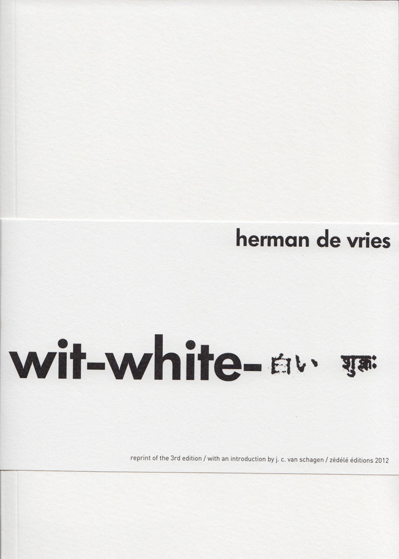

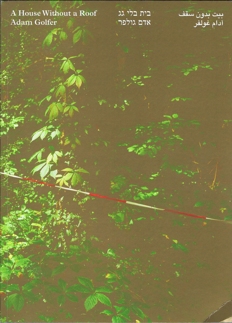
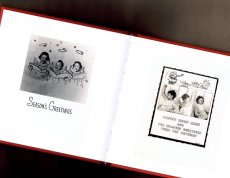

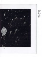

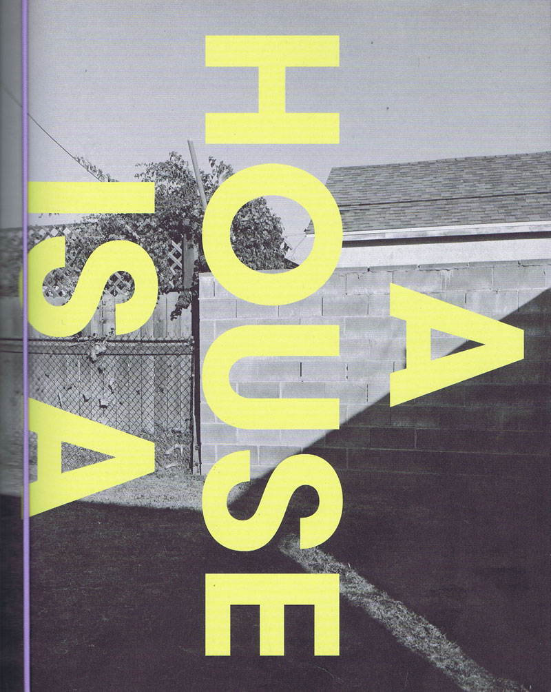
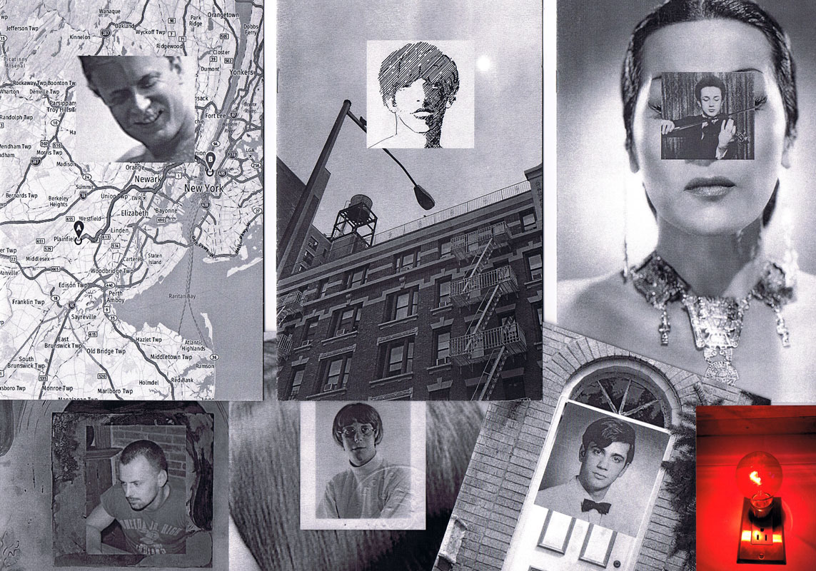


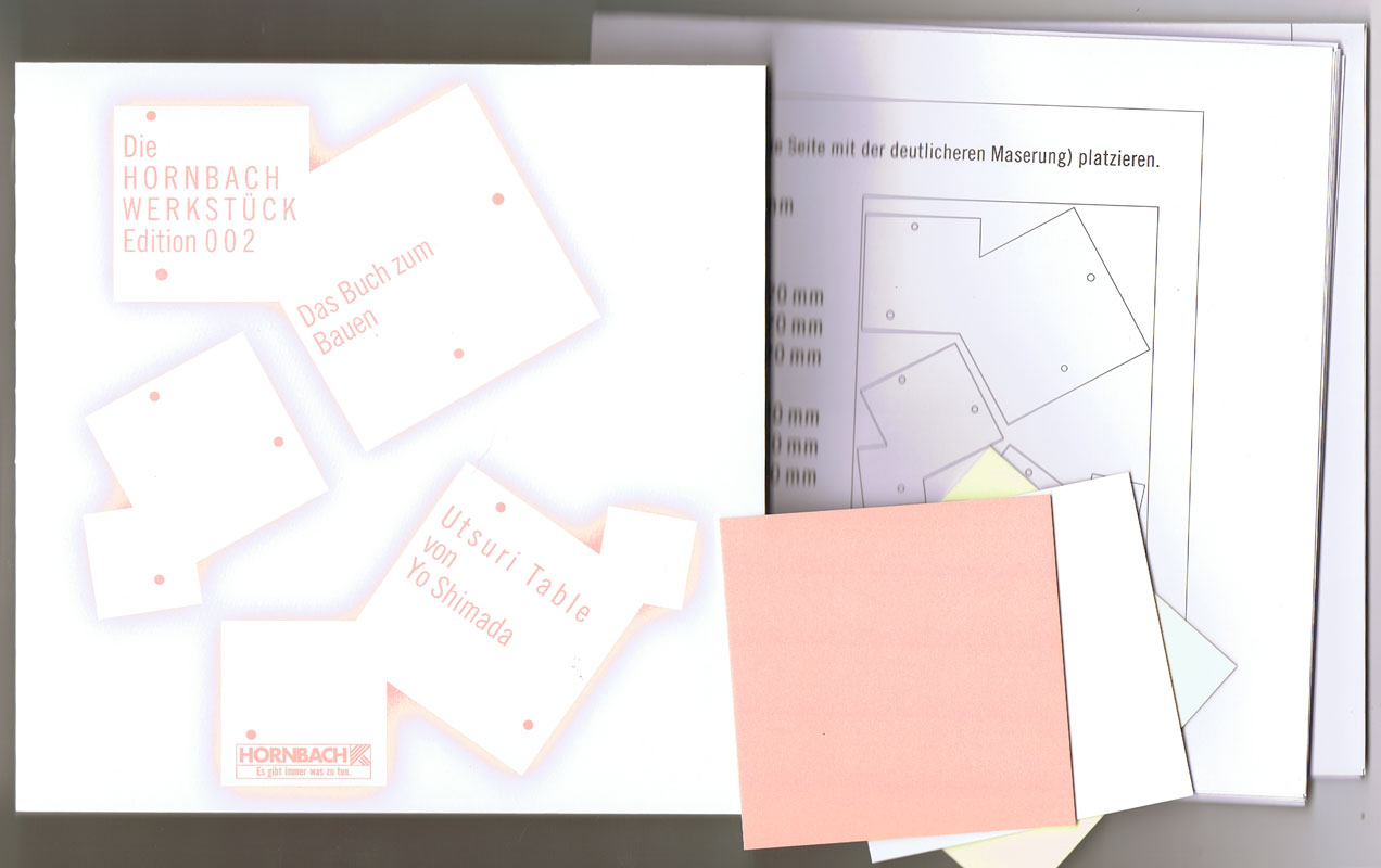

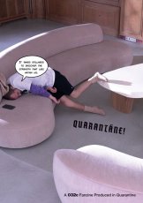


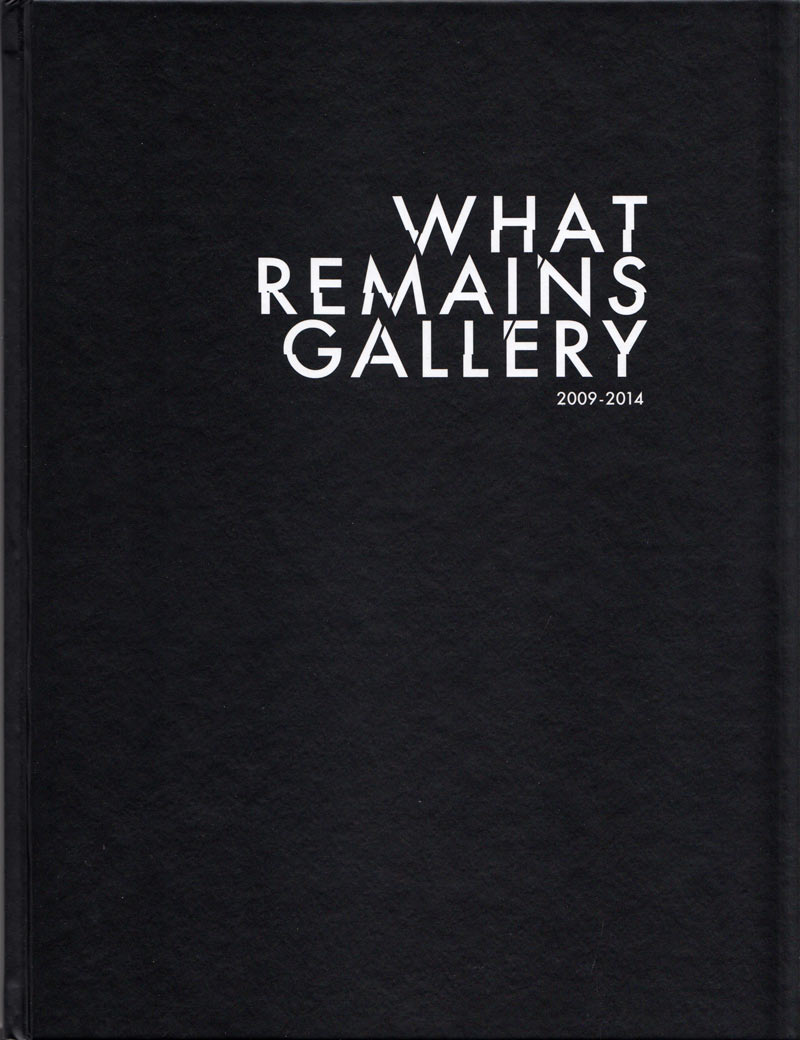
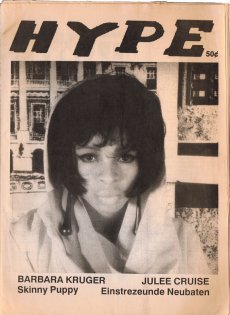

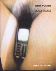

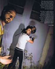
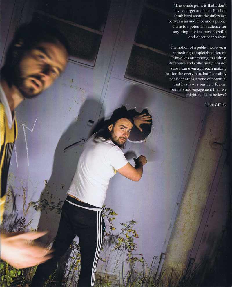
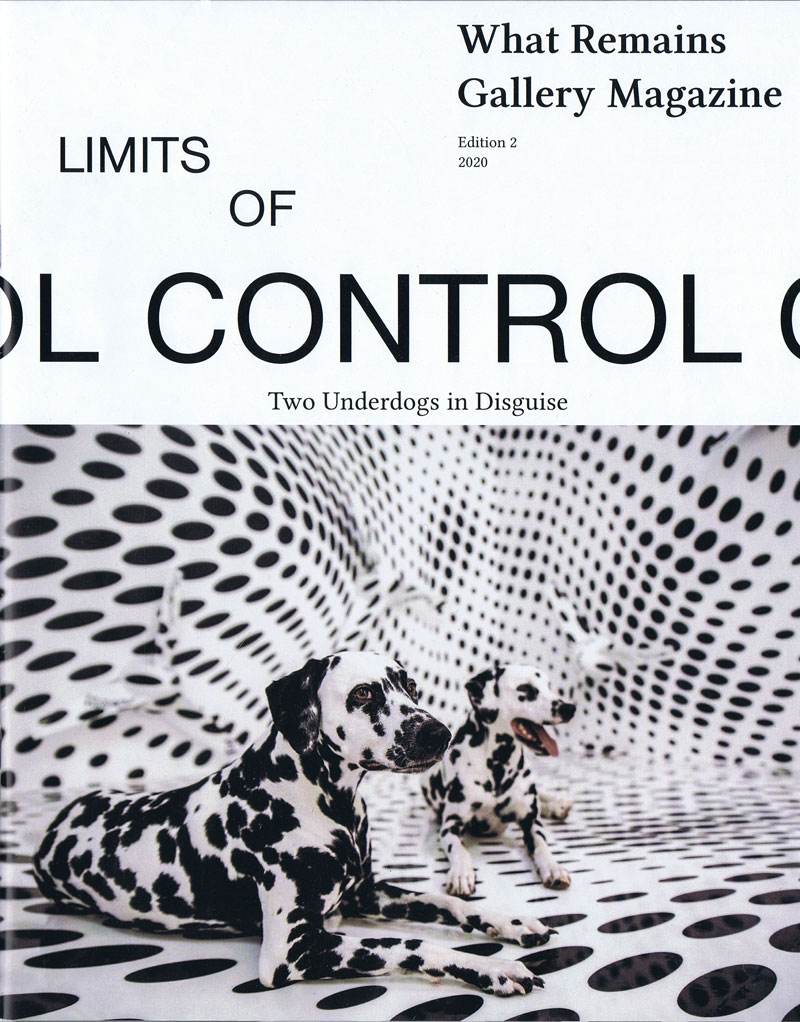

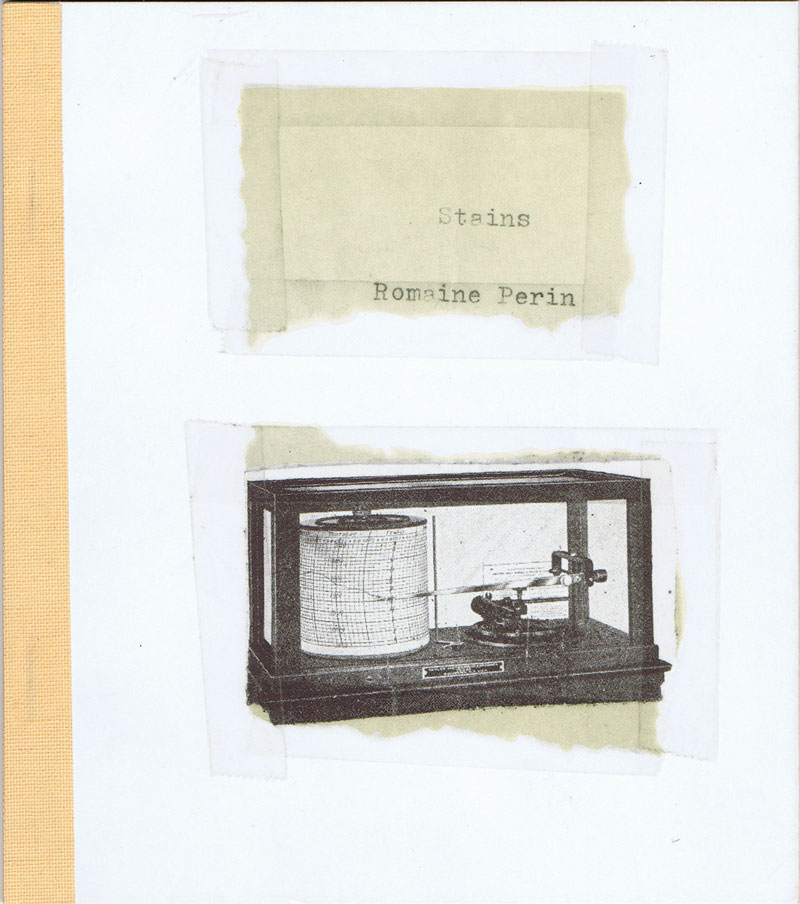
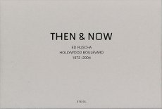
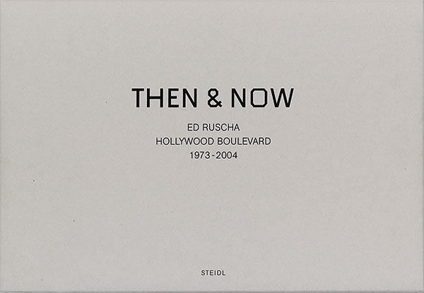
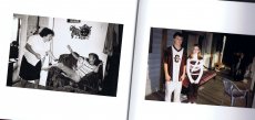


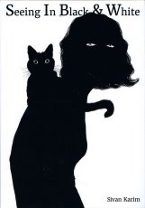
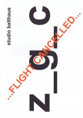
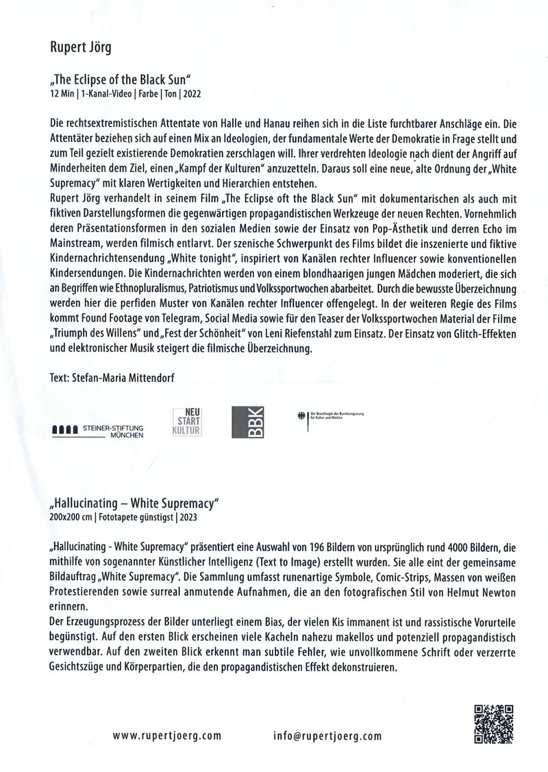
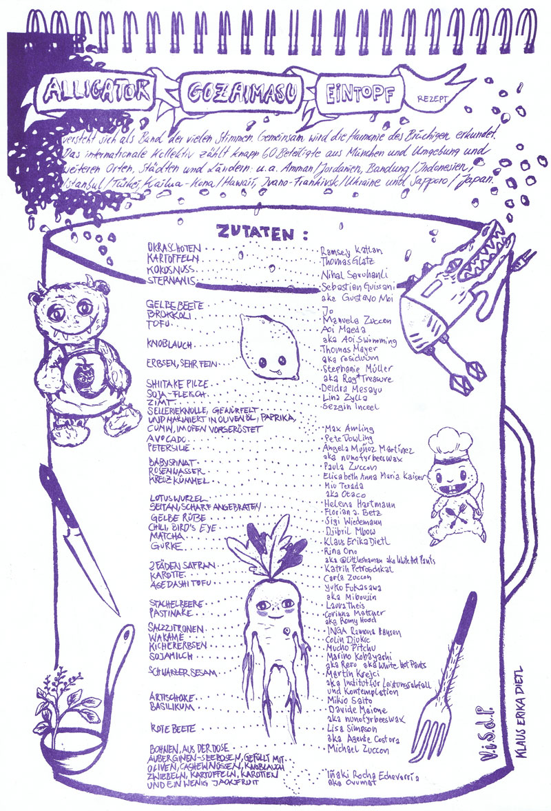


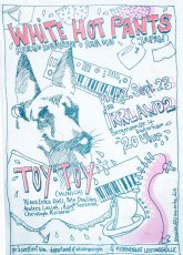
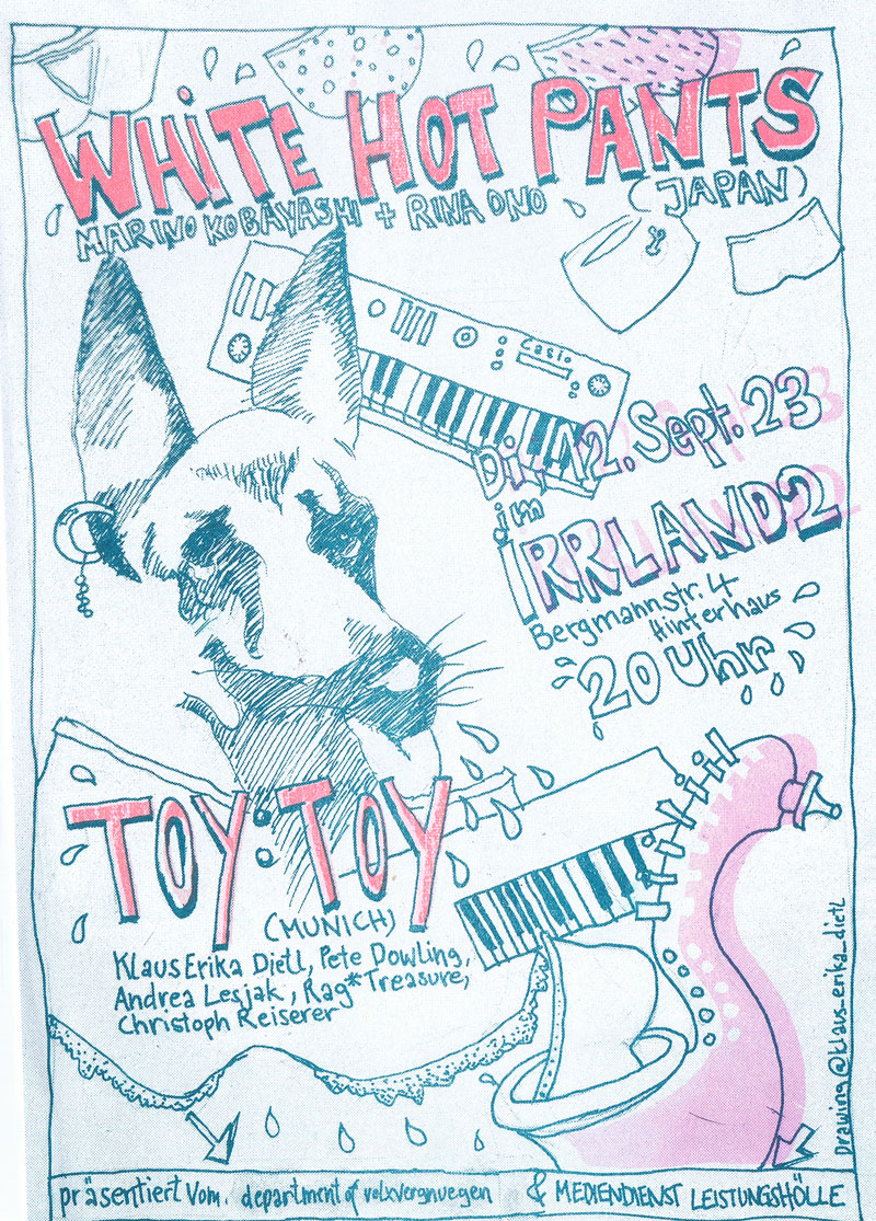


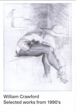


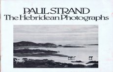

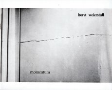


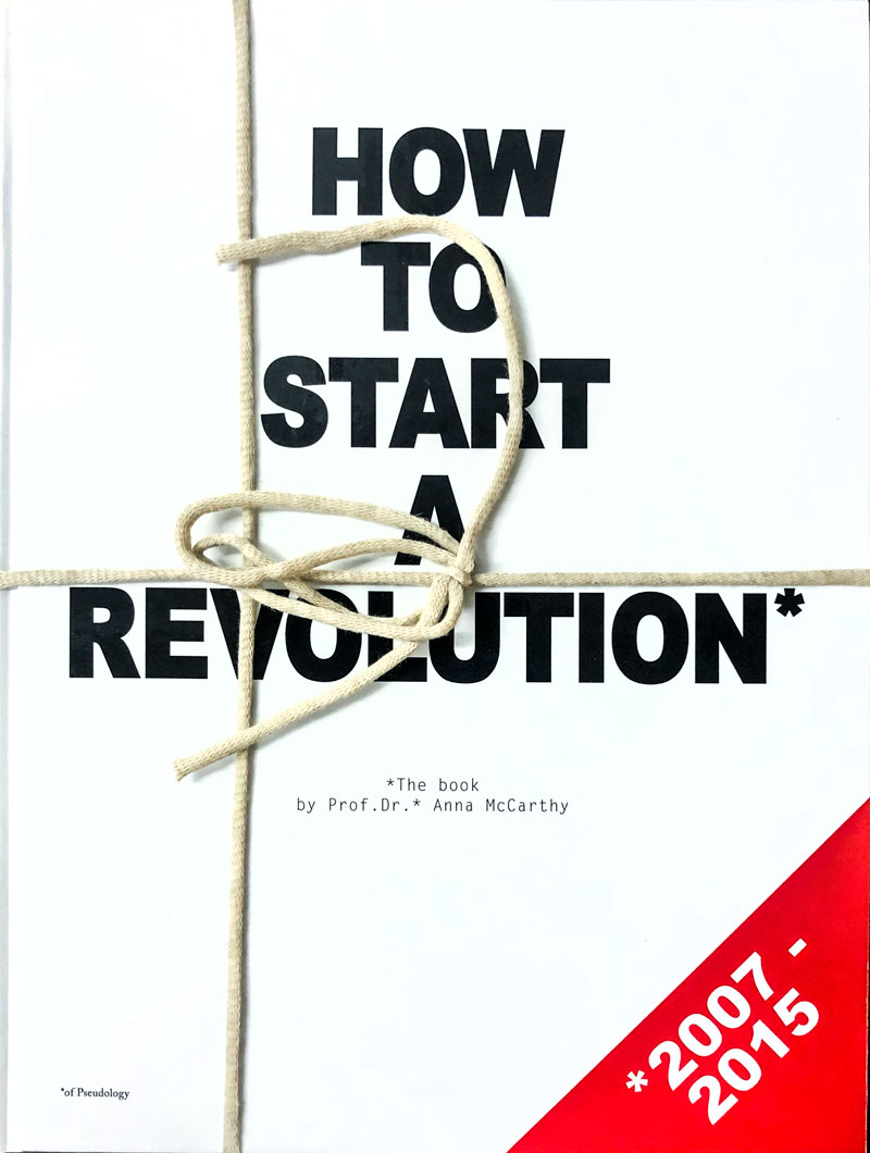


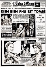

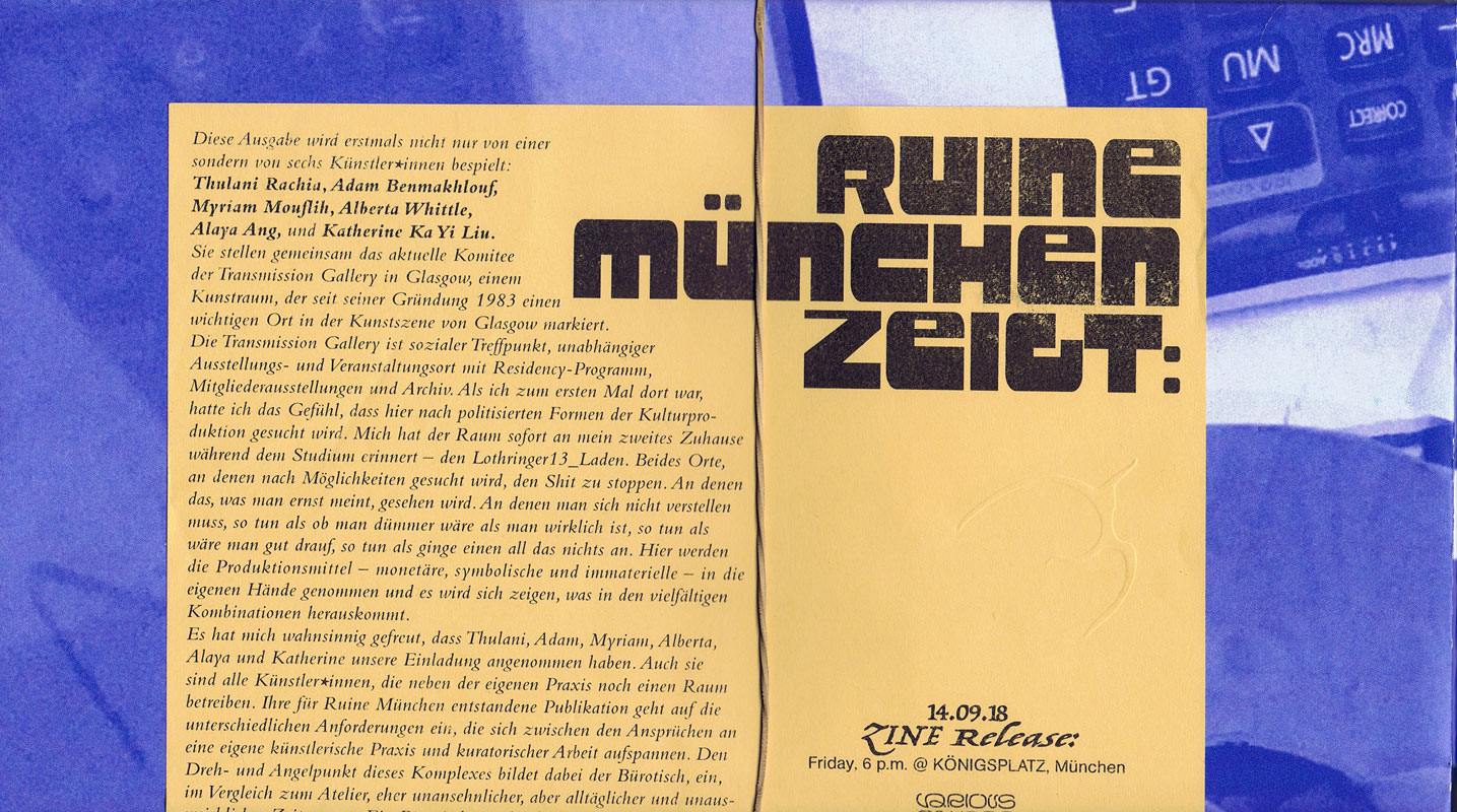

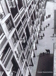


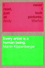

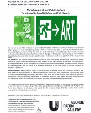
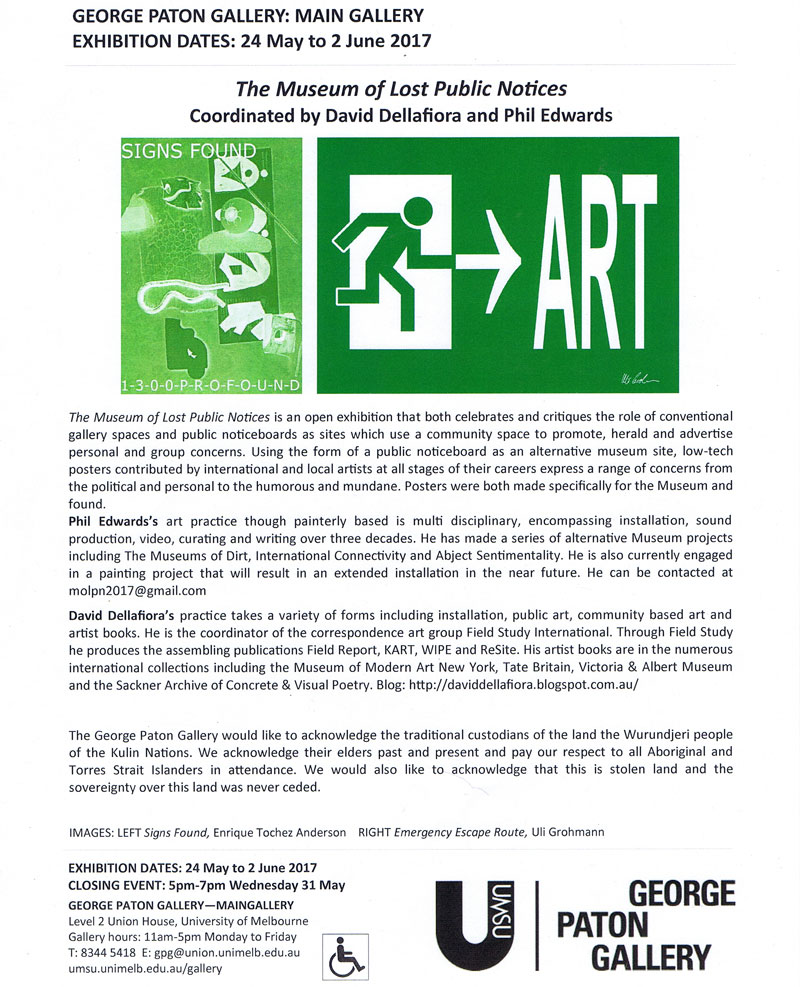


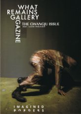
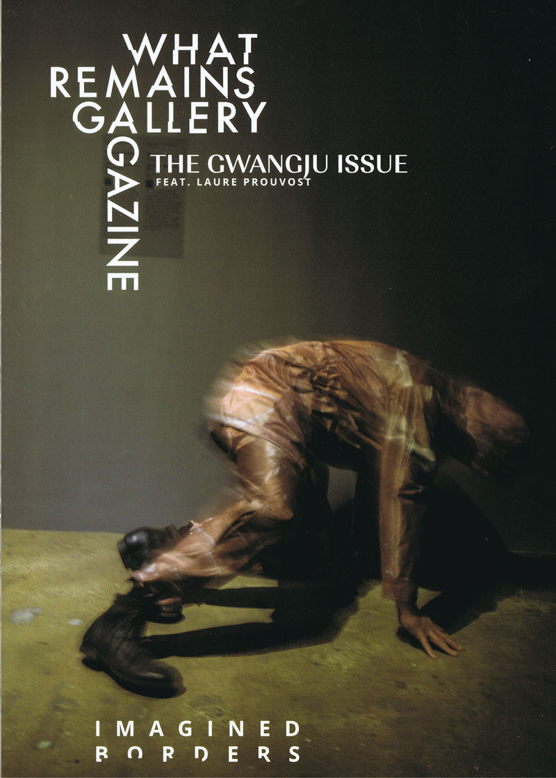


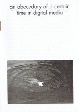
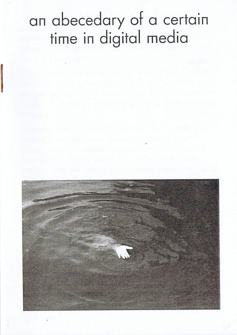


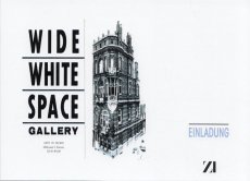


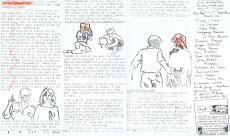
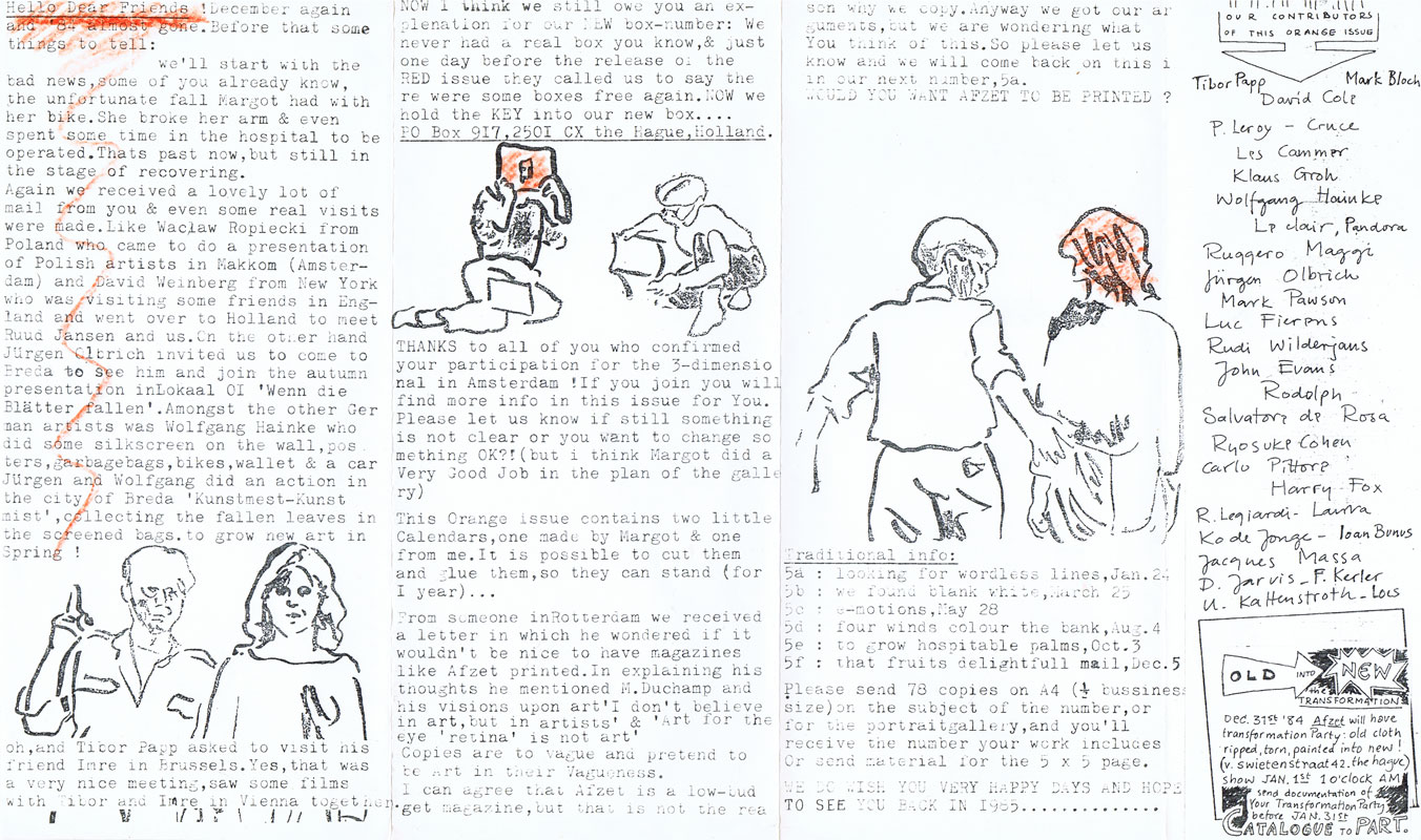


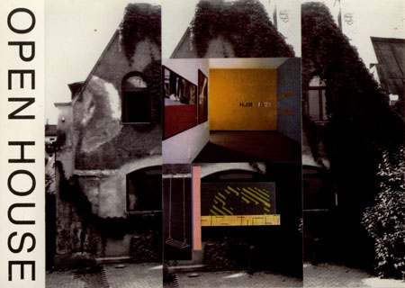

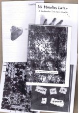


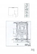


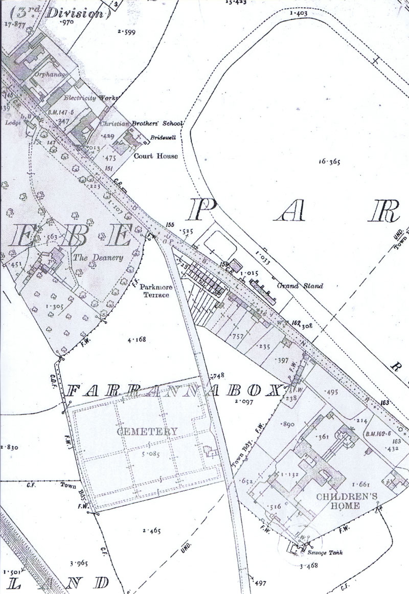
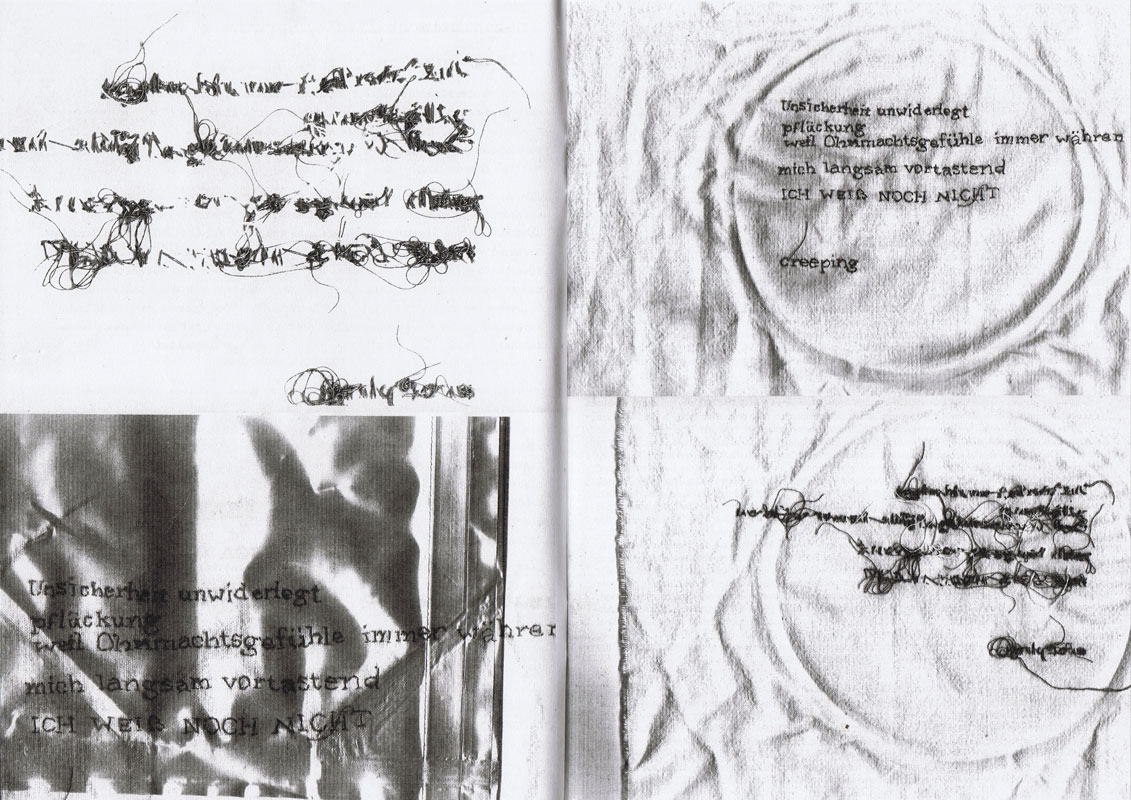
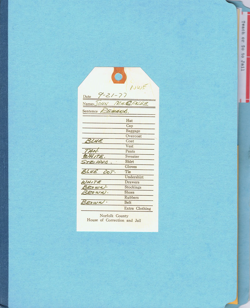
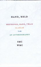
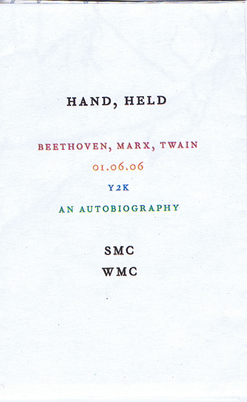
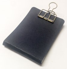
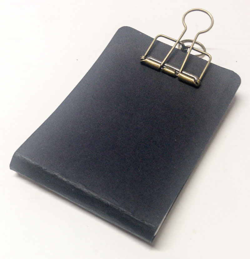


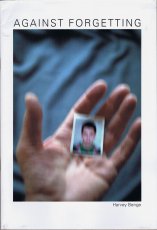

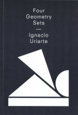
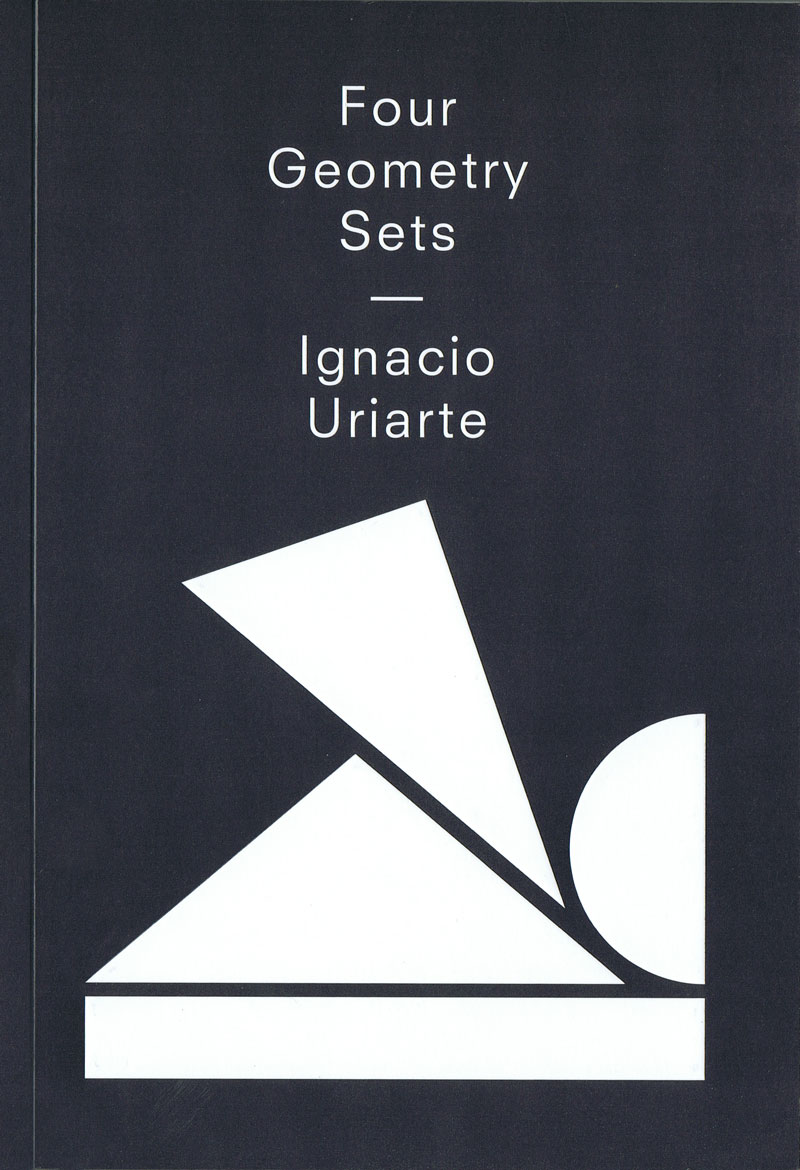
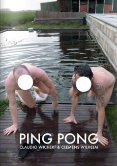

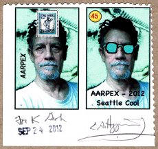

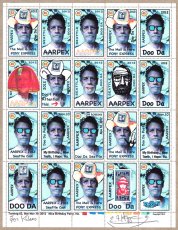


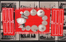

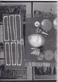

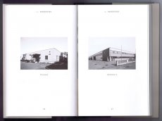

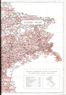

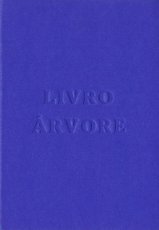
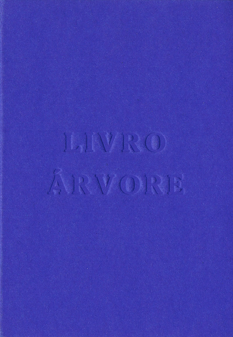
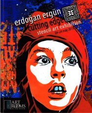

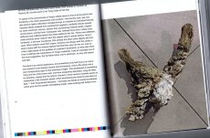


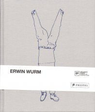


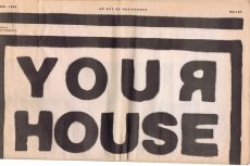

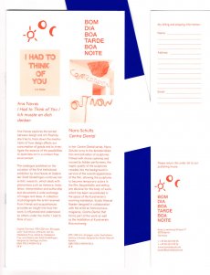


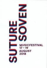

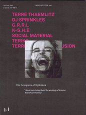


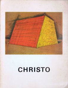


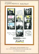


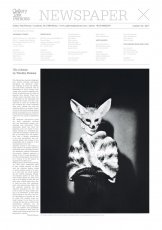


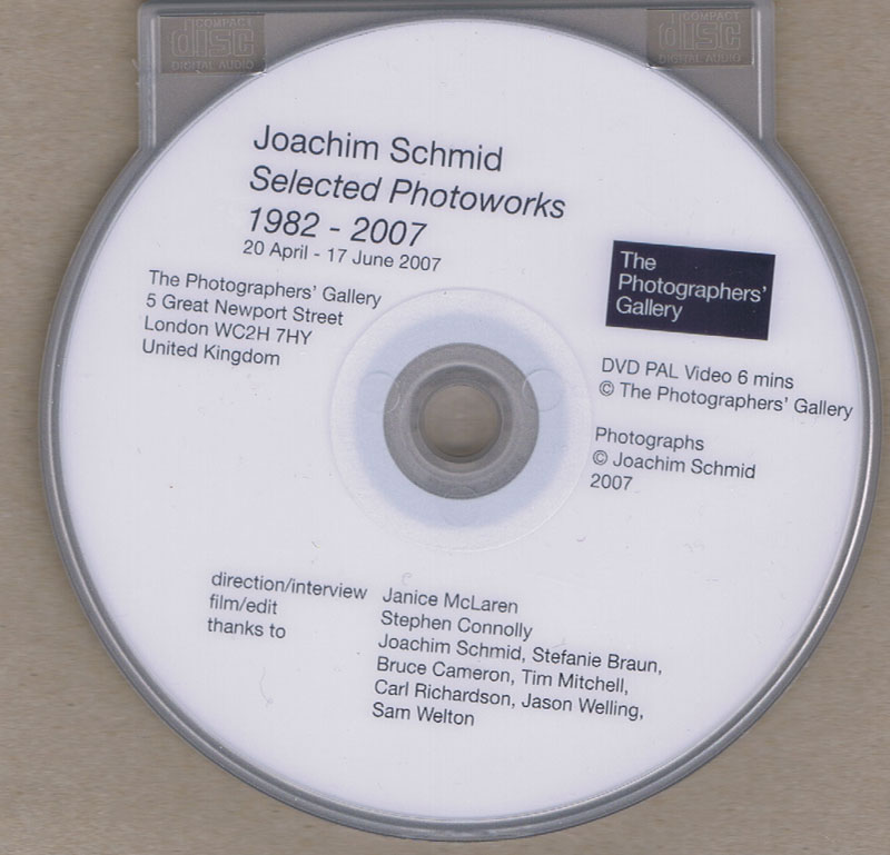


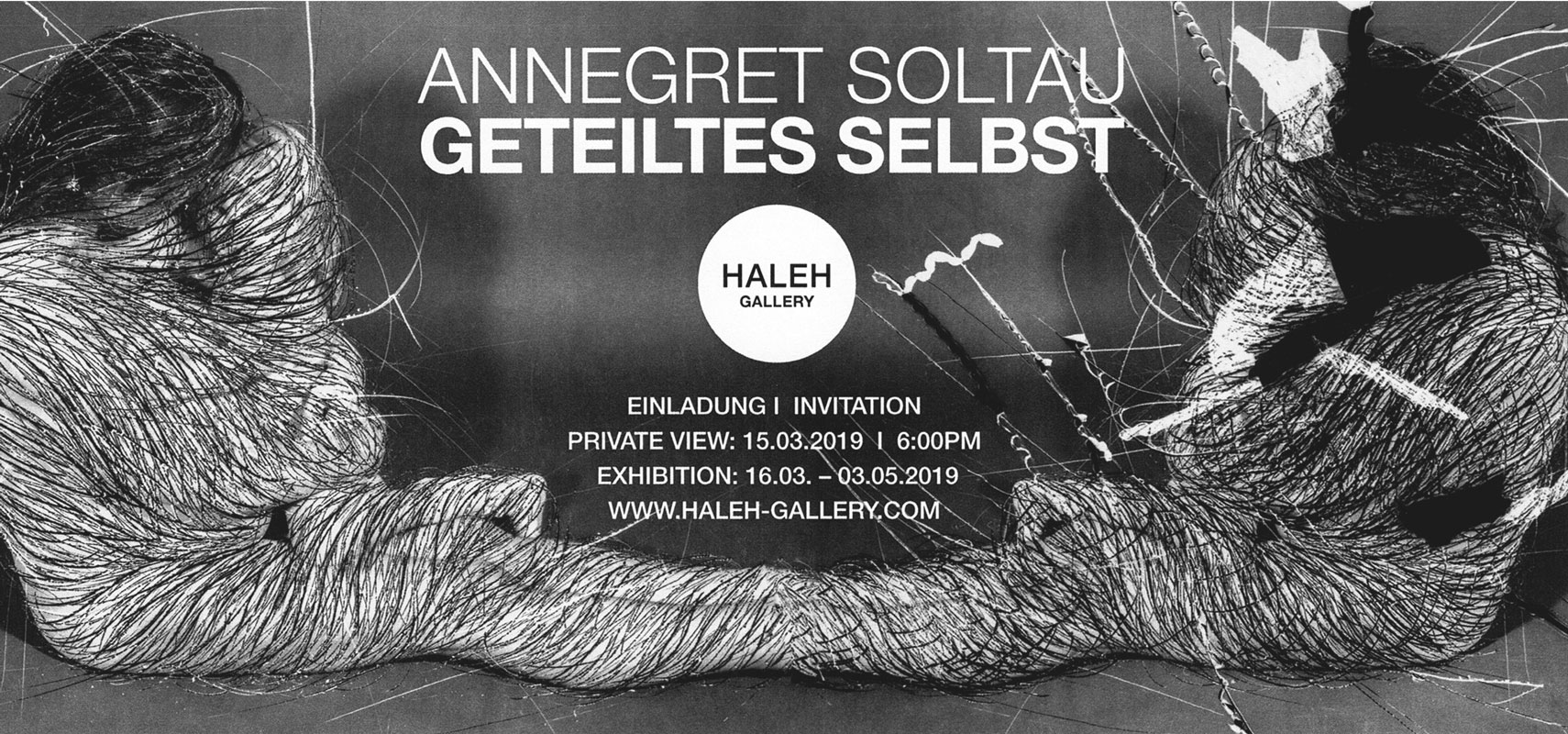

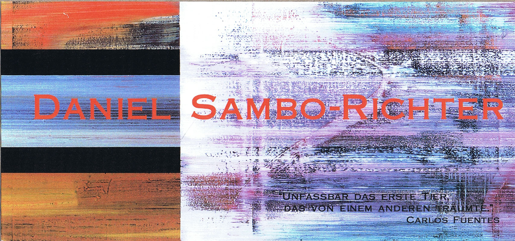
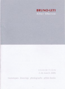
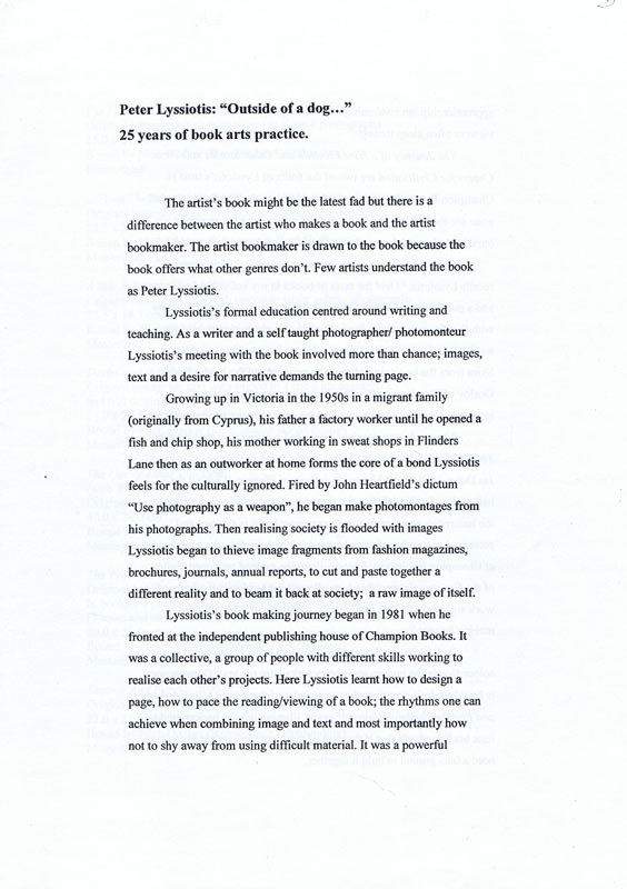


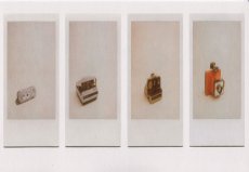

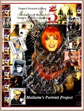


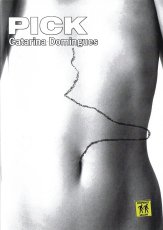

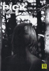


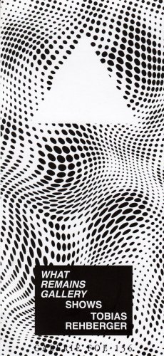


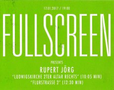


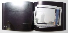

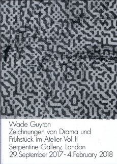


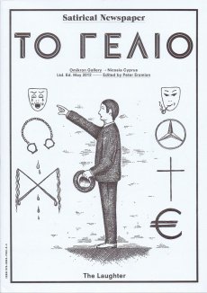

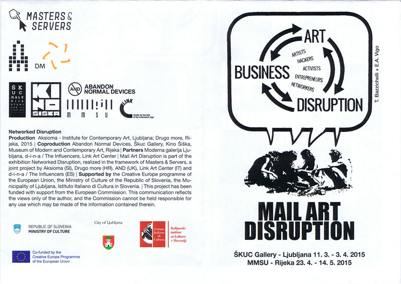


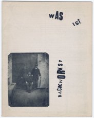


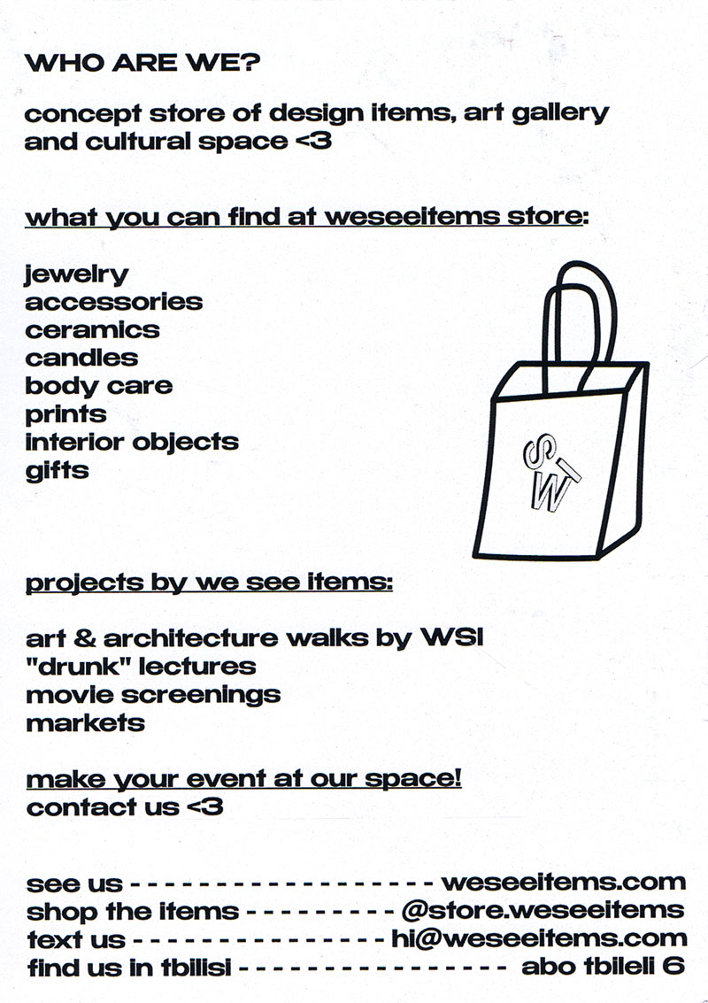
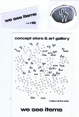


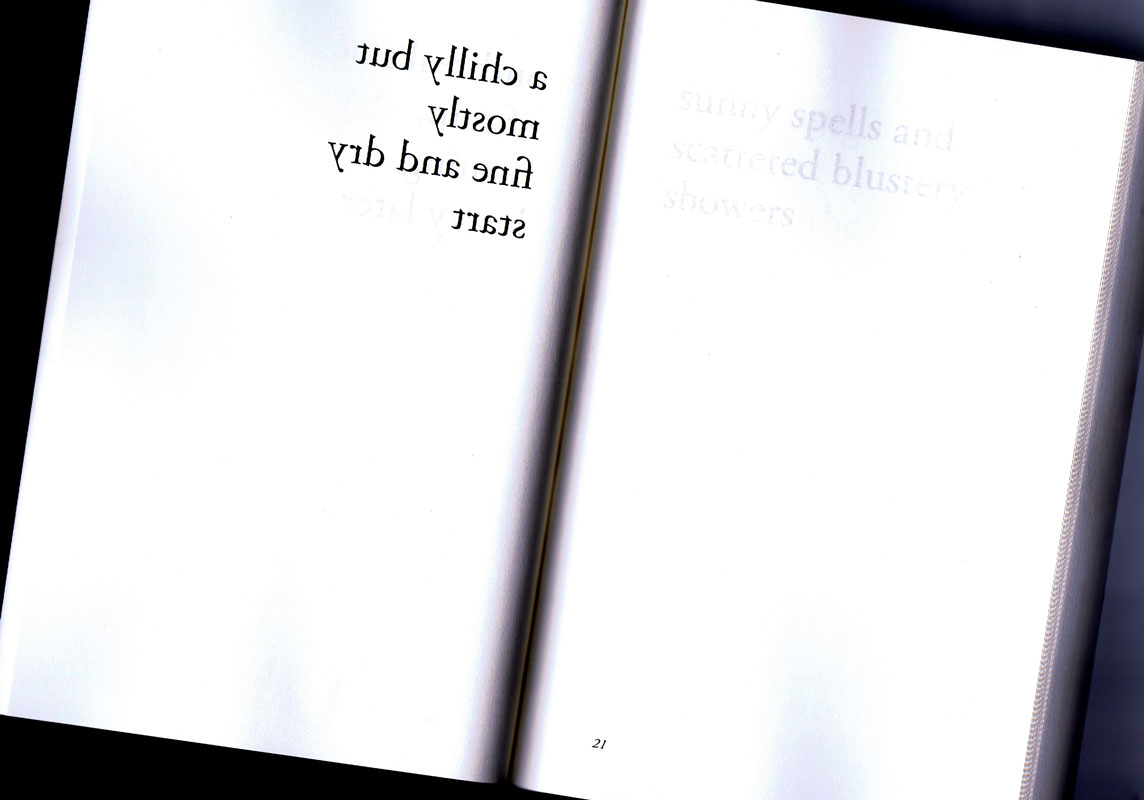
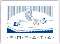

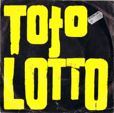
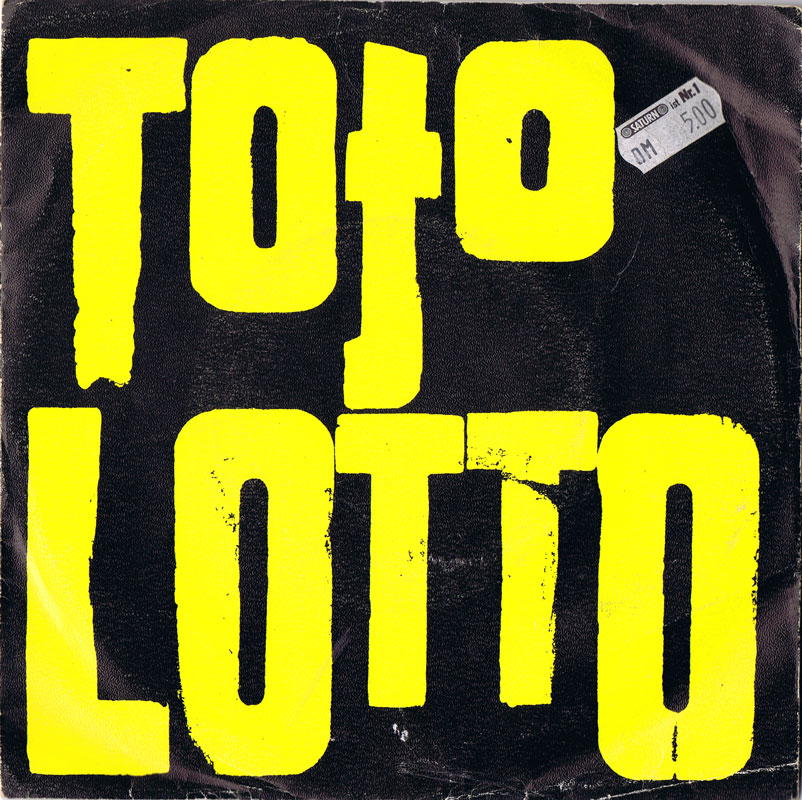


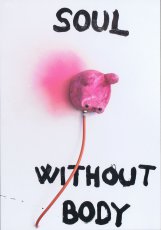


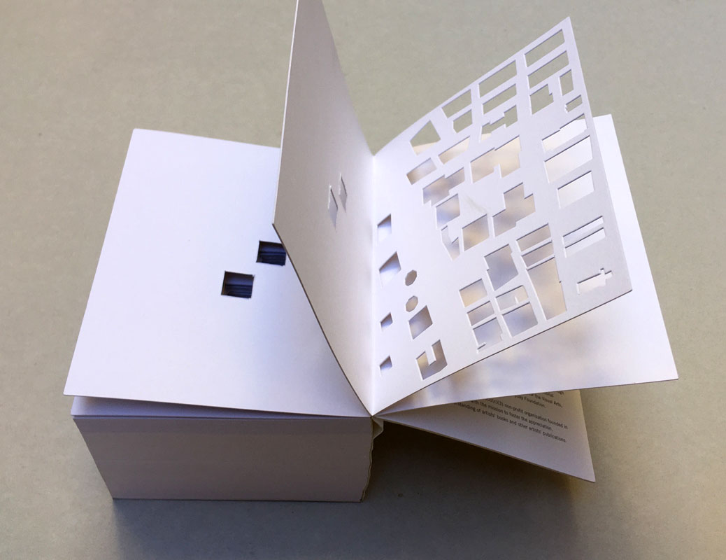

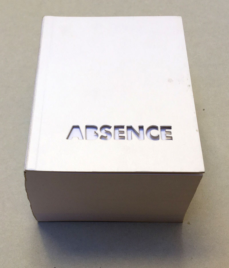


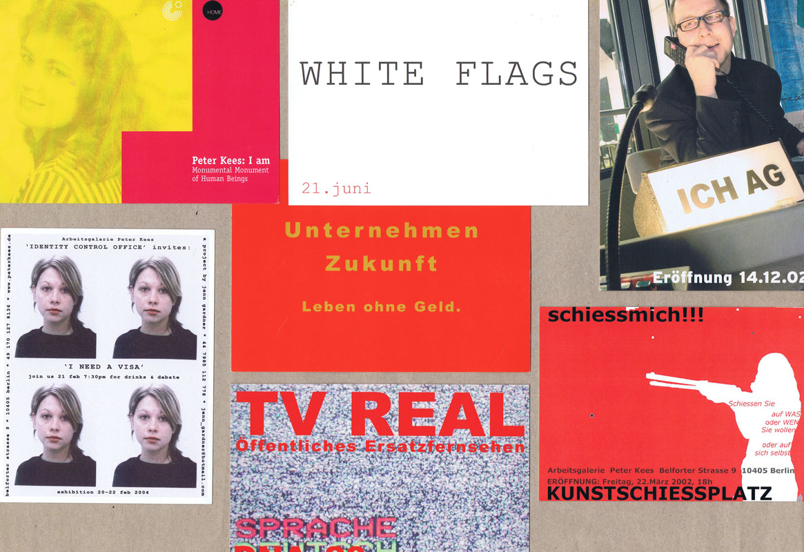


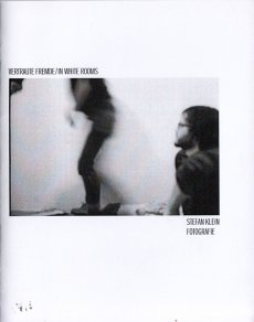


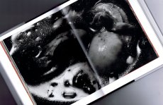

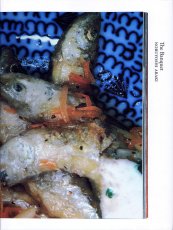

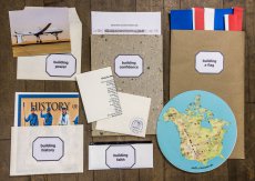

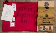

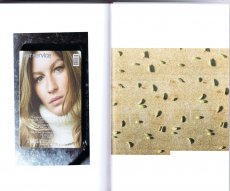


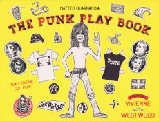


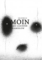


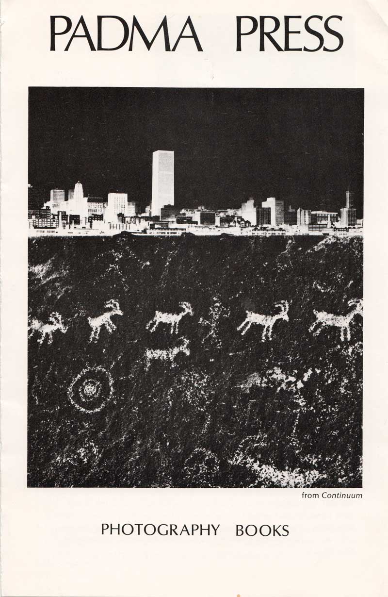


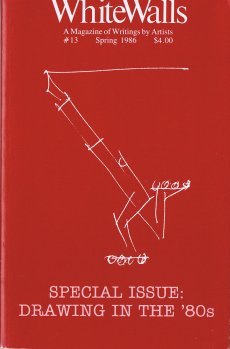

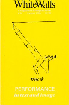


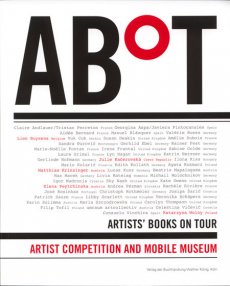


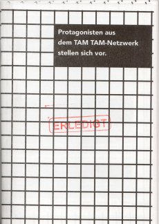


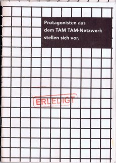
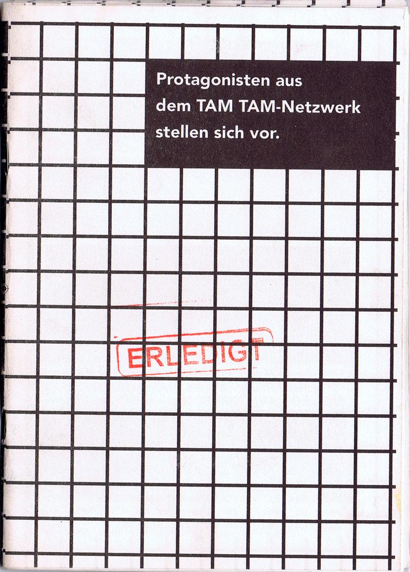
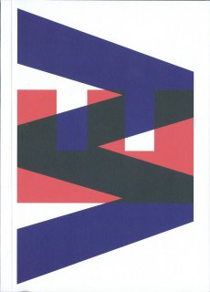


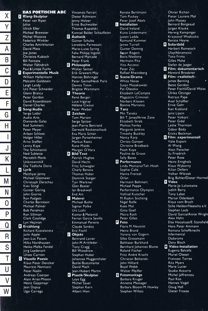

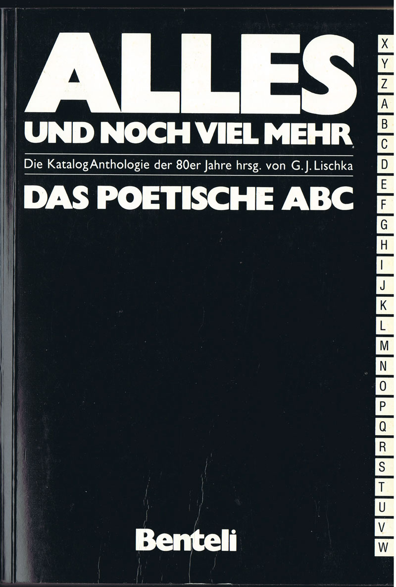


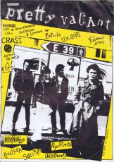


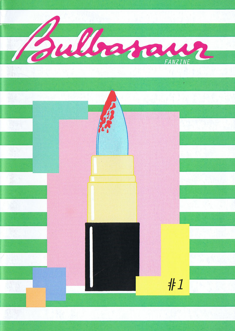

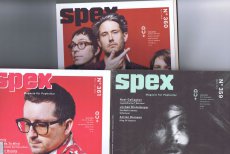

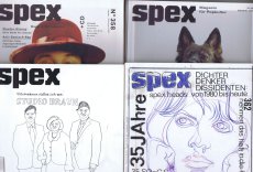
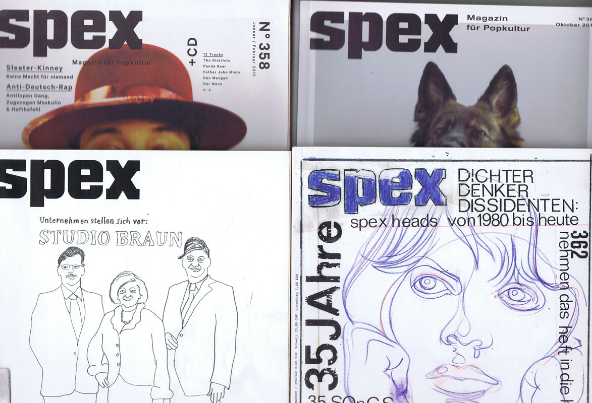
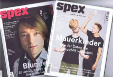


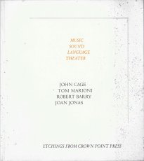
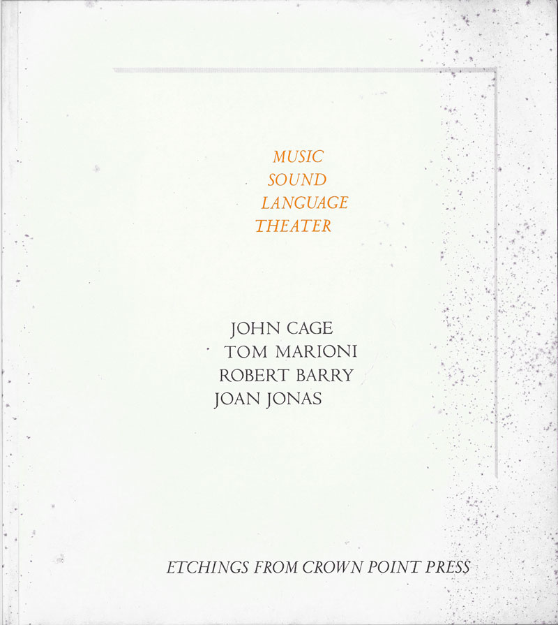
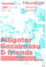
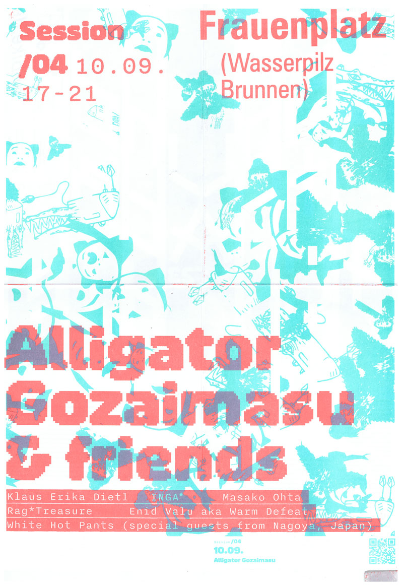


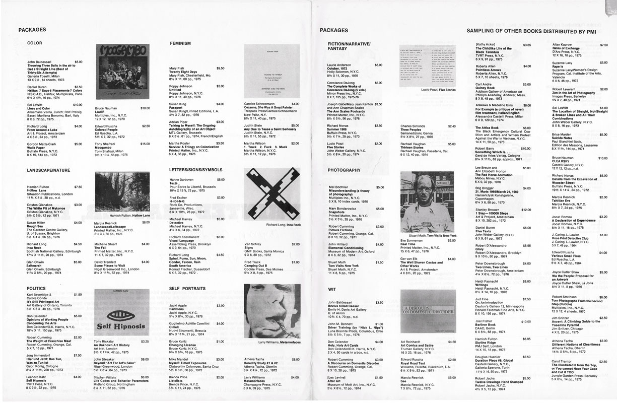
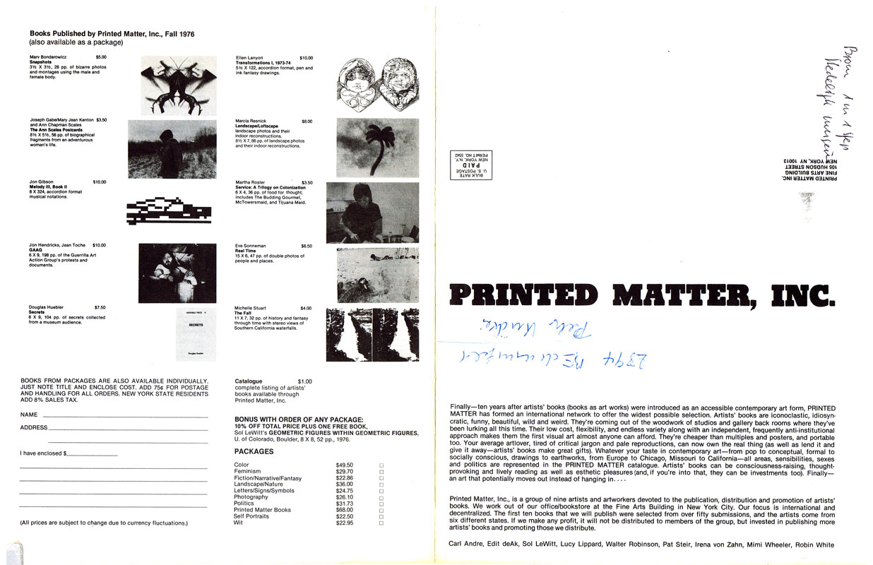


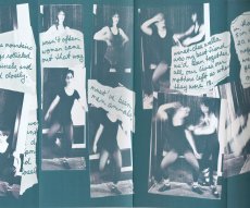

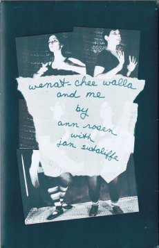


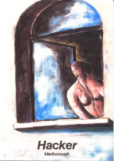


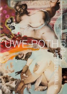

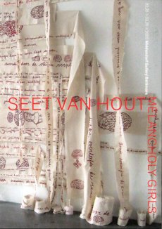

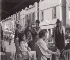

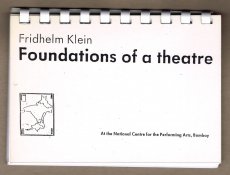
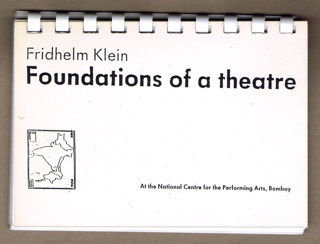
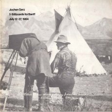


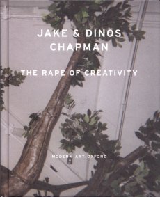


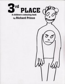


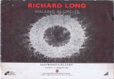

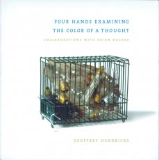

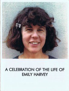


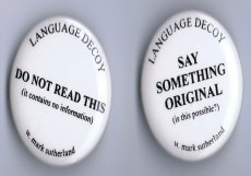


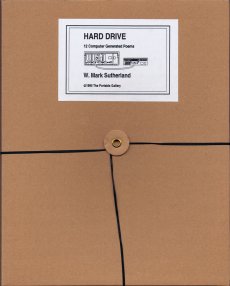

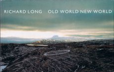

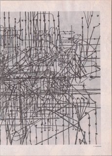

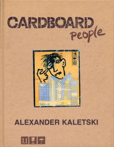


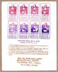


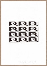

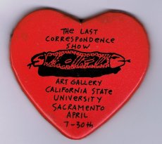


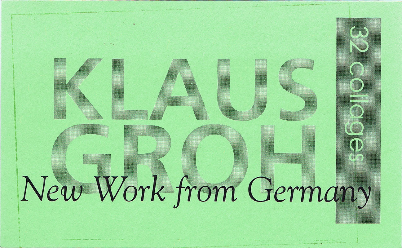
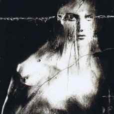

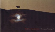

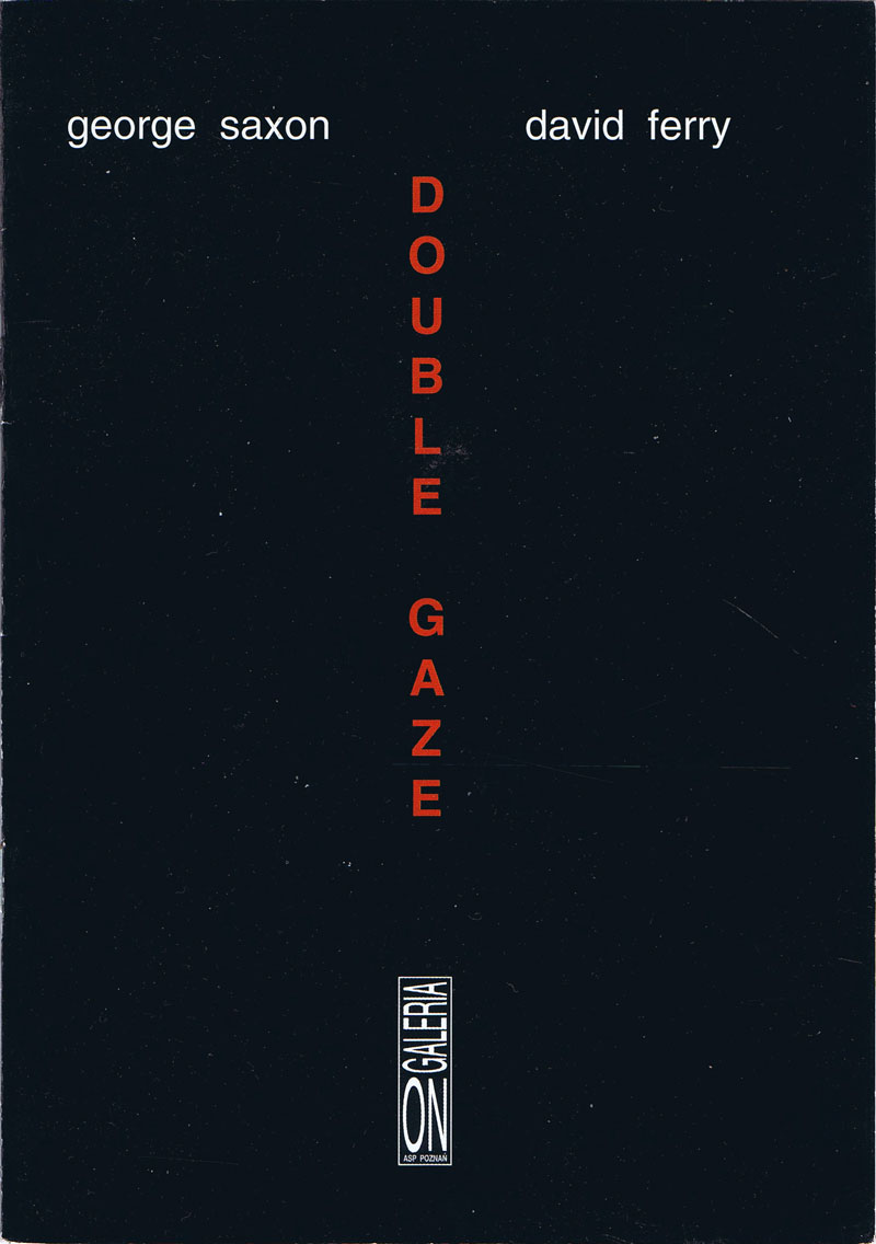


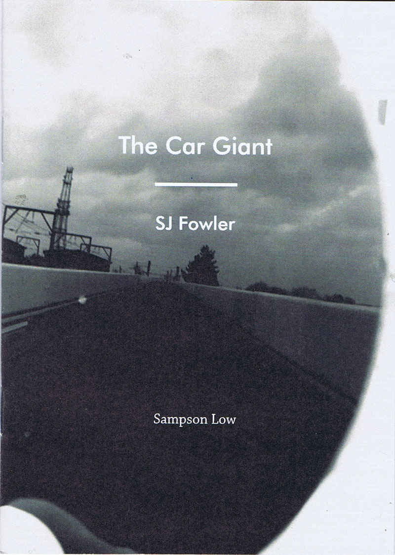


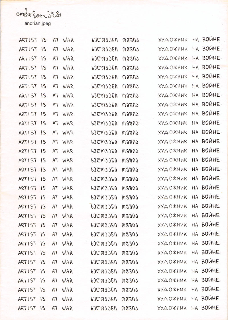


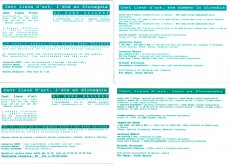


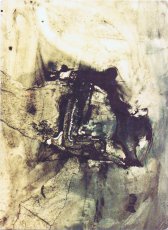


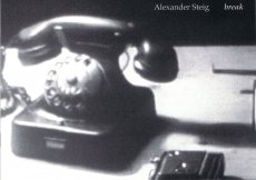


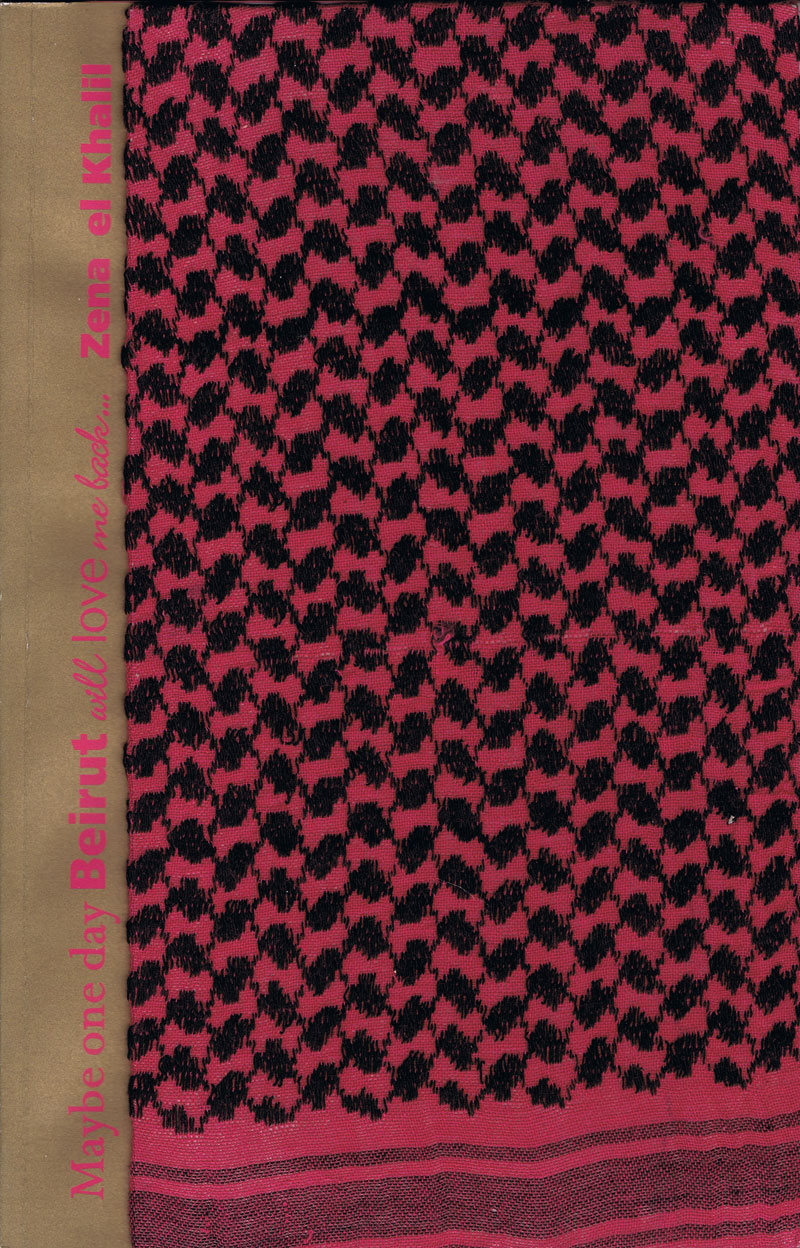

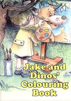

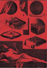


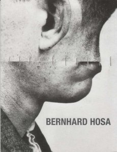

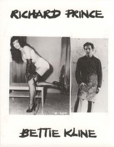


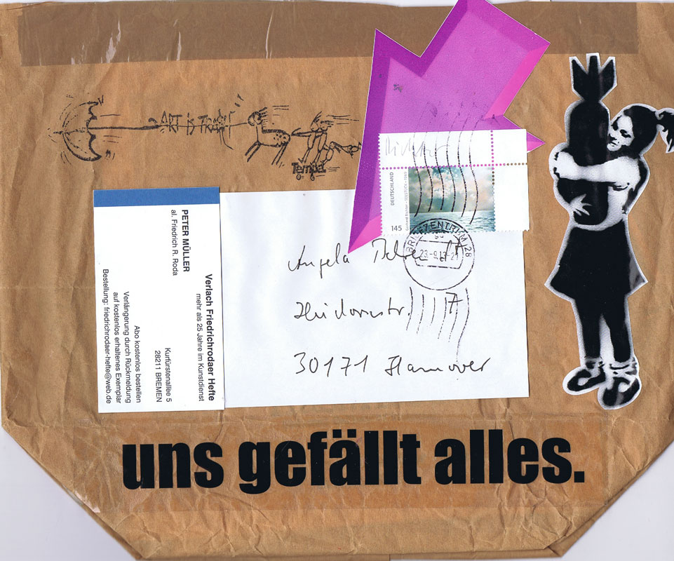


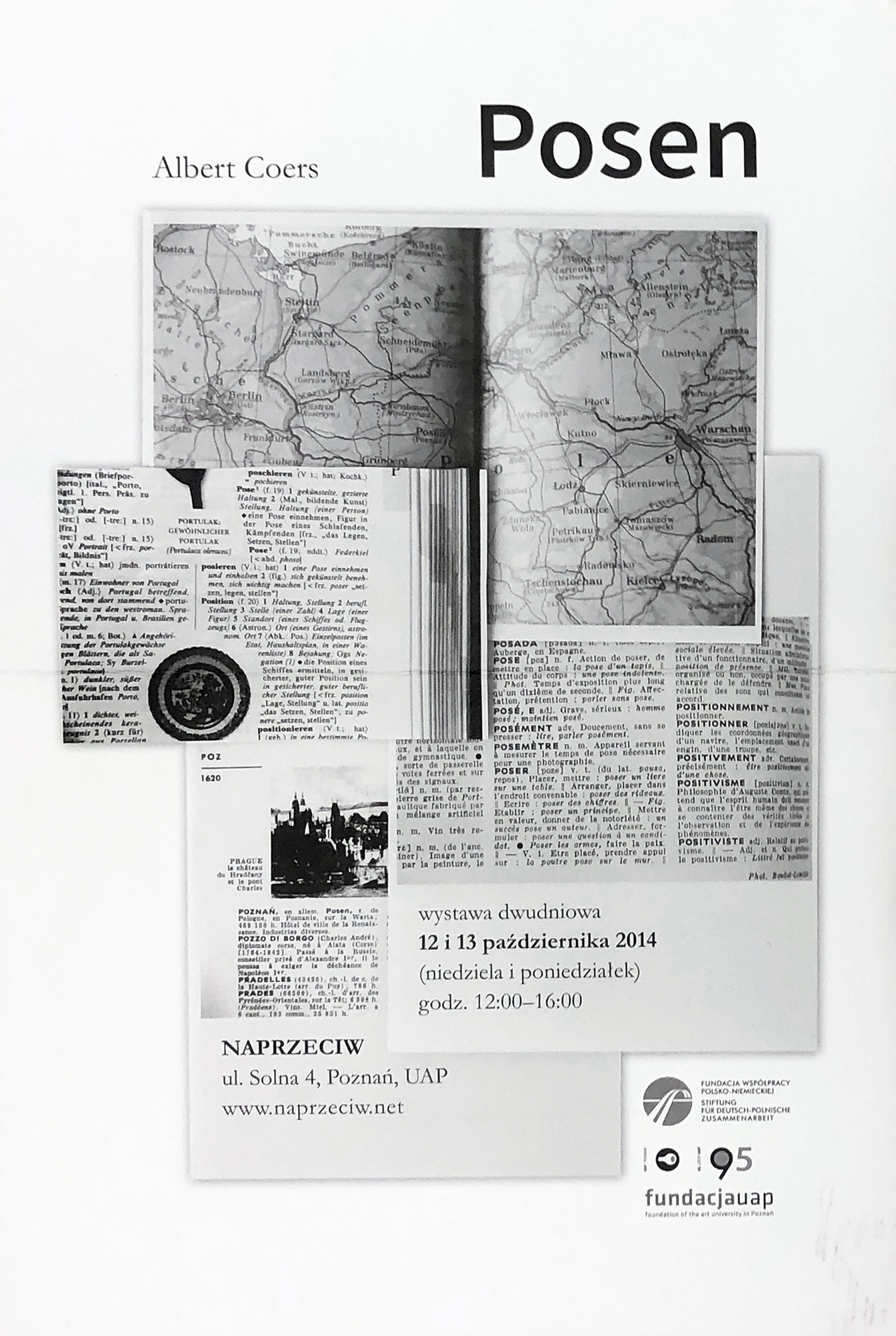
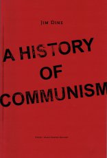


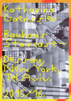

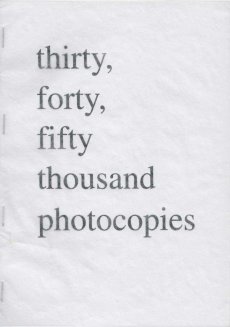

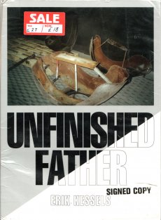

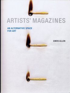
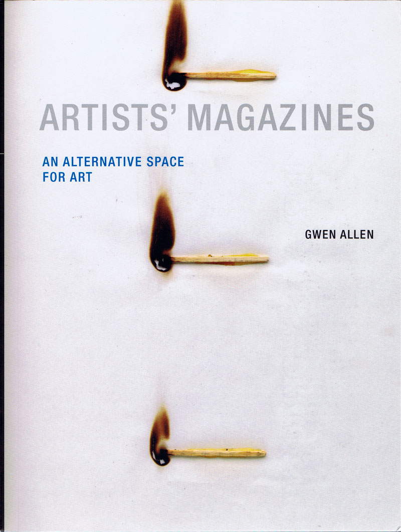

