Gesucht wurde After the Fact. Propaganda im 21. Jh., Medienart , Sortierung DatensatzNr., aufsteigend.
Kein exaktes Ergebnis. Alternative Fundstellen: 162 Treffer
AAP Archive Artist Publications - Munich - www.artistbooks.de
Verfasser
Titel
Ort Land
Verlag Jahr
Medium
Technische
Angaben
ZusatzInfos
Weitere
Personen
Sponsoren
Stichwort / Schlagwort
Geschenk von
TitelNummer
|
 
Verfasser
Titel
Verlag Jahr
Medium
Technische
Angaben
ZusatzInfos
Sprache
Stichwort / Schlagwort
WEB Link
Erworben bei Amazon
TitelNummer
|
 
Verfasser
Titel
Ort Land
Verlag Jahr
Medium
Technische
Angaben
ZusatzInfos
Sprache
Stichwort / Schlagwort
WEB Link
Geschenk von
TitelNummer
|
Verfasser
Titel
Ort Land
Verlag Jahr
Medium
Technische
Angaben
ZusatzInfos
Weitere
Personen
Sponsoren
Stichwort / Schlagwort
Geschenk von
TitelNummer
|
Verfasser
Titel
Ort Land
Verlag Jahr
Medium
Technische
Angaben
Sprache
Stichwort / Schlagwort
Geschenk von
TitelNummer
|
Verfasser
Titel
Medium
Technische
Angaben
ZusatzInfos
Erworben bei Aaron Fabian
TitelNummer
|
Verfasser
Titel
Ort Land
Medium
Technische
Angaben
ZusatzInfos
Stichwort / Schlagwort
WEB Link
TitelNummer
|
 
Verfasser
Titel
Ort Land
Verlag Jahr
Medium
Technische
Angaben
ZusatzInfos
Weitere
Personen
Stichwort / Schlagwort
TitelNummer
|
Verfasser
Titel
Ort Land
Verlag Jahr
Medium
Technische
Angaben
ZusatzInfos
Sprache
Stichwort / Schlagwort
WEB Link
TitelNummer
|
Verfasser
Titel
Ort Land
Verlag Jahr
Medium
Technische
Angaben
ZusatzInfos
Weitere
Personen
Stichwort / Schlagwort
WEB Link
TitelNummer
|
Verfasser
Titel
Ort Land
Verlag Jahr
Medium
Technische
Angaben
ZusatzInfos
Weitere
Personen
Sprache
Stichwort / Schlagwort
WEB Link
Erworben bei múltiplos
TitelNummer
|
Verfasser
Titel
Ort Land
Medium
Technische
Angaben
ZusatzInfos
Weitere
Personen
Sprache
Stichwort / Schlagwort
Erworben bei art book cologne
TitelNummer
|
 
Verfasser
Titel
Ort Land
Verlag Jahr
Medium
Technische
Angaben
ZusatzInfos
Weitere
Personen
Stichwort / Schlagwort
Geschenk von
TitelNummer
|
Verfasser
Titel
Ort Land
Verlag Jahr
Medium
Technische
Angaben
ZusatzInfos
Weitere
Personen
Sprache
Stichwort / Schlagwort
Geschenk von
Erworben bei Abo Süddeutsche Zeitung
TitelNummer
|
 
Verfasser
Titel
Ort Land
Verlag Jahr
Medium
Technische
Angaben
ZusatzInfos
Weitere
Personen
Geschenk von
TitelNummer
|
Verfasser
Titel
Verlag Jahr
Medium
Technische
Angaben
ZusatzInfos
Weitere
Personen
Sprache
Stichwort / Schlagwort
Erworben bei múltiplos
TitelNummer
|
Verfasser
Titel
Ort Land
Medium
Technische
Angaben
ZusatzInfos
Stichwort / Schlagwort
WEB Link
TitelNummer
|
 
Verfasser
Titel
Ort Land
Medium
Technische
Angaben
ZusatzInfos
Stichwort / Schlagwort
WEB Link
TitelNummer
|
Verfasser
Titel
Ort Land
Verlag Jahr
Medium
Technische
Angaben
ZusatzInfos
Weitere
Personen
Sprache
Stichwort / Schlagwort
Geschenk von
TitelNummer
|
Verfasser
Titel
Ort Land
Verlag Jahr
Medium
Technische
Angaben
ZusatzInfos
Weitere
Personen
Sponsoren
Sprache
Stichwort / Schlagwort
WEB Link
Erworben bei Rote Sonne München
TitelNummer
|
 
Verfasser
Titel
Ort Land
Verlag Jahr
Medium
Technische
Angaben
ZusatzInfos
Weitere
Personen
Sprache
Stichwort / Schlagwort
Erworben bei Buchhandlung Walther König München
TitelNummer
|
Verfasser
Titel
Ort Land
Medium
Technische
Angaben
WEB Link
TitelNummer
|
Verfasser
Titel
Ort Land
Verlag Jahr
Medium
Technische
Angaben
ZusatzInfos
WEB Link
TitelNummer
|
Verfasser
Titel
Ort Land
Verlag Jahr
Medium
Technische
Angaben
ZusatzInfos
Geschenk von
TitelNummer
|
Verfasser
Titel
Ort Land
Verlag Jahr
Medium
Technische
Angaben
ZusatzInfos
TitelNummer
|
Verfasser
Titel
Ort Land
Verlag Jahr
Medium
Technische
Angaben
ZusatzInfos
Stichwort / Schlagwort
WEB Link
Geschenk von
TitelNummer
|
Verfasser
Titel
Ort Land
Verlag Jahr
Medium
Technische
Angaben
ZusatzInfos
Weitere
Personen
Stichwort / Schlagwort
WEB Link
Geschenk von
TitelNummer
|
Verfasser
Titel
Ort Land
Verlag Jahr
Medium
Technische
Angaben
ZusatzInfos
Weitere
Personen
Sprache
Stichwort / Schlagwort
Geschenk von
TitelNummer
|
Verfasser
Titel
Ort Land
Verlag Jahr
Medium
Technische
Angaben
ZusatzInfos
Weitere
Personen
Stichwort / Schlagwort
WEB Link
WEB Link
Geschenk von
TitelNummer
|
Verfasser
Titel
Ort Land
Verlag Jahr
Medium
Technische
Angaben
ZusatzInfos
Weitere
Personen
Sprache
Stichwort / Schlagwort
Geschenk von
TitelNummer
|
 
Verfasser
Titel
Ort Land
Verlag Jahr
Medium
Technische
Angaben
ZusatzInfos
Weitere
Personen
Sprache
Stichwort / Schlagwort
WEB Link
Erworben bei 032c
TitelNummer
|
Verfasser
Titel
Verlag Jahr
Medium
Technische
Angaben
ZusatzInfos
Weitere
Personen
Sprache
Stichwort / Schlagwort
Geschenk von
TitelNummer
|
Verfasser
Titel
Ort Land
Verlag Jahr
Medium
Technische
Angaben
Weitere
Personen
Stichwort / Schlagwort
TitelNummer
|
Verfasser
Titel
Ort Land
Verlag Jahr
Medium
Technische
Angaben
Sprache
Stichwort / Schlagwort
WEB Link
TitelNummer
|
Verfasser
Titel
Ort Land
Verlag Jahr
Medium
Technische
Angaben
ZusatzInfos
Stichwort / Schlagwort
TitelNummer
|
Verfasser
Titel
Ort Land
Medium
Technische
Angaben
ZusatzInfos
WEB Link
TitelNummer
|
 
Verfasser
Titel
Ort Land
Verlag Jahr
Medium
Technische
Angaben
ZusatzInfos
WEB Link
TitelNummer
|
Verfasser
Titel
Ort Land
Verlag Jahr
Medium
Technische
Angaben
ZusatzInfos
Sprache
Stichwort / Schlagwort
Geschenk von
TitelNummer
|
Verfasser
Titel
Ort Land
Verlag Jahr
Medium
Technische
Angaben
ZusatzInfos
Sprache
Stichwort / Schlagwort
WEB Link
Geschenk von
Erworben bei Melville Brand Design
TitelNummer
|
Verfasser
Titel
Ort Land
Verlag Jahr
Medium
Technische
Angaben
ZusatzInfos
Sprache
Stichwort / Schlagwort
Geschenk von
TitelNummer
|
Verfasser
Titel
Ort Land
Medium
Technische
Angaben
ZusatzInfos
Weitere
Personen
Sprache
Stichwort / Schlagwort
WEB Link
Geschenk von
Erworben bei Booklyn
TitelNummer
|
Verfasser
Titel
Ort Land
Verlag Jahr
Medium
Technische
Angaben
Stichwort / Schlagwort
WEB Link
TitelNummer
|
Verfasser
Titel
Ort Land
Verlag Jahr
Medium
Technische
Angaben
Stichwort / Schlagwort
WEB Link
TitelNummer
|
Verfasser
Titel
Ort Land
Verlag Jahr
Medium
Technische
Angaben
Stichwort / Schlagwort
WEB Link
TitelNummer
|
 
Verfasser
Titel
Ort Land
Verlag Jahr
Medium
Technische
Angaben
ZusatzInfos
WEB Link
TitelNummer
|
Verfasser
Titel
Ort Land
Verlag Jahr
Medium
Technische
Angaben
ZusatzInfos
Erworben bei Buchhandlung Goltz
TitelNummer
|
Verfasser
Titel
Verlag Jahr
Medium
Technische
Angaben
ZusatzInfos
Sprache
Stichwort / Schlagwort
WEB Link
Geschenk von
Erworben bei Librería Dadá
TitelNummer
|
 
Verfasser
Titel
Ort Land
Verlag Jahr
Medium
Technische
Angaben
ZusatzInfos
Sprache
WEB Link
Erworben bei The Library Project
TitelNummer
|
Verfasser
Titel
Ort Land
Verlag Jahr
Medium
Technische
Angaben
ZusatzInfos
Sprache
Erworben bei Abo Süddeutsche Zeitung
TitelNummer
|
Verfasser
Titel
Ort Land
Verlag Jahr
Medium
Technische
Angaben
ZusatzInfos
Stichwort / Schlagwort
WEB Link
Geschenk von
TitelNummer
|
 
Verfasser
Titel
Ort Land
Verlag Jahr
Medium
Technische
Angaben
ZusatzInfos
Geschenk von
TitelNummer
|
Verfasser
Titel
Ort Land
Verlag Jahr
Medium
Technische
Angaben
ZusatzInfos
WEB Link
TitelNummer
|
 
Verfasser
Titel
Ort Land
Verlag Jahr
Medium
Technische
Angaben
ZusatzInfos
Weitere
Personen
Sprache
Stichwort / Schlagwort
Geschenk von
TitelNummer
|
Verfasser
Titel
Ort Land
Verlag Jahr
Medium
Technische
Angaben
ZusatzInfos
Sprache
Stichwort / Schlagwort
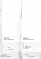
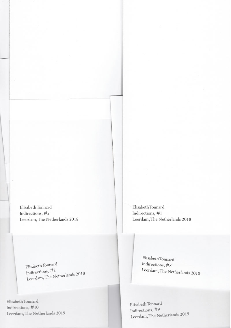
Erworben bei Elisabeth Tonnard
TitelNummer
|
 
Verfasser
Titel
Ort Land
Medium
Technische
Angaben
Weitere
Personen
Sprache
Stichwort / Schlagwort
Geschenk von
TitelNummer
|
 
Verfasser
Titel
Verlag Jahr
Medium
Technische
Angaben
ZusatzInfos
Sprache
Stichwort / Schlagwort
Geschenk von
TitelNummer
|
Verfasser
Titel
Verlag Jahr
Medium
Technische
Angaben
ZusatzInfos
Sprache
Stichwort / Schlagwort
WEB Link
Erworben bei múltiplos
TitelNummer
|
 
Verfasser
Titel
Ort Land
Verlag Jahr
Technische
Angaben
ZusatzInfos
Weitere
Personen
Sprache
Stichwort / Schlagwort
Geschenk von
TitelNummer
|
Verfasser
Titel
Ort Land
Verlag Jahr
Medium
Technische
Angaben
ZusatzInfos
Sprache
Stichwort / Schlagwort
Geschenk von
TitelNummer
|
Verfasser
Titel
Ort Land
Verlag Jahr
Medium
Technische
Angaben
ZusatzInfos
Sprache
Stichwort / Schlagwort
Geschenk von
TitelNummer
|
 
Verfasser
Titel
Ort Land
Verlag Jahr
Medium
Technische
Angaben
ZusatzInfos
Weitere
Personen
Stichwort / Schlagwort
Geschenk von
TitelNummer
|
Verfasser
Titel
Ort Land
Verlag Jahr
Medium
Technische
Angaben
ZusatzInfos
Weitere
Personen
Sprache
Stichwort / Schlagwort
Geschenk von
TitelNummer
|
Verfasser
Titel
Ort Land
Verlag Jahr
Medium
Technische
Angaben
ZusatzInfos
Weitere
Personen
Sprache
Stichwort / Schlagwort
WEB Link
Geschenk von
TitelNummer
|
 
Verfasser
Titel
Ort Land
Verlag Jahr
Medium
Technische
Angaben
ZusatzInfos
Weitere
Personen
Stichwort / Schlagwort
Geschenk von
TitelNummer
|
Verfasser
Titel
Ort Land
Verlag Jahr
Medium
Technische
Angaben
ZusatzInfos
Weitere
Personen
Sprache
Stichwort / Schlagwort
WEB Link
Geschenk von
TitelNummer
|
Verfasser
Titel
Ort Land
Verlag Jahr
Medium
Technische
Angaben
ZusatzInfos
Weitere
Personen
Sprache
Stichwort / Schlagwort
Erworben bei Abo Süddeutsche Zeitung
TitelNummer
|
Verfasser
Titel
Ort Land
Verlag Jahr
Medium
Technische
Angaben
Stichwort / Schlagwort
TitelNummer
|
 
Verfasser
Titel
Ort Land
Verlag Jahr
Medium
Technische
Angaben
ZusatzInfos
Stichwort / Schlagwort
TitelNummer
|
Verfasser
Titel
Verlag Jahr
Medium
Technische
Angaben
ZusatzInfos
Stichwort / Schlagwort
Nachlass von Michael Köhler
TitelNummer
|
 
Verfasser
Titel
Ort Land
Verlag Jahr
Medium
Technische
Angaben
Stichwort / Schlagwort
TitelNummer
|
Verfasser
Titel
Ort Land
Verlag Jahr
Medium
Technische
Angaben
ZusatzInfos
Stichwort / Schlagwort
TitelNummer
|
Verfasser
Titel
Ort Land
Medium
Technische
Angaben
Stichwort / Schlagwort
WEB Link
TitelNummer
|
Verfasser
Titel
Ort Land
Medium
Technische
Angaben
ZusatzInfos
Stichwort / Schlagwort
WEB Link
TitelNummer
|
Verfasser
Titel
Ort Land
Verlag Jahr
Medium
Technische
Angaben
ZusatzInfos
Weitere
Personen
Sprache
TitelNummer
|
Verfasser
Titel
Ort Land
Verlag Jahr
Medium
Technische
Angaben
Stichwort / Schlagwort
WEB Link
Geschenk von
TitelNummer
|
 
Verfasser
Titel
Ort Land
Verlag Jahr
Medium
Technische
Angaben
TitelNummer
|
Verfasser
Titel
Ort Land
Verlag Jahr
Medium
Technische
Angaben
ZusatzInfos
Weitere
Personen
Stichwort / Schlagwort
Erworben bei Buchhandlung Walther König Köln
TitelNummer
|
Verfasser
Titel
Verlag Jahr
Medium
Technische
Angaben
Stichwort / Schlagwort
Geschenk von
TitelNummer
|
Verfasser
Titel
Ort Land
Verlag Jahr
Medium
Technische
Angaben
Geschenk von
TitelNummer
|
Verfasser
Titel
Ort Land
Verlag Jahr
Medium
Technische
Angaben
Erworben bei Email
TitelNummer
|
Verfasser
Titel
Ort Land
Verlag Jahr
Medium
Technische
Angaben
Sprache
Geschenk von
TitelNummer
|
Verfasser
Titel
Ort Land
Verlag Jahr
Medium
Technische
Angaben
ZusatzInfos
Erworben bei múltiplos
TitelNummer
|
Verfasser
Titel
Verlag Jahr
Medium
Technische
Angaben
ZusatzInfos
Sprache
WEB Link
Erworben bei múltiplos
TitelNummer
|
Verfasser
Titel
Verlag Jahr
Medium
Technische
Angaben
ZusatzInfos
Sprache
TitelNummer
|
Verfasser
Titel
Verlag Jahr
Medium
Technische
Angaben
ZusatzInfos
TitelNummer
|
Verfasser
Titel
Ort Land
Verlag Jahr
Medium
Technische
Angaben
ZusatzInfos
Weitere
Personen
Stichwort / Schlagwort
WEB Link
WEB Link
TitelNummer
|
Verfasser
Titel
Verlag Jahr
Medium
Technische
Angaben
ZusatzInfos
WEB Link
Erworben bei Pavel Matveyev
TitelNummer
|
Verfasser
Titel
Ort Land
Medium
Technische
Angaben
ZusatzInfos
Sprache
WEB Link
TitelNummer
|
Verfasser
Titel
Ort Land
Verlag Jahr
Medium
Technische
Angaben
ZusatzInfos
Sprache
Stichwort / Schlagwort
Erworben bei Moufflon Bookshop
TitelNummer
|
Verfasser
Titel
Ort Land
Verlag Jahr
Medium
Technische
Angaben
ZusatzInfos
Weitere
Personen
Stichwort / Schlagwort
Erworben bei Michalis Pichler
TitelNummer
|
Verfasser
Titel
Ort Land
Verlag Jahr
Medium
Technische
Angaben
ZusatzInfos
Geschenk von
TitelNummer
|
Verfasser
Titel
Ort Land
Verlag Jahr
Medium
Technische
Angaben
ZusatzInfos
Weitere
Personen
WEB Link
Geschenk von
TitelNummer
|
Verfasser
Titel
Ort Land
Verlag Jahr
Medium
Technische
Angaben
ZusatzInfos
Geschenk von
TitelNummer
|
Verfasser
Titel
Ort Land
Verlag Jahr
Medium
Technische
Angaben
ZusatzInfos
Stichwort / Schlagwort
Geschenk von
TitelNummer
|
Verfasser
Titel
Verlag Jahr
Medium
Technische
Angaben
ZusatzInfos
Stichwort / Schlagwort
WEB Link
TitelNummer
|
 
Verfasser
Titel
Ort Land
Verlag Jahr
Medium
Technische
Angaben
ZusatzInfos
Weitere
Personen
Sprache
Stichwort / Schlagwort
WEB Link
TitelNummer
|
 
Verfasser
Titel
Ort Land
Verlag Jahr
Medium
Technische
Angaben
ZusatzInfos
WEB Link
TitelNummer
|
Verfasser
Titel
Ort Land
Verlag Jahr
Medium
Technische
Angaben
ZusatzInfos
WEB Link
TitelNummer
|
 
Verfasser
Titel
Ort Land
Verlag Jahr
Medium
Technische
Angaben
ZusatzInfos
Stichwort / Schlagwort
WEB Link
TitelNummer
|
 
Verfasser
Titel
Ort Land
Verlag Jahr
Medium
Technische
Angaben
ZusatzInfos
Sprache
WEB Link
TitelNummer
|
Verfasser
Titel
Ort Land
Verlag Jahr
Medium
Technische
Angaben
ZusatzInfos
Weitere
Personen
Sprache
Stichwort / Schlagwort
WEB Link
Geschenk von
TitelNummer
|
 
Verfasser
Titel
Verlag Jahr
Medium
Technische
Angaben
ZusatzInfos
Stichwort / Schlagwort
WEB Link
Erworben bei Buchhandlung Walther König Köln
TitelNummer
|
 
Verfasser
Titel
Ort Land
Verlag Jahr
Medium
Technische
Angaben
ZusatzInfos
Weitere
Personen
Stichwort / Schlagwort
TitelNummer
|
Verfasser
Titel
Ort Land
Verlag Jahr
Medium
Technische
Angaben
ZusatzInfos
Sprache
Stichwort / Schlagwort
WEB Link
TitelNummer
|
Verfasser
Titel
Ort Land
Verlag Jahr
Medium
Technische
Angaben
ZusatzInfos
Sprache
Stichwort / Schlagwort
TitelNummer
|
Verfasser
Titel
Ort Land
Medium
Technische
Angaben
ZusatzInfos
Weitere
Personen
Sprache
Stichwort / Schlagwort
TitelNummer
|
Verfasser
Titel
Ort Land
Verlag Jahr
Medium
Technische
Angaben
ZusatzInfos
Weitere
Personen
Sprache
Stichwort / Schlagwort
Erworben bei Hamburger Kunsthalle
TitelNummer
|
 
Verfasser
Titel
Ort Land
Verlag Jahr
Medium
Technische
Angaben
ZusatzInfos
Weitere
Personen
Stichwort / Schlagwort
Geschenk von
TitelNummer
|
Verfasser
Titel
Ort Land
Verlag Jahr
Medium
Technische
Angaben
ZusatzInfos
Sprache
Stichwort / Schlagwort
WEB Link
Geschenk von
TitelNummer
|
 
Verfasser
Titel
Ort Land
Verlag Jahr
Medium
Technische
Angaben
ZusatzInfos
Weitere
Personen
Sprache
Stichwort / Schlagwort
WEB Link
Geschenk von
TitelNummer
|
Verfasser
Titel
Ort Land
Verlag Jahr
Medium
Technische
Angaben
Sprache
Stichwort / Schlagwort
Geschenk von
TitelNummer
|

Verfasser
Titel
Ort Land
Verlag Jahr
Medium
Technische
Angaben
ZusatzInfos
Weitere
Personen
Sprache
Stichwort / Schlagwort
Erworben bei Elisabeth Tonnard
TitelNummer
|
 
Verfasser
Titel
Ort Land
Verlag Jahr
Medium
Technische
Angaben
ZusatzInfos
Weitere
Personen
Sprache
Stichwort / Schlagwort
Erworben bei Elisabeth Tonnard
TitelNummer
|
Verfasser
Titel
Ort Land
Verlag Jahr
Medium
Technische
Angaben
ZusatzInfos
Weitere
Personen
Sprache
Stichwort / Schlagwort
Erworben bei Hamburger Kunsthalle
TitelNummer
|
Verfasser
Titel
Ort Land
Verlag Jahr
Medium
Technische
Angaben
ZusatzInfos
Weitere
Personen
Sprache
Stichwort / Schlagwort
WEB Link
Geschenk von
GND Permalink
TitelNummer
|
Verfasser
Titel
Verlag Jahr
Medium
Technische
Angaben
ZusatzInfos
Sprache
Stichwort / Schlagwort
Geschenk von
TitelNummer
|
Verfasser
Titel
Medium
Technische
Angaben
ZusatzInfos
Sprache
Stichwort / Schlagwort
WEB Link
Geschenk von
TitelNummer
|
Verfasser
Titel
Ort Land
Verlag Jahr
Medium
Technische
Angaben
ZusatzInfos
Weitere
Personen
Sprache
Stichwort / Schlagwort
Erworben bei art book cologne
TitelNummer
|
Verfasser
Titel
Ort Land
Verlag Jahr
Medium
Technische
Angaben
ZusatzInfos
Weitere
Personen
Sprache
Stichwort / Schlagwort
Erworben bei art book cologne
TitelNummer
|
Verfasser
Titel
Verlag Jahr
Medium
Technische
Angaben
ZusatzInfos
Weitere
Personen
Sponsoren
Sprache
Stichwort / Schlagwort
WEB Link
Erworben bei wordery - your online bookshop
TitelNummer
|
Verfasser
Titel
Ort Land
Verlag Jahr
Medium
Technische
Angaben
ZusatzInfos
Sprache
Stichwort / Schlagwort
WEB Link
Geschenk von
Erworben bei Melville Brand Design
TitelNummer
|
Verfasser
Titel
Ort Land
Verlag Jahr
Medium
Technische
Angaben
ZusatzInfos
Sprache
Stichwort / Schlagwort
WEB Link
Geschenk von
Erworben bei Melville Brand Design
TitelNummer
|
 
Verfasser
Titel
Ort Land
Verlag Jahr
Medium
Technische
Angaben
ZusatzInfos
Sprache
Stichwort / Schlagwort
WEB Link
Geschenk von
Erworben bei Melville Brand Design
TitelNummer
|
Verfasser
Titel
Ort Land
Verlag Jahr
Medium
Technische
Angaben
ZusatzInfos
Sprache
Stichwort / Schlagwort
WEB Link
Geschenk von
Erworben bei Melville Brand Design
TitelNummer
|
Verfasser
Titel
Ort Land
Verlag Jahr
Medium
Technische
Angaben
ZusatzInfos
Sprache
Stichwort / Schlagwort
WEB Link
Geschenk von
Erworben bei Melville Brand Design
TitelNummer
|
Verfasser
Titel
Ort Land
Verlag Jahr
Medium
Technische
Angaben
ZusatzInfos
Sprache
Stichwort / Schlagwort
Geschenk von
Erworben bei Melville Brand Design
TitelNummer
|
Verfasser
Titel
Ort Land
Verlag Jahr
Medium
Technische
Angaben
ZusatzInfos
Sprache
Stichwort / Schlagwort
WEB Link
Geschenk von
Erworben bei Melville Brand Design
TitelNummer
|
Verfasser
Titel
Ort Land
Verlag Jahr
Medium
Technische
Angaben
ZusatzInfos
Sprache
Stichwort / Schlagwort
WEB Link
Geschenk von
Erworben bei Melville Brand Design
TitelNummer
|
 
Verfasser
Titel
Ort Land
Verlag Jahr
Medium
Technische
Angaben
ZusatzInfos
Sprache
Stichwort / Schlagwort
WEB Link
Geschenk von
Erworben bei Melville Brand Design
TitelNummer
|
Verfasser
Titel
Ort Land
Verlag Jahr
Medium
Technische
Angaben
ZusatzInfos
Weitere
Personen
Sponsoren
Stichwort / Schlagwort
Erworben bei Motto Books
TitelNummer
|
Verfasser
Titel
Ort Land
Verlag Jahr
Medium
Technische
Angaben
ZusatzInfos
Weitere
Personen
Sprache
WEB Link
TitelNummer
|
Verfasser
Titel
Ort Land
Verlag Jahr
Technische
Angaben
ZusatzInfos
Weitere
Personen
Sprache
Stichwort / Schlagwort
WEB Link
Erworben bei Z Common Ground
TitelNummer
|
Verfasser
Titel
Ort Land
Verlag Jahr
Technische
Angaben
ZusatzInfos
Weitere
Personen
Sprache
Stichwort / Schlagwort
WEB Link
Erworben bei Z Common Ground
TitelNummer
|
Verfasser
Titel
Ort Land
Verlag Jahr
Medium
Technische
Angaben
ZusatzInfos
Weitere
Personen
Sprache
Geschenk von
TitelNummer
|
 
Verfasser
Titel
Ort Land
Verlag Jahr
Medium
Technische
Angaben
ZusatzInfos
Weitere
Personen
Stichwort / Schlagwort
WEB Link
WEB Link
WEB Link
GND Permalink
TitelNummer
|
Verfasser
Titel
Ort Land
Verlag Jahr
Medium
Technische
Angaben
ZusatzInfos
Sprache
Stichwort / Schlagwort
WEB Link
Geschenk von
TitelNummer
|
Verfasser
Titel
Ort Land
Verlag Jahr
Medium
Technische
Angaben
ZusatzInfos
Weitere
Personen
Sprache
WEB Link
Geschenk von
TitelNummer
|
Verfasser
Titel
Ort Land
Verlag Jahr
Medium
Technische
Angaben
ZusatzInfos
Sprache
Stichwort / Schlagwort
WEB Link
Geschenk von
Erworben bei Melville Brand Design
TitelNummer
|
Verfasser
Titel
Ort Land
Medium
Technische
Angaben
ZusatzInfos
Sprache
Geschenk von
TitelNummer
|
Verfasser
Titel
Ort Land
Verlag Jahr
Medium
Technische
Angaben
ZusatzInfos
Weitere
Personen
Sprache
Stichwort / Schlagwort
WEB Link
Nachlass von Berengar Laurer
TitelNummer
|
Verfasser
Titel
Ort Land
Verlag Jahr
Medium
Technische
Angaben
Weitere
Personen
Sprache
Stichwort / Schlagwort
Erworben bei Berliner Büchertisch
TitelNummer
|
Verfasser
Titel
Ort Land
Verlag Jahr
Medium
Technische
Angaben
ZusatzInfos
Weitere
Personen
Sprache
Stichwort / Schlagwort
WEB Link
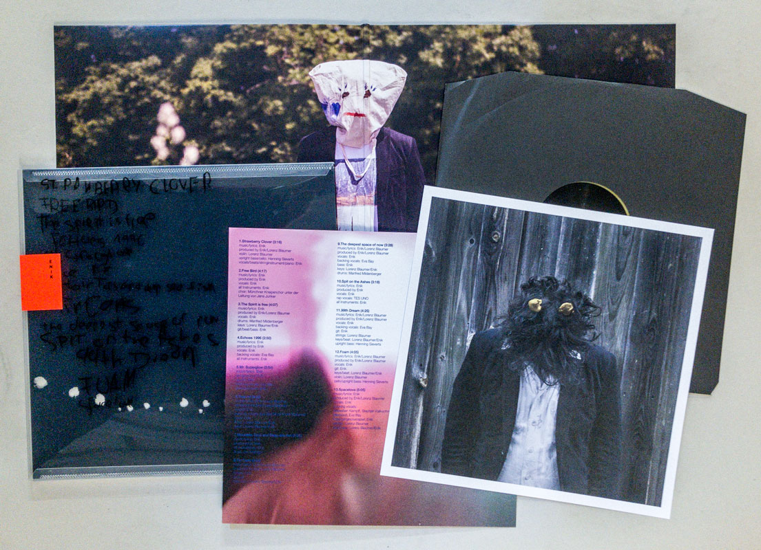
Erworben bei Enik
TitelNummer
|
Verfasser
Titel
Ort Land
Verlag Jahr
Medium
Technische
Angaben
ZusatzInfos
Weitere
Personen
Stichwort / Schlagwort
WEB Link
WEB Link
WEB Link
TitelNummer
|
Verfasser
Titel
Ort Land
Medium
Technische
Angaben
ZusatzInfos
Weitere
Personen
Sprache
Stichwort / Schlagwort
Geschenk von
TitelNummer
|
Verfasser
Titel
Ort Land
Verlag Jahr
Medium
Technische
Angaben
ZusatzInfos
Sprache
Stichwort / Schlagwort
Geschenk von
TitelNummer
|
Verfasser
Titel
Ort Land
Verlag Jahr
Medium
Technische
Angaben
ZusatzInfos
Stichwort / Schlagwort
WEB Link
Erworben bei Sergej Vutuc
TitelNummer
|
Verfasser
Titel
Ort Land
Verlag Jahr
Medium
Technische
Angaben
ZusatzInfos
Weitere
Personen
Sprache
Stichwort / Schlagwort
Nachlass von Elfi Ledig
TitelNummer
|
Verfasser
Titel
Ort Land
Verlag Jahr
Medium
Technische
Angaben
ZusatzInfos
Weitere
Personen
Sprache
Stichwort / Schlagwort
WEB Link
Geschenk von
TitelNummer
|
 
Verfasser
Titel
Ort Land
Medium
Technische
Angaben
ZusatzInfos
Weitere
Personen
Sprache
Stichwort / Schlagwort
Geschenk von
TitelNummer
|
Verfasser
Titel
Ort Land
Verlag Jahr
Medium
Technische
Angaben
ZusatzInfos
Weitere
Personen
Stichwort / Schlagwort
WEB Link
Geschenk von
TitelNummer
|
Verfasser
Titel
Ort Land
Verlag Jahr
Medium
Technische
Angaben
ZusatzInfos
Weitere
Personen
Sprache
Stichwort / Schlagwort
Geschenk von
TitelNummer
|
Verfasser
Titel
Verlag Jahr
Medium
Technische
Angaben
ZusatzInfos
Sprache
Geschenk von
TitelNummer
|
Verfasser
Titel
Verlag Jahr
Medium
Technische
Angaben
Weitere
Personen
Sprache
Geschenk von
TitelNummer
|
Verfasser
Titel
Verlag Jahr
Medium
Technische
Angaben
ZusatzInfos
Weitere
Personen
Stichwort / Schlagwort
WEB Link
Geschenk von
TitelNummer
|
Verfasser
Titel
Ort Land
Verlag Jahr
Medium
Technische
Angaben
ZusatzInfos
Sprache
Stichwort / Schlagwort
Geschenk von
TitelNummer
|
 
Verfasser
Titel
Verlag Jahr
Medium
Technische
Angaben
ZusatzInfos
Weitere
Personen
Stichwort / Schlagwort
TitelNummer
|
Verfasser
Titel
Verlag Jahr
Medium
Technische
Angaben
ZusatzInfos
Weitere
Personen
Stichwort / Schlagwort
WEB Link
Erworben bei múltiplos
TitelNummer
|
 
Verfasser
Titel
Ort Land
Medium
Technische
Angaben
ZusatzInfos
Weitere
Personen
Sprache
Stichwort / Schlagwort
TitelNummer
|
Verfasser
Titel
Ort Land
Verlag Jahr
Medium
Technische
Angaben
ZusatzInfos
Weitere
Personen
Sprache
WEB Link
Geschenk von
TitelNummer
|
Verfasser
Titel
Ort Land
Verlag Jahr
Medium
Technische
Angaben
ZusatzInfos
Sprache
Stichwort / Schlagwort
WEB Link
Geschenk von
Erworben bei Melville Brand Design
TitelNummer
|
Verfasser
Titel
Verlag Jahr
Medium
Technische
Angaben
ZusatzInfos
Weitere
Personen
Stichwort / Schlagwort
Geschenk von
TitelNummer
|
Verfasser
Titel
Ort Land
Verlag Jahr
Medium
Technische
Angaben
ZusatzInfos
Weitere
Personen
Sprache
Stichwort / Schlagwort
WEB Link
Erworben bei Lulu.com
TitelNummer
|
Copyrighthinweis: Das Copyright für die abgebildeten Publikationen bleibt bei den jeweiligen Rechteinhabern (Künstlern, Fotografen, Gestaltern, Publizisten). Die Abbildungen und Textzitate dienen der künstlerischen und wissenschaftlichen Recherche. Hier werden Werke dokumentiert, die sonst nur schwer oder gar nicht zugänglich wären. Wer nicht damit einverstanden ist, dass sein Werk auf dieser Webseite gezeigt wird, kann die Abbildung umgehend durch mich löschen lassen. Für wissenschaftliche Recherchen können die großen Abbildungen auf Antrag freigeschaltet werden.
Wenn Sie als Rechteinhaber möchten, dass Ihre Abbildungen bei Klick größer gezeigt werden (Höhe x Breite = ca. 800 x 1200 Px), dann melden Sie sich bitte bei mir:
Wenn Sie als Rechteinhaber möchten, dass Ihre Abbildungen bei Klick größer gezeigt werden (Höhe x Breite = ca. 800 x 1200 Px), dann melden Sie sich bitte bei mir: