Gesucht wurde Sate of Being Wood Reid, Medienart , Sortierung DatensatzNr., aufsteigend.
Kein exaktes Ergebnis. Alternative Fundstellen: 157 Treffer
AAP Archive Artist Publications - Munich - www.artistbooks.de
 
Verfasser
Titel
Verlag Jahr
Ort Land
Medium
Technische
Angaben
ZusatzInfos
Weitere
Personen
Sponsoren
Schlagwort
WEB Link
Geschenk von
TitelNummer
|
 
Verfasser
Titel
Verlag Jahr
Ort Land
Medium
Technische
Angaben
ZusatzInfos
Weitere
Personen
Sponsoren
Schlagwort
WEB Link
Geschenk von
TitelNummer
|
 
Verfasser
Titel
Verlag Jahr
Ort Land
Medium
Technische
Angaben
ZusatzInfos
Weitere
Personen
Sponsoren
Schlagwort
WEB Link
Geschenk von
TitelNummer
|
 
Verfasser
Titel
Verlag Jahr
Ort Land
Medium
Technische
Angaben
ZusatzInfos
Weitere
Personen
Sponsoren
Schlagwort
WEB Link
Geschenk von
TitelNummer
|
 
Verfasser
Titel
Verlag Jahr
Ort Land
Medium
Technische
Angaben
ZusatzInfos
Weitere
Personen
Sponsoren
Schlagwort
WEB Link
Geschenk von
TitelNummer
|
 
Verfasser
Titel
Verlag Jahr
Ort Land
Medium
Technische
Angaben
Sprache
ZusatzInfos
Weitere
Personen
Schlagwort
Geschenk von
TitelNummer
|
 
Verfasser
Titel
Verlag Jahr
Medium
Technische
Angaben
Sprache
ZusatzInfos
Weitere
Personen
Schlagwort
Geschenk von
TitelNummer
|
 
Verfasser
Titel
Verlag Jahr
Ort Land
Medium
Technische
Angaben
Sprache
ZusatzInfos
Weitere
Personen Chuck Welch (Text) Clemente Padin (Text) Gregorio Berchenko (Text) Guillermo Deisler (Text) John Held Jr. (Text) Patrizia (TICTAC) Ruggero Maggi (Text) Ryosuke Cohen (Cover - Umschlag hinten)
Schlagwort
WEB Link
WEB Link
WEB Link
Geschenk von
TitelNummer
|
 
Verfasser
Titel
Verlag Jahr
Ort Land
Medium
Technische
Angaben
Sprache
ZusatzInfos
Weitere
Personen
Schlagwort
TitelNummer
|
 
Verfasser
Titel
Verlag Jahr
Ort Land
Medium
Technische
Angaben
Sprache
ZusatzInfos
Schlagwort
Geschenk von
TitelNummer
|
   
Verfasser
Titel
Verlag Jahr
Ort Land
Medium
Technische
Angaben
ZusatzInfos
Weitere
Personen
Geschenk von
TitelNummer
|
 
Verfasser
Titel
Medium
Technische
Angaben
ZusatzInfos
Weitere
Personen
Schlagwort
WEB Link
Geschenk von
TitelNummer
|
 
Verfasser
Titel
Verlag Jahr
Medium
Technische
Angaben
ZusatzInfos
Schlagwort
WEB Link
Geschenk von
TitelNummer
|
 
Verfasser
Titel
Verlag Jahr
Ort Land
Medium
Technische
Angaben
Sprache
ZusatzInfos
Schlagwort
TitelNummer
|
 
Verfasser
Titel
Verlag Jahr
Ort Land
Medium
Technische
Angaben
Sprache
ZusatzInfos
Weitere
Personen
Schlagwort
Geschenk von
TitelNummer
|
 
Verfasser
Titel
Verlag Jahr
Ort Land
Medium
Technische
Angaben
ZusatzInfos
Weitere
Personen
Schlagwort
WEB Link
Geschenk von
TitelNummer
|
   
Verfasser
Titel
Verlag Jahr
Ort Land
Medium
Technische
Angaben
ZusatzInfos
Weitere
Personen
Schlagwort
Erworben bei Jürgen O. Olbrich
TitelNummer
|
 
Verfasser
Titel
Verlag Jahr
Ort Land
Technische
Angaben
Sprache
ZusatzInfos
Weitere
Personen Anna Banana (Anne Lee Long)
Schlagwort
Geschenk von
TitelNummer
|
 
Verfasser
Titel
Verlag Jahr
Ort Land
Medium
Technische
Angaben
ZusatzInfos
Weitere
Personen
WEB Link
Erworben bei Antiquariat (ZI)
TitelNummer
|
 
Verfasser
Titel
Verlag Jahr
Medium
Technische
Angaben
Sprache
Geschenk von
TitelNummer
|
 
Verfasser
Titel
Verlag Jahr
Ort Land
Medium
Technische
Angaben
Sprache
ZusatzInfos
Weitere
Personen
Schlagwort
WEB Link
TitelNummer
|
   
Verfasser
Titel
Verlag Jahr
Ort Land
Medium
Technische
Angaben
ZusatzInfos
Weitere
Personen
Sponsoren
Schlagwort
Geschenk von
TitelNummer
|
 
Verfasser
Titel
Verlag Jahr
Ort Land
Medium
Technische
Angaben
Sprache
Schlagwort
WEB Link
TitelNummer
|
Verfasser
Titel
Verlag Jahr
Medium
Technische
Angaben
Sprache
ZusatzInfos
Schlagwort
WEB Link
Geschenk von
Erworben bei Librería Dadá
TitelNummer
|
 
Verfasser
Titel
Verlag Jahr
Ort Land
Medium
Technische
Angaben
ZusatzInfos
Schlagwort
WEB Link
Erworben bei Hans Rudolf Zeller
TitelNummer
|
 
Verfasser
Titel
Verlag Jahr
Ort Land
Medium
Technische
Angaben
Sprache
ZusatzInfos
Weitere
Personen
TitelNummer
|
 
Verfasser
Titel
Verlag Jahr
Medium
Technische
Angaben
Sprache
ZusatzInfos
WEB Link
Erworben bei múltiplos
TitelNummer
|
   
Verfasser
Titel
Verlag Jahr
Ort Land
Technische
Angaben
ZusatzInfos
Weitere
Personen
Geschenk von
TitelNummer
|
 
Verfasser
Titel
Ort Land
Medium
Technische
Angaben
Sprache
ZusatzInfos
Schlagwort
Geschenk von
TitelNummer
|
 
Verfasser
Titel
Verlag Jahr
Ort Land
Medium
Technische
Angaben
Sprache
ZusatzInfos
Weitere
Personen
Schlagwort
Geschenk von
TitelNummer
|
   
Verfasser
Titel
Ort Land
Medium
Technische
Angaben
Sprache
ZusatzInfos
Weitere
Personen
Schlagwort
Geschenk von
TitelNummer
|
 
Verfasser
Titel
Verlag Jahr
Medium
Technische
Angaben
Sprache
Weitere
Personen
Erworben bei Motto Berlin
TitelNummer
|
 
Verfasser
Titel
Verlag Jahr
Ort Land
Medium
Technische
Angaben
Weitere
Personen
WEB Link
Erworben bei Motto Berlin
TitelNummer
|
 
Verfasser
Titel
Verlag Jahr
Ort Land
Medium
Technische
Angaben
ZusatzInfos
WEB Link
Geschenk von
TitelNummer
|
 
Verfasser
Titel
Verlag Jahr
Ort Land
Medium
Technische
Angaben
ZusatzInfos
WEB Link
Geschenk von
TitelNummer
|
 
Verfasser
Titel
Verlag Jahr
Ort Land
Medium
Technische
Angaben
ZusatzInfos
Weitere
Personen
Schlagwort
Erworben bei Printed Matter
TitelNummer
|
 
Verfasser
Titel
Verlag Jahr
Ort Land
Medium
Technische
Angaben
ZusatzInfos
Weitere
Personen
Schlagwort
WEB Link
Erworben bei Jürgen O. Olbrich
TitelNummer
|
 
Verfasser
Titel
Verlag Jahr
Ort Land
Medium
Technische
Angaben
Sprache
ZusatzInfos
Schlagwort
Geschenk von
TitelNummer
|
 
Verfasser
Titel
Verlag Jahr
Ort Land
Medium
Technische
Angaben
Sprache
ZusatzInfos
Weitere
Personen
Geschenk von
TitelNummer
|
   
Verfasser
Titel
Verlag Jahr
Ort Land
Medium
Technische
Angaben
Sprache
ZusatzInfos
Weitere
Personen
Schlagwort
Geschenk von
TitelNummer
|
 
Verfasser
Titel
Verlag Jahr
Ort Land
Medium
Technische
Angaben
Sprache
ZusatzInfos
Weitere
Personen
Schlagwort
WEB Link
Erworben bei Buchhandlung Walther König im Haus der Kunst
TitelNummer
|
 
Verfasser
Titel
Verlag Jahr
Ort Land
Medium
Technische
Angaben
Sprache
ZusatzInfos
Weitere
Personen Anna Banana (Anne Lee Long)
Schlagwort
Geschenk von
TitelNummer
|
Verfasser
Titel
Verlag Jahr
Medium
Technische
Angaben
Sprache
ZusatzInfos
Weitere
Personen
Schlagwort
Geschenk von
TitelNummer
|
 
Verfasser
Titel
Verlag Jahr
Ort Land
Medium
Technische
Angaben
ZusatzInfos
Weitere
Personen Anna Banana (Anne Lee Long)
Schlagwort
Geschenk von
TitelNummer
|
 
Verfasser
Titel
Verlag Jahr
Ort Land
Medium
Technische
Angaben
Sprache
ZusatzInfos
Weitere
Personen
Schlagwort
Geschenk von
TitelNummer
|
 
Verfasser
Titel
Verlag Jahr
Ort Land
Medium
Technische
Angaben
Sprache
ZusatzInfos
Weitere
Personen
Schlagwort
Geschenk von
TitelNummer
|
 
Verfasser
Titel
Verlag Jahr
Ort Land
Medium
Technische
Angaben
Sprache
ZusatzInfos
Weitere
Personen
Schlagwort
Erworben bei art book cologne
TitelNummer
|
 
Verfasser
Titel
Ort Land
Medium
Technische
Angaben
Sprache
Weitere
Personen
Schlagwort
Erworben bei Andreas Brandolini
TitelNummer
|
 
Verfasser
Titel
Verlag Jahr
Medium
Technische
Angaben
ZusatzInfos
Schlagwort
TitelNummer
|
 
Verfasser
Titel
Verlag Jahr
Ort Land
Medium
Technische
Angaben
Sprache
ZusatzInfos
Weitere
Personen Rose Pistola (Gestaltung)
Schlagwort
Geschenk von
TitelNummer
|
 
Verfasser
Titel
Verlag Jahr
Ort Land
Medium
Technische
Angaben
ZusatzInfos
Weitere
Personen
Schlagwort
Geschenk von
TitelNummer
|
 
Verfasser
Titel
Verlag Jahr
Ort Land
Medium
Technische
Angaben
ZusatzInfos
Weitere
Personen
Schlagwort
Geschenk von
TitelNummer
|
 
Verfasser
Titel
Verlag Jahr
Ort Land
Medium
Technische
Angaben
ZusatzInfos
Weitere
Personen
Geschenk von
TitelNummer
|
 
Verfasser
Titel
Ort Land
Medium
Technische
Angaben
Sprache
ZusatzInfos
Weitere
Personen
Schlagwort
WEB Link
TitelNummer
|
 
Verfasser
Titel
Verlag Jahr
Ort Land
Medium
Technische
Angaben
ZusatzInfos
Weitere
Personen
Schlagwort
WEB Link
Geschenk von
TitelNummer
|
 
Verfasser
Titel
Ort Land
Medium
Technische
Angaben
ZusatzInfos
Schlagwort
TitelNummer
|
Verfasser
Titel
Verlag Jahr
Ort Land
Medium
Technische
Angaben
ZusatzInfos
Schlagwort
TitelNummer
|
 
Verfasser
Titel
Verlag Jahr
Ort Land
Medium
Technische
Angaben
Sprache
ZusatzInfos
Weitere
Personen
Schlagwort
Geschenk von
TitelNummer
|
 
Verfasser
Titel
Verlag Jahr
Ort Land
Medium
Technische
Angaben
Sprache
ZusatzInfos
Weitere
Personen
Schlagwort
Geschenk von
TitelNummer
|
   
Verfasser
Titel
Verlag Jahr
Ort Land
Medium
Technische
Angaben
Sprache
ZusatzInfos
Weitere
Personen
Schlagwort
Erworben bei Buchhandlung Walther König Köln
TitelNummer
|
Verfasser
Titel
Verlag Jahr
Ort Land
Medium
Technische
Angaben
Sprache
ZusatzInfos
Schlagwort
Geschenk von
GND Permalink
TitelNummer
|
 
Verfasser
Titel
Verlag Jahr
Ort Land
Medium
Technische
Angaben
Sprache
ZusatzInfos
Weitere
Personen
Sponsoren
Schlagwort
Geschenk von
GND Permalink
TitelNummer
|
   
Verfasser
Titel
Verlag Jahr
Ort Land
Medium
Technische
Angaben
Sprache
ZusatzInfos
Weitere
Personen
Schlagwort
WEB Link
Erworben bei momox
TitelNummer
|
   
Verfasser
Titel
Verlag Jahr
Ort Land
Medium
Technische
Angaben
Sprache
ZusatzInfos
Weitere
Personen
Schlagwort
WEB Link
Erworben bei Harpune Verlag
TitelNummer
|
 
Verfasser
Titel
Verlag Jahr
Ort Land
Medium
Technische
Angaben
Sprache
ZusatzInfos
Schlagwort
Geschenk von
Erworben bei Melville Brand Design
TitelNummer
|
Verfasser
Titel
Verlag Jahr
Ort Land
Medium
Technische
Angaben
Sprache
ZusatzInfos
Weitere
Personen
Schlagwort
Geschenk von
TitelNummer
|
 
Verfasser
Titel
Verlag Jahr
Ort Land
Medium
Technische
Angaben
Sprache
ZusatzInfos
Weitere
Personen
Schlagwort
Erworben bei Moufflon Bookshop
TitelNummer
|
 
Verfasser
Titel
Verlag Jahr
Ort Land
Medium
Technische
Angaben
ZusatzInfos
Weitere
Personen
Schlagwort
Erworben bei Abo
TitelNummer
|
 
Verfasser
Titel
Verlag Jahr
Ort Land
Medium
Technische
Angaben
Sprache
ZusatzInfos
Weitere
Personen
Geschenk von
Nachlass von Ludwig Gebhard
TitelNummer
|
Verfasser
Titel
Verlag Jahr
Ort Land
Medium
Technische
Angaben
Sprache
ZusatzInfos
Schlagwort
Geschenk von
TitelNummer
|
 
Verfasser
Titel
Verlag Jahr
Ort Land
Medium
Technische
Angaben
ZusatzInfos
Weitere
Personen
Schlagwort
Erworben bei Halle 2 Pop-up-Store
TitelNummer
|
 
Verfasser
Titel
Verlag Jahr
Ort Land
Medium
Technische
Angaben
Sprache
ZusatzInfos
Weitere
Personen
Schlagwort
WEB Link
Geschenk von
TitelNummer
|
 
Verfasser
Titel
Verlag Jahr
Medium
Technische
Angaben
ZusatzInfos
Weitere
Personen
Geschenk von
TitelNummer
|
 
Verfasser
Titel
Verlag Jahr
Ort Land
Medium
Technische
Angaben
Sprache
Weitere
Personen
Schlagwort
Geschenk von
TitelNummer
|
 
Verfasser
Titel
Verlag Jahr
Ort Land
Medium
Technische
Angaben
Sprache
ZusatzInfos
Weitere
Personen Christian Haas (Gestaltung)
Schlagwort
WEB Link
Geschenk von
TitelNummer
|
 
Verfasser
Titel
Verlag Jahr
Ort Land
Medium
Technische
Angaben
Sprache
ZusatzInfos
Weitere
Personen
Geschenk von
TitelNummer
|
 
Verfasser
Titel
Verlag Jahr
Ort Land
Medium
Technische
Angaben
ZusatzInfos
Weitere
Personen Hans Döring (Foto) Knut Wilhelm (Redaktion) Rebecca King (Foto) Thomas Martial (Foto) Wilfried Petzi (Foto)
Sponsoren
Schlagwort
Geschenk von
TitelNummer
|
 
Verfasser
Titel
Verlag Jahr
Ort Land
Medium
Technische
Angaben
Sprache
ZusatzInfos
Weitere
Personen
Schlagwort
Erworben bei Calouste Gulbenkian Museum
TitelNummer
|
 
Verfasser
Titel
Verlag Jahr
Ort Land
Medium
Technische
Angaben
Sprache
ZusatzInfos
Weitere
Personen
Schlagwort
WEB Link
Geschenk von
TitelNummer
|
Verfasser
Titel
Verlag Jahr
Ort Land
Medium
Technische
Angaben
Sprache
ZusatzInfos
Schlagwort
Geschenk von
TitelNummer
|
 
Verfasser
Titel
Verlag Jahr
Ort Land
Medium
Technische
Angaben
Sprache
ZusatzInfos
Weitere
Personen
Sponsoren
Schlagwort
WEB Link
Geschenk von
TitelNummer
|
Verfasser
Titel
Verlag Jahr
Ort Land
Medium
Technische
Angaben
Sprache
ZusatzInfos
Weitere
Personen
Schlagwort
WEB Link
Erworben bei Booklyn
TitelNummer
|
 
Verfasser
Titel
Verlag Jahr
Ort Land
Medium
Technische
Angaben
Sprache
ZusatzInfos
Weitere
Personen Watergrass (Andy Davis)
Schlagwort
Geschenk von
TitelNummer
|
 
Verfasser
Titel
Verlag Jahr
Ort Land
Medium
Technische
Angaben
Sprache
ZusatzInfos
Weitere
Personen
Schlagwort
WEB Link
Geschenk von
TitelNummer
|
 
Verfasser
Titel
Verlag Jahr
Ort Land
Medium
Technische
Angaben
ZusatzInfos
Weitere
Personen
Schlagwort
WEB Link
TitelNummer
|
 
Verfasser
Titel
Ort Land
Medium
Technische
Angaben
ZusatzInfos
Weitere
Personen
Sponsoren
Schlagwort
Erworben bei Pinakothek der Moderne
TitelNummer
|
 
Verfasser
Titel
Ort Land
Medium
Technische
Angaben
Sprache
ZusatzInfos
Weitere
Personen
Schlagwort
WEB Link
Geschenk von
Erworben bei Call for Entry Slanted45
TitelNummer
|
Verfasser
Titel
Verlag Jahr
Ort Land
Technische
Angaben
ZusatzInfos
Weitere
Personen
Schlagwort
WEB Link
Erworben bei Stefan Brand
TitelNummer
|
 
Verfasser
Titel
Verlag Jahr
Ort Land
Medium
Technische
Angaben
Sprache
ZusatzInfos
Weitere
Personen Leo Steinberg (Einleitung) Roy Lichtenstein (Cover)
Schlagwort
Geschenk von
TitelNummer
|
Verfasser
Titel
Verlag Jahr
Ort Land
Technische
Angaben
Sprache
ZusatzInfos
Weitere
Personen
Schlagwort
WEB Link
WEB Link
Geschenk von
TitelNummer
|
Verfasser
Titel
Medium
Technische
Angaben
Sprache
Schlagwort
TitelNummer
|
Verfasser
Titel
Verlag Jahr
Ort Land
Medium
Technische
Angaben
Sprache
ZusatzInfos
Weitere
Personen bpNichol (Barrie Phillip Nichol) H. C. Artmann (Hand Carl Bronislavius)
Schlagwort
TitelNummer
|
 
Verfasser
Titel
Verlag Jahr
Ort Land
Medium
Technische
Angaben
Sprache
ZusatzInfos
Weitere
Personen
Schlagwort
WEB Link
TitelNummer
|
Verfasser
Titel
Verlag Jahr
Ort Land
Medium
Technische
Angaben
Schlagwort
TitelNummer
|
 
Verfasser
Titel
Verlag Jahr
Medium
Technische
Angaben
Schlagwort
TitelNummer
|
 
Verfasser
Titel
Verlag Jahr
Ort Land
Medium
Technische
Angaben
Sprache
Schlagwort
WEB Link
TitelNummer
|
 
Verfasser
Titel
Medium
Technische
Angaben
ZusatzInfos
Weitere
Personen
WEB Link
Erworben bei Selfridges London
TitelNummer
|
 
Verfasser
Titel
Verlag Jahr
Ort Land
Medium
Technische
Angaben
ZusatzInfos
Schlagwort
Erworben bei Saturn
TitelNummer
|
 
Verfasser
Titel
Verlag Jahr
Medium
Technische
Angaben
ZusatzInfos
WEB Link
Erworben bei Librería Dadá
TitelNummer
|
 
Verfasser
Titel
Verlag Jahr
Ort Land
Medium
Technische
Angaben
ZusatzInfos
Schlagwort
Geschenk von
TitelNummer
|
 
Verfasser
Titel
Ort Land
Medium
Technische
Angaben
ZusatzInfos
WEB Link
Geschenk von
TitelNummer
|
 
Verfasser
Titel
Verlag Jahr
Medium
Technische
Angaben
ZusatzInfos
WEB Link
TitelNummer
|
Verfasser
Titel
Verlag Jahr
Ort Land
Medium
Technische
Angaben
ZusatzInfos
Erworben bei Zédélé éditions
TitelNummer
|
 
Verfasser
Titel
Verlag Jahr
Ort Land
Medium
Technische
Angaben
ZusatzInfos
WEB Link
TitelNummer
|
 
Verfasser
Titel
Verlag Jahr
Ort Land
Medium
Technische
Angaben
ZusatzInfos
Geschenk von
TitelNummer
|
Verfasser
Titel
Verlag Jahr
Ort Land
Medium
Technische
Angaben
ZusatzInfos
TitelNummer
|
 
Verfasser
Titel
Verlag Jahr
Ort Land
Medium
Technische
Angaben
Sprache
ZusatzInfos
Schlagwort
WEB Link
WEB Link
WEB Link
Geschenk von
TitelNummer
|
 
Verfasser
Titel
Verlag Jahr
Ort Land
Medium
Technische
Angaben
ZusatzInfos
WEB Link
Erworben bei Rens Chantal
TitelNummer
|
 
Verfasser
Titel
Verlag Jahr
Ort Land
Medium
Technische
Angaben
Sprache
ZusatzInfos
Schlagwort
Erworben bei Verlag der Buchhandlung Walther König
TitelNummer
|
 
Verfasser
Titel
Medium
Technische
Angaben
Sprache
ZusatzInfos
Weitere
Personen
Schlagwort
WEB Link
TitelNummer
|
Verfasser
Titel
Verlag Jahr
Ort Land
Medium
Technische
Angaben
Sprache
ZusatzInfos
Schlagwort
TitelNummer
|
 
Verfasser
Titel
Verlag Jahr
Ort Land
Medium
Technische
Angaben
ZusatzInfos
WEB Link
Geschenk von
TitelNummer
|
 
Verfasser
Titel
Verlag Jahr
Ort Land
Medium
Technische
Angaben
Sprache
ZusatzInfos
Schlagwort
TitelNummer
|
 
Verfasser
Titel
Verlag Jahr
Medium
Technische
Angaben
ZusatzInfos
TitelNummer
|
Verfasser
Titel
Verlag Jahr
Ort Land
Medium
Technische
Angaben
Sprache
ZusatzInfos
Weitere
Personen
Schlagwort
WEB Link
Geschenk von
TitelNummer
|
 
Verfasser
Titel
Verlag Jahr
Ort Land
Medium
Technische
Angaben
Sprache
ZusatzInfos
Schlagwort
TitelNummer
|
 
Verfasser
Titel
Verlag Jahr
Ort Land
Medium
Technische
Angaben
Sprache
ZusatzInfos
Schlagwort
Geschenk von
TitelNummer
|
 
Verfasser
Titel
Medium
Technische
Angaben
ZusatzInfos
Schlagwort
WEB Link
TitelNummer
|
 
Verfasser
Titel
Verlag Jahr
Ort Land
Medium
Technische
Angaben
Sprache
ZusatzInfos
Weitere
Personen
Schlagwort
Geschenk von
TitelNummer
|
 
Verfasser
Titel
Verlag Jahr
Ort Land
Medium
Technische
Angaben
Sprache
Weitere
Personen
Schlagwort
Geschenk von
TitelNummer
|
Verfasser
Titel
Ort Land
Medium
Technische
Angaben
Sprache
ZusatzInfos
Weitere
Personen
Schlagwort
Erworben bei artbooksonline
TitelNummer
|
   
Verfasser
Titel
Verlag Jahr
Ort Land
Medium
Technische
Angaben
Sprache
ZusatzInfos
Weitere
Personen
Schlagwort
Geschenk von
Erworben bei Hermann Feldhaus
TitelNummer
|

Verfasser
Titel
Verlag Jahr
Ort Land
Medium
Technische
Angaben
ZusatzInfos
Weitere
Personen
Schlagwort
Geschenk von
TitelNummer
|
 
Verfasser
Titel
Verlag Jahr
Ort Land
Medium
Technische
Angaben
Sprache
ZusatzInfos
Weitere
Personen
Schlagwort
TitelNummer
|
   
Verfasser
Titel
Verlag Jahr
Ort Land
Medium
Technische
Angaben
Sprache
ZusatzInfos
Weitere
Personen
Schlagwort
Geschenk von
TitelNummer
|
 
Verfasser
Titel
Verlag Jahr
Medium
Technische
Angaben
Sprache
Geschenk von
TitelNummer
|
Verfasser
Titel
Verlag Jahr
Ort Land
Medium
Technische
Angaben
ZusatzInfos
Weitere
Personen
WEB Link
Geschenk von
TitelNummer
|
   
Verfasser
Titel
Verlag Jahr
Ort Land
Medium
Technische
Angaben
Sprache
ZusatzInfos
Schlagwort
Erworben bei ABC-Culture
TitelNummer
|
 
Verfasser
Titel
Verlag Jahr
Ort Land
Medium
Technische
Angaben
Sprache
ZusatzInfos
Weitere
Personen
Schlagwort
Erworben bei art book cologne
TitelNummer
|
 
Verfasser
Titel
Verlag Jahr
Ort Land
Medium
Technische
Angaben
Sprache
ZusatzInfos
Schlagwort
TitelNummer
|
 
Verfasser
Titel
Verlag Jahr
Ort Land
Medium
Technische
Angaben
Sprache
ZusatzInfos
Schlagwort
Geschenk von
Erworben bei Melville Brand Design
TitelNummer
|
 
Verfasser
Titel
Verlag Jahr
Ort Land
Medium
Technische
Angaben
Sprache
ZusatzInfos
Schlagwort
WEB Link
Geschenk von
Erworben bei Melville Brand Design
TitelNummer
|
Verfasser
Titel
Verlag Jahr
Ort Land
Medium
Technische
Angaben
Sprache
ZusatzInfos
WEB Link
Geschenk von
Erworben bei Melville Brand Design
TitelNummer
|
Verfasser
Titel
Verlag Jahr
Ort Land
Medium
Technische
Angaben
Sprache
ZusatzInfos
Schlagwort
WEB Link
Geschenk von
Erworben bei Melville Brand Design
TitelNummer
|
 
Verfasser
Titel
Verlag Jahr
Ort Land
Medium
Technische
Angaben
Sprache
ZusatzInfos
Schlagwort
WEB Link
Geschenk von
Erworben bei Melville Brand Design
TitelNummer
|
 
Verfasser
Titel
Verlag Jahr
Ort Land
Medium
Technische
Angaben
Sprache
ZusatzInfos
Schlagwort
Geschenk von
Erworben bei Melville Brand Design
TitelNummer
|
   
Verfasser
Titel
Verlag Jahr
Ort Land
Medium
Technische
Angaben
Sprache
ZusatzInfos
Weitere
Personen
Schlagwort
Geschenk von
TitelNummer
|
 
Verfasser
Titel
Ort Land
Medium
Technische
Angaben
ZusatzInfos
Weitere
Personen
Schlagwort
Geschenk von
TitelNummer
|
 
Verfasser
Titel
Verlag Jahr
Medium
Technische
Angaben
Sprache
ZusatzInfos
Weitere
Personen
Schlagwort
Erworben bei art book cologne
TitelNummer
|
 
Verfasser
Titel
Verlag Jahr
Ort Land
Medium
Technische
Angaben
Sprache
ZusatzInfos
Weitere
Personen
Schlagwort
Erworben bei Café Royal Books
TitelNummer
|
 
Verfasser
Titel
Verlag Jahr
Ort Land
Medium
Technische
Angaben
Sprache
ZusatzInfos
Weitere
Personen
Schlagwort
WEB Link
WEB Link
Geschenk von
TitelNummer
|
 
Verfasser
Titel
Verlag Jahr
Ort Land
Medium
Technische
Angaben
Sprache
ZusatzInfos
Weitere
Personen
Schlagwort
WEB Link
Erworben bei Luca Hillen
TitelNummer
|
   
Verfasser
Titel
Verlag Jahr
Ort Land
Medium
Technische
Angaben
Sprache
ZusatzInfos
Schlagwort
Geschenk von
TitelNummer
|
 
Verfasser
Titel
Verlag Jahr
Ort Land
Medium
Technische
Angaben
Sprache
ZusatzInfos
Weitere
Personen
Schlagwort
Geschenk von
Erworben bei Vienna Art Book Fair #1
TitelNummer
|
 
Verfasser
Titel
Verlag Jahr
Ort Land
Medium
Technische
Angaben
Sprache
ZusatzInfos
Weitere
Personen
WEB Link
Geschenk von
TitelNummer
|
Verfasser
Titel
Verlag Jahr
Ort Land
Medium
Technische
Angaben
Sprache
ZusatzInfos
Weitere
Personen
Schlagwort
WEB Link
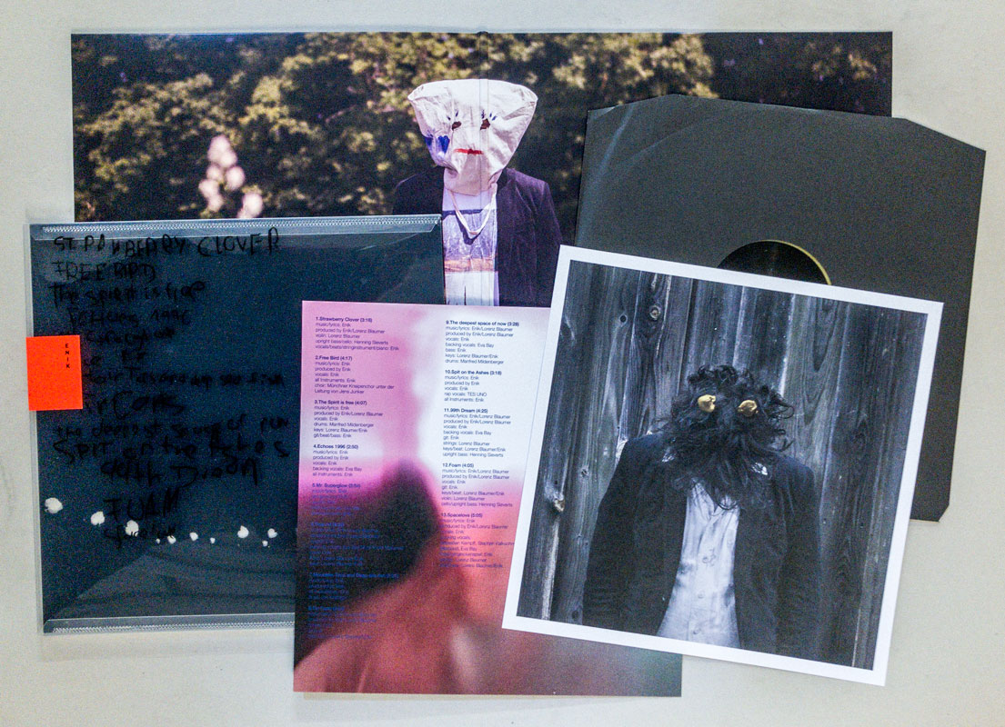
Erworben bei Enik
TitelNummer
|
   
Verfasser
Titel
Verlag Jahr
Medium
Technische
Angaben
Sprache
ZusatzInfos
Weitere
Personen
WEB Link
Erworben bei múltiplos
TitelNummer
|
Verfasser
Titel
Medium
Technische
Angaben
Sprache
ZusatzInfos
Schlagwort
Erworben bei múltiplos
TitelNummer
|
 
Verfasser
Titel
Verlag Jahr
Medium
Technische
Angaben
Sprache
ZusatzInfos
Weitere
Personen Robbie Whitehead (Grafikdesign)
Schlagwort
WEB Link
WEB Link
Erworben bei múltiplos
TitelNummer
|
 
Verfasser
Titel
Verlag Jahr
Ort Land
Medium
Technische
Angaben
ZusatzInfos
Weitere
Personen
Schlagwort
WEB Link
Erworben bei Achim Riechers
TitelNummer
|
 
Verfasser
Titel
Verlag Jahr
Ort Land
Medium
Technische
Angaben
Sprache
ZusatzInfos
WEB Link
Erworben bei Printed Matter
TitelNummer
|
 
Verfasser
Titel
Verlag Jahr
Ort Land
Medium
Technische
Angaben
ZusatzInfos
Schlagwort
WEB Link
Geschenk von
TitelNummer
|
Verfasser
Titel
Verlag Jahr
Ort Land
Medium
Technische
Angaben
Weitere
Personen
Geschenk von
TitelNummer
|
 
Verfasser
Titel
Verlag Jahr
Medium
Technische
Angaben
ZusatzInfos
Weitere
Personen
Schlagwort
WEB Link
WEB Link
Geschenk von
TitelNummer
|
Verfasser
Titel
Verlag Jahr
Ort Land
Medium
Technische
Angaben
Sprache
ZusatzInfos
Schlagwort
WEB Link
Erworben bei Call for Entry Slanted45
TitelNummer
|
Verfasser
Titel
Verlag Jahr
Ort Land
Medium
Technische
Angaben
Sprache
ZusatzInfos
Schlagwort
WEB Link
Erworben bei Call for Entry Slanted45
TitelNummer
|
 
Verfasser
Titel
Ort Land
Medium
Technische
Angaben
Sprache
ZusatzInfos
Schlagwort
Erworben bei Steidl
TitelNummer
|
Copyrighthinweis: Das Copyright für die abgebildeten Publikationen bleibt bei den jeweiligen Rechteinhabern (Autoren, Künstlern, Fotografen, Gestaltern, Publizisten). Die Abbildungen und Textzitate dienen der künstlerischen und wissenschaftlichen Recherche.
Hier werden Werke dokumentiert, die sonst nur schwer oder gar nicht zugänglich wären. Wer nicht damit einverstanden ist, dass sein Werk auf dieser Webseite gezeigt wird, kann die Abbildung umgehend durch mich löschen lassen.
Für wissenschaftliche Recherchen können die großen Abbildungen auf Antrag freigeschaltet werden.
Wenn Sie als Rechteinhaber möchten, dass Ihre Abbildungen bei Klick größer gezeigt werden (Höhe x Breite = ca. 800 x 1200 Px), dann melden Sie sich bitte bei mir: