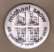
Gesucht wurde Erwa One Göhlich Vincent, Medienart , Sortierung DatensatzNr., aufsteigend. Alle Suchbegriffe sind in allen Ergebnissen enthalten: 500 Treffer
Hinweise zum Copyright und ServiceAAP Archive Artist Publications - Munich - www.artistbooks.de
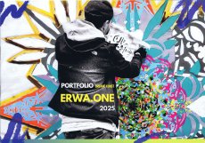
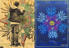
„Erwa.One“ aka VincentGöhlich ist im Bereich der urbanen (Streetart) und bildendenden Kunst tätig. Neben dem Fokus auf Wandgestaltungen und die Kunstvermittlung in Oberbayern, Schwaben und im Allgäu, unterstützt er vor allem die Entwicklung einer urbanen Kultur, welche soziale sowie inklusive Momente schafft und Menschen zusammenbringt.
Von Website übernommen.
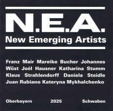
N.E.A. – New emerging artists. Zwischen dem Eintauchen in der jungen Kunst und dem Auftauchen ins Da-Sein als Künstler liegen Welten. Die Ausstellungsreihe „N.E.A. – New emerging artists“ in Zusammenarbeit mit dem Galerieverein Landsberg e.V. zeigt im zweiwöchigen Wechsel neue künstlerische Positionen aus der Region. Die Kuration erfolgt durch Vincent Göhlich aka „Erwa.One“. Ein Katalog zur Ausstellung wird erstellt.
Text von Website übernommen.
16.11.2010. Ausstellung „Aber Hallo“ von Vincent Mitzev in der Artothek, Bildersaal
Unter dem Titel „Aber Hallo“ zeigt der aus Bulgarien stammende Künstler Vincent Mitzev vom 19.11.-8.01.in der Artothek, Bildersaal, eine raumgreifende, aus gefundenen Möbelstücken bestehende Installation. Vincent Mitzev verfolgt in seinen Arbeiten das Thema der Wahrnehmung des Alltäglichen und stellt diese im wahrsten Sinne auf den Kopf. Es erwartet die Besucher das Bild einer verkehrten Welt: Möbelstücke werden zu Türmen aufgehäuft oder scheinen schwerelos im Raum zu schweben. Stühle werden mit Zwingen an einer vier Meter hohen Säule befestigt und entziehen sich damit ihrer Bestimmung. Mitzevs fragile Kompositionen aus vorgefundenen Gegenständen sind ihrem Funktionszusammenhang enthoben und irritieren die gewohnte Sichtweise durch ihre funktionsfremde Anordnung im Raum. Charakteristisch für ihn ist der ausgeprägte Sinn für Vorhandenes, das oft durch minimale Eingriffe eine andere Bedeutung erhält. Auf der Suche nach Einfachheit erschafft Vincent Mitzev ironisch heitere Arbeiten, die still, durchdacht und poetisch sind
Diese Publikation ist eine überarbeitete Version der Bachelorarbeit an der Hochschule München: Sie beschäftigt sich mit dem Zeichen S, mit seiner Herkunft, seiner Beliebtheit und Bedeutung in der Graffitiszene, seine Aussagekraft in der Subkultur sowie in der Popkultur. Der Grafiker Freitag Vincent (Text und Gestaltung) hat es in einer nummerierten Auflage von 100 Stück mit jeweils selbstgefertigtem Siebdruck-Umschlag und im Offsetdruck fertigen lassen.
About the series:
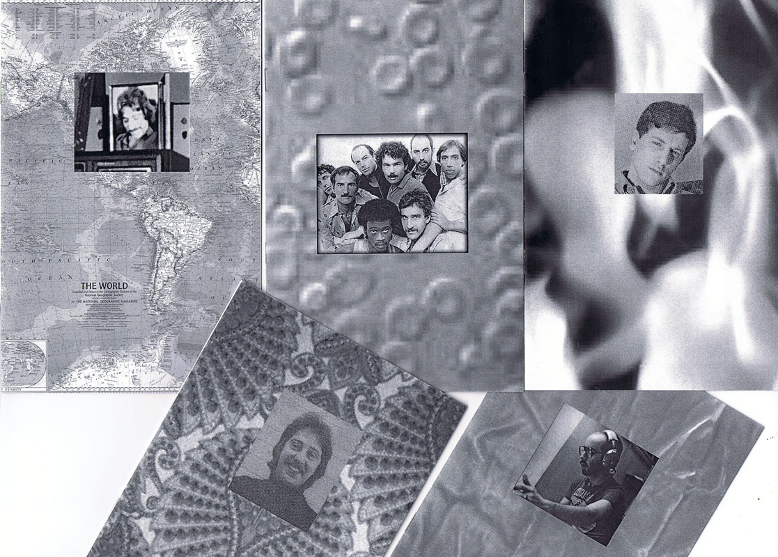
The For Everard zine series chronicles the 1977 fire at New York's Everard Baths, combining archival research with imagined narratives to re-focus attention to obscured histories. The series explores the media coverage of the subsequent investigation of the fire, and the lives of the nine men who perished. The zines bring together photographic images with primary news sources, as well as personal anecdotes collected from eyewitness testimonials.
About the individual zines:
For Everard, Vol. 1, 2013, ed. 100 (nr. 65)
This zine chronicles the May 25, 1977 fire at New York's Everard Baths and the media coverage of the subsequent investigation.
For Everard, Vol. 2 (Bloodbrothers), 2013, ed. 100 (Nr. 81)
In the second volume of his series chronicling the 1977 fire at New York’s Everard Baths, Anthony Malone focuses on Bellevue Hospital’s blood drive for the victims of the great bathhouse tragedy. Malone draws parallels between the 1977 restrictions placed on gay men for donating blood to their “brothers” and current FDA guidelines that indefinitely defer donations from men who have had sex with men since 1977. This black and white photocopied zine (ed 100) juxtaposes archival images, news clippings, and just a touch of fantasy.
For Everard, Vol. 3 (Remembering Jimmy), 2015, ed. 100 (Nr. 94)
Volume 3 of the series, For Everard is dedicated to the memory of Jimmy Stuard, who died in the tragic fire at the Everard Baths in 1977. Stuard was a rising star in the disco music scene. He spun records first at Boston’s 1270 Club, and later at New York’s 12 West, where he inspired an entire generation of musical artists and DJs. In this particular volume, Anthony Malone assembles images and archival texts that serve as a tribute to the great Jimmy Stuard.
For Everard, Vol. 4 (A Lovely Show), 2016, ed. 100 (Nr. 62)
For Everard, Vol. 4 (A Lovely Show) is a tribute to Kenneth Hill, one of the nine men who died in the devastating fire at the Everard Baths in 1977. Kenn played a vital role in the East Village/Lower East side countercultural movement in the late ‘60s and 1970s. He was a hippie, a bar tender at Phebe’s (a watering hole and salon for the experimental theater community in the 1970s), one of the founders of the Old Reliable Theatre Tavern, House Manager at La Mama Experimental Theatre Club, and a photographer. This zine celebrates Kenneth Hill by collaging archival documents with personal artifacts and pictures of Kenn from meaningful moments in his life.
For Everard, Vol. 5 (A Dearly Loved Man), 2017, ed. 100 (Nr. 95)
For Everard, Vol. 5 (A Dearly Loved Man) assembles images and stories from the life of Ira Landau, a gifted and dedicated teacher who died in the tragic fire at the Everard Baths in 1977. Ira left behind a devoted family (his mother, brother, niece, and lover) and is still greatly missed by his loved ones. This zine is a tribute to the life and accomplishments of a remarkable man who served in the Peace Corps and committed himself to educating young minds both abroad (in the Middle East) and at home in the US. It contains family photos and personal images generously contributed by Ira’s niece.
For Everard, Vol. 6 (Yosef’s Song), 2017, ed. 100 (Nr. 94)
Volume 6 of the series For Everard celebrates the life of a remarkable musical prodigy, Yosef Synovec. This zine tells the story of a young man with great aspirations who emigrated to the United States from Czechoslovakia to study classical violin. In 1976, Holly Woodlawn overheard Synovec vocalizing as he was painting the bathroom of his East Village apartment, and determined on the spot that she had discovered an emerging star. As a singer, Synovec used his extreme vocal range to imitate the voice and persona of Peruvian diva Yma Sumac. He performed Sumac’s exotic musical numbers at several New York City cabarets and show venues. Sadly, on May 25, 1977, Yosef perished in the tragic fire at the Everard Baths.
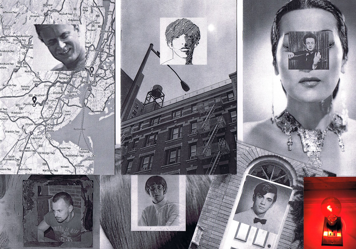
For Everard, Vol. 7 (Tony from the Bronx), 2017, ed. 100 (Nr. 86)
This zine brings together images and stories from the life of Tony Calarco, one of the nine men who died in the fire at the Everard Baths in 1977. Tony was only 26 when he died. He lived with his parents and siblings in a modest house in the Bronx. He had recently graduated from college and was working as a social worker in New York city at the time of his death. Tony had aspirations to become a lawyer and was scheduled to begin law school in September of 1977. This zine celebrates Tony Calarco’s memory through photos of Tony, artifacts from his high school and college years, and recent photographs of his home and final resting place.
For Everard, Vol. 8 (Looking for Amado), 2017, ed. 100 (Nr.84)
Amado Alamo, a young man only 17 years old, lost his life in the fire at the Everard Baths in 1977. In Volume 8 of For Everard, Anthony Malone documents his search for the identity of the youngest victim of the Everard fire. The zine is an abstracted portrait of Alamo that assembles the few extant fragments of his story culled from newspaper articles and documentary sources glued together with the artist’s imagination.
For Everard, Vol. 9 (Last Call), 2017, ed. 100 (Nr.72)
Life was difficult for Hillman Wesley Adams. He was born in Jacksonville FL in 1938. His mother died just a few months after his birth, and by the age of nine, he found himself in an orphanage with his older brother. Fast forward 30 years: Hillman moved to NYC, struggled to make ends meet while working on and off as a bartender, and he met his lover, Ralph, with whom he shared a modest apartment in New Jersey. On May 25, 1977, Hillman died in the fire at the Everard Baths. Vol. 9 of For Everard is an assemblage of newspaper articles and vintage photos chronicling the life and untimely death of Hillman Wesley Adams.
For Everard, Vol. 10 (In Memoriam: Patrick Nott), 2018, ed. 100 (Nr. 64)
Volume 10 of For Everard memorializes the life of Patrick Nott, one of the nine men who died in the fire at the Everard Baths. Nott, a native of Wales with a passion for theater, literature, and music, pursued a successful career in hairdressing. He fell in love with his pen pal (a young woman from Brooklyn) and after their marriage, they moved to New York City, where Nott worked at the Vidal Sassoon Salon. This zine weaves together elements from his story (shared with the artist by Patrick Nott’s wife), with photographs, newspaper clippings, and artifacts. It acts as a humble tribute, an “In Memoriam” for this greatly loved man.
For Everard, Vol. 11 (Thunderbird), 2019, ed. 100 (Nr. 79)
Brian Duffy was an aspiring artist. In 1966 he was accepted to Pratt Institute of Art and although he declined admission to the school, he seized the opportunity to move to NYC and start a new life for himself. In the city, he worked hard at various retail jobs and tried to break into the theater, but everything changed when he met the love of his life, Bradley. The couple moved to a “quieter life” in Boston. They worked in restaurants in the Back Bay area and created a community for themselves amongst their chosen family of friends. Volume 11 of For Everard celebrates the brief life of Brian Duffy, a young man who died in the fire at the Everard Baths in 1977. This zine compiles photographs and stories shared with Malone by Brian’s sister and dear friend.
The pseudonym "Anthony Malone" comes from a novel by Andrew Holleran (Dancer from the Dance). In this novel, Malone is the protagonist and at the end he disappears. Some of his friends believe that he may have committed suicide, others feel that he may have run away from New York, while some say that they saw him at the Everard Baths on the night of the fire. I imagine that Malone survived the fire and he is now making books and zines telling the story of the tragedy.
Reproduzierte Illustrationen aus dem Buch "A Key to Better Memory", New York 1959. "One Hundred Things to Remember is based on one book suggesting a visual approach to improving memory. Taken out of context and viewed from a distance of nearly seventy years, the combinations of simple words and drawings turn out to be an absurd selection of random signs, a form of unintentional poetry reminding us of a time when computers with virtually unlimited memory were not even a dream yet."
Text von der Webseite
During Paris lockdown, 16 photograhers shared one roll of film, connecting from neighborhood to neighborhood, in frame of one hour and one kilometer freezing one frame.
Während des Pariser Lockdowns teilen sich 16 Fotografen eine Filmrolle, anschließend von Stadtviertel zu Stadtviertel. Im Rahmen von einer Stunde und einem Kilometer hielten sie jeweils ein Bild fest.
Text von der Webseite, Übersetzung DeepL
Diese Publikation illustriert verschiedene Gespräche, Ideen und Projektansätze, die Vincent Hofmann und Simon Kindle während ihres Aufenthalts in Rotterdam geführt, formuliert und entworfen haben. Als Ausgangspunkt für ihre Diskussion wählten sie die Form eines Eies, eine Form, die den größtmöglichen Kontrast zu den allgegenwärtigen rechteckigen Transportbehältern darstellt, die das Bild von Rotterdam prägen.
Text von Website übernommen, übersetzt mit DeepL.
Sammlung von Fotos des als Graffiti gesprühten Wortes "Hallo", und zwar nur auf Zugwaggons. Auf der letzten Seite, U4, wird bereits das nächste Heft "Ausgabe Nr. 2 / Klaus" angekündigt. Es erschien aber erst 2023.
Sammlung von Fotos des als Graffiti gesprühten Wortes "Klaus": auf Mauern vor allem. Außerdem kurze Zeilen eines inneren Monologs, eines Mann namens Klaus; z. B. "Ich stehe über Dir. Auch wenn ich im Gebüsch hocke."
21x10,5 cm, keine weiteren Angaben vorhanden Einladungskarte zur Eröffnung. Klappkarte. Gezeigt wird auch der Film von Fischli und Weiss: Der Lauf der Dinge
ZusatzInfos
Nun schon zum dritten Mal in Folge steht eine Ausstellung mit dem Motto „Der leere Raum“ am Anfang der Spielzeit des Kulturreferats in der Rathausgalerie.
Die historische Halle gibt selbstbewusstes Eigenleben vor. Frei von Stellwänden und Einbauten eröffnet der leere Raum den teilnehmenden Künstlern neue Möglichkeiten zum Experiment.
Ina Ettlinger zeigt eine bunte Ansammlung ihrer Stoffskulpturen. Surreal, aber auch menschhaft wirkende Wesen, Knäuel und Ausbeulungen. Vincent Mitzev errichtet in der Hallenmitte aus Fundstücken einen gewaltigen Turm von Babel, der bis zum Glasdach reichen wird. Fink Ossi komplettiert mit Bildern und Raumarbeiten in gekonnt verwegener Manier die Ausstellung. Insgesamt eine Zusammenstellung sehr eigenständiger Arbeiten, die trotz ausufernder Farbigkeit und ungewöhnlichen Werkstoffen die souveräne Ruhe klassischer Skulpturen ausstrahlen.
Ausstellungseröffnung am Freitag, 16.März 2012, 19:00 Uhr
Es sprechen Dr. Ingrid Anker, Stadträtin der Landeshauptstadt München in Vertretung des Oberbürgermeisters und Johannes Muggenthaler, Kulturreferat
Ab 20.30 Uhr spielt die Band Aftermars (Sebastien Brault, Thomas Jocher, Tom Früchtl)
Die sakrifizielle Verstümmelung und das abgeschnittene Ohr des Vincent van Gogh (Documents 1930)
»Der kapitale Essay ... stellt zweifelsfrei eines der ausgeführtesten Kapitel der Batailleschen ›mythologischen Anthropologie‹ dar.« (Bernd Mattheus)
Prometheus Van Gogh (Verve 1937)
Erstens also den vorletzten Artikel Batailles für das berüchtigte Zeitschriftenexperiment des dissidenten Surrealismus, der bereits über Documents hinaus weist: Aus Ethnologie, Psychoanalyse, Kunst und Mythos knüpfen sich hier die blutigen Glieder der entstehenden Heterologie als eigenwillige Theoriemontage – Batailles Totem und Tabu. Ergänzt um eine weitere Text-Variation auf den großen Künstlermythos um van Gogh.
Text von der Webseite
2 S., 29,7x21 cm, keine weiteren Angaben vorhanden Einzelblatt, zweifach gefaltet
ZusatzInfos
08.12.2017-14.01.2018 . Der Kunstsommer 2017 war bestimmt durch die drei großen, international bedeutenden Kunstprojekte: documenta 14 in Athen und Kassel, Biennale Venedig und Skulptur-Projekte in Munster. Die hohen Erwartungen vorab und die Berichterstattungen, Diskussionen und Kritiken währenddessen hatten starke öffentliche Präsenz und waren Dauerbrenner in den Medien. Neben den theoretischen Diskursen der Fachwelt, stand auch das Kunsterleben des Publikums im Zentrum, das unter dem Anspruch der gesellschaftlichen Relevanz von Kunst im großen Stil erreicht werden sollte. Nach dem Ende des Kunstsommers stellt sich in besonderer Weise für Künstler_innen die Frage, was aus diesen bedeutenden Events bleibt. Welchen nachhaltigen Einfluss haben sie, welche Erkenntnisse daraus wirken auf die jeweils eigene Arbeit?
Die in München lebenden Künstler Valio Tchenkov und Vincent Mitzev sind seit mehreren Jahren gemeinsam als Besucher auf diesen Kunstgroßveranstaltungen unterwegs. ...
Text von der Webseite
Mit der Initiative „DEBUTANT*INNEN des BBK München und Oberbayern“ fördert der Berufsverband Bildender Künstler*innen München und Oberbayern e. V. (BBK) bereits seit 1982 herausragend talentierte junge Künstler*innen in Bayern. Jährlich bietet die Ausstellung drei Kunstschaffenden die Möglichkeit ihre Arbeiten in der GALERIE DER KÜNSTLER*INNEN (Maximilianstraße 42, 80538 München) auszustellen - 06.09.-16.10.2022 - und so an einem zentralen Ausstellungsort für zeitgenössische Kunst in München das professionelle Debüt zu feiern.
Zusätzlich wird die Nachwuchsreihe durch den Bayerischen Staat und die LfA Förderbank Bayern mit der Finanzierung einer ersten Monografie gefördert, die den Ausstellenden ermöglicht, neben dem Ausstellungsformat auch das Druckwerk als künstlerisches Ausdrucksmittel zu nutzen. Durch die Monografie bietet sich den Künstler*innen eine Plattform, um die eigene künstlerische Praxis auch überregional vorstellen und präsentieren zu können. Die Veröffentlichung der Publikationen von Janna Jirkova, Vincent Vandaele und Lukas Rehm – herausgegeben durch den BBK München und Oberbayern – findet im Rahmen der Ausstellungseröffnung statt.
Text von der Webseite
Die Monografien befinden sich ebenfalls im AAP.
06.11.-22.12.2023, Klasse Rosefeldt, Klasse Pumhösl, Klasse Nicolai, Klasse Kogler, Klasse Bircken und Vogel, Klasse Oehlen.
Die erste Eröffnung der 5. arkadenale findet am Donnerstag, 05.10.2023, 19 h in den Kunstarkaden mit einer Begrüßung durch Herrn Stadtrat Dr. Roth, in Vertretung des Oberbürgermeisters, Anton Biebl, Kulturreferent der LHS München und Mehmet Dayi, Kunstarkaden statt.
Seit 2015 präsentiert der städtische Kunstraum Kunstarkaden alle zwei Jahre die Ausstellungsreihe „arkadenale.“ Zur diesjährigen Ausgabe wurden sechs Klassen der Akademie der Bildenden Künste München eingeladen, die Kunstarkaden für jeweils zwei Wochen zu bespielen. Neben den gezeigten Kunstwerken erwarten die Besuchenden eine Vielzahl von Performances und weiteren Kunstaktionen.
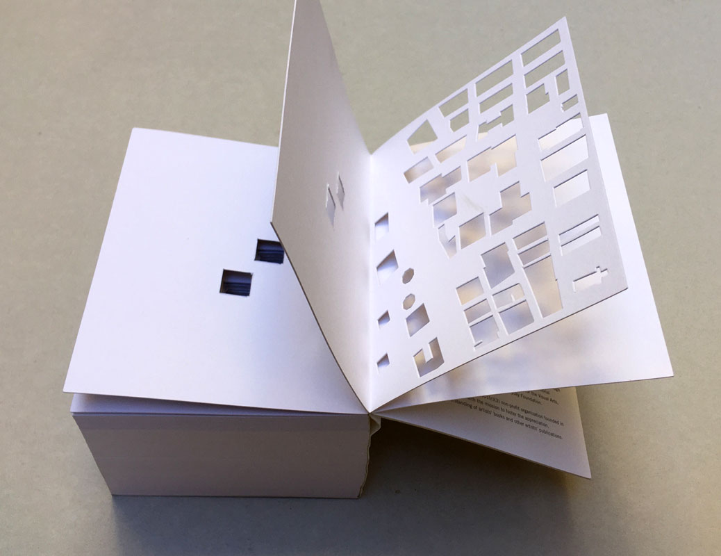
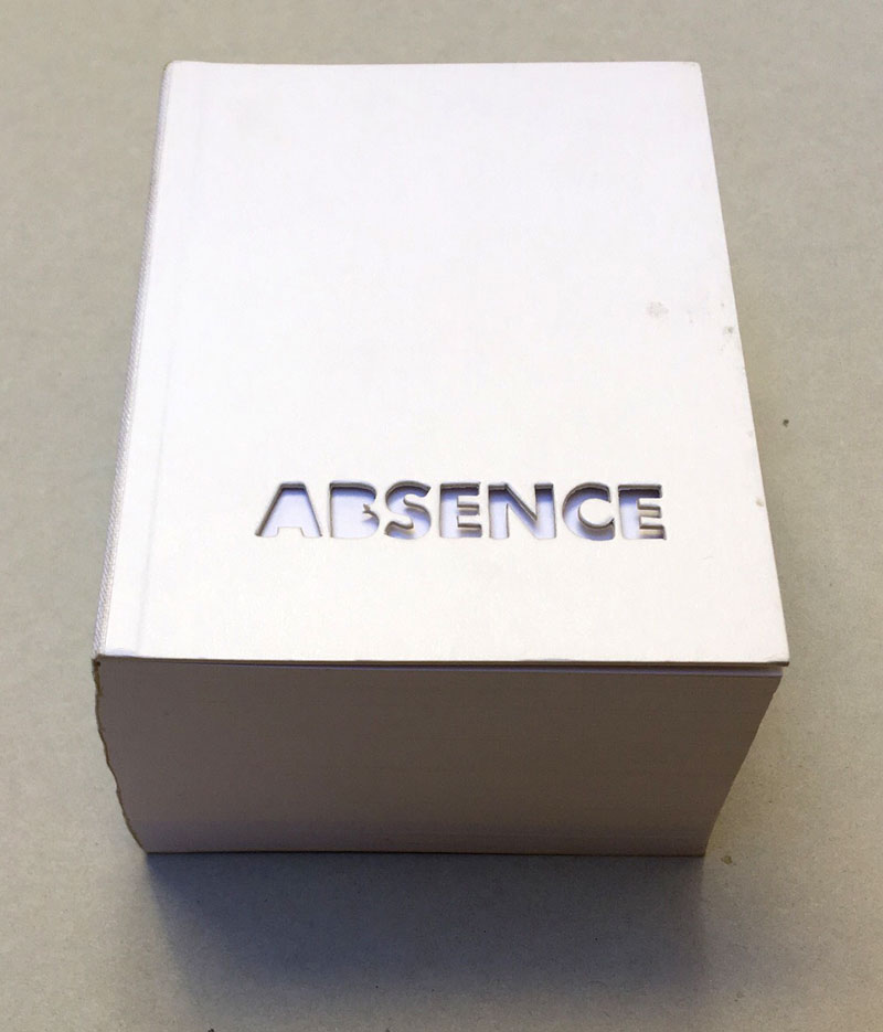
2004 winner of I.D. Magazine's Design Distinction award, Absence is the third book to come out of Printed Matter’s Publishing Program for Emerging Artists, a program made possible through the generous support of New York City's Department of Cultural Affairs, The Andy Warhol Foundation for the Visual Arts, the Elizabeth Firestone Graham Foundation, and the Heyday Foundation. The generosity of Whitney trustees Melva Bucksbaum and Raymond J. Learsy was instrumental to the Museum’s participation in the publication of this exciting new work.
Both a book and a sculptural object, Absence is a memorial to the twin towers of the World Trade Center. Yoon, an architect and designer who is currently an Assistant Professor of Architecture at the Massachusetts Institute of Technology, chose not to produce a traditional design proposal for the World Trade Center Memorial Competition. Instead she created a non-architectural, non site-specific space of remembrance: a portable personal memorial in the form of book.
At almost two pounds, Absence has a considerable physical presence, but it is in every way the ghost of a presence, and it is this ghostliness that gives it its particular emotional weight. A solid white block of thick stock cardboard pages, the book’s only "text" consists of one pinhole and two identical squares die-cut into each of its one-hundred-and-twenty pages – one for each story of the towers including the antenna mast. These removed elements lead the reader floor by floor through the missing buildings towards the final page where the footprint of the entire site of the World Trade Center is die-cut into a delicate lattice of absent structures.
Of all of the proposed monuments and grand designs for the twin towers to emerge in the last two years, Absence is remarkable for its employment of an under-used strategy: restraint. The simplicity of Yoon’s materials and her use of repetition speak, without words, about unspeakable loss. Quiet, respectful, mournful, the book does not aim to represent the magnitude of the disaster. Instead it appeals to the vastness of the reader’s imagination and capacity to grieve. The human scale of her memorial operates on a personal level – it delivers the memory of lives lost into the reader’s hands. At the same time, as a scale model of a vanished architectural site, it operates on a larger cultural level by commemorating the site itself.
Text von der Webseite. Fotos Xenia Fumbarev
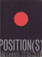
[124] S., 18x13,5 cm, ISBN/ISSN 9782954197401 Broschur, Buchrücken aufklappbar, gefaltetes Plakat in eingeklebter Papierhülle, Posterformat 85,4x64cm, in Schutzhülle mit Aufkleber
A journal written at the third person that seeks to depict Antoine d’Agata’s quest – the inexorable course from void to void.A literary and photographic experiment where words, sometimes descriptive, sometimes poetic, intersect with images in a narrative continuity. An example of the photographer’s existential choice and form of resistance which leads toward the subject’s disappearance and the ego’s negation within the neutral spectrum of the image while insisting on an intimate involvement with its matter and a perfect superposition of art and life. The pictures have been treated and reduced to the simple black and white contrast, following the main axis of this editorial project: shaplessness and the sense of fading-out. This flattening to a drawing effect releases the image as a shadow, a border between a recognizable sign and a blurry, ambiguous one, so that the photograph is both “trace” and “other”. The book, whose main language is English, also foresees a separate and folded poster, including texts in French on one side and, for the first time, in Italian on the other printed on a background colour image. The two languages allow to include texts in their original version, but allude as well to the artist’s double origins. In line with the book, the poster also reflects d’Agata’s search direction towards the interlacing of word and image and it finally refers to the idea of a topographic description of passions. Member of the Magnum agency, Antoine d’Agata (1961) is one of the most influential photographers of his generation. He lives in both Paris and Marseilles and he works around the world. He is represented by the gallery Les Filles du Calvaire, Paris.
Text von der Webseite.
28,2x19 cm, signiert, 5 Teile. keine weiteren Angaben vorhanden Konvolut aus aufklappbarem Karton, beschrieben, signiert, gestempelt, datiert und mit drei Objekten beklebt (Kindersocke, Haargummi, schwarzer Plastikdeckel). einer Postkarte mit handschriftlichem Gruß. einem ausgedruckten Buchcover. einer Ausgabe "Pirol" in Plastikhülle. alles in original Versandtasche.
Mail Art Projekt "One Day in Berlin" vom 11. Juni 2018, aus der Serie "Lost and Found", die Elke Grundmann seit 2004 betreibt. In der beigelegten Pirol-Ausgabe Nr. 6, September 2017, ist eine Abbildung von "One Day in Berlin" zu sehen. Mit ausgedrucktem Buchcover "Book for Mail Art", Karuizawa New Art Museum.
Chances are that you will be far more familiar with Brian Eno and his work than you might realise. Whether you know him as a founding member of the gloriously influential 1970s art-rock outfit Roxy Music, or as the inventor of ambient music, in one breathless career Eno has actually released no less than 25 solo albums and contributed to countless projects and collaborations, but also left his fingerprints on dozens of seminal albums as a producer – think U2, Talking Heads or Coldplay, to name but a few – composed several film scores not to mention the start-up theme for Microsoft’s Windows 95. All of which is to say that it is hard to not be in earshot of his musical influence in one way or another. With mono.kultur, Brian Eno talked about the impact of technology on culture, the similarities between producing music and parenting, and why they called Elvis ‘The Pelvis’. Given Brian Eno’s interest in how art can affect moods and emotions, our new issue turned into somewhat of an experiment in chromatics, with the pages gradually traveling the entire colour spectrum from yellow to blue and back again, which not only affects the optical perception of the yellow text, but also how one responds to the content of the interview. Suffice to say: this must certainly rank as the most colourful mono.kultur to date.
Text von der Website.
Basiert auf einem Faximile von Ludwig Wittgensteins Manuskript für den Traktacus Logico-Philosophicus mit faksimilierten handschriftlichen Texten.
The book’s point is an ethical one. I once meant to include in the preface a sentence which is not in fact there now but which I will write out for you here. … What I meant to write, then, was this: My work consists of two parts, the one presented here plus all that I have not written. And it is precisely this second part that is the important one. My book draws limits to the sphere of the ethical from the inside as it were, and I am convinced that this is the only rigorous way of drawing those limits.
Text von der Webseite
Ausstellung 06.09.-19.10.2024 in den Räumen der ERES-Stiftung.
Ausgezeichnet! Das sind vierzehn Absolventen der Münchner Kunstakademie, die 2024 ihren Abschluss gemacht und von verschiedenen Institutionen Preise und Förderungen erhalten haben. Die als Debütanten-Ausstellung bekannte und beliebte Gruppenshow wird von der Akademie der Bildenden Künste präsentiert. Wir freuen uns sehr, in diesem Jahr mit der Ausstellung one step beyond Gastgeber sein zu können.
Eine Debütanten-Ausstellung ermöglicht das Ausprobieren der eigenen Kräfte, stärkt das Selbstvertrauen und gibt den Teilnehmerinnen und Teilnehmern die Möglichkeit, die Herausforderungen der freien künstlerischen Existenz auszuloten.
Die ERES Stiftung hat die Anfrage der Akademie, in diesem Jahr Austragungsort zu sein, mit Freude und Überzeugung vom Potential dieses Jahrgangs bejaht. Vor allem auch deshalb, weil viele Positionen naturwissenschaftliche und technische Aspekte auf emotional ansprechende Weise verhandeln. Daten, Studien und Archive aus Geophysik, Tiefseeforschung, Astronomie oder Ornithologie schwingen als Resonanzboden mit und fließen in die Formgebung ein. Auffallend häufig setzen die Debütanten Gitterstrukturen (Grids), Laborgestänge und Metallprofile aus Messe- und Maschinenbau ein oder feiern die Retroschönheit des technischen Objekts wie Flugzeuge und Motorräder. Undogmatisch wird die vielfältige Deutung des Konzepts Natur sowie die Komplexität einer Zeit verhandelt, in der die Technisierung des Lebendigen durch die Digitalisierung rasant fortschreitet. Wie in einem Raumschiff können sich die Besucher durch die Räume bewegen, werden angezogen von Tönen aus dem Erdinneren, Düften natürlicher Pflanzenaromen, Vogelrufen ausgestorbener Arten oder surrender Sci-Fi-Maschinen. Daneben gibt es Arbeiten, die sich mit der jüngsten RAF-Geschichte oder der NS-Zeit auseinandersetzen und Parallelen zur Jetztzeit ziehen. So weist diese aufbrechende Generation uns Betrachtern den Weg zurück zur wachen Erfahrung von Natur und Gesellschaft und trägt dazu bei, Sensibilität für Zukünftiges zu entwickeln.
Text von der Webseite
1448 S., 28x27x8,5 cm, Auflage: 100, signiert, ISBN/ISSN 3922760058 Broschur, Softcover, 2 Bücher in Schuber
ZusatzInfos
Volume one contains very many pages with incredibly many dots on each page. We are to understand that each of these dots represents one second of the time it takes the earth to once orbit the sun. The second volume contains again very many pages with each incredibly many parallel lines. The length of all those lines together represents the true distance covered by the earth each second on its way to orbit the sun.
2. Auflage
Produced for following exhibitions at the Archtectural Association PhotoLibrary, London, and the Urbanissue Gallery, Berlin.
Over a period of twenty-eight minutes and thirty-eight seconds, the artists photographed pedestrians with a camera "adapted so that it had an open slot of one millimetre as its aperture. Behind this the film is run in a single exposure over a set time, that is at a set speed, usually about fifteen to forty seconds. the camera is still, only the film moves. How should one describe the results?" asks Mark Cousins in the essay included in this paperback book of unusual black and white photographs. 29 June 2009 (printedmatter.org)
15,5x10,5x3,2 cm, signiert, keine weiteren Angaben vorhanden zwei Bücher in Schuber, Leinengebundene Kartons mit original maschinenengeschriebenen Texten und Stempeln
Hundert Jahre nach Marcel Duchamps dreimonatigem Besuch in München (1912) wird ... eine ... Lücke ("le mystère") im kunsthistorischen Wissen zu füllen versucht. ... mit einer Ausstellung, gut organisiert vom Lenbachhaus, zwei beachtlichen Publikationen, einem Duchamp Journal und einem seltsam gekippten Wohnungsmodell neben der Alten Pinakothek, das dem Betrachter mit 'kalten' Wänden in etwa Duchamps ehemalige Wohnsituation in der (später ausgebombten) Barerstr. 65 vorführt. Dieses Modell ist das Werk des Bildhauers und promovierten Kunsthistorikers Rudolf Herz, der auch eines der beiden Veröffentlichungen und das Journal verantwortet ...
Text von der Webseite: www.sehepunkte.de
On June 21, 2012, precisely one hundred years will have passed since Marcel Duchamp arrived in Munich. He spent three months in the city, three months that were to radically change his art and turn him into one of the most influential artist of modernism. He is regarded as pioneer of conceptual art influencing numerous artists from Sol LeWitt to Ai Weiwei and still today continuously inspires new generations of artists.
On the anniversary of the French artist’s arrival, Munich’s Architecture Museum is presenting Rudolf Herz’s latest art project “Marcel Duchamp – Le mystère de Munich”, in which the artist investigates the background story of his predecessor’s stay in the Bavarian capital. The project includes a sculpture as well as a new book.
Text von der Webseite duchamp-munich.org
As time doesn't stop, we are proud to devote this second edition of BEK to EVIL's newest project: his alter-ego SUPER A. EVIL will be in Langenhagen (Germany) in March and April to give us guys an insight into his personal well being. SUPER A of course, is just one little facet, but as you will hopefully discover, a more than eye-popping one. Therefore we are especially happy to feature both an extensive interview with EVIL KNIEVEL on his alter-ego and a mind-blowing photo story of SUPER A himself. Also we are introducing a new column at the end of the mag that tries to show a wider perspective of our so beloved EVIL KNIEVEL." (Peter Hush)
Mit Textbeiträgen von Peter Hush und Andy Reid sowie einem Interview mit Evil Knievel von Ken T. Evans.
Text von der Webseite
14,5x10,6 cm, 2 Teile. keine weiteren Angaben vorhanden Postkarte, beidseitig bedruckt mit Künstlerbriefmarke, gestempelt und eine lose Künstlerbriefmarke
2000 artist postcards in 2000 days, one by one handmade in a rich variety of themes and techniques by Angela and Peter Netmail, and mailed out during the last 2000 days of this millenium.
Text von Postkarte.
Katalog zur gleichnamigen Ausstellung in der Fondadtion Cartier pour l'Art Contemporain, Paris, 30.03.-10.06.2018.
In Freeing Architecture, Ishigami elaborates upon his most recent research into function, form, scale and the environment in architecture, thereby revealing his vision for the future of the field. Through over 40 models, as well as numerous films and drawings, the exhibition presents twenty projects from their genesis to the complex process of their realization. Far from being tools prior to construction, the models assembled in the exhibition were made specifically for the occasion. As viewers contemplate these hand-crafted works, assembled in the architect’s studio over the course of one year, one can see the many steps and the painstaking work that led to the development of their final form. All different in terms of their material, size and level of detail, they offer a glimpse of the slow maturation process, necessary for the creation of Ishigami’s architectural works. Works infused by a poetics that is achieved as much through experimentation, as it is by theory, knowledge, and technology.
Text von der Webseite
Englische Version des Buchs "KRITZEL" der gleichen Autorinnen.
"Doodled is almost everything, always and everywhere. Even horses! Who knows what a great line is? A straight, clean one or a crooked, smeared one? In the picture book DOODLE, Doodle himself is talking. And we listen, look closely, and ask ourselves questions like, “When is a line an arm?” In this book, the arm is the beginning of a story. DOODLE shows kids that you can do quite a lot with just a few quick strokes. And that you should never underestimate Doodle."
(Text übernommen von der Internetseite https://www.felderbooksberlin.de/kritzel_doodle/)
752 S., 19,8x12,6 cm, Auflage: 1.000, signiert, 2 Stück. ISBN/ISSN 0953676587 Softcover, Taschenbuch. Translated by a Lingo algorithm, programmed by Christine Morris
ZusatzInfos
For this book work, Re-Writing Freud the artist Simon Morris has re-written Sigmund Freud’s The Interpretation of Dreams. A computer programme (designed by Christine Morris) randomly selects words, one at a time from Freud’s 222,704 word text and begins to reconstruct the entire book, word by word, making a new book with the same words, every time the programme is re-started. This book is one instantiation of that process, scrupulously typeset according to the dimensions, fonts, chapter divisions and paragraph lengths of the 1976 Penguin paperback edition of Freud’s work, and printed on equivalent paper stocks.
Text von der Webseite
[42] S., 28,9x22,2 cm, Auflage: 200, numeriert, signiert, keine weiteren Angaben vorhanden Fadenheftung, sechsfarbiger Risographie, letzte Seite ausklappbar
Rage, Heal, Root, Grow is a celebration of the chaos and complexity of life and one person’s process of adapting to it. Johnson’s postpartum years were challenging. She was fearful of what she saw happening—that she was disappearing as her male partner was becoming more visible. She struggled to find the time and space necessary to heal her body, and to reconcile the intense inequity of a child-rearing partnership when one partner (her) was nursing. A unique postpartum tale that refuses the female body as its central character. In its place: that body’s voice, and the bespoke flotsam of daily life.
Rage, Heal, Root, Grow was created on a shared Risograph duplicator over many months while Johnson’s child slept in a stroller nearby. She scanned and printed drawings they had made together with markers, watercolors, crayons, pencils, and lots of stamps into symphonic six-color prints. A narrative text describes her experience of raging, healing, rooting herself, and subsequently growing in a new direction.
Wir sind begeistert, die Debüt-EP des Schweizer Duos Gated Boyhood, auch bekannt als Mr. Peña und Dizco Joe, zu präsentieren. Die Musik ist eine Hommage an die alten Tage, als wir zusammen in der Rave-Höhle getanzt haben, übertragen auf die Gegenwart und bereit, dieses Gefühl sowohl alten Kennern als auch der neuen Generation zu vermitteln. Wir hoffen, dass es euch gefällt, denn es ist eines der am tiefsten verwurzelten Projekte unseres Labels, an dem viele liebe Menschen beteiligt sind.
We are hyped to present the debut EP of the Swiss duo Gated Boyhood, already known as Mr.Peña and Dizco Joe. The music is a tribute to the old days when we used to dance together down in the rave cave, transferred to the present and ready to provide this feeling to both old connoisseurs as well as the new generation. We hope you enjoy this one, it’s one of the most Deeply rooted projects of our label, involving many lovely people.
Text von der Webseite, Übersetzt mit DeepL
Katalog mit den Fotografien des Künstlers Peter Neusser, beginnend mit seinen Multiples "Abbadia" bis hin zu seinen neueren Mehrfachbelichtungen von Berglandschaften.
Seine Multiples sind, obwohl sie das Ergebnis einer strengen, Versuchsanordnung darstellen, alles andere als vorhersehbar....
Was entsteht, könnte man als die Essenz von Landschaft begreifen. Einem Ort, der ausgerechnet qua Überdeterminierung seine Spezifika verliert und zu einer Art Super-Berg oder Gebirgslandschaft an sich mutiert.
Man kann Peter Neussers Multiples auch als Gegenbilder zu den Traumlandschaften der Tourismusindustrie lesen. Den ewigen Reproduktionen des Immergleichen setzt er Überlappungen entgegen, die mit ihren Unschärfen und Verschwommenheiten wie Welten wirken, die uns im Traum oder der Erinnerung aufscheinen. Irritierend und doch auf wundersame Art vertraut.
Text von Gero Günther
QR-Code zur Wandinstallation mit alten Perry Rhodan Heften in der Galerie Apartment der Kunst in München, in der Ausstellung A Room for One´s Own kuratiert von Hanna Banholzer 22.04.-17.05.2023
Einladungskarte zur Ausstellung "No one is an island", die vom 31.03.-30.06.2023 in der HALLE 6 in München stattfand. Für dieses Projekt wurden Künstler*innen aus China, Guadeloupe, Israel, Kamerun, Senegal, Serbien und der Ukraine für jeweils drei Monate nach München eingeladen, um über globale Abgrenzungstendenzen zu diskutieren, sich zu vernetzen und den Austausch bei Symposien und Residenzen zu vertiefen.
Begleitpublikation zur Installation in der Rotunde der Pinakothek der Moderne in München, 29.03.-27.08. 2023
Am 28. März wurde „One Million German Passports“, eine Installation des Künstlers Alfredo Jaar in der Rotunde der Pinakothek der Moderne eröffnet. Eine Million deutsche Pässe sind hier dicht an dicht zu einem Kubus von 6m x 6m x 80cm gestapelt, hinter einer gläsernen Hochsicherheitswand zu sehen. Die Zahl referiert, laut Alfredo Jaar, auf die Zahl der Menschen, die die ehemalige Bundeskanzlerin Angela Merkel 2015 in Deutschland willkommen hieß. Sie soll aber auch an die Zahl der Menschen erinnern, die sich später von ihr und ihrer Partei, der CDU, distanzierten und 2017 die rechtsextreme Partei AfD wählten. Alfredo Jaar bezieht sich in diesem polarisierenden Werk über die Situation in Deutschland und Europa hinaus auch ganz allgemein auf die globale Migration und berührt damit grundsätzliche Fragen zu Flucht, Einwanderung und Staatsbürger:innenschaft.
Eine solch politisch und gesellschaftlich herausforderndes Werk kann als engagierte Concept Art verstanden werden und erfordert in seiner minimalistischen Ästhetik nach einer Kontextualisierung. Dazu veröffentlicht das Architekturmuseum der TUM eine 20 Seiten starke Zeitung mit 15 Beiträgen von internationalen Expert:innen, Wissenschaftler:innen und Schriftsteller:innen
Text von der Webseite
Challenge: Mapping New Relations Between Art, War and Society
Madrid - SdA Innovation Challenge, Spring, 2025
Can you solve it?
How to Differentiate Between Art and Cognitive Warfare?
On the one hand, art is weaponized and securitized; on the other, warfare is producing new models of inescapable reality enhanced in cognitive and artificial ways. What concept of art could be separated from war? Or, if that is not even the purpose anymore, how does one distinguish weaponized art that is friendly from art that is hostile?
Friday, January 17, 2025, 6--9 pm Information event
Saturday, February 22, 2025, 5-9 pm Pilehing event
Herausforderung: Kartierung neuer Beziehungen zwischen Kunst, Krieg und Gesellschaft
Madrid - SdA-Innovationswettbewerb, Frühjahr, 2025
Können Sie die Aufgabe lösen?
Wie kann man zwischen Kunst und und kognitiver Kriegsführung unterscheiden?
Auf der einen Seite wird die Kunst bewaffnet und abgesichert, auf der anderen Seite produziert die Kriegsführung neue Modelle einer unausweichlichen Realität, die auf kognitive und künstliche Weise verbessert werden. Welcher Begriff von Kunst könnte vom Krieg getrennt werden? Oder, wenn das nicht einmal mehr der Zweck ist, wie unterscheidet man dann bewaffnete Kunst, die freundlich ist, von Kunst, die feindlich ist?
Freitag, 17.01.2025, 18 bis 21 Uhr Informationsveranstaltung
Samstag, 22.02.2025, 17-19 Uhr Pitching-Veranstaltung
Übersetzt mit DeepL
[56] S., 33,3x21,5 cm, keine weiteren Angaben vorhanden Klebebindung, Umschlag mit Palästinenser Tuch umbunden, eine Seite mit Ausstanzung in Form einer MP
[52] S., 26,2x21,1 cm, Auflage: 500, numeriert, ISBN/ISSN 9781590052464 Hardcover mit Leineneinband und transparentem Schutzumschlag, bedruckt. Seiten jeweils linksseitig beklebt
Copied pages from Jean-Paul Sartre’s philosophical main work "Being and Nothingness", are glued into John Divola’s new book, references are highlighted by a marker, their content is respectively visualized by a photography by Divola. The pictures do not seem to add something, they simply show a visual translation of the things described in words – ONE translation. If one only reads, the pink cake can take shapes in diverse forms. Now it has the form, which is visible in the photograph.
Alle Fotografien wurden zwischen 1995 und 1999 angefertigt.
Text von der Webseite.
720 S., 21x15x4.5 cm, Auflage: Print on demand, keine weiteren Angaben vorhanden Softcover, Schwarz-Druck auf Papiere, Titel und Autor in weißer Schrift auf dem Buchrücken. Gedruckt bei Lulu
Ink used for digital printing is one of the most precious substances in the world. A single gallon of ink costs over four thousand dollars and this is one reason why digitally printed books are so expensive.
However, the price of a book is not calculated according to the amount of ink used in its production. For example, a Lulu book of blank pages costs an artist as much to produce as a book filled with text or large photographs. Furthermore, as the number of pages increases, the price of each page decreases. A book containing the maximum number of pages printed entirely in black ink therefore results in the lowest cost and maximum value for the artist.
Combining these two features, buyers of The Black Book can do so with the guarantee that they are getting the best possible value for their money.
Text von der Webseite
Patti Smith: Camera Solo, on view at the Wadsworth Atheneum from 21.10.2011-19.02.2012, was the first museum exhibition of Patti Smith’s photography in the United States and included seventy photographs, one multimedia installation, and one video work.
The pioneering artist, musician, and poet, Smith has made her mark on the American cultural landscape throughout her 40-year career, from her earliest explorations of artistic expression with friend and vanguard photographer Robert Mapplethorpe in the 1960s and 70s to her profound influence on the nascent punk rock scene in the late 1970s and 80s.
Text von der Website.
Erscheint anlässlich der Ausstellung “Joseph Beuys – Difesa della Natura”, 13.05.-14.08.2011, Kunsthaus Zürich, herausgegeben von der Züricher Kunstgesellschaft/ Kunsthaus Zürich. 3 Ausgaben, italienisch, deutsch, englisch.
12 May 2011 is the 90th anniversary of the birth of Joseph Beuys (1921-1986), one of the key figures in the artistic scenario of the last century. The Kunsthaus in Zurich is paying tribute to the German master by staging an important international event that forms an integral part of the exhibition entitled “Joseph Beuys – Difesa della Natura” (Joseph Beuys – Defense of Nature), curated by Lucrezia De Domizio Durini and Tobia Bezzola. This book marking the birthday of this German painter and sculptor, who was one of the most authoritative and innovative voices of post-war society, is also being published in English and German. The book, about 1,000 pages long, containing more than 200 illustrations from the historical archive of De Domizio Durini, describes the Living Sculpture which made Beuys famous, together with the historical background that is fundamental to comprehending his thinking and work.
Text von der Webseite
I had been in Cuba for almost a year studying in the Behavior Art School. One night, when my parents and I were having dinner at a tourist restaurant during one of their visits, I observed that most of the tables were occupied by couples made up of middle-aged tourists and Cuban girls. At the time (2008) the only option Cubans had to leave the country legally was to make a tourist man or woman fall in love with them and marry him or her. Love had become a kind of passport to freedom—or to the illusion of freedom, and winning someone’s heart and seducing them allowed Cubans to dream with a new life, a better—or different—life, regardless of it being real or unreal. That very day I decided to marry a Cuban man in order to understand and draw attention to what was happening in the country, that exchange of interests, that market of dreams, sex and company. My plan was to follow the same pattern. I would marry a Cuban man; I would give him the means to obtain the coveted papers and permits to leave the country in exchange of being able to use him in a work of art. I would use love to fool Cuban and Spanish bureaucracy. This is how the project Humanitarian Help was born. With that in mind, I organised a kind of public open call in which I offered to marry the Cuban man who wrote me “the most beautiful love letter in the world”, offering also to pay for the wedding expenses, his ticket to Spain and all the formalities to obtain Spanish nationality. This offer was aimed at those Cuban men who were interested in emigrating. A jury made up of three Cuban prostitutes would pick the winning letter and, therefore, my future husband. Mirroring the interested conditions that are usually applied in humanitarian aid, I required in the terms that the selected man be at my disposal for any request for the duration of the marriage. Once he acquired the Spanish citizenship, we divorced in accordance with the agreed terms and conditions. In the event that the work is sold, the profits will be shared out in equal parts.
Text von der Website
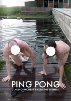
The artists Claudio Wichert & Clemens Wilhelm spend 90 days in a house to make a book. Each day they produce one page. Like in a match of ping-pong, each page is a reaction to the other artist's work from the day before. The two resulting storylines are presented in this book full of duels and duets. The media mix and only one thing is for certain: it's all or nothing.
Text von der Webseite
This publication contains a selection of 60 photographs from the documenta Archive, one of the oldest and most esteemed exhibition of contemporary art in the world. The photographs — belonging to different ages — depict the two elements that make art history possible: artwork and spectator. This amazing journey through time not only concerns the history of one of the most important exhibitions in the world, but also traces the evolution, customs, and traditions of the society that created it. The book portrays a love story between two subjects — a human being and an inanimate element — that are capable of a relationship even if they speak a different language. The photographs capture the moment of these encounters, and this is what their distinctive feature consists in. Of course we are not able to listen to the dialogues, but we can still imagine them.
Text von der Verlagswebseite
[28] S., 30x20 cm, Auflage: 300, 2 Stück. keine weiteren Angaben vorhanden Blätter lose ineinander gelegt, Risographie, in transparenter Kunststoffhülle
The origin of this work of self-fiction can be found in one of São Trindade’s sketchbooks, this one entirely devoted to the subject of loss or decadence. With references to the aesthetics of crime scenes and nightlife photographed by Weegee in New York in the 1930 and 1940’s, the device is simple: in a "real décor," São Trindade’s body, abandonned and unconscious, is photographed. The body is always the same but differently ‘prepared’ and ‘composed’ with new dresses, new gestures, new signs of a recent activity or a different personality. Each image has its particular story and each space is a sounding board for each of these performative states of body.
Text von der Webseite
Erschienen als Nummer 1 der Serie X1 Editions, Mehr als 30 Abbildungen der Werke von Brendan Danielsson.
Der Künstler stellt außerdem seine Werke im Rahmen der Don't Wake Daddy Ausstellungen von Feinkunst Krüger in Hamburg aus. Diese Serie nahm in der Hamburger Galerie 2006 ihren Anfang und präsentiert die sogenannte Lowbrow-Szene.
Feinkunst Krüger beschreibt diese Kunstrichtung auf ihrer Webseite:
Lowbrow (oder auch Pop Surrealism) ist als Kunstrichtung langsam aus den amerikanischen Subkulturen der 50er Jahre bis heute hervorgegangen. Sucht man die Ursprünge von Low Brow, so fängt man am besten bei den mittlerweile altehrwürdigen Surf- und Hot Rod-Bewegungen an und schaut dann was der Stein alles mitgenommen hat, sobald er ins Rollen geraten ist: Science Fiction-Fernsehserien, psychedelische Rockmusik, Softpornos, Animes usw. Wer billige Monsterfilme aus den Sechzigern kennt, Cartoons von Robert Crumb gelesen oder sich einmal mit amerikanischen Werbeplakaten aus den letzten 20-30 Jahren beschäftigt hat, dem dürften die Low Brow-Welten einigermaßen vertraut vorkommen. Das war praktisch der Anfang einer Emanzipation der Illustrative, die dadurch ihren Weg in die Galerien und Museen fand.
... Lock arbeitet meist mit feinen Stiften auf pastellfarbenem Papier in kleinen bis mittleren Formaten. Diese sind gerade groß genug um die aufwendigen Details der Zeichnung zu erkennen. Gerade in letzter Zeit und speziell für diese Ausstellung arbeitet er aber auch an größeren Formaten in denen er mit Acrylfarben und Wasserfarben experimentiert und sich so neue Universen erschafft. Diese sind inspiriert von Science Fiction, postapokalytischen Vorhersagen, Death Metal, ... Der 25 jährige Künstler lebt und arbeitet in Massachusetts. In den letzten Jahren hat er weltweit an vielen großen Gruppenausstellungen teilgenommen und seine Arbeiten sind in unzähligen Publikationen erschienen. ... Angefangen aber hat alles schon in seiner Kindheit, als der junge Matt, fasziniert von jeder Art Comicfiguren und Charakteren aus X-Men und Star Wars, seine Lieblingshelden zu kopieren versuchte. Als Vorlagen dienten Buchcover, Comics, Poster und die Packungen von Actionfiguren. Das Ergebnis war dann eine bunte Mischung aus fantasievollen Comiczeichnungen und eigenen Kreationen. ...
Text von der Webseite
Erschienen als Nummer 3 der Serie X1 Editions.
23x18,5 cm, keine weiteren Angaben vorhanden Drahtheftung, Pappumschlag, bestehend aus drei ausklappbaren Teilen, verschiedene Papiere, perforiert, metallverstärkte Ecken, in transparenter Kunststoffhülle, mit angebrachten Aufklebern
ZusatzInfos
"RRRUIDOSSS" is a handmade publication divided in three parts that wants to take in the noises that has been established like the most annoying, noxious including the ultrasonics and infrasonics. This damaging sounds, written in paper using onomatopoeias, are reduced and convert into harmless ones. In addition, this is a very special edition as you can unfold and streap through the micro holes! So you have the possibility to get three books in one or an unfold one.
Text von der Webseite
Erschienen als Nummer 6 der Serie X1 Editions zur Vernissage von 08.06.-29.06.2013. Das Zine X1 #007 Use your Illusions II erschien ebenfalls im Rahmen dieser Ausstellung.
324 S., 19,8x12,8 cm, Auflage: 500, ISBN/ISSN 9781907468216 Softcover, Taschenbuch
ZusatzInfos
Getting Inside Simon Morris’ Head is a performative retyping of Simon Morris’ conceptual bookwork Getting Inside Jack Kerouac’s Head. Like Morris’ original performance of retyping the scroll edition of Jack Kerouac’s On the Road, Joe Hale’s project first appeared as a blog. At the rate of one page per day, like Morris retyping Kerouac before him, Hale retyped Morris’ entire book and in doing so re-retraces Kerouac’s famous adventure. Morris gave us all of Kerouac’s pages in reverse order: each blog post presented one page and the default settings of the blog platform organised his posts in reverse order, from the newest to the oldest. Now inverted again, as a double negative, Hale has restored the direction of travel to the story and produced a wholly (un)original new text. This first printed edition takes the imitative gesture to a new extreme. It features an introductory essay by poet Kenneth Goldsmith and reuses Morris’ paratext. From the cover design to the choice of paper, Hale tests the limits of conceptual extension.
Text von der Webseite
Erschienen zur Ausstellung bei der FOR-SITE Foundation, San Francisco 27.09.2014-26.04.2015.
Internationally renowned Chinese artist and activist Ai Weiwei is one of contemporary art's most newsworthy figures, noted for both his groundbreaking work and his outspoken stance on human rights, which ultimately resulted in his controversial 2011 detainment. In an astonishing new large-scale project, he turns his attention to Alcatraz—a place he could not visit because he was not permitted to leave China, but that stands as a world-famous symbol of both incarceration and protest. This book showcases the major exhibition presented by FOR-SITE Foundation of site-specific, multimedia installations and sculptures Ai Weiwei create for the island, on view from the fall of 2014 through the spring of 2015. Featuring beautiful photographs and thought-provoking text, At Large is the essential document of this remarkable happening from one of today's most celebrated artists.
Text von der Website.
Collected Works compiles eight of my books into one convenient volume. The books are combined together, so that page one of Collected Works is a "sandwich" of the first page of all eight books, page two contains the second page of each book, page three the third page, etc. Collected Works reproduces Squares With Sides And Corners Torn Off, Some Los Angeles Apartments, Real Estate Opportunities, The Location of Lines, and Records in their entirety, plus excerpts from 60 Years Later, Arcs Circles & Grids, and The Xeroxed Book. - Eric Doeringer
Text von der Webseite
4 S., 21x14,9 cm, 2 Stück. keine weiteren Angaben vorhanden Einladungsflyer, beiliegend ein beidseitig bedrucktes Informationsschreiben zur Ausstellung
ZusatzInfos
zur Ausstellung vom 21.05.-04.06.2016 im Neo Toum - Neoterismoi Toumazou, Nikosia, Zypern.
He was dancing steadily. He could see the backs of people’s heads moving in the darkness and was aware of the shifting spaces between their bodies. He did not register the music except as a sort of vibration. He felt as if he was dancing in perfect silence. He saw the already dim room growing ever darker around him. He became less conscious of his surroundings and more aware of himself. His introspection grew but his body was now moving automatically, softly cycling through a short loop of set motions. He noticed dust under his feet, and soon the realisation reached him that he was slowly wearing a shallow hole in the wooden floor. His body was locked in an efficient cycle. Before too long he was six inches below floor level, his head parallel with some of the shorter dancers. Yet he could not stop. Gradually he sank deeper into the ground until his face was level with people’s waists. No one noticed, below the eye level of the crowd, he was almost invisible. Presently his eyes came level with the soles of dancing shoes. He could see shards of coloured light flashing through a forest of legs casting jagged shapes across the floor. There were points where soft reflected light shone through looming figures like sunlight into a clearing. Eventually he was entirely submerged. He could look up through the hole and see foreshortened bodies moving above him oblivious to his plight. Still his feet moved, wearing away damp, pungent earth. The vibrations from the music lessened until the dull thump of the kick drum was all that he could feel. When it stopped he realised he too was still, and looking up he saw the sphere of light was gone.
Text von der Webseite
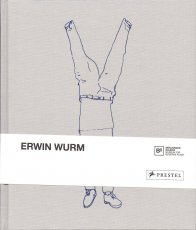
Buch erschien anlässlich der Ausstellung, in der Berlinischen Galerie, 15.04.–22.08.2016.
Der österreichische Künstler Erwin Wurm (*1954) war 1987 als Stipendiat des DAAD-Künstlerprogramms in Berlin. In diese prägende Phase fällt eine grundlegende Veränderung seiner Arbeitsweise: Er beginnt, die Grenzen zwischen Skulptur, Objekt und Performance auszuloten. Erwin Wurm wird nun erstmals in einer monografischen Ausstellung in einem Berliner Museum präsentiert. Die Berlinische Galerie zeigt zentrale Werkbereiche, darunter jüngst entstandene Arbeiten. Im Mittelpunkt steht der menschliche Körper und Wurms partizipatorischer Ansatz, den Betrachter zu einem Teil seines Kunstwerkes werden zu lassen. Ausgangspunkt ist das Narrow House, ein detailgetreuer, begehbarer Nachbau von Wurms Elternhaus, gestaucht auf die Breite von 1,10 Meter. Die Enge der Provinz wird so sprichwörtlich für den Besucher physisch erfahrbar. Ergänzt wird dieses Werk durch die One Minute Sculptures. Mithilfe alltäglicher Objekte soll der Besucher ungewöhnliche Posen einnehmen. Folgt er den Handlungsanweisungen des Künstlers, wird er für eine Minute zur lebenden Skulptur. Die Ausstellung widmet sich mit rund 80 Arbeiten außerdem erstmals ausführlich dem zeichnerischen Werk und zeigt auch jüngst entstandene, skulpturale Arbeiten: Nachgebildete verbeulte Kühlschränke, riesige deformierte Telefone und eingeknickte Sideboards.
Text von der Webseite
3 S., 29,7x21 cm, signiert, 4 Teile. keine weiteren Angaben vorhanden Briefumschlag, beschrieben und beklebt, mit drei Blättern, Inkjetdrucke, handschriftlicher Gruß und ausgedruckter Visitenkarte,
Ausschreibung zum Mail Art Projekt "we history wonderful make (one-man strategy)", Erinnerungsblatt an den 100. Geburtstag von Cavellini am 11. Sept. 2014, 1 Blatt Mail Art
Schwarz-Weiß-Drucke, Nr. 029 aus der Reihe 100for10.
Christoph Vieweg is a drawer and illustrator, based in Berlin. He realizes his art mainly through drawings which focus on everyday observations. Most recently, Vieweg was engaged in the project SOWEIT DIE MELDUNGEN in which he attempts to artistically explore daily news delivered through radio podcasts. The challenge of the project is to keep up the artistic output of at least one drawing per day, each of it representing one received news item. Vieweg’s work presents itself in complex serial blocks which again and again aim to visualize and capture the undertone of the society we live in.
Schwarz-Weiß-Drucke
Internationally renowned photographer, Horst A. Friedrichs was born in Frankfurt in 1966. He studied photography in Munich and has worked as a freelance photojournalist for numerous magazines including The New York Times, Geo and Stern. In 2008, he received the prestigious Lead Award for Best Reportage Photography. He has published a number of books including the best-selling I’m One: 21st Century Mods (Prestel). He lives in London. The Six Days of Bremen is a six-day track cycling race held annually in Bremen, Germany. The event was first held in 1910 as a one-off event and as a regular event since 1965. It is held at the ÖVB Arena.
104 Minuten, DVD 9.
Der Film erzählt die Geschichte einer leidenschaftlichen, schönen und talentierten Frau – ein jüdisches Flüchtlingskind aus Hamburg, das sich an die Spitze der Der Film erzählt die Geschichte einer leidenschaftlichen, schönen und talentierten Frau – ein jüdisches Flüchtlingskind aus Hamburg, die sich an die Spitze der US-Kunstszene kämpfte und bis zu ihrem frühen Tod 1970 mit 34 Jahren die Kunstgeschichte verändert hat. Anlässlich der Ausstellung "Eva Hesse - One More than One" in der Hamburger Kunsthalle (29. November 2013 bis 2. März 2014) entstand der Dokumentarfilm über Leben, Werk und Wirkung von Eva Hesse. Die Ausstellung bot einen passenden Rahmen, um erstmals viele ihrer komplexen Werke filmisch dokumentieren zu können. „Eva Hesse ist eine extrem relevante Künstlerin, die für einen Übergang und eine Verwandlung der Kunst der 1960er steht.” Nicholas Serota, Director Tate Museums, 2013 Eva Hesse, die als Kind vor den Nazis in die USA fliehen konnte, hatte ihre künstlerische Erweckung 1964/65 während eines Deutschland-Aufenthaltes. Sie starb 1970 in New York an einem Hirntumor und schuf in dieser kurzen Zeit ein Werk, das die Geschichte der Kunst veränderte.
Text von der Webseite
185 Blatt S., 28x21,5 cm, Auflage: 1.000, keine weiteren Angaben vorhanden Offsetdruck nach original Fotokopierarbeiten, je Künstler 25 Seiten, First Edition
Siegelaub in einem Interview: The Xerox book - I now would prefer to call it the Photocopy book, so that no one gets the mistaken impression that the project has something to do with Xerox – was perhaps one of the most interesting because it was the first where I proposed a series of requirements for the project, concerning the use of a standard size paper and the amount of pages the container within which the artist was asked to work.
Das Buch ist/war die Ausstellung
21x15 cm, ISBN/ISSN 8496540170 Grafic Tourism Since Two Thousand And Three, The Collection of Volumes One Through Five, 5 Hefte zusammengebunden in mehrfach gefalteten farbigen Umschlag mit Dokumentation
45x30,6 cm, Auflage: 15.000, keine weiteren Angaben vorhanden Blätter lose zusammengelegt, farbiger Druck auf Zeitungspapier. Mit der Beilage des Metrolit Magazin Nr. 2
20,8x14,8x4 cm, 2 Stück. keine weiteren Angaben vorhanden 10 Hefte, Broschur und Drahtheftung, Softcover, mit Gummiband zusammen gehalten, Druck auf farbige Papiere
ZusatzInfos
One of the modul-dance project key elements is the promotion of mobility, so that artists receiving its support follow itineraries across Europe to develop their creative work and present it to different audiences.
Modul-dance presents a collection of modul-dance city guides. Each of the guides in this collection shows a city from the viewpoint of a local artist, who proposes his or her own particular route to artists in transit, seeking to put them in connection with their host city. While these city routes share some basic features, each one is different and in their differences lies a wealth of gazes, aesthetics, approximations to the local and much more. In a word, they form a mirror of the diversity that modul-dance has always fostered. Athens, Barcelona, Bassano del Grappa, Dresden, London, Stockholm, Vienna, Toulouse, Paris and Poznań, ready to be discovered.
Text von der Webseite
[20] S., 18x14 cm, Auflage: 3.000, ISBN/ISSN 9783868740080 Drahtheftung
ZusatzInfos
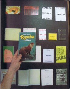
Ruscha der Fischotter aka: Printed Matter And Other Visible Things On Paper Not Necessarily Meant To Be Viewed As After Ruscha aka: One Hundred Views Of One Hundred Views Of Mount Fuji, If Someone Says So aka: SIX HANDS AND A CHEESE SANDWICH is a book about books, a catalogue and an art/bookwork in its own right.
Content: By now the appropriation and paraphrasing of Ed Ruscha constitutes a genre of its own. The first were 1968 Bruce Nauman with 'Burning Small Fires' and 1971 'Ed Ruscha' (actually Joel Fisher) with 'Six Hands and a Cheese Sandwich', with further appropriations or hommages over the decades, and in the last years it almost became fashionable, the evidence is massive.
Text von der Webseite
The publication is an attempt to map the local businesses in the area around Victoria Square, and a “meeting point" for the people of the neighborhood where they can narrate their stories. Every issue will host two new stories. Ausgabe vom 21.04.2017
erschienen zur Ausstellung 30.04.-25.07.2010
Mit Essays von Benjamin H.D. Buchloh und Birgit Pelzer sowie einem Text von Herman und Nicole Daled.
The Brussels-based collectors Herman Daled and Nicole Daled refuse to perceive art as decoration and to, thereby, exploit it. They approach art in a fundamentally different way: Basis for their activities are their relationships and conversations with artists.
In keeping with the aim of Conceptual Art that places the intellectual content of a work above its realisation, they consider themselves not collectors but communicators and producers: They provide artists with the opportunity to also realise works outside of established market mechanisms. Their intense engagement with Conceptual Art, one of the most important movements in recent art history, goes far beyond usual collecting practices. This is not only apparent in the actual works, but also in the meticulously archived documents containing actions and works. One of the most important influences for Herman and Nicole Daled was Marcel Broodthaers, more than 80 of his works are in their collection. Moreover, the collection holds several works by Daniel Buren, Dan Graham, On Kawara, Sol Lewitt, Niele Toroni, Lawrence Weiner, Cy Twombly and many more.
Text von der Webseite
Martino Gamper is the kind of product designer we all have been waiting for: Brimming with ideas, energy and humour, his designs are disarmingly irreverent and irresistibly fun, and unlike anything one will see in the puristic galleries of contemporary design. Crossing over from studying sculpture to completing an MA in product design at the prestigious Royal College of Art under Ron Arad, Gamper has had little time to worry over the theoretical do’s and don’t’s of his profession – instead, he has followed a simple rule of learning by doing, meaning: the more you do, the more you learn. With mono.kultur, Martino Gamper talked about his idea of fun, why a chair is the ultimate challenge and what design has in common with cooking. Visually, the issue is bursting with references and ideas, reclaiming image material from left and right, while unveiling the structure of a book with three booklets of different sizes all lovingly assembled into one – and manually at that, which makes for some rough edges or rather what we like to call extra personality.
Text von der Website.
[50] S., 28x21,5 cm, Auflage: 100 ca., signiert, keine weiteren Angaben vorhanden geklammerte Fotokopien, ein Blatt als Sticker eingebunden. Kopiert im August 2019
... If you know me at all, then you know I like to operate where I see vacuums in the culture. Zine El-Arab came about precisely for that reason. This was 2011, a time of great revolutionary upheaval that started in Tunisia, spilled over into Egypt, and kind of spread from there not just in the region but halfway across the world.
By late 2011, there was really no denying the ripples of change pulsating through Cairo. It was evident on the streets, in music, conversations, at art galleries, on television, it was everywhere. But I was growing frustrated that there didn’t seem to be any regular publication that featured the voices of dissent that were otherwise all around you. It felt like there was a rift between everyday voices and what was being published, and how cool would it be if there were at least one? Especially if it were a crude one. ...
... Die Formel war scheinbar ganz einfach. Das Titelbild (von mir erstellt) wurde auf Social Media veröffentlicht und lud Mitwirkende aus dem arabischsprachigen Raum ein, darauf entweder mit Text oder Bild zu antworten (nur S/W). Entsprechende Einreichungen werden ausgewählt und zu einem digitalen Zine zusammengestellt, der als PDF mit detaillierten Anweisungen für Druck und Montage hochgeladen wird. Die Idee war, nicht nur den Inhalt, sondern auch die physische Produktion des Zine zu dezentralisieren, wodurch Mitwirkende und Leser ihre eigenen Kopien drucken und organisch unter ihren Gemeinschaften verbreiten konnten. In Wirklichkeit hatten beide Ausgaben ihre "Launchparties", Ausgabe eins in Makan in Jordanien und Ausgabe zwei in der Townhouse Gallery in Kairo, was bedeutete, dass für jeden Start etwa 100 Exemplare gedruckt und zusammengestellt werden mussten.
Eine Sache, die ich tun wollte, war, die Tatsache zu nutzen, dass jedes Exemplar technisch individuell gedruckt und gebunden wurde. So gab es beispielsweise für die Ausgabe #1 Anweisungen, den Blutfleck manuell auf das Cover zu malen, und im Inneren befand sich eine Seite (mit mehreren Bildern verziert), die für den Druck auf Klebepapier bestimmt war, auf der die Leser ausschneiden und als Aufkleber verwenden konnten.
Es sollte beachtet werden, dass es im Namen der Zine ein kleines Wortspiel gibt. Das Wort "zine" in arabischer Sprache ist die gleiche genaue Schreibweise wie das Wort "zain", was in etwa "das Beste" bedeutet. So schlägt Zine El-Arab nicht nur "die Zine des Arabers" vor, sondern wird gleichzeitig als "das Beste vom Araber" gelesen. ...
Übersetzt mit DeepL
Text von der Webseite
Foto Innenteil von Ganzeer
We are heading into a future where our choices will be shaped – if not outright determined – by algorithms and artificial intelligence. This coming state has been labelled “the new dark age” (James Bridle, 2018).
It remains to be seen what this brings to photography, and vice versa. One thing, however, seems clear: photography, which has already changed significantly in the 21st century, is affected by – and in some important ways is part of – this development. This issue of “Fotografija” explores how programmes, apps and AI-related technologies shape and change the discourse of photography, challenging traditional boundaries of the medium.
Various programmes and services – Google, Photoshop, Flickr, Snapchat, visual recognition, etc. – provide new tools to conceive image-making and think photographically. Technological interfaces not only deliver instruments for making work but can become the very logic for creating photographic series.
The presented artists offer perspectives to raise questions and discuss these technological shifts. From dealing with traumatic events (Indrė Šerpytytė) and inaccessible sites (James Bridle) through technological mediation to playing with our expectations of an all-pervasive Photoshop manipulation (Erin E’Keefe). From exploring so-called smart surveillance systems (Esther Hovers) and censoring politically sensitive sites (Mishka Henner) to everyday glitches (Mantas Grigaitis). From playing with the copyrights of such collective websites as Flickr (Penelope Umbrico) to exploring the shared language of being in some of the most photographed places on earth (Thomas Albdorf). And from using Photoshop to create images (Aaron Hegert) to an image that is barely photographic (Zachary Dean Norman). The four essays (Kate Palmer Albers, Roksana Filipowska and Marijana Rayl, Ilaria Speri, Alise Tifentale) map out the works in broader social, historical and art contexts.
In short, the works deal with our technologized world. They talk about being in the middle of changes that few have envisioned. Being so immersed, one can feel it (almost) hurts.
Text von Paul Paper.
36 S., 14,5x15 cm, Auflage: 100, keine weiteren Angaben vorhanden Drahtheftung, im Umschlag vorne 3 Booklets und 1 gefaltetes Poster (Klang! Suoni Contemporeani) in Einschubtasche, rückseitig eine selbstgebrannte und -gestempelte Multimedia CD, Heftseiten Schwarz-Weiss Kopien mit 4 eingeklebten Farbbildern, auf dem Cover das Klang! Logo ebenfalls aufgeklebt
ARTE POSTALE! (1979-2009) One of the best known and probably the most long-live mail art magazine on the planet, Arte Postale! has assembled original works or published materials by hundreds of international networkers. The project is considered concluded with issue n.100 (december 2009).
Text von mailartprojects.blogspot.com
When, just over twenty, I was assembling the first issue of the magazine Arte Postale!, joining with brass rings a dozen of sheets printed in one hundred copies on pink paper, I would never have imagined that thirty years later I would have been still busy putting together with scissors and glue the very same publication. Instead, this issue n. 100, intentionally produced in the homemade cut-and-paste style typical of mail art, even shares the musical theme with that first experiment, in which I already rubberstamped and glued leaflats on the pages or I stapled on them a piece of magnetic tape.
Introduction by Vittore Baroni
Issue no. 100 of Vittore Baroni's Arte Postale! magazine dedicated to the Klang! exhibition/sonic arts festival held in Viareggio, Italy, august 7-9 2009.
36 pp. booklet with attached cd-r, published in 100 copies (standard edition, in the AAP) plus 100 copies with additional plastic pouch including 30 original cd-size works by 30 artists (Joel S. Cohen, David Dellafiora, Mike Dickau, Carol Stetser, Ruggero Maggi, Emilio Morandi, Jan-Willem Doornenbal, Ever Arts, Luc Fierens, Richard Kostelanetz, Jurgen O. Olbrich, Gianni Simone, Rod Summers, Bruno Cassaglia, Ruggero Maggi, Serse Luigetti, etc.
Among them comes a CD mini-album by Jarmo Sermilä: Mechanical Partnership, a complimentary copy of the official Jase 2000 release - see Jarmo Sermilä - Mechanical Partnership.
Text von discogs Webseite
Audio
1. Mike Dickau - Arte Postale!: Pax Vobiscum (2’54”)
2. Günther Ruch - Musica 123456 (2’09”)
3. Reid Wood - Future Sound (0’27”)
4. Krell - Bzzzoing! (5’00”)
5. Franco Piri Focardi - Concerto Per Bozuffo (3’41”)
6. Jan Willem Doornenbal - Lake Crocodile (2’16”)
7. Bruno De Angelis - 100: Game Over! (4’ 30”)
8. Joel Cohen - Last Song Reverse (2’17”)
Tempo Totale | Total Time: 23’54”
Ausgabe Februar 2020. „Arts of the Working Class“ ist eine Straßenzeitung für Armut, Reichtum und Kunst. Sie erscheint alle zwei Monate und enthält Beiträge von Künstlern und Denkern aus verschiedenen Feldern und in verschiedenen Sprachen. Sie richtet sich an die Arbeiterklasse, also an alle, und es geht um alles, das allen gehört. Jeder, der sie verkauft, verdient mit. Jeder Künstler, dessen Arbeit beworben wird, gestaltet mit.
Century-old lore holds fast to the idea that a mirror is not only a reflection but a window from the facade of appearance into one's soul. For the superstitious, breaking a mirror tempts malignant forces, soul-splintering demons and seven years of bad luck. But what of the cracks at the edges of ancient mirrors or the spider web splintering across the screen in your pocket? We have yet to devise a reflection of ourselves that can weather time or violence. For what spills forth from cracks? What use is the time you spend looking in the mirror? For the survival of our souls we need to reflect one another and cultivate solidarity. To turn away from capitalist hegemony we must abandon our reflection and turn towards the other humans, and pull each other up through the cracks.
Text von der Webseite.
aufgenommen am 12.09.2018, ist Teil von Psych.KG 231 von Kommissar Hjuler.
Richard Franecki - guitar, electronics. James Warchol - guitar. Lars Kvam - saxophone. Rusty (7) - drums, percussions. Mitglieder: James Warchol
von Discogs
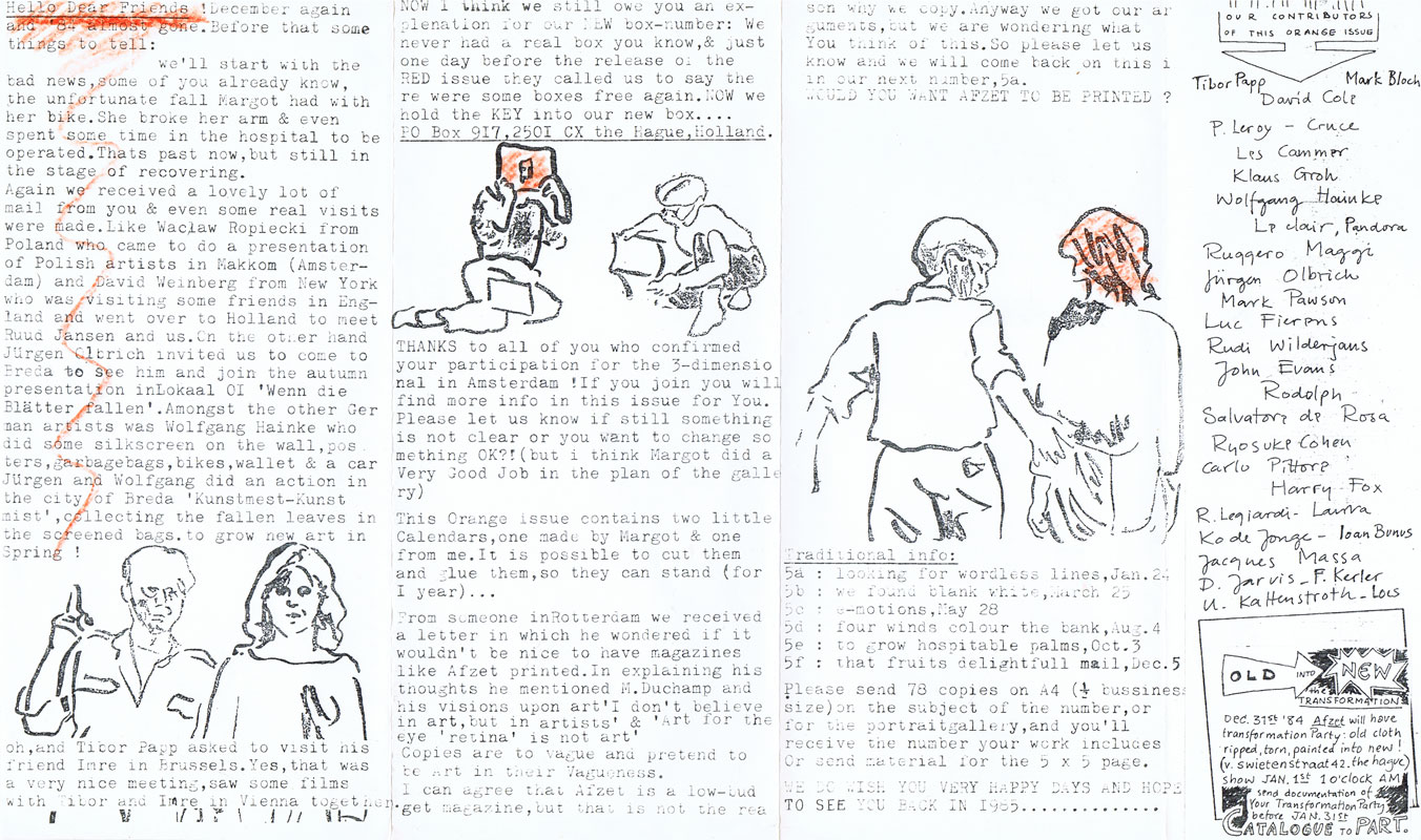
• 18,5x28cm Brief adressiert an Kattenstroth, Acrylfarbe orange, Stempel
• Briefumschlag transparent, Collage, gefaltetes Papierobjekt, handschriftliche Nachricht
• Kopie Schwarz-Weiß, 21,3x35,7cm, "Orange Issue" Afzet, Buntstift orange, Dezember 1984
• 11.12.1984; "About Afzet's Palmbank", 29x14,9cm, Schwarz-Weiß Xerox auf blauem Tonpapier, Stempel, gelber Aufkleber, zweifach gefaltet
ABOUT AFZET'& PALMBANK
This bimonthly publication is edited and mailed by Sonja van der Burg and Margot van Oosten.
Our alm lo to exchange ideas related to the theme of the Issue, or to your interests of the moment, and to supply information on (mainly mail-art) projects.
TABLE OF CONTENTS
As for now each issue can be divided into the following chapters:
- Afzet's contribution (part of the editora)
- Portraitgallery (work related to your portrait)
- 5 х 5 раgе (advertisements and notes)
-VisitorsPalmbank (works related to the theme, or free).
YOUR CONTRIBUTION
So what to do if you would like to participate...
-Portraitgallary : send 60 copleß or originals that have something to do with your most recent portrait, max, size A5 (74,5 x 20,5 cm).
-5 x 5 page: send a design for your advertisement special note, and we copy 1t (black/white).
-VisitorsPalmbank: send 60 copies or originals concerning the theme, or something you are concerned with, max. size A5/folded A4.
Participants of the PORTRAITGALLERY & VISITORSPALMBANK will receive the edition that contains their contribution automatically.
SUBSCRIPTIONS
If you don't want to participate, but like to receive the publications ...or if you like to support ...:
Please send an International Money Order addressed to :
Sonja van der Burg/Margot Van Oosten (Afzet's Palmbank)
Postbox I4864 , 250I GW the Hague the Netherlands
Subscribera in Holland can transfer directly to our account: Giro 4231869 (addressed as above).
Prize : for one year (6 numbers: Jan-Dec) 60
Dutch Gullders
for one number- I5 Dutch Guilders.
I984-themes and deadlines
Nr. 4a - yellow - Feb. 9
Nr. 4b - green - March 28
Nr. 4c - blue - May 30
Nr. 4d - purple - August I
Nr. 4e - red - Oct.3
Nr.4f - orange - Dec. 5
4 S., 10,5x14,8 cm, Auflage: 100, signiert, 2 Stück. ISBN/ISSN 9783923205127 4 Postkarten mit Original-Blumenstempeln, in Umschlag, Umschlag signiert und mit Stempel
22x30,8x16 cm, 120 Teile. keine weiteren Angaben vorhanden Karton, Cover beschriftet und beklebt, mit 112 gelochten Heften (110 mit Drahtheftung, 2 Broschur) und 8 Ephemera, Schwarz-Weiß- und Farbfotokopien, Text
Archive Set of every publication published by La Bibliothèque Fantastique from 2009 until 2013. (Beschreibung Deckel)
Persönliches Austellungs-Set von Antoine Lefebvre.
OR #19. If you get it, pass it around. If you've got it, give it away. Kiss, kiss, kiss. A hit from the past. Portrait of the artist a a young dupe by El Largato.
Text vom Heft.
Seit 1990 feiert das Festival Chaumont Graphic Design sowohl das Poster als auch die Grafikdesigner. Es ist eine international renommierte Veranstaltung und das erste französische Festival in dieser Kategorie.
Taken 100% from reality, this is a full length transcript of the fourth quarter 2009 Monsanto Company Earnings Conference Call, treated, layouted, published and performed as an original theater piece (on occasion of the exhibition & symposion "The apparatus of life and death" at the Museum of Contemporary Art Skopje).
The main acts are "Presentation", "Question-and-Answer Session" and "Copyright Policy", the main characters are Hugh Grant (President & CE), Carl Casale (EVP & CFO), Terrell Crews (EVP, CEO Vegetable Business), Scarlett Foster (VP IR) as well as various Analysts.
As Karsten Schubert puts it "A gulf has sprung between post-Duchampian, postmodern artistic practice and a still Modernist-Romantic interpretation of copyright."
Dies ist eine zu 100% der Realität entnommene Abschrift der Telefonkonferenz der Monsanto Company für das vierte Quartal 2009, die als originelles Theaterstück bearbeitet, gestaltet, veröffentlicht und aufgeführt wurde (anlässlich der Ausstellung und des Symposions „The apparatus of life and death“ im Museum für zeitgenössische Kunst in Skopje).
Die Hauptakte sind „Präsentation“, „Frage-und-Antwort-Sitzung“ und „Copyright Policy“, die Hauptdarsteller sind Hugh Grant (Präsident & CE), Carl Casale (EVP & CFO), Terrell Crews (EVP, CEO Vegetable Business), Scarlett Foster (VP IR) sowie verschiedene Analysten.
Karsten Schubert formuliert es so: „Es ist eine Kluft entstanden zwischen der postduchampianischen, postmodernen künstlerischen Praxis und einer immer noch modernistisch-romantischen Interpretation des Urheberrechts.“
Übersetzt mit DeepL
Text von der Webseite
Unter dem Motto »Sprachen der Liebe. Wie wollen wir leben?« kuratiert in diesem Jahr der Berliner Autor Daniel Schreiber das künstlerische Programm. Er zeigt, dass Literatur immer politisch ist: Denn wofür wir glühen, was uns begeistert und zusammenhält, was uns provoziert oder empathisch für andere sein lässt, vermitteln uns starke Texte und künstlerische Perspektiven. Über den Tellerrand hinausschauen und offen sein – das ist in unserer Gegenwart wichtiger denn je. Die »Münchner Schiene«, diesmal federführend vom Lyrik Kabinett ausgerichtet und kuratiert von Lisa Jay Jeschke und Chris Reitz, zeigt erneut, wie innovativ auch die freie literarische Szene der Stadt ist.
Text von Website übernommen.
Werbeflyer zum Buch "Heilkunst - Risiken und Nebenwirkungen des Kunstbetriebs", für Arthur Klings "Heilkunst-Tee" und die Online-Selbsthilfegruppe für den Kunstbetrieb "ArtVictims Anonymous" in der Kunststiftung Baden-Württemberg, 23.02.-25.03.2000.
Zum Buch: Ein Vademecum zur Pathologie des Kunstbetriebs. Der Autor beschreibt anschaulich und leicht verständlich den Kunstbetrieb und seine häufigsten Risiken und Nebenwirkungen. Heilkunst gibt Tipps zu deren Behandlung mit einheimischen Heilkunstpflanzen in Wort und Bild, die speziell für die Linderung von Kunstbeschwerden zusammengestellt wurden.Heilkunst ist ein unverzichtbares Standardwerk für all diejenigen, die im Kunstbetrieb tätig sind, vom Anfänger bis zum Arrivierten. Dem kunstinteressierten Laien bietet das Buch fundierte Hilfestellung im Umgang mit dem Kunstbetrieb. Ein Nachschlagewerk von Artomanie über Augenschwäche, Grössenwahn, fehlende Inspiration, Kunstkritik, Melancholie und Technerrhöe bis Vincent-Syndrom, Wundheilung und Zwangserscheinungen. Das Verzeichnis der Heilkunstpflanzen enthält botanische Beschreibungen, Tipps zum Sammeln und Zubereiten sowie eine Fülle von Rezepturen zur Selbstbehandlung.
Text von der Webseite.
29,7x21 cm, 32 Teile. keine weiteren Angaben vorhanden Verschiedene Drucksachen in braunem Briefumschlag, Flyer, Folder, Visitenkarten, Postkarten, Textblätter
Publikation im Rahmen der Ausstellung "Debutant*innen 2022" der Galerie der Künstler und des BBK in München vom 06.09.-16.10.2022.
Thy Flesh consumed ist der Titel der vierten Episode des Videospiels Doom. Die Titel der Level des Playstation-Spiels stammen aus der Bibel. Das Spiel ist nicht für Minderjährige freigegeben; inhaltlich basiert es auf brutaler Gewalt.
Mit Gastspielen von Lion Bischof, Böhler & Orendt, Otakar Skala und Sophia Süßmilch und Texten von Felix Burger, Lion Bischof, Otakar Skala und Sophia Süßmilch.
Das Buch dokumentiert Felix Burgers Ausstellungsprojekt »Medizinisch Psychologische Untersuchung« in Brutus, Rotterdam von 05.04.-23.06.2024.
Burger verwandelte den ehemaligen Industriekomplex in eine Wunderkammer voll absurder Weltentwürfe. Singende Puppen, verwaiste Zirkusartisten, kleine Männer, sprechende Hunde, belehrende Eisbären und debile Priester besetzten das Gebäude. Die fast 5000qm große Ausstellungsfläche wurde zum begehbaren Bühnenbild und in sich geschlossenem Mikrokosmos. Neben seinem monografischen Werk wurden auch Kollaborationen mit Lion Bischof, Böhler & Orendt und Otakar Skala, Sophia Süßmilch gezeigt.
The book documents Felix Burger’s exhibition project »Medizinisch Psychologische Untersuchung« in Brutus, Rotterdam from April 5 to June 23, 2024.
Burger transformed the former industrial complex into a chamber of wonders full of absurd world concepts. Singing puppets, orphaned circus performers, little men, talking dogs, lecturing polar bears and moronic priests occupied the building. The almost 5000 square meter exhibition space became a walk-in stage set and a self-contained microcosm. In addition to his monographic work, collaborations with Lion Bischof, Böhler & Orendt and Otakar Skala, Sophia Süßmilch were also shown.
Publikation anlässlich der Ausstellung "Georges Tony Stoll" in der La Galerie, Contemprary Art Centre, Noisy-le-Sec, Frankreich, 03.12.2011-11.02.2012
Ergänzung zum Kaleidoscope Magazin (Nr. 13), Mailand, Italien
42 S., 18x13.2 cm, keine weiteren Angaben vorhanden Offsetdruck, das Blatt wurde 6x der Länge und 2 der Höhe nach gefaltet - es ergeben sich 8 panoramaartige Bildstreifen pro Blattseite
ausgebreitete Größe: 54 x 92 cm, die Zeichnungen sind während eines Spaziergangs in Arles entstanden,
in Zusammenarbeit mit der Vincent van Gogh Foundation Arles
[24] S., 14,8x10,5 cm, Auflage: 200, 2 Teile. keine weiteren Angaben vorhanden Drahtheftung, farbiger Druck (Risographie?) mit beigelegtem Poster, beidseitig bedruckt und mehrfach gefaltet.
Vermutlich erschienen anlässlich der Ausstellung "Schrift stücke" bei Immanace, Paris, 25.02.-30.04.2017 und in Kassel zur documenta 14 10.06.-19.07.2017
26,7x26,6 cm, signiert, 25 Teile. keine weiteren Angaben vorhanden Sieben Künstlerbriefmarken im Bogen, perforiert, gestempelt, mit persönlicher Widmung, Klebefolie
15x29,5 cm, keine weiteren Angaben vorhanden Grafik eines Stiers, Fleischstücke beschriftet mit Namen bekannter Maler (wie im Sticker grüner Stier), Kopfteil ersetzt durch Wolfgang Rostek, handschriftliche Widmung an Wolfgang Rostek
keine weiteren Angaben vorhanden Besucher des Archivs: Kunsthistoriker, Student*innen, Schüler, Kunststudent*innen, Künstler, Sammler, Bibliothekare, Gestalter*innen, Designer, Professoren, Kurator*innen, Kunstpädagogen, Fotografen, Verleger*innen, befreundete Menschen und ...
Personen und Gruppen, die das AAP Archiv in der Türkenstraße 60 UG besucht haben. Im BLOG sind Besuche einzelner BesucherGruppen dokumentiert.
Punkt 16 aus dem BLOG: Kann ich/man das AAP Archiv besuchen?
Ja, das Archiv kann nach Absprache besucht werden. Gruppen sind bis zu 15 Personen möglich. Wenn Sie besondere Wünsche haben und gerne Exponate ansehen möchten, bitte ich 8 bis 14 Tage vorher um eine Liste der gewünschten Titel mit Angabe der TitelNummer. Alle Items können grundsätzlich selbst vorsichtig durchgesehen werden.
Da das Heraussuchen der Titel aus den einzelnen Schachteln mit einiger Arbeit verbunden ist, schlage ich einen Tausch vor: Arbeit gegen Arbeit, d. h. Sie bringen als kleine Gegenleistung eigene oder fremde Publikationen mit, also irgendetwas, das gut in das Archiv passen würde. Alle Geschenke werden unter Nennung des Spenders in den Online-Katalog aufgenommen. Bitte keinen Wein, Schokolade, Blumen oder ähnliches mitbringen.
Beim Besuch können Fotografien von den Exponaten, dem Raum und den anwesenden Personen gemacht werden.
Für Recherche- und Studienzwecke kann auch ein temporärer Arbeitsplatz zur Verfügung gestellt werden.
Die Dauer des Besuches können Sie selbst festlegen. Ein Besuch ist täglich nach Absprache zwischen 10 und 22 Uhr möglich.
Bitte bedenken, dass das Archiv im Tiefgeschoss liegt und es keinen Lift gibt.
Freue mich auf Ihren Besuch.
Foto: Besuchergruppe 2013, Studentinnen der LMU.
10 Tage lang arbeiten und präsentieren Studenten der kunstakademie München in einem Projekt von Peter Kogler und Katrin Agnes Klar in den Räumen der Kunstarkaden, 16.11.-25.11.2023
29,7x21 cm, Auflage: 4.000, 2 Stück. keine weiteren Angaben vorhanden Broschur mit Leinenband, Aufkleber auf dem Cover, Originalbeiträge vieler beteiligter Künstler, verschiedene Papiere und Techniken. Die letzten 9 Blätter verkehrt herum eingebunden
Katalog der ersten freien Produzentenmess 07.-12.09.1971 auf dem Jakobsplatz München, nach einer Initiative des Genossenschaftlichen Kunstvertriebs zehn neun
22 Blätter S., 31,5x22,5 cm, Auflage: 140, numeriert, signiert, 2 Stück. keine weiteren Angaben vorhanden geklammert in Mappe, mit Originalumschlägen und Briefen, Collagen, Stempeldrucke, teilweise signiert
ZusatzInfos
zur Ausstellung in Kassel 01.01.-31.01.1985 mit 220 envelope-works von 153 Künstlern
Das Buch Sin Otro Particular enthält die Arbeiten des Mail Art Contest, die La Más Bella im Jahr 2002 gemacht hat. Das Buch wurde vom Verlag Blur Ediciones (Madrid) herausgegeben und enthält alle fast 300 Werke, die La Más Bella während des Aufrufs erhalten hat. Der Mail Art Call von La Más Bella aus dem Jahr 2002 basierte auf der Verbreitung einer 10 × 15 cm großen Postkarte in alle vier Winde. Am Ende der Ausschreibung, im März 2003, hatte die Postbox von La Más Bella fast 300 Sendungen aus 25 Ländern erhalten. Das Buch Sin Otro Particular enthält alle erhaltenen Werke, sowie eine Liste mit den Daten aller Teilnehmer, sowie zwei einführende Texte von La Más Bella und Pere Sousa (in Spanisch und Englisch).
Text übersetzt von der Webseite
Freiburg ist weltweit als „Green City“ bekannt, als Stadt mit einem breiten ökologischen Bewusstsein, die umweltpolitische Diskurse aufgreift und setzt. Künstlerinnen und Künstler von New York über Moskau bis Peking sind nun der Einladung des Museums gefolgt und bringen sich in die Ausstellung ein, infiltrieren, polemisieren, deuten um und bieten Alternativen.
Text von der Webseite
200 S., 31x22 cm, Auflage: 1.000, 2 Stück. ISBN/ISSN 22197559
ZusatzInfos
Wir wagen das Experiment, eines der wohl flüchtigsten und am wenigsten greifbaren Dinge, die es gibt, zu suchen, zusammenzutragen und zu archivieren – die leidenschaftliche Hingabe.
33,5x22,5 cm, Auflage: 150, numeriert, 6 Teile. keine weiteren Angaben vorhanden Umschlag mit einem Einzelblatt, 2 Heften (Spiralbindung und Drahtheftung), 2 Postkarten und 1 Werbeflyer, Umschlag mit Bindfadenverschluss, Hefte und Einzelblatt gestempelt und unterschiedlich abgehakt,
[8] S., 15x10,5 cm, keine weiteren Angaben vorhanden Zweifach gefaltetes, doppelseitig bedrucktes Einzelblatt mit begelegter Postkarte
ZusatzInfos
Flyer und Einladungskarte zum Kunstprojekt "Pasing by", 3.-12.07.2015 im Zentrum Pasings.
Konzeption/Anlass: Der Münchner Stadtrat hat im Jahr 2010 ein mehrstufiges Kunstkonzept für das Pasinger Zentrum beschlossen, das mit den Kunst am Bau-Mitteln der Nordumgehung Pasing finanziert wird. Im Rahmen des letzten verbleibenden Bausteins sollen nun unter dem Titel „Pasing by“ mehrere Kunstprojekte im Umfeld der Gleichmann- und Bäckerstraße und des neu gestalteten Teilbereiches der Landsberger Straße verwirklicht werden. Das Besondere an diesem Projekt ist die angestrebte Kooperation zwischen Künstlern und Grundstückseigentümern sowie Geschäftstreibenden. Hierdurch sollen auch auf privaten Grundstücken Kunstwerke entwickelt werden, die aus städtischen Mitteln finanziert werden. Nach dem Umbau des Pasinger Zentrums durch die Landeshauptstadt München wird nun auch Privaten angeboten, sich für die weitere Aufwertung zu engagieren. Weitere Projekte hierfür werden zudem im Rahmen des Städtebauförderungsprogramms Aktive Zentren durchgeführt.
Text von Website
Gestaltung Johannes Bissinger
240 S., 34x22,5 cm, ISBN/ISSN 9781419706292 Broschur mit Klappumschlag
ZusatzInfos
Punk was born on the East Coast in the late 1960s, later crossing the Atlantic and exploding in London and Paris. This dynamic countermovement churned out heaps of professional magazines and photocopied, hand-stapled fanzines, all expressing ideas on music, art, and current events. By creating its own press, the punk movement secured its place in the history of 20th-century culture. Featuring collages, cutouts, and handcrafted typography, Punk Press compiles the stunning graphics created by these publications, spanning from the East Village to East London to the Left Bank. With unforgettable images of punk’s greatest bands—the Ramones, the Sex Pistols, the Clash, the Dead Kennedys, Iggy Pop, and more—this is a captivating look at some of music’s most fascinating personalities and greatest talents.
Text von der Webseite
The exhibition Copy Construct departs from different artistic practices and specific works by artists that are based on reproduction or copy. The selected works are inherent to the production of printed matter or artist’s books. This implies that different artistic media such as painting, drawing, photography, video, sculpture, and graphic design can manifest themselves through graphical problematics and their meanings. Alongside the 25 works of the artists, a little less than 300 books from the KASK collection (School of Arts, Ghent) and private collections from Belgium and England are displayed in the exhibition. The exhibition architecture is designed by Kris Kimpe and Koenraad Dedobbeleer and is accompanied by a publication, designed by Joris Dockx, which includes a bibliography of the exhibited books, different contributions by the artists, an interview with a book collector, etc.
Pressetext
Themen: Kunst in sozialistischen Staaten, Referat "Schwierigkeiten beim allmählichen Verfertigen der Gedanken wie beim Schreiben der Wahrheit für eine Eröffnungsrede zu Arnulf Rainers Foto-Übermalungen nach Selbstbildnissen von Vincent van Gogh" von Hans Albert Peters, FLUXUS und der erweitere Kunstbegriff, Diskussion um Ed Sommers KUNSTmanifest, Kunstpreis Stadt Darmstadt, u.a
2 S., 16x11,5 cm, keine weiteren Angaben vorhanden Einladungskarte zur Ausstellungseröffnung, beidseitig bedruckt
ZusatzInfos
Einladung zur Eröffnung der Ausstellung am 02.06.2017.
Ausstellung des Zentrums für Künstlerpublikationen 03.06.2017-06.08.2017
Die Ausstellung möchte erstmals einen Überblick über die aktuelle Entwicklung und Verbreitung des Künstlerbuches geben und die Vielfältigkeit dieses Genres aufzeigen. Es werden Künstlerbücher gezeigt, die ca. in den letzten fünf Jahren international entstanden sind. Dazu lädt das Zentrum für Künstlerpublikationen mit einen "Call for Artists‘ Books" Künstlerinnen und Künstler aus aller Welt ein, sich mit einem Werk an der Ausstellung zum internationalen Künstlerbuch zu beteiligen. Unter dem Motto "Künstlerbücher für Alles - Artists‘ Books for Everything - Livre d'artiste pour tout" können bis Ende April 2017 Künstlerbücher eingereicht werden, die in einer größeren Auflage, also nicht als Unikate oder in Kleinstauflage, entstanden sind und über den Buchhandel oder Galerien bzw. die Künstlerinnen und Künstler selbst vertrieben werden. ...
Der Titel oder das Motto "Künstlerbücher für Alles" oder "Artists Books for Everything" bezieht sich auf den deutsch-schweizerischen Künstler Dieter Roth und seine "Zeitschrift für Alles", für die er ebenso Künstlerinnen und Künstler eingeladen hatte, sich mit künstlerischen Beiträge zu beteiligen.
Text von der Webseite
Geld stinkt bekanntlich nicht. Tut es aber auf Seite 177 in Pist Protta. Wenn Sie ein wenig an der Oberfläche kratzen, wird ein vulkanischer Geruch aus dem Beitrag "Tit Island Four" von Clara Ursitti aufsteigen.
Die reguläre Redaktion wurde dieses Mal um Karena Nomi, dänisch-kanadische Künstlerin mit Wohnsitz in Glasgow und Gitte Broeng, dänische Autorin in Kopenhagen, erweitert. Das Magazin selbst ist das Ergebnis einer Reihe von Besuchen, die die in Dänemark ansässigen Redaktionsmitglieder 2011-2012 in Glasgow durchgeführt haben. Bei jedem Besuch in Nomi's Kitchen, einem Kunstprojekt in Karena Nomis Wohnung, haben die Mitwirkenden an Ausstellungen, Workshops etc. zusammengearbeitet.
Text von der Webseite, übersetzt.
1 S., 59,4x42 cm, keine weiteren Angaben vorhanden Ein Plakat, gefaltet, einseitig bedruckt, dazu persönliches Schreiben in Briefumschlag von Phyllis Dierick
Plakat zur Ausstellung vom 03.03-22.03.2018, KASK Gent.
FLIP is the sequel to the exhibition Copy Construct held at CC Mechelen in 2017. The exhibition focuses on displaying a temporary archive of artists’ books parallel to about a dozen filmic works. The term ‘FLIP’ associatively refers to the performative gesture of leafing through a book but also to notions of image sequences, reversal (printing), the flipbook, as well as the use of text and images in both books and video works. In short, the exhibition is an attempt to show these media together, emphasizing the use of narrative strategies and image construction as extensions of each other.
Text von der Website.
Publikation zur Ausstellung vom 03.03-22.03.2018, KASK Gent.
FLIP is the sequel to the exhibition Copy Construct held at CC Mechelen in 2017. The exhibition focuses on displaying a temporary archive of artists’ books parallel to about a dozen filmic works. The term ‘FLIP’ associatively refers to the performative gesture of leafing through a book but also to notions of image sequences, reversal (printing), the flipbook, as well as the use of text and images in both books and video works. In short, the exhibition is an attempt to show these media together, emphasizing the use of narrative strategies and image construction as extensions of each other.
Text von der Website.
The exhibition Copy Construct departs from different artistic practices and specific works by artists that are based on reproduction or copy. The selected works are inherent to the production of printed matter or artist’s books. This implies that different artistic media such as painting, drawing, photography, video, sculpture, and graphic design can manifest themselves through graphical problematics and their meanings. Alongside the 25 works of the artists, a little less than 300 books from the KASK collection (School of Arts, Ghent) and private collections from Belgium and England are displayed in the exhibition. The exhibition architecture is designed by Kris Kimpe and Koenraad Dedobbeleer and is accompanied by a publication, designed by Joris Dockx, which includes a bibliography of the exhibited books, different contributions by the artists, an interview with a book collector, etc.
Pressetext
Flyer zur 7. KloHäuschen Biennale "Die Räume", die vom 13.07.- 03.08.2024 stattfand.
Schon seit 2012 richtet das KloHäuschen seine eigene Biennale aus. Und obwohl es damit schon bei den internationalen Großevents mitspielt und schon fast um die halbe Welt gereist ist haben wir es noch nie so wirklich in die Gesellschaft der freien „Kunsträume“ eingeführt. Das soll sich jetzt ändern. Denn gleichzeitig wird das KloHäuschen 15 – es ist höchste Zeit!
Aber was ist denn das für eine Gesellschaft, diese „Räume“? Gastgeber* für zeitgenössische Kunst. Für Ausstellung, Performance, Dialog. Für Newcomer & Alte Hasen. Für bisher Ungesehenes, Unerwartetes – und manchmal auch Unplanbares. Lokal und international, klein und größer (und wir haben nur die bis zu einer bestimmten Größe besucht). Manche stehen mitten auf der Straße – andere wollen entdeckt werden. Manche findet man In den kleinsten Ecken – und manchmal auch nur für eine bestimmte Zeit. Sie alle sind nicht-kommerziell (und finden verschiedenste Wege, ihren Raum trotzdem zu halten). Alle vertreten vor allem ihre Gäste – und nicht nur sich selbst. Und alle sind selbst-organisiert, entscheiden und agieren so frei wie möglich – auf eigene Verantwortung, und auf eigenes Risiko.
Also diese offenen Räume der Kunst laden wir zur Jubiläums-Biennale ins KloHäuschen ein. Vor allem die Münchner plus einige dem KloHäuschen verbundene Räume aus dem „Ausland“ (Ebersberg, Dresden, New York, …). Und jeder Raum kommt mit einer eigenen Ausstellung mit jeweils 7 Künstler*n. Alle ins KloHäuschen. Über 30 Räume haben zugesagt. Über 30 spannende Ausstellungen mit insgesamt mehr als 200 beteiligten Künstler*n.
Text von der Webseite
Die Redaktion begleitet mit ihrem Beitrag die Schule auf ihrem Weg, eine Botschafterschule des Europäischen Parlaments zu werden. Sie macht deutlich, dass es von der lokalen bis zur EU-Ebene wichtig ist, Europa mitzugestalten. Das Projekt „Botschafterschule für das Europäische Parlament" dient dazu, ein europaweites Netzwerk zwischen Schulen aufzubauen. Ziel ist, das Bewusstsein für Europa und für das Parlament zu stärken. Es richtet sich an Schulen, die sich mit europapolitischen Fragen auseinandersetzen.
Die Schülerzeitungsredaktion erklärt in ansprechender und professioneller Weise, welche Entscheidungen die Europäische Kommission, das Parlament und der Rat als Ko-Gesetzgeber treffen: Green Deal, Freiwilligendienst und Solidarität während der Corona-Pandemie. Außerdem erkennt die Redaktion, dass Europa vor allem vor Ort umgesetzt wird und stellt die Rolle der Landtage in der Europapolitik anschaulich dar.
An der Samuel-Heinicke-Fachoberschule können junge Menschen mit einer Hörschädigung die Fachhochschulreife erlangen. Zielgruppengerecht hat die Redaktion auch die Themen aufgegriffen, die diese Schülerinnen und Schüler besonders betreffen. So geht es im „Europablatt“ um die Europäische Strategie zugunsten von Menschen mit Behinderungen und um die Verständigung mit der Gebärdensprache auf Reisen durch die EU.
Auszeichnungen:
Europapreis beim Schülerzeitungswettbewerb der Länder. Deutscher Schülerzeitungswettbewerb
[104] S., 7,5x10,5 cm, Auflage: 250, keine weiteren Angaben vorhanden 2 Bände, Bd. 1: The Catalogue - Katalog, Bd. 2: Logbook-Bordbuch, zusammengehalten mit Banderole aus Goldfolie
Von Anja Uhlig konzipierte internationale Biennale 5. Klohäuschen Biennale 2020 - 5th KloHäuschen Biennial KHBi 5 – Ausstellung aktueller Kunst in der neuen KH-Kunsthalle, 10.07.–14.08.2020. Ausstellungseröffnung: 10.07.2020,20:00 Uhr. Grafik auf Cover zeigt Grundriss des Raumes, Bögen der Pissoirs, die aber auch mit Bögen über den Canal Grande in Venedig in Verbindung gebracht werden können. Logbook mit Text von Rasso Rottenfusser: KHBI 5 - Ausstellungsarchitektur. Kunsthalle - Display. Schaustücke - Schwindel.
"Internationale Großveranstaltungen sind out. Das weiß inzwischen ja jeder. „Paßt“, findet das KloHäuschen. Es wollte sich in diesem Jahr eh konzentrieren. Auf seine Arbeit, auf seine Gäste – und auf die Eröffnung seiner neuen Kunsthalle.
Denn während seine „großen Vorbilder“ wie Venedig (und andere) ihre Biennalen im Moment verschieben (kann man jemanden noch als Vorbild nehmen, der nichtmal seinen Rhythmus halten kann?), will’s das KloHäuschen wissen: Wo sind die Kunst und die Lebendigkeit? – Jetzt? – Ja, natürlich genau jetzt.
Es sucht sich Verbündete und kuratiert seine Biennale diesmal einfach selber. Und es sucht KünstlerInnen, die noch frei ihre Arbeit machen – und die so mutig sind, das, woran ihnen wirklich liegt, mit uns zu teilen. Es fragt sie direkt nach ihrer Kunst (also nicht nach der letzten Ausstellung oder dem letzten Auftrag oder welchem quantifizierbaren, sozialen, politischen etc. Ziel ihre Arbeit dienen könnte). Es fragt sie nach der aktuellen Arbeit – und die kann auch noch unfertig sein – und danach, wofür ihr Herz schlägt, egal ob das „nützlich“ ist oder nicht. „An welcher Arbeit bist Du grad dran?“ „Was berührt Dich daran?“ „Was interessiert Dich daran?“
Und die Künstlerliste wird hochkarätig und international und lokal – und vor allem länger als je zuvor in der Geschichte der Biennale."
Text von der Webseite
[6] S., 22,2x10,5 cm, 2 Teile. keine weiteren Angaben vorhanden Faltflyer, Endformat A7 quer. 6-seitiger Leporello. Zwei Varianten: Vorderseite Perlmutt und Vorderseite Klebefolie transparent.
Von Anja Uhlig konzipierte internationale Biennale 5. Klohäuschen Biennale 2020 - 5th KloHäuschen Biennial KHBi 5 – Ausstellung aktueller Kunst in der neuen KH-Kunsthalle, 10.07.–14.08.2020. Ausstellungseröffnung: 10.07.2020, 20:00 Uhr. Grafik auf Cover zeigt Grundriss des Raumes, Bögen der Pissoirs, die aber auch mit Bögen über den Canal Grande in Venedig in Verbindung gebracht werden können.
"Internationale Großveranstaltungen sind out. Das weiß inzwischen ja jeder. „Paßt“, findet das KloHäuschen. Es wollte sich in diesem Jahr eh konzentrieren. Auf seine Arbeit, auf seine Gäste – und auf die Eröffnung seiner neuen Kunsthalle.
Denn während seine „großen Vorbilder“ wie Venedig (und andere) ihre Biennalen im Moment verschieben (kann man jemanden noch als Vorbild nehmen, der nichtmal seinen Rhythmus halten kann?), will’s das KloHäuschen wissen: Wo sind die Kunst und die Lebendigkeit? – Jetzt? – Ja, natürlich genau jetzt.
Es sucht sich Verbündete und kuratiert seine Biennale diesmal einfach selber. Und es sucht KünstlerInnen, die noch frei ihre Arbeit machen – und die so mutig sind, das, woran ihnen wirklich liegt, mit uns zu teilen. Es fragt sie direkt nach ihrer Kunst (also nicht nach der letzten Ausstellung oder dem letzten Auftrag oder welchem quantifizierbaren, sozialen, politischen etc. Ziel ihre Arbeit dienen könnte). Es fragt sie nach der aktuellen Arbeit – und die kann auch noch unfertig sein – und danach, wofür ihr Herz schlägt, egal ob das „nützlich“ ist oder nicht. „An welcher Arbeit bist Du grad dran?“ „Was berührt Dich daran?“ „Was interessiert Dich daran?“
Und die Künstlerliste wird hochkarätig und international und lokal – und vor allem länger als je zuvor in der Geschichte der Biennale."
Text von der Webseite
erscheint zur Großen Kunstausstellung im Haus der Kunst München, 16.11.2000-28.01.2001, erstmalig nach Auszug der Bayerischen Staatsgemäldesammlung im Westflügel Haus der Kunst. Veranstalter: Ausstellungsleitung Große Kunstausstellung im Haus der Kunst München e.V., Präsident: Manfred Mayerle, Konzept und Jury: Gäste und Mitglieder der drei Künstlergruppen Neue Gruppe Münchener Secession, Neue Münchner Künstlergenossenschaft.
Mit Texten von Manfred Mayerle, Helmut Kästl, Jochen Meister (Vom Haus der Deutschen Kunst zu einer internationalen Kunsthalle. Zur Wandlung eines Ortes), Andreas Kühne (Kuben und Labyrinthe. Überlegungen zu den 'Positionen' der Großen Kunstausstellung).
Die Ausstellungsleitung Große Kunstausstellung im Haus der Kunst München benannte sich 2014 um in "Künstlerverbund im Haus der Kunst München e.V." Ab 2013 gibt es ein neues Konzept für die Große Kunstausstellung: Eine große Ausstellung mit langer Laufzeit soll nur noch alle zwei Jahre stattfinden, unter dem Titel "Biennale der Künstler", im Westflügel des Haus der Kunst, in den Jahren dazwischen eine kürzere Ausstellung, in einem der Galerie-Geschosse des Haus der Kunst.
84 S., 30,5x22 cm, Auflage: 400, keine weiteren Angaben vorhanden 8 Große Bögen A1, lose ineinandergelegt,gefaltet, 42x29,7, in Stülpschachtel aus Graupappe, Deckel mit Metallfolienprägung.
Erscheint anlässlich von Kunstrausch - 14. RischArt_Projekt, 22.06.-16.07.2017, Kunstareal München, Südwiese | Alte Pinakothek München. Gestaltung: Christian Schmid Redaktion: Katharina Keller, Kirsten Wengmann.
Bereits heute lebt jeder zweite Mensch weltweit in einer Stadt. Das Großstadtleben hat viele Vorteile. Nirgendwo sonst bieten sich so viele Möglichkeiten zur individuellen Entfaltung. Gleichzeitig ist der Stadtmensch mit einer Vielzahl von Reizen konfrontiert. Vielen Stadtbewohnern fällt es zunehmend schwerer „runter zu kommen“, kurz innezuhalten, sich abzugrenzen oder sich selbst wahrzunehmen.
„Ruhe mitten in der Stadt, ist das überhaupt möglich?“ Diese Fragestellung hat die Kuratorin Katharina Keller an sechs Künstlerinnen und Künstler weitergegeben. Sie alle haben zum aktuellen Ausstellungsthema PARASYMPATHIKUS sehr unterschiedliche funktionale Skulpturen entwickelt.
Text von der Webseite
Fanzine zur Veranstaltung Support Your Local Artist #1 - kurz SYLA #1 - am 19.12.2019 in der Lothringerstraße München, im Lothringer13_Florida.
Das Fanzine ist als Einleger dem FLORIDA Magazin #6 beigelegt.
120 S., 29,7x20,8 cm, Auflage: 300, 2 Stück. keine weiteren Angaben vorhanden Broschur, verschiedene Papiere, beiliegend ein Anschreiben des FLORIDA Komitees und das Fanzine SYLA #1 (Support Your Local Artist).
Die Ausgabe versammelt Beiträge aus dem FLORIDA-Programm ab April 2019 und vereint somit u. a. Kunstformen wie Fotografie, Lyrik, Theater, Lesung, Bildende Kunst ...
28 S., 41,5x29 cm, Auflage: 26.000, 2 Stück. keine weiteren Angaben vorhanden 2 Umschlagseiten - mit mittig gesetzter quadratischer Schwarz-weiß-Fotografie - ineinander gelegt, dazu das Magazin als ineinander gelegte lose Blätter - 16 Seiten - und in der Mitte wiederholt sich das Umschlagdesign auf einem weißen Bogen. Eingelegt zudem ein Faltposter mit der Übersicht von 29 Förderprojekten.
Umrisse verweisen, im Bild gesprochen, auf die Topografie von etwas Zukünftigem, das sich vielleicht bereits schemenhaft am Horizont erahnen lässt oder das erst aus der Imagination entwickelt und in den ersten Zügen skizziert wird. In diesem Sinne widmen sich die Autoren unseres Magazins #35 "umrisse" der Erprobung möglicher Zukünfte.
Die Künstlerinnen, Wissenschaftler und Schriftstellerinnen umreißen ihre Eindrücke und Gedanken insbesondere angesichts der Coronakrise, die die Welt seit diesem Jahr erschüttert. Wie können wir uns Veränderungen vorstellen, wenn die Konfrontation mit dem Status quo alle Kräfte einzufordern scheint?
Text von der Webseite
Zine mit "6-Track-Hit-Single & Miniposter" + Punk in München Story Teil IV
Das KRUZEFIX-Fanzine ist kein gewerbliches Unternehmen=keine Veröffentlichung im Sinne des Pressegesetzes! Es ist ein Rundbrief an Freunde, Bekannte und Sympatisanten. Verkaufspreis und Anzeigen decken - wenn überhaupt -nur die Unkosten wie Druck, Porto usw. Zensur gibt es bei uns nicht! Wir drucken was uns gefällt, was man uns schickt, oder sonst irgend einen Schmarrn, ohne Kommentar, möglichst ungekürzt und ungeschönt. Wem's nicht passt, kann uns am Arsch lecken.
Text aus dem Heft
158 S., 25x21 cm, keine weiteren Angaben vorhanden mit eingelegter Druckgraphik: "Lesezeichen" von Michael Golf, Offset, 300 g, matt gestrichen. Weißes Papier in der Größe des Katalogs, mit Registerlasche mit Werkangaben unten. Mit Farbcode bzw. Farbbalken unten als Markierung der einzelnen Künstlergruppen.
erscheint zur Großen Kunstausstellung im Haus der Kunst München, Malerei und Plastik im Dialog. Sonderausstellung: Experimentelle Druckgraphik, 21.08.-20.10.1996, Veranstalter: Ausstellungsleitung Große Kunstausstellung im Haus der Kunst München e.V., Präsident: Helmut Kästl, Schriftführer: Reinhard Fritz, Schatzmeister: Manfred Mayerle. Konzept und Jury: Gäste und Mitglieder der drei Künstlergruppen Neue Gruppe Münchener Secession, Neue Münchner Künstlergenossenschaft.
Sonderausstellung experimentelle Druckgraphik: Dengler, Dollhopf, Fang Lijun, Gertsch, Golf, Gruppe Berlin-Beijing, Haider, Huber, Maier, Phillips, Schlegel, Shimontani, Stöber, Stumpf, Voss"
Mit Texte von Andreas Kühne: Tendenzen heutiger Druckgraphik. Mit Text von Helmutz Kästl, Reinhard Fritz, Manfred Mayerle "... zur Großen Kunstausstellung München 1996".
Die Ausstellungsleitung Haus der Kunst München e.V. konzentrierte sich ab den 1990er Jahren auf die jährliche Große Kunstausstellung und benannte sich deshalb um in "Ausstellungsleitung Große Kunstausstellung im Haus der Kunst München".
Die Ausstellungsleitung Große Kunstausstellung im Haus der Kunst München benannte sich 2014 um in "Künstlerverbund im Haus der Kunst München e.V."
Erscheint zur Ausstellung in Ebersberg, 14.06.-18.07.2021.
Das KloHäuschen reist zum Arkadien-Festival nach Ebersberg
Das bestgehütetste Geheimnis arkadischen Daseins ist es, an dem Ort, an dem man ist, glücklich und zufrieden zu sein, das weiß das KloHäuschen sehr wohl. Dennoch: der Festival-Einladung des Botschafters von Arkadien kann es nicht widerstehen: es besteigt den fliegenden Teppich seines Grundrisses, packt befreundete KünstlerInnen mit ihren freien Arbeiten (ja, richtig freien Arbeiten, die einfach Kunst sind und keinem weiteren Ziel dienen müssen - Arkadien halt!) in den Koffer seiner mobilen Kunsthalle, lädt noch arkadische Gäste dazu ein, und reist mit diesen Reisegefährten ins Ebersberger Arkadien.
Und dort landet es an einem Ort, der so ist, wie das KloHäuschen als Stadtpflanze sich "Arkadien" halt vorstellen kann: es ist eine Waldhütte - mitten in der Stadt.
Text von der Webseite
La Tranchée Racine wird anlässlich der Ausstellung von Stéphane Blanquet in der Halle Saint Pierre, Paris, von September 2020 bis Juli 2021 für 42 Ausgaben wöchentlich erscheinen: ein verrücktes Projekt, das fast ein Jahr lang mit einer Ausgabe pro Woche ein umfangreiches Forum für Art Brut, zeitgenössische Kunst und Zeichnung bilden soll.
La Tranchée Racine ist das grafische Periodikum der United Dead Artists. ... La Tranchée Racine versammelt von Stéphane Blanquet (der alle Titelseiten der Ausgaben illustriert) ausgewählte Bilder, Strips, Fotografien und Texte und spiegelt die rohe Identität des Verlags wider. In jeder Ausgabe werden die Werke von zahlreichen Autoren in einer rauen, aber akribischen Präsentation vorgestellt.
Text von der Webseite
Ausstellung in den kunstarkaden 06.10.-18.12.2021.
Für die Ausstellung got something to say about europe wurden 13 Künstler*innen in die Kunstarkaden eingeladen, ihre Gedanken und Ideen zu dem Thema Europa künstlerisch umzusetzen.
Von der Vorhersage von Kriminalität bis hin zur sexuellen Orientierung - gefälschte und zutiefst fehlerhafte KI ist weit verbreitet. Inmitten dieser fieberhaften Hype-Atmosphäre hinterfragt dieses Buch den Aufstieg und Fall von KI-Hype, Pseudowissenschaft und snake oil.Es bringt verschiedene Perspektiven und Stimmen aus unterschiedlichen Disziplinen und Ländern zusammen und stellt Verbindungen zwischen den Ungerechtigkeiten her, die durch unangemessene KI verursacht werden.
Jedes Kapitel packt faule und schädliche Annahmen aus, die von Entwicklern bei der Konzeption von KI-Tools und -Systemen gemacht werden, und untersucht die existenziellen Grundlagen der Technologie selbst, um zu fragen: Warum gibt es so viele nutzlose und sogar gefährlich fehlerhafte KI-Systeme?
Klappentext, mit DeepL übersetzt
Die Problematik von Künstlicher Intelligenz (KI) wird in 16 Kapiteln von unterschiedlichen Blickwinkeln beleuchtet:
Kapitel 1: This book is an intervention
Kapitel 2: AI Snake Oil, Pseudoscience and Hype
Kapitel 3: Cheap AI
Kapitel 4: The bodies underneath the rubble
Kapitel 5: Who am I as data?
Kapitel 6: The case for interpretive techniques in machine learning
Kapitel 7: Do we need AI or do we need Black feminisms? A poetic guide
Kapitel 8: How (not) to blog about an intelligent toothbrush
Kapitel 9: Learn to take on the ceiling
Kapitel 10: Uses (and abuses) of hype
Kapitel 11: Talking heads
Kapitel 12: What is a face?
Kapitel 13: Why automated content moderation won’t save us
Kapitel 14: Consolidating power in the name of progress: techno-solutionism and farmer protests in India
Kapitel 15: When fintech meets 60 million unbanked citizens
Kapitel 16: Algorithmic registers and their limitations as a governance practice
The power of resistance: from plutonium rods to silicon chips
Sammelband mit den Ausgaben eins bis zehn des Münchner Fanzines Plastic Indianer und Band 2 mit den Ausgaben elf bis zwanzig, mit einem Text über Punkfanzines der 80er Jahre von Wolfgang Diller.
Reprint der Ausgaben 01 (1981) bis 20 (2008)
In den 80er Jahren erschienen ungefähr 19 Ausgaben des “plastic indianer”. Es handelte sich dabei um ein fotokopiertes Fanzine einer jungen Münchner Künstlergruppe. Um zu vermeiden, dass der“plastic indianer” in falsche Hände geriet, wurden maximal 40 Exemplare pro Ausgabe angefertigt, die lediglich bei Punkkonzerten und obskuren Ausstellungen und Performances verkauft wurden. Ästhetisch bietet der plastic indianer die COPY/ART des Praecomputerzeitalters.
AusgabeMai 2022. „Arts of the Working Class“ ist eine Straßenzeitung für Armut, Reichtum und Kunst. Sie erscheint alle zwei Monate und enthält Beiträge von Künstlern und Denkern aus verschiedenen Feldern und in verschiedenen Sprachen. Sie richtet sich an die Arbeiterklasse, also an alle, und es geht um alles, das allen gehört. Jeder, der sie verkauft, verdient mit. Jeder Künstler, dessen Arbeit beworben wird, gestaltet mit.
Anniversary launch Issue 21. Arts of the Working Class is glad to invite you on June 8 to the launch of its fourth anniversary issue AROUND THE WORLD IN 80 PAGES. Organized in collaboration with Callie’s and a.p. Starting at 6.30 PM, the event will take a tour and discuss matters of tourism and forced displacement through the words and works of its contributors. The title of both the event and our latest issue take Jules Verne’s proto sci-fi book as a starting point for our shared research. Verne, the poet and writer whose narratives took us on a journey into imaginary and inconceivable worlds, left us with an invaluable lesson– we perceive the world in its entirety only through technology, the very same technology that can only be progressive if accessible to everyone, rather than as means for individual convenience.
Text von der Webseite.
Prolog - Heft für Zeichnung und Text erscheint seit 2007 als nicht-kommerzielles Kunstprojekt in Form einer Zeitschrift. Aus den Heften entstehen Ausstellungen, Lesungen, der Salon tz-p, Kooperationen und...
Text von der Webseite
Erschienen zur Ausstellung im Rahmen der Initiative Kunst und Kultur für Respekt - Münchner Kunst- und Kulturschaffende gegen Rassismus, Rechtsextremismus und Rechtspopulismus, 29.10.-21.11.2014. Sie steht im Zeichen des Münchner Bündnisses für Toleranz, Demokratie und Rechtsstaat.
Diese Publikation erscheint anlässlich der Ausstellung 30 Künstler / 30 Räume, welche vom 17.03.-17.06.2012 in Nürnberg, Neues Museum - Staatliches Museum für Kunst und Design, gezeigt wird.
Nennung der Veranstaltungen bis Ende September 2023 im "Le centre des livres d'artistes" ( Le cdla) sowie Nennung der neuen Bücher die der Kollektion zugefügt wurden.
Auf jeder der cdla Karten befindet sich der Hinweis:
Die Informationskarte des Cdla wird als digitale Datei verbreitet und kann Ihnen auf Anfrage auch in Papierform zugesandt werden.
Die Grafik "inflation" auf der Rückseite stammt von Elsa Werth.
29,7x21 cm, 32 Teile. keine weiteren Angaben vorhanden Verschiedene Drucksachen in braunem Briefumschlag, Flyer, Folder, Postkarten, Textblätter, Plakat
Ausgelegen in den Gängen und Ateliers der Akademie der Bildenden Künste München am 08.02.2024, inclusive des Offenen Briefs Gegen Zensur an der AdBK München von der Initiative Studierender an die Angehörigen der AdBK München.
Das Studio Vier5 beschäftigt sich insbesondere mit der Außendarstellung und dem Erscheinungsbild verschiedener Museen und Ausstellungen. Ein Schwerpunkt des Studios liegt in der Entwicklung und Erforschung zeitgemässer Typografie sowie deren Anwendung.
So entwickelten die Designer das Logo und das Erscheinungsbild für die Außendarstellung des Museums Angewandte Kunst Frankfurt, Deutschland, wo sie 2005 auch eine Einzelausstellung hatten. Ebenso zeichnete das Büro für die Außendarstellung des Centre d’art contemporain de Brétigny (CAC Brétigny), Frankreich, verantwortlich. Von 2009 bis 2014 waren VIER5 Artist in Residence am CAC Brétigny. Für die documenta 12 (2007) entwarfen VIER5 das Leitsystem (Schilder, Containerbeschriftungen, sowie einfach verständliche Informationen und Zeichen). 2011 entwickelten sie das Erscheinungsbild sowie das Leitsystem für das 22E Festival International de l'Affiche et du Graphisme de Chaumont, Frankreich. Weiter waren sie verantwortlich für das Erscheinungsbild und Interventionen im öffentlichen Raum der Busan Biennale 2012, Südkorea. Von 2013 bis 2017 waren sie verantwortlich für das Erscheinungsbild des Johann Jacobs Museum in Zürich, Schweiz. 2014 wurden sie in das Designteam der documenta 14 berufen. Sie waren verantwortlich für den grafischen Gesamtauftritt der documenta 14 in Athen, Griechenland. Im Jahr 2016 betreuten sie das Erscheinungsbild der Kunstbiennale Suzhou Documents in Suzhou, China.
Arbeiten von VIER5 befinden sich in verschiedenen internationalen Museumssammlungen, wie z. B. der Bibliothèque Nationale de France, dem Centre national des arts plastiques[8], dem Les Arts Décoratifs, dem Museum für Gestaltung in Zürich, dem documenta-Archiv in Kassel, der Neuen Sammlung in München.
2021 hatte das Studio eine retrospektive Einzelausstellung seiner Arbeiten im Macro, Museum for contemporary art of Rome, Italien.
aus Wikipedia
État Des Choses ist ein Verein, dessen Hauptaktivität die Herausgabe einer Zeitschrift ist, die sich zeitgenössischen Überlegungen zu sozialen und künstlerischen Praktiken widmet.
Sie versteht sich als Trägerin der Ideen, Ängste, Gedanken, Frustrationen und Ereignisse der heutigen Jugend im Kanton Freiburg und darüber hinaus. Wir erforschen soziale Muster in der Tiefe und wollen das Verlagswesen, die Publikation und physische Objekte in unserem ultradigitalen Zeitalter wieder in den Vordergrund rücken.
Unser Ziel ist es auch, die Arbeit von Künstlern aus Freiburg und Umgebung durch Begegnungen mit der Öffentlichkeit in Form von Ausstellungen und Veranstaltungen zu präsentieren und hervorzuheben. Außerdem nehmen wir monatlich einen Podcast zu kulturellen und künstlerischen Themen auf, die uns bewegen.
Das Magazin ist eine echte Plattform für die Verbreitung und Aufwertung von Künstlern.
Übersetzt mit DeepL
15 Jahre Das KloHäuschen
Schon seit 2012 richtet das KloHäuschen seine eigene Biennale aus. Und obwohl es damit schon bei den internationalen Großevents mitspielt und schon fast um die halbe Welt gereist ist haben wir es noch nie so wirklich in die Gesellschaft der freien „Kunsträume“ eingeführt. Das soll sich jetzt ändern. Denn gleichzeitig wird das KloHäuschen 15 – es ist höchste Zeit!
Aber was ist denn das für eine Gesellschaft, diese „Räume“?
Gastgeber* für zeitgenössische Kunst. Für Ausstellung, Performance, Dialog. Für Newcomer & Alte Hasen. Für bisher Ungesehenes, Unerwartetes – und manchmal auch Unplanbares. Lokal und international, klein und größer (und wir haben nur die bis zu einer bestimmten Größe besucht). Manche stehen mitten auf der Straße – andere wollen entdeckt werden. Manche findet man In den kleinsten Ecken – und manchmal auch nur für eine bestimmte Zeit.
Sie alle sind nicht-kommerziell (und finden verschiedenste Wege, ihren Raum trotzdem zu halten). Alle vertreten vor allem ihre Gäste – und nicht nur sich selbst. Und alle sind selbst-organisiert, entscheiden und agieren so frei wie möglich – auf eigene Verantwortung, und auf eigenes Risiko.
Also diese offenen Räume der Kunst laden wir zur Jubiläums-Biennale ins KloHäuschen ein. Vor allem die Münchner plus einige dem KloHäuschen verbundene Räume aus dem „Ausland“ (Ebersberg, Dresden, New York, …). Und jeder Raum kommt mit einer eigenen Ausstellung mit jeweils 7 Künstler*n. Alle ins KloHäuschen. Über 30 Räume haben zugesagt. Über 30 spannende Ausstellungen mit insgesamt mehr als 200 beteiligten Künstler*n.
Und das KloHäuschen selber?
Das nimmt sich als Raum ausnahmsweise mal zurück (so gut es das halt hinbekommt) und überlässt zu seinem Jubiläum seinen Gästen die große Bühne.
Text von der Webseite
Dokumentation der 11 tägigen Kunstprojekt Aktionen Pasingby 03.07-11.072015. Fotografien, Zeitungssartikel über das Projekt, Interviews, Texte der teilnehmenden Künstler, Lageplan, Auszüge aus dem Gästebuch. Vorwort Romanus Scholz, Vorsitzender des Bezirksausschusses Pasing- Obermenzing und Elisabeth Merk, Stadtbaurätin. Nachwort von Dr. Heinz Schütz
Das Künstlerprojekt ZIMMER FREI wird städtisch gefördert und wird in Kooperation mit dem Kulturreferat München seit 1999 realisiert. Seit 25 Jahren ist es nun schon ein beliebter Bestandteil der Freien Kunstszene in München und bereichert alljährlich mit seinem authentischen Charakter die Kunstlandschaft. ZIMMER FREI wird jedes Jahr veranstaltet im Oktober nach der Wiesn und findet eine Woche statt. Die Ausstellung besetzt immer die ersten zwei Stockwerke des Hotels, der Betrieb in den restlichen Stockwerken behält den normalen alltäglichen Ablauf. Künstler*innen aus München, oft mit Migrationshintergrund, belegen die Hotelzimmer, befassen sich mit der Raumsituation und schaffen situative Kunstwerke. 12 Hotelzimmer werden von Künstlern*innen "bezogen". Sie kommen mit großen Installationen, kleinen Figuren, poetischen Geschichten oder wilden und unberechenbaren Performances - ohne zweifel immer mit Schaffenskraft! Der langjährige Besucherstrom zeigt die Beliebtheit der Ausstellung. Die Ausstellung ist vom 15.10.-20.10.2024 im Hotel Mariandl in der Goethestr. 51 besuchbar. Der Flyer beinhaltet auch kurze detaillierte Biografien der jeweiligen Künstler*innen und auch kurze Zusammenfassungen zu den gestalteten Zimmer. Außerdem verweist der Flyer auf die Ausstellung "Boden der Tatsachen" in den Kunstarkaden, die vom 24.09.-26.10.2024 stattfindet.
Zur Ausstellung 06.02.2025, 18-22 Uhr im Vorhoelzer Forum des Lehrstuhl für Bildende Kunst, Prof. Karianne Fogelberg, TUM School of Engineering and Design.
In der Ausstellung im Vorhoelzer Forum präsentieren die Studierenden aus dem Bachelor- und Masterstudium Architektur ihre künstlerischen Arbeiten, die im Verlauf des Semesters am Lehrstuhl für Bildende Kunst in den Wahlmodulen Experimentelles Gestalten, Künstlerisches Projekt und Freie Kunst entstanden sind.
Mit dem Semesterthema „was übrig bleibt – zwischen Überforderung und Ermächtigung“ haben wir die Studierenden eingeladen, das Übrigbleibende in seinen unterschiedlichen Formen und Ausprägungen – materiellen wie immateriellen – und in seiner Unbeständigkeit und Ambivalenz zu untersuchen und eigene ästhetische Positionen dazu zu entwickeln.
Die Einzel- und Gruppenarbeiten umfassen alle künstlerischen Medien, von Skulptur, Objekt, Installation, Fotografie, Video und Multimedia bis hin zur Performance. Sie regen zur Beschäftigung mit den vielfältigen Fragen an, die das Übrige an uns stellt, und eröffnen damit Einblicke in die Themen und Anliegen unserer Gegenwart.
Lehrstuhl für Bildende Kunst, Prof. Karianne Fogelberg, Elke Dreier, Ute Heim und Florian Lechner.
Am 14.11.2024 war eine Studentengruppe des Projekts zur Vorbereitung im AAP Archive Artist Publications zu Besuch
Ein Heft von Ambivalenz und Dringlichkeit.
Die Eröffnungsausstellung K_rien/rein_S zeigt Werke von 31 Künstlerinnen und 29 Künstlern. Der Titel entwirft ein offenes Themenfeld und generiert über die sprachliche Vertauschung der mittleren Buchstabenfolge r-i-e-n aus der umschriebenen Stadt «Kriens» neue Inhalte. «Rien» wird mit «rein» kurzgeschlossen. Die Leere, das Undefinierte begegnet dem Reinen, Klaren. Die unerwartete Gegenüberstellung erzeugt einen rätselhaften Bilderraum und verortet die einzelnen Positionen zu einem dringlichen Statement zwischen existenziellen Abgründen und hoffnungsvollen Höhenflügen. Die Ausstellung widerspiegelt die herantastende Vorgehensweise von Stephan Wittmer, Fragen zu stellen und sie gleichzeitig in Zusammenarbeit mit den Kunstschaffenden mit einem Ausrufezeichen zu versehen.
Text von Website übernommen.
Es gibt zwei Ausgaben. Die erste von 1973 (Selbstverlag (samizdat)) und die andere von 1974, herausgegeben von Albrecht D. Es sind die gleichen Postkarten. In der ersten Ausgabe sind die Karten Schwarz-Weiß und in der Ausgabe von 1974 haben sie einen violetten Farbton.
Herzliche Grüße Emmanuelle Rapin und Raphaël Levy
Addenda: Just between you and me. There was no other. Who does our past belong to tonight? We understand at last. And while we slept, we vanished. The walls of the world fell in on us. We claimed always to abide by terms. Shattered mirrors and sliding panels. Always. Except when we choose not to. One must keep alert to all possibilities. The old Indian pearl diver clambered onto the dock, grinning and shaking the water from our body. At night we could hear our mind ticking like some cheap alarm clock. Radio broadcasts played on tribal feelings. Our voice trailed off. Truth was delay. A heavy splash followed many ripples. Food, batteries and water-purifying chemicals arrived over the week-end.
Text von der Webseite
56 S., keine weiteren Angaben vorhanden Umschlag hinten und vorne mit Teilen eines roten Palästinensertuches (Kufiya) überzogen. Seiten teilweise mit transparentem Lack bedruckt, eine Seite mit cut-out
240 S., 29,5x20 cm, ISBN/ISSN 1881616363 Hardcover Leineneinband mit Schutzumschlag, eingelegte Bestellkarte
ZusatzInfos
Book title is drawn from the various genres found in video stores. Many sources list Adult Comedy Action Drama as one of the best books by Richard Prince
One of the most well-known of Ruscha's books from his early period is Every Building on The Sunset Strip, showing a famous stretch of real estate along Sunset Boulevard in Los Angeles, published in 1966. In July, 1973 he followed the same procedure while documenting Hollywood Boulevard.
Loading a continuous strip of 33 feet of Ilford FP-4 black & white 35mm film into his motor-drive Nikon F2 and then mounting it on a tripod in the bed of a pickup truck, he drove back and forth across the 12 miles of the street shooting, frame-by-frame, both the north and south sides of its entire length. The negatives were developed, contact sheets were made, and the materials were placed in storage.
Thirty years later, in 2003, a digital record of Hollywood Boulevard was created and it served as a reference guide for the traditional film/still documentary of 2004. For this shoot, the same type of camera equipment was used to re-photograph the street on 35mm color-negative film.
The resulting material of both shoots — 4500 black & white and 13,000 color images — have been scanned and digitally composed into four panoramics of the complete 12 miles. In THEN & NOW, the original 1973 North side view is shown along the top of the page and juxtaposed with its 2004 version underneath. Along the bottom of the page, you find the original 1973 South side view shown upside down, also juxtaposed with its 2004 version. The panoramics face each other and they are aligned.
Text von der Webseite
23x15.4 cm, keine weiteren Angaben vorhanden Drahtheftung
ZusatzInfos
Oshawa – A History of CAW Local 222 (1982-83) a history of the first major industrial union organized in Canada in 1937, focusing on the role played by women in the union. Oshawa 1938 – 1945 is one section of a large work on the history of Canadian Auto Workers (CAW) Local 222, whose members work at the General Motors plant in Oshawa, Ontario. It covers the history of the union from its founding in 1937 up to the beginning of the ‘post-industrial’ era in the mid 1980′,s. A major focus of the work is the changing role played by women in the workplace and the union.
Text von Website
The Perfect Picture is a project on CD-ROM. It is an attempt to make a perfect picture of a formerly impassible part of the town of Utrecht: the military barracks The Kromhoutkazerne. The goal of The Perfect Picture is not to formulate a representative photographic vision of the subject. It seeks rather to present a method whereby the subject can be experienced - experienced in a manner that verges on the way we do that in reality: one that is complex, abundant, and not always equally clear and unambiguous.
Text von der Website
31,5x32,8 cm, Auflage: 9, numeriert, keine weiteren Angaben vorhanden LP, weißer Karton mit Collagen als Fotodruck beklebt, schwarze one-sided LP
ZusatzInfos
Beiträge von:
Goh Lee Kwang - The Spirit Of Rashomon
Mama Baer - The Island
Daniel Spicer - Let The Body Attend
Schallplattentitel entsprechen Psych.KG 183
108 S., 13,5x20,4 cm, Auflage: 25, numeriert, keine weiteren Angaben vorhanden Broschur. Offset, Fotokopie, Cover Siebdruck
ZusatzInfos
Accounted For, 2006 collects 54 train receipts in order to document, in chronological order, the trips a railway traveller took in 2006. The blue-and-white pattern found on Belgian Railways tickets is printed offset over photocopies of one year’s worth of travel expenses (the individual receipts record the date and destination of each trip), thus giving the impression of continuous movement. Accounted For, 2006 was printed in downtown Lima, Peru in 2009, some three years after the train trips actually took place.
Text von der Webseite
Katalog zur Ausstellung der The Morgan Library & Museum, New York, 10.05.- 08.09.2013 und der Bibliothèque Nationale de France, Paris, 08.10.2013-05.01.2014.
Drawing has always been an incredibly important part of Matthew Barney's practice: his first major work completed while still at Yale Art School involved him creating a wall drawing while harnessed to the ceiling of his studio. In this exhibition and accompanying catalogue, one hundred of the artist's most important drawings are presented from his major series of works including "The Cremaster Cycle," "The Drawing Restraint" series, and most notably "Ancient Evenings," the body of work that has occupied the artist in the last few years (and is based on Norman Mailer's ancient Egyptian-inspired novel of the same name).
Text von der Website
In 1961, Robert Watts designed a perforated sheet of fifteen stamps combining popular and erotic imagery. In so doing, he became the first artist to create a sheet of postage stamps within a fine art context. In 1964, Watts published his fourth postage stamp sheet in four years. His former experience with the medium culminated in producing one of the masterpieces of his career, the stampsheet Fluxpost/17-17.
There is a singular border design common to the hundred postage stamps, all with different images, a pleasing mix of the abstract and figurative, from sources as diverse as photography, drawing, and engraving, arranged in a sheet of ten rows each containing ten stamps.
Fluxpost/17-17 was often included, in whole or in part, in the 1966/67 George Maciunas flux-kit multiple, Flux Post Kit 7.
Text von der Website.
Teil einer Installation, die in der Ausstellung "Marlene McCarty – Mund Verkehr: In die Hose gegangen" in der NGBK Berlin, 6.06.–12.07.1992 gezeigt wurde. Aus der Pressemitteilung zur Ausstellung:
Marlene McCarty’ (1957) Interesse gilt dem Machtgebaren und den patriarchalen Strukturen, der von ihnen geprägten männlichen Umgangssprache. Die alltäglichen Sprüche die ihr, einer Frau, auf den Straßen New Yorks zugerufen werden, die unverstellten oder unverschämten Aufforderungen mit denen sie konfrontiert wird, sind das Ausgangsmaterial für ihre künstlerischen Strategien wie für ihre Kunstobjekte.
Marlene McCarthy zur Installation: “This is a floor sculpture and it’s 15,000 matchbooks. They’re standard matchbooks you can order from a catalog. On one side they have pinup girls on them, and on the other side I had them print, ‘I got a clit so big I don’t need a dick.’ If you’ll notice, clit and dick are handwritten. The company had called me up and were like, ‘Ummm, we have a problem. We can print dick but we can’t print THAT OTHER WORD.’ She wouldn’t even say the word clit. So I said OK, take the mechanical—this was in the olden days—and just slice the dick and the clit off. Then I got some friends together and we wrote them all in by hand. I’m reproducing these for the retrospective, but the curator is worried about whether we can have NYU students writing dick and clit 15,000 times. Maybe the seniors can do it.”
Texte von den Webseiten.
Englische Ausgabe. Erschienen anlässlich der Ausstellung "The Line of Fate" im mumok, Wien, 04.03.-29.05.2011.
Seven Books Grey is an updated, expanded version of Tacita Dean’s Seven Books (2003), and is an exploration of Dean’s oeuvre as it straddles film, drawing, photography, writing and book-making. Each book has a different focus and together they are an accurate survey of Dean’s work to date.
Book One: “Complete Works and Filmography 1991–2011”
Book Two: “Selected Writings 1992–2011” (Dean’s writings)
Book Three: “A Panegyric, Gaeta, Edwin Parker” (three projects made with and about Cy Twombly)
Book Four: “Film Works with Merce Cunningham”
Book Five: “Footage” (artist’s book with a text by Marina Warner taking a cultural-historical look at the foot and the significance of limping)
Book Six: “Post-War Germany and ‘Objective Chance’: W.G. Sebald, Joseph Beuys and Tacita Dean” (essay by Christa-Maria Lerm Hayes)
Book Seven: “Essays on the Work of Tacita Dean” (texts by Wolfram Pichler, Peter Bürger, Douglas Crimp and Achim Hochdörfer)
Text von der Webseite
Katalog zur Genese der gleichnamigen Ausstellung im Lousiana Museum of Modern Art, 20.8.2014-11.1.2015.
In the fall of 2014 the internationally acclaimed Danish-Icelandic artist Olafur Eliasson (born 1967) showed the major solo exhibition Riverbed at Louisiana Museum of Modern Art in Denmark. The exhibition included a monumental site-specific intervention—a huge landscape of rocks and streaming water—occupying the main part of Louisiana's exhibition space in what was his first solo show in the renowned museum, located on the outskirts of Copenhagen.
The installation radically transforms the museum and the visitors' journey through this reconstructed space: it comes to life through the visitors' encounters with one another, extending from inside the museum to the world outside.
This book introduces the artist and the ideas behind the exhibition to a broader audience through interviews, dialogues and an introductory essay by Louisiana curator Marie Laurberg.
Text von der Webseite.
Katalog zum visuellen Gang durch die gleichnamigen Ausstellung im Lousiana Museum of Modern Art, 20.8.2014-11.1.2015.
In the fall of 2014 the internationally acclaimed Danish-Icelandic artist Olafur Eliasson (born 1967) showed the major solo exhibition Riverbed at Louisiana Museum of Modern Art in Denmark. The exhibition included a monumental site-specific intervention—a huge landscape of rocks and streaming water—occupying the main part of Louisiana's exhibition space in what was his first solo show in the renowned museum, located on the outskirts of Copenhagen.
The installation radically transforms the museum and the visitors' journey through this reconstructed space: it comes to life through the visitors' encounters with one another, extending from inside the museum to the world outside.
This book introduces the artist and the ideas behind the exhibition to a broader audience through interviews, dialogues and an introductory essay by Louisiana curator Marie Laurberg.
Text von der Webseite.
[224] S., 23x15,2 cm, ISBN/ISSN 9781908452610 Paperback mit Klebebindung, Blätter rückseitig in Spiegelschrift bedruckt, so dass sie durch das dünne Papier lesbar sind.
a non-complete and subjective collection of english weather forecasts- edited out of 28 random newspapers during 4 ifferent London visits betweem october 2012 and september 2013. read in those small excerpts, the english weather appears like poetry. this book is a twin. whereas weather forecast (1) shows the "weather poems" one after another, page by page, black on white, weather forecast (2) uses the book format differently: every "poem" is printed side-inverted on the backside of front page. due to transparency of the paper, the text can be read "through" the page. every "weather poem" also exists as fine hand letterpressed sheet in A4 format.
Text von der Webseite.
The Bermuda Love-Triangle, from 1988, is Tom Grothus's most elaborate production. The printing is all offset-lithography on quality stock. The black, red, and yellow cover includes some spot varnish highlights. The 24 leaves inside are printed in blue and black ink, for 48 pages of content. Interspersed among the pen-and-ink drawings are several beautiful duotones of pencil and ball-point-pen drawings. Some of the images in this book are like those of a dream that haunts you with an elusive meaning. The common literary thread throughout is a list of various proposed freedoms, such as the "Freedom to Obey Puppets." These may fill in some of the gaps left in the U.S. Constitution by that nation's founding fathers. Editor's Note: Gripping, lovely, haunted, serene, and impeccably surreal, this book of gentle hallucinations defies categorization. You might call them cartoons, but they will make you laugh silently for weeks. This is one of the nicest books we have ever held.
Text von der Website.
Kenneth Goldsmith wants you to rethink the internet. Many people feel guilty after spending hours watching cat videos or clicking link after link after link. But Goldsmith sees that “wasted” time differently. Unlike old media, the internet demands active engagement—and it’s actually making us more social, more creative, even more productive. When Goldsmith, a renowned conceptual artist and poet, introduced a class at the University of Pennsylvania called “Wasting Time on the Internet”, he nearly broke the internet. The New Yorker, the Atlantic, the Washington Post, Slate, Vice, Time, CNN, the Telegraph, and many more, ran articles expressing their shock, dismay, and, ultimately, their curiosity. Goldsmith’s ideas struck a nerve, because they are brilliantly subversive—and endlessly shareable. In Wasting Time on the Internet, Goldsmith expands upon his provocative insights, contending that our digital lives are remaking human experience. When we’re “wasting time,” we’re actually creating a culture of collaboration. We’re reading and writing more—and quite differently. And we’re turning concepts of authority and authenticity upside-down. The internet puts us in a state between deep focus and subconscious flow, a state that Goldsmith argues is ideal for creativity. Where that creativity takes us will be one of the stories of the twenty-first century. Wide-ranging, counterintuitive, engrossing, unpredictable—like the internet itself—Wasting Time on the Internet is the manifesto you didn’t know you needed.
Text von der Webseite
Fluxus Bucks: It's currency for you to alter, create (depending on its state when you receive it) Carry it with you a while, but one you're done with it please mail it to... Documentation & Bucks in return.
Text von dem Geldschein.
Playing on her ficticious world of images, Dörte Eissfeldt has collected works for this exhibition from the years 1986/87 under the title “Perfect Worlds”. She works in individual pictures, but underlying them is always the plan for a paring or a contrast of the images. This working method proceeds on the one hand from a thematic consideration, i.e. work cycles; at the same time, it also alludes to the filmmaker Dörte Eissfeldt.
Text von der Webseite.
no one should call you a dreamer / 60 Minutes Later - A Collaborative Zine about Identity / ok werner / We Need Our Days To Be Quiet / days of each other,
[20-36] S., 21x14,8 cm, 5 Teile. keine weiteren Angaben vorhanden Drahtheftung, Schwarz-Weiß-Fotokopien
ZusatzInfos
"Ok Werner" is a handmade fanzine made in collaboration with my brother, Glasgow-based musician Brian McEwan about our favourite filmmaker, Werner Herzog.
The zine was made over a period of 4 days in late July 2012 at my house in Yorkshire on a self appointed 'Herzog holiday' and contains our personal and collaborative responses to Herzog and his films via interviews, quotes, images and writing.
"We Need Our Days To Be Quiet" is a sketchbook in zine format, containing collected drawing and collage, text and photography and thoughts, reading and findings from summer 2012.
Text von der Webseite
28 S., 14,8x14,8 cm, ISBN/ISSN 9783940548306 Drahtheftung, in Transparenthülle
ZusatzInfos
Macro visions, abstract objects, alien and utopian worlds, every day material, densed and loose structures, dots and lines, as well as the drawing process in itself make one bounce back and forth between a narrative coherence and a journey into the unknow
28 S., 14,8x14,8 cm, ISBN/ISSN 9783940548276 Drahtheftung, in Transparenthülle
ZusatzInfos
The colorful and almost symbolic forms are scratched out of a black vibrating surface reminding one of spaceships, architecture, prehistoric and indian symbolism seamlessly blending a contemporary or even futuristic pictographic language with the most basic forms
16 S., 14,8x14,8 cm, ISBN/ISSN 9783940548092 Drahtheftung, in Transparenthülle
ZusatzInfos
´TREES´ is a series of tree drawings from 2008 and 2009 by the german artist Stephane Leonard.
Different trees without any leaves captured at their most naked, most fragile moment right in between life and death. The pencil describes sceleton like structures giving the trees an airy transparency leading one towards their momentary state of existence
13x13 cm, keine weiteren Angaben vorhanden Musik-CD in gefalteter Papphülle und transparenter Kunststoffhülle
ZusatzInfos
"My compositions have no concept. That's my concept. I just see them as a tool that stirs up the minds or consciousness of the people listening. I've never felt that a performer did injustice to my pieces, for a composition only comes to life in the particular context, the combination of the performer and the atmosphere of the public. I like to compose not only for instruments, but for "things" as well. Sound of things can be surprising, especially their artificial sound. For example, without looking, one would never guess that my tapping and dragging fingers across the surface of a cigar box that is connected to a laptop for what it is." (Tetsuya Hori)
13x13 cm, keine weiteren Angaben vorhanden Musik-CD in Papphülle und transparenter Kunststoffhülle, cover art: Stephane Leonard & Martin Eichhorn
ZusatzInfos
recorded in 2006, mastered at ICEM in 2007.
We are very proud to announce our 10th release !!! and what makes it even better is that it´s a new dis.playce album!
The EP is called ´Das Ende von Amerika´ (The End of America) and it´s dis.playce´s second release on naivsuper. The title refers to the book ´Amerika´ by Franz Kafka and should not be interpretated in the wrong way)
´Amerika´, also known as ´Der Verschollene´ or ´The Man Who Disappeared´, was the incomplete first novel by Franz Kafka, published posthumously in 1927.
The story describes the bizarre wanderings of a sixteen-year-old European emigrant named Karl Rossmann in the United States, who was forced to go to New York to escape the scandal of his seduction by a housemaid.
Hope originates when something else is absent and holes need to be filled again. The purpose of hope is to make itself vanish again and to reach a state of mind where Utopia or the promised land of North America won´t be needed anymore.
Kafka puts his hero Karl Rossmann over and over again in situations where he is lacking something only to discover that he is lacking even more. The spiral of hope, disappointment and reproaches seems to be endless. With ´Amerika´ Kafka finishes a series of America-fiction from the 19. Century which glorified the United States as the land of boundless possibilities. For Kafka America is not the solution of our problems anymore, it is almost like a second Europe - a land where the problems stay the same.
´Das Ende von Amerika´ is one 24 minute piece published on high quality CDRs
13x13 cm, Auflage: 200, keine weiteren Angaben vorhanden Musik-CD mit 6 Blättern aus Transparentpapier in transparenter Kunststoffhülle, cover art: Olaf Hochherzd
ZusatzInfos
recorded in 2004 - 2007.
Pets EP is the first record by Olaf Hochherz. Four extraordinary and rich compositions and one spoken word piece.
Sculpted with self-coded computer programs and lots of love for detail.
2004 wurde Olaf von einer Hochschule für Musik vor die Tür gesetzt: Die Ansichten der Lehrenden wirkten seinen Vorstellungen von dem was elektroakustische Musik sein könnte ungut entgegen. Just am gleichen Tag traf er einen Teamangehörigen von naivsuper, und man beschloss dass er seine Musik dort veröffentlichen sollte, da sich hier Ideen von elektroakustischer Musik produktiv begegneten.
"Pets sind 5 Stücke einer CD oder der Versuch eine geräuschbasierte Lebensform zu beschreiben. Eine die sich in die Nische zwischen Natur und Kultur zu klemmen scheint. pets sind die akustischen Bewohner von ´nature-culture´, haarige Staubknäul, die erst ohne Grund hin und her eilen und sich dann ganz plötzlich tot stellen. Überlebende also. Überlebende die angeschoben werden, sich aber manchmal selbst bewegen, mal schnell mal langsam, die unerwartet sprechen und unsanft verstummen. Es sind Klangkreaturen aus der Welt der Kleinstrobotik, die uns ihre akustischen Zustände und ihre kommunikationslose Sprache überbringen, durch Lautsprecher und Sprecher, letztlich nur um doch ihre Vergänglichkeit willkommen zu heissen.
Die Klänge enstehen mit Hilfe eines selbstgeschriebenen Programms, welches eine technische Analyse des Ausgangsmaterials (Sprechen, Geklapper und Geschmatze) durchführt. Diese computergestützte Analyse findet aber in einem andern Verständnis von dem was wesentlich an den Klängen sei, statt: Nicht dass, was man hört ist für den Computer entscheidend, sondern die Struktur, die von ihm erzeugt wird. Es kommt also zu einer Verschiebung zwischen dem Ausgangsmaterial und seiner Darstellung durch den Computer. Dennoch bleicht ein gebrochener Bezug zum Ausgangsmaterial erfahrbar. Die Bearbeitung fÜhrt so zu Ergebnissen die willkürlich erscheinen, die aber bisweilen Regelmässigkeiten aufweisen, welche Verständnis vermitteln.
Entscheidend ist, dass aus dieser Methode der Klangerzeugung, Klänge und Sequenzen entstehen, die ihre eigenen Regeln mitbringen. Dies ist auch der Schnittpunkt zwischen den elektronischen Kompositionen und dem Stück, welches den Klang der Sprache herausstellt. Hier zeigt sich Sprache als Klangereigniss losgelösst von Grammatik und Inhalt. Die Grammatik die die klangliche Bewegung in eine Struktur zwängt wird ausgeschaltet und übrig bleibt der Spass einer klanglichen "Willkür".
Anders formuliert ist pets eine Antwort auf die Frage, was die Dinge und Gegenstände unseres Lebensraums, nach der Emanzipation von ihrer Funktionalität für Geräusche und Klänge von sich geben würden
13x13 cm, keine weiteren Angaben vorhanden Musik-CD in KlappPapphülle, transparenter Kunststoff, mit Infoblatt in transparenter Kunststoffhülle, cover art: Stephane Leonard
ZusatzInfos
written.produced.performed.recorded by Stephane Leonard between 2002 - 2003 in Berlin and Bremen, Germany.
nr 1.1 - 1.8 originally released on Sinnbus in 2003.
nr 2 ´maintain´ (Bonustrack) recorded in 2004 is filmmusic for ´Die Begegnung´- a short film by Claudio Pfeifer and Stephane Leonard.
´Schmalfilmer´ is the first official album (ep) by Stephane Leonard. Tracks 1.1 to 1.8 belong together and can be seen as one song. ´Schmalfilmer´ shows early experiments including beats, rhythm and loop based music. Most parts of this EP were build with an old 8 track cassette recorder. Some beats were created on a neighbour´s PC and Fruity Loops, the rest of the sounds are guitar noise, found objects, filter and loop machine
13x13 cm, keine weiteren Angaben vorhanden Musik-CD in gefalteter Papphülle mit Beiblatt in transparenter Kunststoffhülle, cover art: Stephane Leonard
ZusatzInfos
music by Daniel Lopatin aka Dania Shapes.
Soundsystem Pastoral was recorded by Daniel Lopatin aka Dania Shapes during the winter of 2004 using synthesizers, a first generation digital sequencer, and a freeware sound editor. It was remixed in 2006 for the release on naivsuper.
Celebrating the potential of amateurishness, decadence and romance in the realm of digital audio arts, Lopatin looks to marry the aesthetic sensibilities of experimental electronics with his allegiance to the classic 'beauty' in music. 'Glitch' is less a process for Lopatin -- rather it is an aesthetic impression which Lopatin emulates by hand. Pairing the residual effects of romantic, heart string melodies with steroidal, detailed, maximalist noise, Dania Shapes' audible bricolage is a tribute to both the beautiful and the broken all at once.
Working with simple tools such as handheld tape recorders, retro synthesizers, and a personal computer, Lopatin creates conceptual systems and processes to create a solo music that's beautiful and inventive, with interesting textures and unexpected sonic interventions. The music has a lush, ambient quality, but an edge as well. Throughout the CD, one finds a subtle use of repetition. The pieces are formally well-conceived and never contrived. The music is clearly indebted to heroes of electronica such as Christian Fennesz, William Basinski, and Brian Eno. and it has links to classic experimentalists such as David Tudor and David Behrman. Yet Lopatin maintains a more song-based musical position that results in an accessible product that will attract fans of ambient, post-rock, and experimental music
[16] S., 21x29,7 cm, keine weiteren Angaben vorhanden Lose Blätter mit Foldback-Klammern zusammen gehalten, Farbausdrucke, einseitig bedruckt, jedes Blatt doppelt vorhanden
Infoblätter zu den Werken einer Ausstellung über Computer Kunst - a one day private exhibition bezüglich eines Fests am 08.03.2025 zur BA in Kunstgeschichte.
9 S., 21x30 cm, Auflage: 300, numeriert, signiert, keine weiteren Angaben vorhanden Softcover, gelocht, mit Kordel zusammengebunden, Prägung 'By Perneczky with one's own hand' mit Signatur
The earliest (1960-62) section of Higgins' largest work, designed to be read only aloud.
Die Great Bear Pamphlet Reihe wurde 1965-67 von Dick Higgins in der Something Else Press veröffentlicht.
"So it was evening, then it was morning: and it was the first day." How does the beginning of everything look like? That eternal energy that generated the first beginning, the early morning of all time, for Simona has to do with an explosion: the fire, linked to the Latin verb foveo and to the Greek words φῶς (phos), light. Imploded energy, the Genesis of all moments. It is with one of the simplest destruction tools, the Molotov bomb, that the artist opens her personal exhibition, where an explosion accompanies us on a journey that with great delicacy investigates the boundaries of human exploration, in its higher sense. That man who wants to know, measure, ennoble. How much space does the highest point of the Earth occupy? "I asked Silvio Mondinelli, the sixth mountaineer in the world to have climbed all fourteen of the eight-thousand of the Himalayan chain, (without the help of oxygen) to recover through memory the space of the summit of Everest. He traced its perimeter in 1: 1 scale on a piece of paper" says Simona. This perimeter was used as a template to create a marble base, where Silvio Mondinelli’s signs and writings make that memory immortal in the most faithful way possible. In that memory, Francesco Šljiva Venturi gives life to a primordial sound that once again seeks a point of contact with the origin, through the use of his voice and a single instrument: a shamanic drum, purpose-built by a craftsman for the performance.
He will climb "on the top of Mount Everest" to sing a variation of Ives' Unanswered Question, in the lowest possible pitch. It is the elaboration of an impossibility: to go as high as possible while going as low as possible.
Text von der Website
• A4 Papier mit diversen Künstlerstempeln, bunt, signiert, 28.05.1984
• Brief adressiert an Kattenstroth mit diversen Künstlerstempeln; A4 Schwarz-Weiß Kopie, zweimal gefaltet, "This is a postcard event-chain for the serious/committed/never-say-die collector" mit Bruce Boone, Michael Pickman, Judy Pruzinsky, Bovine Productions, Bob Kirkman, Janice Peshke, Almeida E. Sousa, Klaus Groh, Thomas Westermann; A4 Stempel-Grafik "Spartanische Balance-Übung am Nordpol", signiert, 02.10.1984; Flyer Tusculum-Galerie Heinz Nied "Eindrücke - Abdrücke" von Henning Mittendorf 1984
• Postkarte "MERRY XMAS PEACEDREAM-PROJECT", Stempel, signiert, 21.11.1984
• Brief adressiert an Kattenstroth, A4 Brief mit handschriftlicher Nachricht, signiert, Künstlerstempel, zweimal gefaltet; A4 mit diversen Stempeln und Künstlerstempeln, zweimal gefaltet; Poststempel vom 18.12.1984
• Brief adressiert an Kattenstroth, Künstlerstempel, Postkarte mit gestempeltem Motiv, rückseitig handschriftliche Nachricht; 2 A4 Schwarz-Weiß Kopien von Grafikarbeiten "Poema colectivo" und "One Riders Apocalypse..."; Poststempel vom 08.01.1985
• Postkarte "Orig. Mail Art Grafik 11 Henning Mittendorf", Offset-Druck, in Briefumschlag mit Künstlerstempel, Poststempel vom 16.03.1985
• Poststempel vom 12.04.1985
• Brief adressiert an Kattenstroth mit diversen Künstlerstempeln; 2 A4 Blätter, zweimal gefaltet, Grafik aus Stempeln, Schwarz-Weiß Druck, signiert; handschriftlicher Brief, rückseitig Schwarz-Weiß Kopie; Poststempel vom 22.06.1985
• Brief adressiert an Kattenstroth mit diversen Künstlerstempeln; Handzettel mit Künstlerbriefmarke, Künstlerstempeln und handschriftlicher Nachricht; 2 Postkarten, Motive aus Künstlerstempel, rückseitig handschriftliche Nachricht; Postkarte "Orig. Mail Art Grafik 11 Henning Mittendorf", Offset-Druck,
• A5 "Fröhliche Osten" Stempeldruck, einfach gefaltet, rückseitig handschriftliche Nachricht
• 2 A4 Seiten, zweimal gefaltet, Text "MAIL-ART - my dream of freedom and love"
17,3x12,8 cm, keine weiteren Angaben vorhanden Verpackung einer chinesischen TütenNudelSuppe, geöffent und entleert, handschriftlich beschrieben mit schwarzem Faserschreiber
A-One Instant Noodles Mi Tom Garnelengeschmack, zum Mitnehmen, Kochen und Posten bei Instagram. Kopfweh
Zimmer 11 im Hotel Mariandl.
Prepare a cup of noodles by peeling back the lid and adding boiling water. Once the noodles are cooked, stir and enjoy them. (wikiHow)
Text aus dem Flyer.
Schicken sie mir bitte ein Bild von Ihrer Zubereitung mit Name und evtl Beruf an xxx oder auf dem von mir gehassten Instagram juliananozomi! Bereiten Sie es auf Ihre Art zu! Egal ob Künstler*in, nicht Künstler*in, Pappst, Päpstin, Schaffner*in, Bäcker*in, Krtautpflücker*in oder Bundeskanzler+in. Ich würde mich sehr freuen! Danke!
Foto der zubereiteten NudelSuppe in Instagram hochgeladen, mittlerweile gelöscht.
In Raw Notes, Oldenburg has scrupulously collected all of the material relating to his performances. According to his specifications, the text in the book is typed rather then set and appears on only one side of the page. Examples of the original manuscript are reproduced in sixty-three script plates, including stage plans, scores, sketches for programs, and posters. More than two hundred annotations by the author expand the text
This handbook presents a collection of modern ways of greeting one another. Addressing today’s technology, daily rituals, and the potential awkwardness of our social encounters, these greetings encourage physical interaction beyond just shaking hands. Whether familiar or bizarre, each greeting asks us to reconsider the simple act of saying hello. Text von der Webseite.
2. Auflage. This artists’ book by David Horvitz is a guide on how to steal books. It details 80 ways in which one can steal a book, from the very practical, to the witty, imaginative, and romantic.
This publication originated in 2012 as a conversation in The Classroom at Printed Matter's NY Art Book Fair.
Text aus dem Buch und von der Webseite.
132 S., 20,9x14,7 cm, Auflage: 400, signiert, ISBN/ISSN 9783903269767 Broschur, Rückseite als Klappe
ZusatzInfos
Artist Gabriel Hensche and curator Ashlee Conery have compiled a catalogue of the work Hensche produced while in residence at Cité Internationale des Arts in Paris, in 2017. The publication includes witness reports that are formally based on actual incident report forms. Adopting the posture of an onlooker, while at the same time acknowledging his role as instigator, Hensche recounts observations of his works as incidents by taking into account the involvement of people and circumstances that led to the events. These protocols are concluded with a final report by Conery in which she adopts the conditions of a mother, a partner and a particle for considering one’s own perspective when acting as a witness, a curator or a bystander.
Text von der Webseite
In der Arbeit verwendet der Künstler Formulare, wie sie im Krankenhaus für einen Unfallbericht verwendet werden, um den ganzen Prozess der Ausstellung detailliert von Anfang an zu dokumentieren. Das Buch = die Berichtsmappe enthält 5 Berichte, die jeweils vom Künstler original abgezeichnet = signiert wurden.
31x31,4 cm, Auflage: 100, numeriert, keine weiteren Angaben vorhanden Schallplatte in schwarzer Papierhülle, 2 Einzelblätter, Umschlag, alles zusammen in bedruckter transparenter Kunststoffhülle mit zwei zwei Papierklebestreifen verschlossen
Limited Gold Vinyl Edition of 100 vom 13.12.2019.
There's not much in the world that is more exciting than a record label's album release number one. If you feel about music like we do, then you will most probably agree. This sets a tone and foundation and we are very excited about this album being our #01. After many collaborations and work as producer, composer for famous artists, this now is ENIK's 4th official solo album and his first solo album in years. The Deepest Space of Now is a truly unique and trippy soundtrack.
Text von der Webseite
Das Niederländische Institut für Kunstgeschichte (RKD) in Den Haag hat in den letzten Jahren sein Archiv mit Zeitungsausschnitten erheblich aufgeräumt. Die Zeitungsausschnitte, die nicht in die Sammlung passten, kamen in die Hände von Bas. In dieser Publikation wirft er einen letzten Blick auf einige dieser gelöschten Künstler, die stolz ihre Werke hochhalten.
The institute cleaned up their local newspaper clipping archives considerably in recent years. The clippings that didn’t fit the collection came into the hands of Bas. In this publication, he takes one last look at some of these deleted artists as they proudly hold up their work.
Text von der Webseite
Übersetzt mit Deepl
31,2x31,4 cm, keine weiteren Angaben vorhanden Schallplatte in schwarzer Papierhülle und beidseitig bedrucktes gefaltetes Poster mit Liedtexten in LP-Hülle
ZusatzInfos
Running by the name of PAAR, three German artists forged their public personae to one sonic canvas to paint their musical visions in sound. Soaked in layers of New Wave and post-punk, swathed by modern electronic sounds and experimental punk, PAAR have created a musical body consisting of beats and synths, refined with steady textures of guitar and bass, sanded with distinctive lyrics and vocals.
Text von der Webseite
29,7x21 cm, signiert, 28 Teile. keine weiteren Angaben vorhanden Sieben Fotografie-Collagen, neun Postkarten, mehrere Blätter, geklammert, fünf Flyer, mehrfach gefaltet, fünf lose Blätter, mehrfach gefaltet, ein Plakat, mehrfach gefaltet, ein Briefumschlag, beklebt und gestempelt.
Mail Art Postkarten u.a. aus dem Verlag Lutz Wohlrab, mit Motiven von Helmut Zielke und Robert Rehfeldt, ein Flyer "How Important Was Ray Johnson For Mail Art?" von Lutz Wohlrab. Mail Art Fotocollagen und Informations-Text von Horst Tress. Postkarten-Einladung zu "Meisterwerke zu Gast: Gerhard Richter - Himmel" ab 10.11.2020 im Museum Folkwang Essen. Postkarten zu den Veranstaltungen Alexandra Bircken "Top Down, Bottom Up" und Trisha Baga "Hope" November 2020 im Fridericianum, Kassel. Einladung zum Medienrundgang "Hauptsache Malerei: Werke aus der Hilti Art Foundation" November 2020 im Kunstmuseum Liechtenstein. Flyer des Kunstmuseum Krefeld zu den Ausstellungen Marcel Odenbach - "plötzlich konnte eins wie das andere sein, suddenly, one could be just like the other" und Ignacio Uriarte - "Den Zufall ordnen, Structuring chance". Flyer zur Ausstellung "A Darker Shade Of Black" im Kunstmuseum Bochum 25.10.2020-10.01.2021 mit Werken von Frank Gerritz, Apostolos Palavrakis, Bruno Querci und Kasimir Malewitsch.
[728] S., 14,8x10,5 cm, Auflage: 60, numeriert, keine weiteren Angaben vorhanden Softcover, Schwarz-Weiß-Digitaldruck
ZusatzInfos
“Watch porn” is one of the many microgenres of popular photography. The genre experienced a heyday as the pandemic and the subsequent lockdown changed many people’s perception of time and their time management. This was also a perfect moment for completing a work I had considered for years (following in the footsteps of Christian Marclay). The Watch is a collection of 548 amateur photographs of men’s wristwatches, arranged in chronological sequence of the time shown on the watch faces.
Text von der Webseite
Der plunderphonische Hochstapler "Le Sony'r Ra né Heissenberg" Gulasch hat sich für diese brandneue Kassette auf der Raketenbasis Haberlandstraße mit dem Wissenschafts-Rap-Ass Hoch¹⁰ "KRS Einstein" MC zusammengetan, Euer führender Experte, wenn es um die Versorgung mit Upbeat, Frownbeat, Queerbeat, Rearbeat, Backbeat, Snack-Leckerbissen, Bassbedarf, in jeder Geschwindigkeit - von Null bis Exeed, dem Bounce von Supermärkten, Waschmaschinen und sogar etwas "Kackegeruch" geht...
The plunderphonic one-upmanship “Le Sony’r Ra né Heissenberg” Gulasch collabo-hustled with scientific-rap-whiz Hoch¹⁰ “KRS Einstein” MC for this brand new cassette on Raketenbasis Haberlandstraße, your leading expert when it comes to the supply of upbeat, frownbeat, queerbeat , rearbeat, backbeat, snack treat, bass need, at any speed – from none to exeed, the bounce of supermarkets,washing mashines and even some “Kackegeruch”…
Text von der Webseite, Übersetzung mit DeepL
Stempeldrucke, DETOUR, etc... ONE WAY, RICE, SOUCHONG TEA, SNAIL MAIL PAR ESCARGOT, OFFISHAL MAIL, you are everywhere.
Künstlerbriefmarken von tictac GEORGIA O'KEEFFE, Ptrzia(TICTAC) the week of Mrs. P, tictac CAVELLINI, QUINDI ISLANDS octopus 2012
AMP WALL MONUMENT CONFRONTATION recontextualizes the Otto-von-Bismarck monument at the Deutsches Museum (Boschbrücke, Munich) using sound and performance. To call attention to the imperialistic, nationalistic, and colonial contexts, a sculpture and counter monument consisting of 21 guitar amplifiers has been installed for one day in front of the monument. Seven electric guitars were connected to the sound system. An ambient drone composition was performed on them with seven guitarists for four hours.
AMP WALL MONUMENT rekontextualisiert das Otto-von-Bismarck-Denkmal im Deutschen Museum (Boschbrücke, München) mittels Sound und Performance. Um auf die imperialistischen, nationalistischen und kolonialen Kontexte aufmerksam zu machen, wurde für einen Tag ein Skulptur- und Gegenmonument aus 21 Gitarrenverstärkern vor dem Denkmal installiert. Sieben E-Gitarren wurden an das Soundsystem angeschlossen. Auf ihnen wurde vier Stunden lang mit sieben Gitarristen eine Ambient-Drone-Komposition gespielt.
Text von der Webseite, Übersetzt mit DeepL
In der beiliegenden Broschüre findet sich die zur Performance zugehörige Partitur und ein Text von Damian Lentini
Love Letters from Grindr ist ein Zine, das einen Einblick in die Untergangsstimmung schwuler Männer auf der App Grindr gibt: Suchen wir nach einem schnellen Kick der Lust oder suchen wir die wahre Liebe?
Die rosafarbene Riso-Tinte steht für den lustvollen Aspekt der Geschichte, während die darüber liegende rote Schicht die Liebe symbolisiert. Das Design spiegelt diese Dualität wider, indem es echte Grindr-Unterhaltungen zeigt, mit einer Bildlaufleiste, die aus Schwanzbildern besteht, die ich im Laufe der Jahre erhalten habe.
Über diese erotischen Chats habe ich eine weitere Bildlaufleiste mit Liebesgedichten aus dem Buch Gay Love Letters Through the Centuries von Rictor Norton gelegt.
Die Texte werden von Aktfotos begleitet, auf denen anstelle der erogenen Zonen ein Liebesbeweis - etwas, wonach wir uns alle sehnen - platziert ist: Ein flüchtiger One-Night-Stand weicht einem Blumenstrauß oder einer Schachtel Pralinen.
Übersetzt mit DeepL
12x12 cm, 3 Teile. keine weiteren Angaben vorhanden drei Leporellos, zwei davon noch verpackt in silberner Folienhülle mit Postkarte, A5 Karte mit Spiegelfolie signiert, schwarze Visitenkarte mit Prägung
Ein Projekt von Funs Kurstjens, das sich mit der Wahrnehmung von Formen beschäftigt. Die Grundidee ist eine Passage aus Ovids Metamorphosen:
'Nothing keeps its own form, and Nature, the renewer of things, refreshes one shape from another. Believe me, nothing dies in the universe as a whole, but it varies and changes its aspect, and what we call 'being born' is a beginning to be, of something other, than what was before, ...´ (Ovid, Metamorphoses, Book XV, Pythagpras)
Nichts behält seine eigene Form, und die Natur, die Erneuerin der Dinge, erneuert eine Form aus der anderen. Glaubt mir, nichts stirbt im Universum als Ganzes, aber es variiert und verändert sein Aussehen, und was wir 'geboren werden' nennen, ist ein Beginn des Seins, von etwas anderem, als das, was vorher war, ...'
Übersetzt mit Hilfe von DeepL
Eine künstlerische Intervention von Peter Kees im super+ CENTERCOURT. 01.05-09.06.2024
Geld macht glücklich – lassen Sie sich Rechnungen schreiben! Sie haben zu wenig Geld? Ihre Miete ist zu hoch? Die Lebenshaltungskosten sind zu teuer? Sie verdienen zu wenig und brauchen Kapital? Oder wollen einfach der Ungleichheit etwas entgegensetzen?
Peter Kees verschenkt eine Schaufensterfläche voller 1 Dollarscheine an Passanten
Ausgehändigt zur Veranstaltung ONE WEEK der Klasse Kogler | Performances vom 04.03.-10.03.2024, Performance am 09.03.2024.
Textfragment aus der Werkausgabe von Martin Walser in 12 Bänden, Der Spaziergang, Erstfassung von 1917, Seiten 276 und 277, Auswahl von Veronika Günther.
Julian Elbel lag eingepackt in einem Karton auf dem Boden und war mit einer Schnur mit einer Staffelei verbunden, auf der sich eine leuchtende Neonröhre und eine gefüllte Blumenvase befanden. Durch das Wegbewegen des Kartons wurde die Leiter umgerissen.
1. Auflage, mit eingeklebtem Ex-Libris von Jürgen Wegner, mit Signatur Wegner mit Bleistift, "Melbourne '03". Preisangabe mit Bleistift "$ 15", mit einglegtem Papierstreifen mit Notiz.
"This work, one of the first full-length studies available of artists' books, provides both a critical analysis of the structures themselves and a basis for further reflection on the philosophical and conceptual roles they play. From codex to document, from performance to self-image, the world of artists' books is made available [...]
Text von der Webseite
Jede Seite mit rundem Stempel "Ninguem Disse Que O Amor É Fácile" (No one said Love is easy). Appropriation and interference rubber stamp on coupon book
Schorr then draws from professional reportage pictures, so as to describe, literally sketch out, one monumental trip from Queens to Vietnam and back. These drawings are contrasted by reproductions of vintage car magazine articles and Schorr's own photograph portraits. There I Was is a complex and multi-faceted look at escape, culture, dreams and mortality, conjuring up an expressionistic portrait of the dichotomies of the late 1960s in a fractured wartime America. Text von der Webseite
This is the first in a series of reprint programme of the most representative titles from the TRAX catalogue, one for each letter of the name: T for Traxman, the comics series created for Frigidaire magazine by Massimo Giacon and Vittore Baroni. R for Rednight, a collective homage to the work of William S. Burroughs. A for Anthems, alternative national hymns for real and imaginary countries. X for Xtra, audio works composed at distance through a process of crossed interferences. Each reprint, accompanied with old and new texts, contemplates a digital remastering of the original works with the addition of remixes, remakes or new compositions created in concordance with the peculiar and distinctive "modular" approach of TRAX.
Begleitpublikation zur Ausstellung "Daniel Knorr - Scherben bringen Glück" in der Kunsthalle Fridericianum Kassel, 07.12.2008-04.01.2009, und der Ausstellung "Daniel Knorr - Led R. Nanirok", Kunsthalle Basel, 20.09.–15.11.2009.
The book is the first monograph on Daniel Knorr, one of the most important Romanian artists of the younger generation. Designed by Ludovic Balland in close collaboration with the artist, the publication is produced as an independent project alongside with Knorr's comprehensive survey exhibition at Kunsthalle Basel.
Text von der Webseite
29,7x19 cm, keine weiteren Angaben vorhanden Faltprospekt als Zeitungsbeilage in der SZ zum All-In-One PC/Entertainment Center mit Multitouch Full HD Display von Medion
56 S., 29,7x21 cm, signiert, ISBN/ISSN 9783936826814 Drahtheftung, einige Seiten zum Ausklappen, mit Schutzumschlag, eingelegt ein beidseitig bedrucktes Poster, Aus der Reihe A 4 Band 12, mit Widmung
92 S., 24x17 cm, Auflage: 500, keine weiteren Angaben vorhanden Display Nummer
ZusatzInfos
MOTLEY is a publication created to inspire, to present creative imagery in an innovative and unorthodox way. We have no set production schedule, it is created when the mood feels correct. Each new issue of Motley will be unique in design and feature the work of new and established artists, Worldwide. The premier issue launched in Summer 2010. Graphic Design by Umlaut.
Issue one features the work of nine international photographers and a graphic code, printed on the cover, allows the reader to identify the work of each featured photographer.
Featured photographers: Brendan Austin, Paola De Grenet, Sandra Freij, Anthony Hill, Samuel Hodge, Simon Howell, Lena Modigh, Benn Northover, Danny Schissler
The official monthly student magazine of University College Cork
[24] S., 26,5x26,5 cm, Auflage: 1.000, numeriert, keine weiteren Angaben vorhanden Drahtheftung, in Heft eingelegt eine Schallplatte in Schutzumschlag, in Pappschuber mit Aufkleber. Einseitige 10" Schallplatte "Brian Roettinger w/ No Age", 45 UpM, Katalognr. SSD.10
ZusatzInfos
Edition 10 in the ongoing Artist Music Journals series features the work of the Los Angeles based designer, artist, musician and label owner Brian Roettinger, who operates the creative umbrella Hand Held Heart. Unlike any previous Artist Music Journal, this installment includes Brian's 24-page book as well as a one-sided 10" record, featuring a collaboration between Brian and No Age with three exclusive tracks!
Brian lives and works in Los Angeles primarily as a graphic designer. He received a BFA in graphic design from CalArts in 2004. His work encompasses design, publishing, writing and curating as well as running his own vinyl-only record label Hand Held Heart. In 2009 he was nominated for a Grammy for his design of the No Age Nouns album packaging. In 1999 he was providing bass duties for This Machine Kills. He is a part-time professor in the design department at CalArts, as well as a current designer in residency in the Design | Media Arts program at UCLA
Morris’ new bookwork, Getting Inside Jack Kerouac’s Head, is a performative retyping of the recently published original scroll edition of Jack Kerouac’s beat classic, On the Road. Morris’ project first appeared as an ongoing journey through the book, read and re-typed on a WordPress blog one page per day. This newly published codex version pours the content of that performative retyping back into the format of the paperback source book. It follows the default logic of a blog archive to put the last post, page at the start and stores the rest of the entries in reverse order. In other words, whereas Kerouac traveled from the East coast to the West coast, Morris crosses America from West to East.
Text von der Webseite
[52] S., 13,5x9,5 cm, Auflage: 300, ISBN/ISSN 09620074 Drahtheftung, Rückseite mit Silberprägung, in transparenter Kunststoffhülle mit beigelegtem Blatt, Aufkleber
ZusatzInfos
In our fifth issue of BLAD we asked Ian Stevenson if he would make enough drawings for us to fill a whole magazine. And we can proudly say that he did! The issue is called Enter Ian Stevenson, and it's a very fine and funny tour through Ian's characteristic and very humorous world of drawings. As he says himself "48 pages of drawings, each one created only for you".
Text von der Webseite
1. Auflage.
First published in 1956, Allen Ginsbergs Howl is a prophetic masterpiece, an epic raging against dehumanizing society that overcame censorship trials and obscenity charges to become one of the most widely read poems of the century. Now a major motion picture, starring James Franco. Howl was directed by two-time Academy Award-winners Rob Epstein & Jeffrey Friedman, who hired Eric Drooker to animate the poem. Howl: A Graphic Novel visualizes the poem with full color animation art Drooker designed for the film.
Text von der Webseite
"For the first thirteen years of my life I lived with my parents in the Auckland suburb of Mt Roskill. Our family home was a modest, two bedroom, flat roofed, weather-board house, which my father had built around 1940. The suburb is known for its volcanic peak, 110 metres in height, one of the many extinct volcanic cones that dot the Auckland isthmus. Mt Roskill has been referred to as the Bible Belt of Auckland with more churches per capita than any other New Zealand suburb. Now, after more years than I care to think about I've gone back to look at my past. Where I grew up. So much has changed. Other things, very little. Here are some photographs. Against forgetting." - Harvey Benge
Fast 500 Schwarz-Weiß Fotografien von 50g Toblerone Einheiten, die auf einer Waage liegen und eben - bis auf einmal - nicht 50g wiegen. Der Künstler machte monatelang Fotos, die Toblerone, die genau 50g wiegte, fand er am 29.12.2009. Das Buch wiegt 580g.
160 S., 20.5x13 cm, 2 Stück. keine weiteren Angaben vorhanden Broschur, Schwarz-weiß Drucke
ZusatzInfos
Arriving in China, most visitors turn into illiterate fools the moment they step off the airplane. Surrounded by signs written in an incomprehensible code, messages meant to guide, to inform, to convince or to sell become little more than abstract pictures. The photographs in this book were produced by one such illiterate as he wandered through a world of signs oblivious to their meaning. Selected from the thousands of pictures made while traveling through China, these pictures reflect the author’s interest in the transformation of image to text and back again.
Text von der Webseite
44 S., 29x22,5 cm, ISBN/ISSN 9781935202592 Drahtheftung
ZusatzInfos
Brought to you by the aberrant, animated mind of Italian-born provocateur, mischief-maker, and macabre witness to our times Maurizio Cattelan, Toilet Paper 2 follows closely on the heels of the inaugural issue of Cattelan's most recent print extravaganza. "The magazine springs from a passion/obsession that Maurizio and I have in common," collaborator photographer Pierpaolo Ferrari said in an interview in Vogue Italia. "Each picture springs from an idea, even a simple one, and then becomes a complex orchestration of people who build tableaux vivants. This project is also a sort of mental outburst." Published by Deste, this part magazine, part artist's book blends commercial photography with warped narratives and surrealistic imagery, creating a series of powerful images that are as appropriate for the coffee table as they are for the WC
18x9 cm, Auflage: 100, numeriert, keine weiteren Angaben vorhanden gefaltetes Poster in Hardcover Ledereinband mit Goldprägung
ZusatzInfos
Where have you been when you knew that Michael Jackson had died? This book of condolences contains a fold out poster with 100 Tweets from the hour when Michael Jackson's dead was announced. Within 140 characters pop-cultural news overlap with political happenings, trivia and gossip. The pointilistic map allows both revealing interconnections and absurd cross references
44 S., 29x22,5 cm, ISBN/ISSN 9781935202783 Softcover Drahtheftung
ZusatzInfos
Specially created by Maurizio Cattelan in collaboration with fellow countryman Pierpaolo Ferrari for Cattelan's major retrospective at the Guggenheim Museum in New York City, Toilet Paper 4 is a brilliant new creation from the aberrant, animated mind of the Italian-born provocateur, mischief-maker and macabre witness to our times. Published by Deste, this part artist's book, part magazine contains no text. only full spreads of color photographs with imagery that often appropriates the slick production values of commercial photography to deliver dreamlike (or nightmarish) images that are as appropriate for the coffee table as they are for the WC. In an interview with Vogue Italia, Ferrari said that "the magazine springs from a passion/obsession that Maurizio and I have in common. Each picture springs from an idea, even a simple one, and then becomes a complex orchestration of people who build tableaux vivants. This project is also a sort of mental outburst."
44 S., 29x22,5 cm, ISBN/ISSN 9781935202608 Drahtheftung
ZusatzInfos
Brought to you by the aberrant, animated mind of Italian-born provocateur, mischief-maker, and macabre witness to our times Maurizio Cattelan, Toilet Paper 2 follows closely on the heels of the inaugural issue of Cattelan's most recent print extravaganza. "The magazine springs from a passion/obsession that Maurizio and I have in common," collaborator photographer Pierpaolo Ferrari said in an interview in Vogue Italia. "Each picture springs from an idea, even a simple one, and then becomes a complex orchestration of people who build tableaux vivants. This project is also a sort of mental outburst." Published by Deste, this part magazine, part artist's book blends commercial photography with warped narratives and surrealistic imagery, creating a series of powerful images that are as appropriate for the coffee table as they are for the WC
[20] S., 14,7x10,3 cm, Auflage: 100, keine weiteren Angaben vorhanden Drahtheftung
ZusatzInfos
Illustrated zine about the russian mathematician Grigori Perelman, who in 2002 solved one of the most difficult problems of our time.
Text von der Webseite
24 S., 21x14.8 cm, Auflage: 50, keine weiteren Angaben vorhanden Broschur
ZusatzInfos
Twenty-one pixelated and decontextualized portraits of politicians altered in such a way as to test the treshold of recognition.
Text von der Website des Künstlers
17x17 cm, keine weiteren Angaben vorhanden Broschiert
ZusatzInfos
Dark Matter is a dialogue of images between Mishka Henner, Jean Keller, Jonathan Lewis and Andreas Schmidt. Produced over a period of three weeks between late August and early September 2011, the artists took turns to send each other single photographs by email, each one a response to the previous image, creating a continuous and meandering photographic exchange.
Auszug des Klappentexts
The Office for Anti-Propaganda was founded by Marina Naprushkina in 2007.
Started as an archive on political propaganda with the focus on Belarus the „The Office for Anti-Propaganda“ drifted to a political platform. In cooperation with activists and cultural makers Office lounges and supports political campaigns, social projects, organizes protest actions, and publishes underground newspapers.
The emphasis lies on projects which work outside the white cube and has social and political relevance. The 16-page newspaper-size novel illustrates the events which happened in Belarus during 2010 Presidential Elections. This is a story about the elections and, in particular, of the day and night of December 19, when the citizens’ peaceful demonstration against falsified elections was brutally suppressed by the police. The novel presents two views on the developments in parallel. The first one shows how the events are interpreted by the state regime and currently widely publicized by state-run newspapers and television. The other version was assembled from information presented by independent media, which for the most part can exist only in the Internet, i.e. blogs, oppositional websites, users’ comments, testimonies of victims and political activists.
Text von der Website
Mit Untzerstützung der Konrad Adenauer Stiftung und der Zeit-Stiftung Ebelin und Gerd Bucerius
[52] S., 13,5x9,5 cm, Auflage: 300, ISBN/ISSN 09640974 Drahtheftung, Rückseite mit Metallfolienprägung, eingelegter Aufkleber, in transparenter Kunststoffhülle mit beigelegtem Blatt, Aufkleber
ZusatzInfos
The man, the myth, the rat! Rat Salad! This issue of BLAD is dedicated to the number one bad attitude rock and roll star out there. We will take you down and in to the dark and stinky obscure world of Rat Salad! Here you can find nice slapstick cartoon drawings made by the man himself, ads about his legendary gigs all around the world, and last but not least a splendid in-depth interview with the Rat talking about his career, band and life on the road in general. This is an absolute must to have for all dedicated fans of this obscure character and for heavy rockers with the right attitude in general. As Rat Salad would say "Eat Shit and Die!".
Text von der Webseite
Sarah Bodman made her first artist’s book tribute to Kurt Johannessen after Tanya Peixoto introduced her to his books at bookartbookshop.
She produced ‘An Exercise for Kurt Johannessen’ in 2010, in tribute to his book ‘Exercises’. The titles of the 100 short stories she wrote and buried for her exercise, have since been taken up by BookArtObject an international book arts group, founded in Australia by Sara Bowen, with 84 artists currently making a book using one of Sarah’s short story titles.
As it is now the 10th anniversary of bookartbookshop in February 2012, and the celebrations are based on theme of: x or what is to be done? Sarah asked Kurt Johannessen if she could select a further 10 (x) exercises from his artist’s book to carry out.
The result is ‘X Exercises for Kurt Johannessen’ an image only artist’s book, published as a free download, DIY self-assembly book on 21.02.2012. The exercises can be identified through reading the texts in Kurt Johannessen’s ‘Exercises’. Sarah has made her book as a free PDF download for you to print out and assemble yourself, you will need 4 sheets of A4 paper and a stapler
44 S., 29x22,5 cm, ISBN/ISSN 9782840665311 Softcover Drahtheftung
ZusatzInfos
Made by Maurizio Cattelan in collaboration with fellow countryman Pierpaolo Ferrari, Toilet Paper 5 is a brilliant new creation from the aberrant, animated mind of the Italian-born provocateur, mischief-maker and macabre witness to our times. Published by Le Dictateur, this part artist's book, part magazine contains no text. only full spreads of color photographs with imagery that often appropriates the slick production values of commercial photography to deliver dreamlike (or nightmarish) images that are as appropriate for the coffee table as they are for the WC. In an interview with Vogue Italia, Ferrari said that "the magazine is born of a passion/obsession that Maurizio and I have in common. Each picture springs from an idea, often a simple one, and through a complex orchestration of people becomes the materialization of the artists' mental outburst."
Karaoke – spoken not sung!
Speech Karaoke – as the name suggests – works in a similar way as a traditional karaoke. Instead of choosing between songs from a booklet, the user chooses between speeches. Within a relaxed atmosphere one can listen to speeches delivered by other karaoke bar guests – or try out how it feels to interpret someone´s speech.
Speech Karaoke is a constantly expanding project by The Speech Karaoke Action Group. When the Speech Karaoke-project arrives to a new city, local speeches are added to the Karaoke archive.
The project was created in Finland, the promised land of karaoke bars.
Karaoke - gesprochen, nicht gesungen!
Speech Karaoke - wie der Name schon sagt - funktioniert ähnlich wie eine traditionelle Karaoke. Anstatt zwischen Liedern aus einem Booklet zu wählen, wählt der Benutzer zwischen Reden. In entspannter Atmosphäre kann man sich die Reden anderer Karaoke-Bar-Gäste anhören - oder ausprobieren, wie es sich anfühlt, die Rede eines anderen zu interpretieren.
Speech Karaoke ist ein ständig wachsendes Projekt von The Speech Karaoke Action Group. Wenn das Speech Karaoke-Projekt in einer neuen Stadt ankommt, werden die dortigen Reden dem Karaoke-Archiv hinzugefügt.
Das Projekt wurde in Finnland ins Leben gerufen, dem gelobten Land der Karaoke-Bars.
Übersetzt mit DeepL, Text von der Webseite
Edited by Gabriele Wix, By Gabriele Wix, graphic design by Lawrence Weiner, Anja Lutz.
Most of his oeuvre, which comprises more than a thousand language-related works, has already been presented in the German-speaking world—some of it either translated by Weiner himself or conceived using German as a basis. Featuring over 350 works, this is the first list of the English/German works. The artist assumed responsibility for the typography and cover design, as if the publication were one of his own works. Accompanying text and visual documents shed light on the creative process, in-situ installations, and Weiner’s way to work with text.
Text von der Webseite
[36] S., 17,6x12,6 cm, Auflage: 250, keine weiteren Angaben vorhanden Drahtheftung
ZusatzInfos
With abstract painting, decisions that lead to a completed work can seem arbitrary or, worst of all, inconsequential. With this project, we've attempted to open up the decision making process, shedding light on both our collaborative approach and the individual choices that lead to the completion of a painting. Two people, two colors, one painting. A painting in 31 marks.
Text von der Webseite
"For me press images are an endless source of material with which to work in one way or another. A long time ago, I realised that, almost unconsciously, I was collecting groups of photographs in a folder without a specific theme. Later on, going through them, I noticed that the female figure was a recurrent subject. I selected them because they caught my attention, they talked to me, or they simply attracted my attention. When I understood that there was that link between them, I felt that maybe there were more images of women than men in the media, so I decided to pick up several newspapers and count their photographs. However, the surprise came when I found that it wasn't like that at all."
Text von der Webseite
40 S., 20,3x12,7 cm, keine weiteren Angaben vorhanden Broschur
ZusatzInfos
In April 21012, the French elected a new president. As usual, the election campaigns were highly personalized with portraits of candidates posted everywhere. Many of these were defaced, especially those advertising Marine Le Pen, leader of the ultra right wing party. From the reaction to these posters one would have expected the French to respond to the ambiguous slogan “Oui, la France” with a distinct “Non, merci.” Yet contrary to the seemingly unanimous rejection in the streets, in the polling booths almost 18% of voters said “yes.”
Text von der Webseite
40 S., 20,3x12,7 cm, 2 Stück. keine weiteren Angaben vorhanden Hardcover, Broschur
ZusatzInfos
According to popular belief, there were no urinals in museums and art galleries before 1917. Allegedly, Marcel Duchamp was the first to introduce one of these useful objects into an exhibition space. Nearly a century later they are ubiquitous. Captured during a six month sojourn through Europe, this book presents a selection of the finest art museum urinals on the continent.
Published in 2012 as a contribution to ABCED, an ABC Artists’ Books Cooperative project in celebration of Ed Ruscha’s seventy-fifth birthday. The book was taken out of circulation on the occasion of Ed Ruscha’s seventy-sixth birthday on December 16th, 2013.
Text von der Webseite
352 S., 21x15 cm, ISBN/ISSN 9782915859416 Broschur mit Banderole, eingelegt ein Informationsblatt
ZusatzInfos
Originalausgabe erschienen bei Artists Press, Bern, 1980.
This book is the third and final version of the first artist’s book published in 1960 by herman de vries, who is currently the author of more than one hundred publications.
The story of this book dates back to 1960. Closely associated with the Zero Group, but also drawn to the buddhist concept of emptiness, herman de vries had just produced a series of white monochromes when he self-published a twenty-page booklet in Arnhem. It had no title, its cover was blank and its pages were unprinted. It contained nothing but a short final poem celebrating, in four languages, the superabundance of white: “wit is overdaad”. In 1962, this manifesto appeared in another version, now entitled wit: two hundred blank pages, four white collages by the artist and an introduction, itself completely blank, by the poet J. C. van Schagen, published in arnhem in only five copies by M. J. Israel. It was followed in 1967 by a second “revised” edition, wit weiss: two hundred and fifty blank pages, pocket-sized, in five hundred copies, published by Hansjörg Mayer in Stuttgart. The only printed elements were the artist’s name, the title and the publisher’s name on the cover, the word “introduction” and the name of its author on the very first page and a colophon on the final page. In 1980 the Artists Press in Berne published the “third revised edition”, in a larger format and with more pages. The original title wit was translated into english and japanese and into sanskrit with a word that means “white” in the sense of bright, pure, immaculate. The title itself does not appear on the book, which remains completely blank. It is printed with the paratext on a broad strip of paper in the form of a detachable publicity strip. The inside flap contains a brief statement initially dating back to the 1962 edition, stating that this book incorporates all aspects of reality. Of the five thousand copies advertised, only a hundred were published. It is this last edition, the most radical, which is republished here, the only addition being the french translation of the statement.
On 1 april 2012, herman de vries wrote of his book, insisting on the importance of the final comma:
white is white
0 = 0
no name
no idea
not even emptiness,
Auflage: 100, 5 Teile. keine weiteren Angaben vorhanden transparenter bedruckter Kunststoffschuber mit 3 Heften und 2 gefalteten Plakaten
ZusatzInfos
WHAT THE SHOP is an art project that first took place in Vienna 2012. WHAT THE SHOP was foundet by Mirjam Schweiger in collaboration with Michael Bäckström and Judith Rohrmoser. WHAT THE SHOP does not stay at one place for long. WHAT THE SHOP speaks several languages. WHAT THE SHOP is run by people who have worked with each other before and trust each other. WHAT THE SHOP always ends with a publication. WHAT THE SHOP is an investigation of artistic practice and the city. WHAT THE SHOP is not about selling things but about everything else. WHAT THE SHOP is open for change. WHAT THE SHOP is always up for tasty food. WHAT THE SHOP is a social sculpture and an artwork. WHAT THE SHOP what the fuck haters?!
Text von der Webseite
172 S., 25,5x20,5 cm, ISBN/ISSN 9789899776326 Hardcover mit Schutzumschlag, beigelegt als Extraheft die englische Übersetzung, eine Postkarte und eine DVD mit Film
Fábrica, a new book and film by photographer Daniel Blaufuks, is a collection of images composed into an expanded scenery of memory, a walk through the abandoned spaces of one of the largest factories in Europe in an once flourishing industrial region, that never recovered from the loss of the textile market to the Chinese exports. Blaufuks worked the book and the film (which comes with this edition) as a documental piece, collecting different kinds of memories, crossing old photographs, manuscripts and objects with images of the present state of the building interiors and surroundings.
Text von der Webseite
Dark alleys, blocks of cement, tired naked bodies, strings that lead to nowhere, abandoned tubes. Rien, the new André Cepeda book, is an immersive experience. Page after page we are led into a void where all things seem to have lost their name, creating a restless and suspended time. More than looking at physical spaces, we feel as if in an endless present tense. There is Emptiness, but a desired one. Cepeda makes the beautiful more white than black large format photographs look spontaneous and free.
Text von der Webseite
[28] S., 20,6x14,5 cm, ISBN/ISSN 9783940907202 Drahtheftung
ZusatzInfos
Katalog zur Ausstellung im In:Surgo!, Berlin. Vicente B. Ballestar, born in Barcelona in 1929, is a Spanish illustrator known worldwide for his genre-defining dark pulp and supernatural realist illustrations. Throughout his long career, he has been beloved by aficionados of the genre worldwide, especially for his cover illustrations for Geisterjäger, John Sinclair (Ghosthunter, John Sinclair). From the beginning of the series in the 70s to his retirement in 2007, Ballestar created almost one thousand striking scenes in his preferred medium watercolour, giving the adventures of John Sinclair their unmistakable graphic character and certainly greatly contributing to its cult status. In the horror detective fiction series, published weekly since 1973, Scotland Yard chief inspector John Sinclair is the eponymous protagonist of the German pulp fiction written by Helmut Rellergerd under the pen name Jason Dark.
Text von der Webseite
Zur Ausstellung 23.02.-07.04.2012 in Paris. Hello Yellow Glove opens with one of Dine’s most treasured motifs, Pinocchio. Using dense charcoal and dripping washes, Dine depicts the sinister edge to Carlo Collodi’s story and Pinocchio’s isolation in his quest to become a real boy. In addition to these bodies of work, Hello Yellow Glove presents Dine’s portrait of Gerhard Steidl, an ambitious suite of nine drawings made by the artist in his Göttingen studio.
Text von der Webseite
In the context of a continuous and persistent spiritual quest in the field of Greek art and its history, the artist Christos Bokoros appears —through simple themes and earthy, warm materials— to win an important battle. He has silently found a subtle and significant way of stripping bare certain symbols—his own ‘signs’: a way of isolating those symbols from anything unnecessary and superfluous, and of drawing the community’s attention to them by revealing them to be purified, resurrectional and full of fire.
Through the presentation of a series of paintings entitled ‘ODOS ELEFTHERIAS’, Bokoros ventures a direct discourse of these ‘signs’ with buildings and streets that are adjacent to, or end up at, Lefkosia’s Green Line. Many of these buildings have suffered damages and decay. One could say that in their own way they constitute a second crevice near the Green Line that divides the state. It is in these fissures that the artist sets up - plants - his ‘ODOS ELEFTHERIAS’, in the hope of giving the city’s centre new fruits and joyous vibrations—in a silent and honest alliance with all the indigenous revitalizing forces
This volume is the lasting legacy of Elvgren’s slide collection. It helps us build a more complete picture of his artistic process and it offers a valuable insight into the development of glamour photography. However, the lasting impression of the collection is of a man who loved and appreciated the female form. Its real beauty and impact lies in the knowledge that one of the greatest masters of the illustrated pin-up took his inspiration from the very real flesh of womanly curves in all of their natural glory.
Text von der Website.
12,4x14,52 cm, keine weiteren Angaben vorhanden CD in Jewelcase mit booklet
ZusatzInfos
Overgrown is the second album of British electronic musician James Blake.[2] It is set to be released on 8 April 2013 through ATLAS, Blake's own record label, and Republic Records.[3] It was supported by first single "Retrograde" and a series of concert appearances including one at Coachella. It is being promoted as Blake's most expansive piece of work to date, with guest features from legendary electronic producer Brian Eno and Grammy Award-winning rapper and producer RZA.
Text aus Wikipedia
[8] S., 9,7x14,2 cm, Auflage: 150, numeriert, keine weiteren Angaben vorhanden Leporello, zweifarbiger Risographie, Storyzine, in transparenter Kunststoffhülle
As a visual artist, Simon Cutts is a poet, and as a poet he is a visual artist. This is no glib turn of phrase, but a lived reality insofar as he conceives how one artistic practice can show the ways of opening the other. For some time now he has insisted that the book is not merely (or simply) a vehicle for poetry, but is itself part of a poem’s form. He extends the idea of a poem being a field of dynamic action beyond the boundaries of the page so as to encompass the book as whole. To read Letterpress is to become a participant in its total and encompassing range. Text von der Webseite
[88] S., 32,5x21,5 cm, ISBN/ISSN 9783869306537 Hardcover, fadengeheftet
ZusatzInfos
The pictures in Ether, Sheikh’s first project in color, were made as a way to honor the experience of death and to try to comprehend its significance. Benares (Varanasi) is one of India’s sacred cities, where many Hindus come to die in the belief that they will find salvation. As he walked its streets by night, Sheikh observed sleeping figures, shrouded in blankets, lost to an oblivion that seemed, in that holy city, to offer a simulacrum of death.
Text von Website
A nuclear facility in Iran before and after an explosion, a village in Pakistan before and after a drone attack, a Cambodian river valley before and after a flood. The before-and-after image has become the tool of choice for analysing events.
Satellite photography allows us to scrutinise the impact of war or climate change, from the safe distance of orbit. But one thing is rarely captured: the event itself. All we can read is its effect on a space, and that’s where the architectural expert is required, to fill the gap with a narrative. In this groundbreaking essay, Eyal and Ines Weizman explore the history of the before-and-after image, from its origins in 19th-century Paris to today’s satellite surveillance. State militaries monitor us and humanitarian organisations monitor them. But who can see in higher resolution? Who controls the size of the pixels? Interpreting these images is never straightforward.
Text von der Webseite
Erschienen als Nummer 7 der Serie X1 Editions zur Vernissage vom 08.06.-29.06.2013 in Hamburg in der Galerie Feinkunst Krüger. Das Zine X1 #006 Use your Illusions I erschien ebenfalls im Rahmen dieser Ausstellung.
31x31 cm, Auflage: 300, keine weiteren Angaben vorhanden Schallplatte, LP, in 2 Hüllen, Infoblatt und gefaltete Grafik
ZusatzInfos
Hans Rudolf Zeller (b. 1934 in Berlin) is best-known for being a music theorist, essayist and writer on contemporary music. His essays on Dieter Schnebel, Iannis Xenakis, microtonality etc., often published in the German journal "Musik-Konzepte", are deemed being among the best ever written on new music. Apart from that, he has since the 1960s maintained his own artistic work, most of which has not been published or only seen the light of day in private micro-editions. Zeller's work often involves combining multiple dimensions (texts, vocals, visual projections) into one cinematological literature.
Text von der Webseite
Side A: 1. Tesa-Klänge, 2. Vokalphantasie, 3. Scriptophonie, 4. Musiktext
Side B: 1. Parallelität, 2. Stimmimprovisation
Zum Teil mit kryptischem Nonsense. Finally - after a long break - Munich's Best Underground Magazine Trennlinie Zwischen Gesten is back again with Volume 3. The artwork changed from A5 format to a sexy square-like individual cutting. This time the magazine is even "more arty" and includes several great german product reviews of the super-special kind. Still very obscure Pasing-scene stuff. Forget Berlin - the dead corpses walk around the Pasing Arkaden in Munich's worst district. Surely nothing for industrial listeners or other narrow-minded people. This one is for true aliens.
Text von der Webseite
26x26,5 cm, keine weiteren Angaben vorhanden 10 Zoll Single, bedruckte Hülle, kleiner Zettel mit Downloadhinweis, schwarze one-side 10 Zoll Single (25,4 cm/10) Rückseite der Platte mit Prägedruck
ZusatzInfos
Tracks:
Side A Anticipation Generalized Other
Side B Etching
Production, Composition and Works by Toro Misawa: Sentimental Fool
Recorded at Hijack Studio MA, USA in Dez. 2014
Photo-Cover: Sukita (Model: Mika)
Publikation zur gleichnamigen Ausstellung vom 15.10.2014-02.03.2015.
The exhibition catalogue of republic brings together a broad selection of works by Juan Luis Moraza that explore the museum as a system of conventions and possibilities of citizenship. If one of the problems of contemporary democracy is the dilemma facing each citizen – between passivity and the possibilities of participation in social life – in the museum Moraza finds a space of convergence between the citizen-artist and citizen-spectator. Texts by the artist, in addition to a glossary and conversation, both developed by the show’s curator João Fernandes, are presented. The publication is arranged into two complementary parts: the odd-numbered pages comprise a catalogue of works, documents and literary works selected by the artist, while the even pages make an essay about republic.
Text von Website
The Pepsi Challenge
Oversized ‘promises’ in the form of real estate advertisements are promoting the new city along the lines of global real estate and living standards. ‘The perfect union to all you desire’ and ‘We believe luxury is best served in small quantities’ first seen along Varthur Road in Whitefield, Bangalore, caught my attention. The second one leaves a particularly ironic, tangy, protestant-flavoured impression, seen from the German point of view.
Questions emerged about the Indian caste system, the sense of community, modesty and personal goals.
The design of this urbanity also reminds me of earlier journeys to the United Arab Emirates and Shanghai. The new urbanity becomes exchangeable, custom-tailored and its ‘ultra-luxurious villas’ accessible ‘for the chosen few’ of the Pepsi Generation.
But what happens to the majority of a city’s population and its needs, uncertain ownership and neglect of basic amenities? Can it withstand the pressure flashed on every corner of the city? Do these promises affect social cohesion? ...
Text von der Webseite
Reprint der Erstausgabe von 1982. Martin Parr's Bad Weather is the debut book from Britain's most world-renown and prolific photographers. Armed with wry humor (and a water-proof camera), Parr captured the social landscape of the UK during downpours, snow storms and the most challenging elements. Published in 1982, Bad Weather has been long out of print and is one of Parr's most sought after books. Books on Books #17 offers an in-depth study of this important photobook including a new essay by Thomas Weski called Even the Queen Gets Wet.
Text von der Webseite.
Workshop im Piracy Reading Room, Kunstverein München, 04.-07. und 25.-28.11.2014, "Join us exploring Munich's independent publishing community." One publishes to find comrades. (A. Breton, 1920)
Der aus Cleveland stammende Künstler Derek Hess, mittlerweile Stammgast bei Feinkunst Krüger, präsentiert, vom 09.02-01.03.2014, seine neuesten Arbeiten. In dieser, bisher umfangreichsten Ausstellung seiner Werke in Europa, zeigt er sowohl übermalte 8Track Tapes und Playboycover als auch seine bekannten düsteren, apokalyptischen Bilder die dem Titel der Ausstellung alle Ehre machen. ... Der Tod war und ist schon immer ein Thema in Hess’ Arbeiten gewesen und dieses begleitet ihn seit langem. Düstere, apokalytische Szenarien und Menschen in großer Not und Trauer sind seit langem Thema in seinen Bildern. Den zweiten Teil der Ausstellung bilden übermalte und bezeichnete 8 Track Tapes (eine Art Musikkassetten in groß). Diese Tapes haben direkt auf dem Kassettenkörper ihre Cover und werden von Hess neu gestaltet. Nach dem großen Erfolg seiner „8traction“- Show in Los Angeles ... Viele der Werke sind direkt vom Bandnamen, den Titeln der Alben oder dem Coverartwork inspiriert, andere wiederum hat Hess frei interpretiert. Den dritten Part bilden überarbeitete Cover von alten Playboy Magazinen seines Vaters. Semi-erotische Zeichnungen des weiblichen Aktes, die sich abheben von den düsteren, apokalyptischen Bildern für die Hess sonst bekannt ist. ... Hess künstlerischer Weg begann in der Musikszene Clevelands und mittlerweile ist er in der Welt der Fine Art angelangt. Ein langer Weg für ihn, aber letztendlich logischer Schritt, denn seine Studien des menschlichen Körpers und sein außergewöhnliches zeichnerisches Können sind längst weit über die Grenzen der Rock Art bekannt und anerkannt. Mittlerweile hat er in beiden Bereichen Fans und Sammler gefunden und gerade die Fans aus dem Musikbereich verehren ihn als absolutes Idol. ... Das Pariser Louvre, aber auch die Rock’n’Roll Hall of Fame in Cleveland, haben seit längerem mehrere von Hess‘ Werken in ihren Sammlungen. Er hat weltweit ausgestellt und Berichte über ihn sind in vielen Zeitungen und Magazinen veröffentlicht worden.
Text von der Webseite
Erschienen als Nummer 10 der Serie X1 Editions.
Vom 06.07.-26.07.2014 präsentiert der Hamburger Künstler Martin Nill in seiner dritten Einzelausstellung bei Feinkunst Krüger seine neuen, erstmals auch großformatigen Arbeiten. Nill geht in dieser Ausstellung in die Landschaft und treibt es auch in dieser bunt, dreckig, brutal und wie immer hemmungslos und ohne Rücksicht auf sich und andere zu nehmen ...
Das nillmuseum, gegründet 2004 um eine Leerstelle herum, besteht inzwischen aus einer umfassenden Sammlung von Kleinskulpturen, Dioramen, Objekten und neuerdings auch mittel- bis großformatigen Skulpturen, die jetzt erstmalig in einer Ausstellung zu sehen sind. ...
Zitat, Appropriation, Fehlleistungen in der Erinnerung bis zur bewussten Lüge oder Behauptung sind beliebte Methoden. So ist das Museum nicht nur Pop, sondern eventuell selbst nur eine Behauptung, nach dem es 2004 kurzzeitig real wurde, aber sich bald wieder in die virtuelle Welt zurückzog. ...
Nun begibt sich das nillmuseum in die Landschaft und treibt seinen üblichen Unfug. Boys ziehen sich nackig aus, spielen Krieg oder verscharren ihre Ehefrauen. Aber es gibt inzwischen auch entspannte Figuren. Formal ist das nillmuseum interessiert an der Verbindung von Skulptur und Landschaft. Die reine Form der Skulptur wird aufgebrochen durch Malerei und große, in die Komposition eingefasste Himmel ...
Text von der Webseite
Erschienen als Nummer 11 der Serie X1 Editions.
Katalogheft zur Ausstellung vom 15.04.-29.05.2015 in der Alfred-Kubin-Galerie des Kulturforum im Sudetendeutschen Haus in München. Gestaltung Hubert Kretschmer
I wanted to show how cars appear in typical street view, which is rarely the subject of photographs. Cars are usually avoided in photography - one waits until a car has exited a view. The ordinary presence of cars is rarely worthy of representation. It's always the special car, or the extreme traffic jam or, of course, the exciting crash that is being pictured. The Cars pays tribute to the shapes and forms we look at every day. How much time we spend with them, sitting inside them, the endless hours we stare at a dashboard. Even if we don't own a car ourselves, their presence is unavoidable. Cars are everywhere. Their sheer number is the most crazy thing about them. They appear in our lives with excessive omnipresence. In their volume cars intrude upon public space, and the way they occupy streets and open areas is rarely challenged.
Ich wollte zeigen, wie Autos in typischen Straßenansichten erscheinen, die selten Gegenstand von Fotos sind. Autos werden in der Fotografie in der Regel gemieden - man wartet, bis ein Auto die Ansicht verlassen hat. Die gewöhnliche Anwesenheit von Autos ist selten der Darstellung würdig. Es ist immer das besondere Auto, der extreme Verkehrsstau oder natürlich der aufregende Unfall, der abgebildet wird. The Cars ist eine Hommage an die Formen und Gestalten, die wir jeden Tag sehen. Wie viel Zeit wir mit ihnen verbringen, in ihnen sitzen, die endlosen Stunden, die wir auf ein Armaturenbrett starren. Auch wenn wir selbst kein Auto besitzen, ist ihre Anwesenheit unvermeidlich. Autos sind überall. Ihre schiere Anzahl ist das Verrückteste an ihnen. Sie tauchen in unserem Leben mit übermäßiger Allgegenwart auf. In ihrer Masse dringen Autos in den öffentlichen Raum ein, und die Art und Weise, wie sie Straßen und Freiflächen besetzen, wird selten in Frage gestellt.
Text von der Webseite, übersetzt mit DeepL.
Erschienen zur Ausstellung vom 16.01.-15.03.2015 in der Galleri Susanne Ottensen Kobenhagen. (Anm. Im Katalog werden drei verschiedene Daten für die Dauer der Ausstellung angegeben).
Text von Magnus Thorø Clausen. Interviews von Hans Ulrich Obrist.
Per Kirkeby and Lawrence Weiner have known each other for many years. The idea of making a collaborative work and an exhibition together already evolved in the mid eighties, but due to practical reasons the project was not realized back then. Last year during the fall, the idea returned to us in a new form, and we decided together with the artists that now was the time to make it happen. Per Kirkeby shows two brick works built directly within the gallery space. One work is a tall stele with a deep niche, a black line or a "metaphysical shadow" running vertically through it. The other piece is a monumental quadrangular block, an open/closed building or, if you will, a hollow slightly rotten tree. This new installation is made in collaboration with Lawrence Weiner, who has contributed with texts across the inner and outer brick walls, so that words, matter and space overlap and transform the whole. Lawrence Weiner is also showing two other textbased sculptures made site specifically for the gallery space.
Text von der Webseite
This year the Vienna Ringstraße is celebrating the 150th anniversary of its existence. For this occasion the BAWAG P.S.K. is publishing a special edition of the Parabol Art Magazine. Parabol is duly inviting the architecture curator Oliver Elser to analyse via this medium one of the most striking and prominent buildings in the Ringstraße ensemble, Otto Wagners Postsparkasse. Together with the architecture photographer Hagen Stier, Elser pays tribute to this paragon of Viennese Modernism.
Text von der Webseite
Publikation zur gleichnamigen Ausstellung vom 10.11.2015-21.03.2016.
A conversation between Hito Steyerl and João Fernandes, curator of the exhibition, an essay by Carles Guerra and Steyerl herself, introduced us to one of the most relevant contemporary artists in the field of Video art. Steyerl approaches current themes in her work, for instance the impact the proliferation of images and the use of the Internet and technology have on our lives. She uses these issues as a starting point for developing, not just through her video pieces but also through writing and essays, critical work about control, surveillance and militarisation, migration, cultural globalisation, feminism and political imagery, questions she believes have the capacity to create realities.
Text von Website
Kelli Sims' It's Michael is a collection of drawings and watercolors created by the artist over a span of one week in March 2015. The book offers a glimpse into the artist's unique process of digesting reality. A certain urgency and rawness is evident in depicting a disorienting range of Sims' subject matters. In her works on paper, a pen or a brush cast a net extracting brief moments of clarity from the sea of daily observations, free association, dreams, and the internet. It is the first time Kelli Sims' work is displayed in a form of a book, adding to her diverse practice ranging from video, performance to painting and sculpture.
Kelli Sims (b. 1984, Monroe, Louisiana) received her MFA from the Glasgow School of Art in 2014 after studying at the University of Louisiana and the School of the Museum of Fine Arts in Boston. Recent exhibitions include Prehistoric Loom, Yada Shimin Gallery, Nagoya, Japan, Prehistoric Loom, No Toilet, Soeul, South Korea, Dear Green, ZK/U, Center for Art and Urbanistics, Berlin. How Many Shades Would an Artist Pack for Holidays?, Neoterismoi Toumazou and Aλ,áς, Nicosia, Cyprus.
Supported by the Glasgow School of Art as part of the Glasgow Master Series 2014.
Text von der Webseite
1. Ausgabe.
From one of the most influential artists of his generation comes a provocative, moving novella about what it means to be a creative person under today's digital regime. In the course of a gripping, headlong narrative, Price's unnamed protagonist moves in and out of contemporary non-spaces on a confounding and enigmatic quest, all the while meditating on art in the broadest sense: not simply painting and sculpture but also film, architecture, literature, and poetry. From boutique hotels and highway bridges to PC terminals and off-ramps. from Kanye West and Jeff Koons to George Bush and Patricia Highsmith. from the playground to the internet to the mirror, Price's hybrid of fiction, essay, and memoir gets to the central questions not only of art, but of how we live now
Text von Amazon.com
Dritte Auflage.
Consider these facts. In Italy the right to worship, without discrimination, is enshrined within the constitution. There are 1.35 million Muslims in Italy and yet, officially, only eight mosques in the whole country. One consequence is that the Muslim population have accumulated a huge number of makeshift and temporary places of worship. These are housed in a variety of buildings including lock ups, garages, shops, warehouses and old factories. This shortage of places to worship is particularly acute in north east Italy – where the photographer Nicolò Degiorgis lives – home to many anti-Islamic campaigns headed by the right wing party Lega Nord. The dull images of the many and diverse buildings that house the makeshift mosques are printed on folded pages. You open up the gatefold to reveal the scenes inside the mosques, shot in full colour. The size of the gatherings varies, from large crowds who sometimes pray outside to a small room full to bursting, or to intimate groups of two or three Muslims. Degiorgis provides a fascinating glimpse of hidden world and leaves the conclusions about this project entirely in our own hands.
In 2014 Hidden Islam was awarded the Gold Award - Deutscher Fotobuchpreis, First Book Award - Paris Photo/Aperture Foundation and Author Book Award - Les Rencontres des Arles.
Text aus dem Vorwort von Martin Parr.
From November 25 to December 26, 2014, it was possible to see a sculpture by the New York artist Ryan Foerster hung on a drink vendor's stand on a street in Saigon. In an extreme economy, the cost of this project, US$ 20, is equal to the salary offered to the street vandor to hang the artwork for a one-month period. The event happened without any publicity, leaving the artwork for public view without advertisement and stirring the curiosity of pasersby.
This experience, an idea of the gallerist José Martos, can be recreated in different contexts, always with the aim of asking questions about the status of the artwork and its autonomy, the exhibition and its form.
Frédérik Sanchez (Auszug aus dem Vorwort)
From the author of Strapless and Guest of Honor, a book about a little-known road trip Andy Warhol took from New York to LA in 1963, and how that journey—and the numerous artists and celebrities he encountered—profoundly influenced his life and art.
In 1963, up-and-coming artist Andy Warhol took a road trip across America. What began as a madcap, drug-fueled romp became a journey that took Warhol on a kaleidoscopic adventure from New York City, across the vast American heartland, all the way to Hollywood and back.
With locations ranging from a Texas panhandle truck stop to a Beverly Hills mansion, from the beaches of Santa Monica to a Photomat booth in Albuquerque, The Trip captures Warhol’s interactions with Dennis Hopper, Peter Fonda, Marcel Duchamp, Elizabeth Taylor, Elvis Presley, and Frank Sinatra. Along the way he also met rednecks, beach bums, underground filmmakers, artists, poets, socialites, and newly minted hippies, and they each left an indelible mark on his psyche.
In The Trip, Andy Warhol’s speeding Ford Falcon is our time machine, transporting us from the last vestiges of the sleepy Eisenhower epoch to the true beginning of the explosive, exciting ’60s. Through in-depth, original research, Deborah Davis sheds new light on one of the most enduring figures in the art world and captures a fascinating moment in 1960s America—with Warhol at its center.
Text von der Webseite
zu Ausstellungen und Veranstaltungen mit Beteiligung der Künstlerin von 2003 bis 2016, darunter "Das achte Feld" im Museum Ludwig. "Internationale Individuen der Welt" und "Stollwerck, Bollwerk, Dollwerk" im Kölnischen Stadtmuseum. "Clean - a one night expose of the body pulpit" im Kali-Film, Berlin. "ZEIGE WAS DU WIRKLICH KANNST!!! und "L : I : G : H : T" im Casabaubou, Berlin. "FUCK GENDER" im Schwulen Museum, Berlin. "Deutsche Fotografie im 20. Jahrhundert - Von Körpern und anderen Dingen" im Deutschen Historischen Museum, Berlin. "Darkside - Fotografische Begierde und fotografierte Sexualität" im Fotomuseum Winterthur, Zürich
[100] S., 23x16,7 cm, Auflage: 300, signiert, ISBN/ISSN 9789963228102 Broschur mit aufklappbarem Schutzumschlag aus Papier und eingelegtem Poster. Signiert und datiert
Mit Texten von Peter Eramian und Evagoras Vanezis.
Stelios Kallinikou's Flamingo Theatre is situated across and beyond a 7km stretch of undeveloped flat land on the East coast of the Akrotiri peninsula in Limassol, Cyprus, titled Lady's Mile. The beach is located within the British Western Sovereign Base Area, one of two territories (the other being Dhekelia) controversially retained by the British under the 1960 treaty of independence. A playful nod to the past, it received its name after the first British governor's horse 'Lady', which he would exercise along the coastal stretch.
Text von der Webseite
[42] S., 25,5x20,5 cm, ISBN/ISSN 9783927533585 Leporello
ZusatzInfos
Seit März 1995 fotografiert Reiner Leist mit einer antiken Großformakamera die tägliche Aussicht aus einem Fenster seines New Yorker Apartments, das im 26. Stock eines Hauses in der 8th Avenue liegt. Er blickte dabei auf bekannte Gebäude wie das One Penn Plaza, Madison Square Garden, das World Trade Center und das ehrwürdige New Yorker Hotel. Der Fall des World Trade Centers markiert eine Zäsur.
Obwohl der Blickwinkel immer gleich ist, variieren Leists Fotos durch die Betriebsamkeit auf der 8th Avenue, veränderte Wetterverhältnisse und Lichtstimmungen. Sie lassen uns am Leben der Metropole teilhaben. Allein bis 2006 entstanden über 2000 Bilder, die als Buch publiziert wurden. Auch danach entstanden weitere Aufnahmen, z.B. jeweils am 14. September eines Jahres, bis hin zur ganz aktuellen Aufnahme aus dem Jahr 2016.
Bei dieser Publikation handelt es sich um ein Extrakt aus "Window fourteen2. In einem langen Leporello entfaltet sich - auf einen Tag im Jahr konzentriert - wiederum die ganze Vielfalt der Fensterbilder über zwei Dekaden.
Text aus mehreren Quellen
128 S., 29,7x21 cm, Auflage: 150, ISBN/ISSN 9789963225101 Softcover, Klebebindung
ZusatzInfos
Christophoros Kyriakides was born in Nicosia, Cyprus in 1949. He was an architecture draughtsman and considered himself an inventor. In 1988 he self-published “Six Continents Stars Compass”, ‘an entertaining and educational’ board game. He considered the game inventive, recreative and formative for all ages and intended its global distribution. The game received no recognition from the public and now only a few copies exist.
In the board game, Kyriakides draws a journey with impossible objects, invented maps, landscapes and anagrammatic poetry with mathematical diagrams. One comes across an abstracted reflection of 80s locality, world politics, obsession with the American dream, an isolated emotional darkness but also a universal landscape. A chance encounter of Marina Xenofontos with this game catalysed a strong fascination that led to the uncovering of his archive. This publication, a part of Xenofontos’ practice-based research, brings to the fore the rich universe of Kyriakides’ personal symbolism that shecreatively harnesses as a means of an alternative, atypical handling and systematisation of themes and issues that she finds affinities with.
Evagoras Vanezis.
Text von der Webseite
Eine Ausstellung in einer Tiefgarage von den Künstlern und Kuratoren von easy! upstream. Arbeiten von 16 Künstlern zeigen einen internationalen Kunstparcours auf 3000 .,Quadratmetern Fläche.
Coral North: Park One, Tiefgarage Schwabinger Tor, Eingang Leopoldstraße 182. Bis 19. .Oktober, 11 bis 20 Uhr
Bast Fooks was one of my new years resolutions for 2016. I haven’t given up smoking yet, but I did end up spending my new years eve in, printing and sewing the first Bast Fook issue. There and then I had decided that it would be a project in 12 parts and that I would produce a book for each month of 2016. Each Bast Fook is a repository of ideas (in the form of notes, thoughts, readings and misreadings, assumptions, aphorisms, contemplations, stories, lists, observations and lost projects). Bast Fooks have evolved into a platform through which, I can organise - in a pretty disorganised way-ideas as they happen and material produced in different ways, under different circumstances, at different places and times and sometimes by totally different versions of myself. Bast Fook is an anagram of Fast Book and in a way each issue is offering a slow consumption of a fastness that often reads a lot like a facebook newsfeed, decentered, fragmented, multivoiced.
Text von der Website
On a full Moon there must be thousands, maybe millions of photos of the night sky being sent by smart phones. The busy Moon moves much faster around the world these day. At the end of 19th century, N (a student of English literature, who would become very well known as an author of many great works), found himself in London. Since the 17th century, the Edo government had prohibited international trade and travel except with China and Holland for over 200 years. It was only when Matthew C. Perry came to Uraga in 1853 and succeeded with his negotiations, what Japan's new history of forgeign affairs began. Gradually the English language was introduced into the intellectual elite, and a few members were sent overseas to learn the language in order to respond to the needs of the new age. N was one of them.
Text von der Webseite
This fiction, a collaboration between Kasper Andreasen and Louis Lüthi, takes as its starting point the painter Alexander Cozens’s publication A New Method of Assisting the Invention in Drawing Original Compositions of Landscape (1785). Set one morning in an empty gallery and told from the point of view of a young man who installs exhibitions for a living, The Preparator combines text and image in a series of compact, associative tableaus, each revolving around a landscape—or rather, the memory of a landscape: a title page, an eighteenth-century ink drawing, the network of cracks in a ceiling, a walk along the Rhine, a satellite photograph, Thomas Bernhard holding forth in a private garden, and others.
Text von der Website.
Bonjour! en goedemorgen! Having made an indefinite amount of trips from Brussels to Gent every academic year, and while barely having any time to spare whilst hurrying to and from the station, I have time and again managed to stop for an eat on the move. Eat on the Move compiles one year of receipts from the railway station's bakery and includes an original croissant bag as end pages.
Text von der Website.
A reflection about the status of the image as a balance of forces in tension and a paradoxical act of cancellation of the body through its own representation. In Ion Grigorescu’s work, as in the book, the body is continually shown in different ways - from photography to film, from performance to drawing - and yet it remains absent, obscuring its own identity in an attempt to question the collective one. As it is impossible to show his art during the regime, it ends up hiding, disappearing inside the image. Instead of showing, the image conceals, because it is non-documentary and non-transmittable. it is an act of birth, a prove of the artist’s resistance, especially as a human being inside (or against) any geographical or historical background. In the rituals of his gestures and in the symbolism of his performances, Grigorescu finds a way to stay alive, preserving his own intellectual status while also defending the dignity of everyday life. The book traces the progression, both expansive and inclusive, of his work, which inscribes itself into the space of the body and of the world. Grigorescu absorbs elements of the surrounding reality, showing us a continuity between art and life: his act of dissidence is not an outcry of provocation, nor is it extreme. it is an anti-aesthetic operation which uses experimentation and rough techniques to uncover the fiction of art, to denounce the artifice of representation and to affirm images as an instrument of subversive power.
Text von der Webseite.
[32] S., 19x13 cm, Auflage: 500, keine weiteren Angaben vorhanden Drahtheftung, Schwarz-Weiss Offsetdruck
ZusatzInfos
The William Crawford Estate is owned and represented by Ampersand Gallery. William Crawford's drawings were discovered in an abandoned house in Oakland, California. His work brings to mind characteristics of prison drawings, an impression confirmed by the fact that several were made on the backs of prison roster sheets dated 1997. These printouts, however, were cut down the middle, so the exact prison from which they originate is unknown. But given their origin in the Bay Area and the fact that several drawings include San Francisco landmarks, it's possible that Crawford made the work in a California state prison. Other than this information drawn from the archive itself, nothing is known about Crawford's life. Indeed, we only know his name because he signed just a few of the drawings, either as Bill, William or WM Crawford. The archive appears to have consisted of several books, with individual drawings in sequences of 30 or more adding up to tell complex visual stories. Several include written captions or fragments of conversation between male and female characters. These sequences, however, have been broken up over the years and reach us now in a fragmentary and fascinating collection of hundreds of delicate pencil drawings. The work conveys the intense sense of sexual longing of a man with an urge to tell dynamic stories. The drawings, which resemble the eroticism of Eric Stanton, the exaggerated male anatomy of Tom of Finland or the ample breasts of a John Currin, show scantily dressed women, drug use, cuckolding and orgies. The details of his interiors, the hairdos and style of dress suggest that Crawford might have come of age in the late 70s or early 80s. A cast of recurring figures populate the drawings, notably one man with a short afro and a moustache who often figures at the center of events, presumably the artist William Crawford himself. Remarkably, given the number of drawings, there is little to no repetition in the work. Crawford’s inventive eye for sexual positions, facial expressions and gestures of hand and body was vast and masterful. Simple geometric details and architectural subtleties define the unusual settings where the action unfolds. We see rooms shown from unusual angles, features that are hinted at, erased or altogether omitted and articles of clothing that are drawn with obsessive precision. This singular and original drawing style compels us to immerse ourselves in the world William Crawford created, more dream than documentation, more fantasy than perversion. Crawford's drawings have been widely exhibited, notably at Galerie Susanne Zander (Cologne and Berlin), Zieher, Smith and Horton (New York), Freddy (Baltimore) and upcoming solo exhibitions at FARAGO (Los Angeles) and Richardson (New York). His work is also featured in the latest issue of Richardson Magazine and was included in "System and Vision" at David Zwirner, an exhibition organized in collaboration with Delmes & Zander. Reviewing it, The New Yorker wrote, "William Crawford's orgiastic illustrations on the backs of prison rosters haven an erotic intensity that rivals anything by Hans Bellmer or Pierre Klossowski."
Text von der Webseite
This is the never-before-published story of a snake trying to make it in the world of sixties high society, strongly suggested to be a stand-in for Warhol himself. The snake’s tongue-in-cheek observations as he slithers from adorning Jackie Kennedy’s boots to embellishing Coco Chanel’s shirt will delight the sophisticated fashion crowd. But the stars of the show are Warhol’s whimsical illustrations, revivified with a color scheme inspired by his iconic Pop Art. Before he achieved his dream of making it big in New York, Andy Warhol worked in advertising for a leather goods company, Fleming-Joffe, alongside Ogden Nash and Piero Fornasetti. It was for Fleming-Joffe that he created these images (1963), held by the Warhol Museum in Pittsburgh, Pennsylvania, and rarely seen until this deluxe publication. The Autobiography of a Snake is a brilliant portrait of Warhol’s obsessions, his talent, and the world he would one day conquer.
Text von Amazon
2 S., 10,5x14,8 cm, keine weiteren Angaben vorhanden Einladungskarte
ZusatzInfos
Zur Präsentation am 17.01.2017 um 19 Uhr, Ludwigskirche 2ter Altar Rechts" 10:05 min, 2016. Flurstraße 2, 12:30 min, 2015, 2016.
FULLSCREEN is a dynamic curated video art program which supports Munich based digital and media artists. Each month Nir Altman Galerie features one significant video during a special event in the gallery space. In addition the video is screened on the gallery's website during the entire month.
Text von der Webseite
a Postal collage and drawing collaboration. A harsh subtile massacre in the world of erotica, junk mail and yellow press fought by three hands and three feet. No one is innocent - so are we!!!
Text aus dem Heft
[180] S., 24,2x17,5 cm, ISBN/ISSN 9788890981760 Lose Einzelblätter, mit schwarzem Gummiband zusammengehalten, Cover aufklappbar und mit Ausstanzung. Zur Mitte länger werdender Schnitt.
ZusatzInfos
Dritte Auflage.
Initially published in 2014 as a fanzine, PEAK documents the Dolomites, originally known as the pale mountains. The book meditates upon the dualism between apex and nadir and the constant alternation of both. By folding double sided prints, each spread becomes a juxtaposition of two separate peaks, each joining to the next one and forming a cycle, from night to day, from summer to winter, and back. Award: Finalist Lucie Photo Book Prize 2017
Text von der Website.
[4] S., 15,2x14,4 cm, Auflage: 80, numeriert, keine weiteren Angaben vorhanden Aufklappbares Einzelblatt aus Büttenpapier mit geschöpftem Rand und mit eingeklebter Seite
derek beaulieu’s “a readymade dictionary.” marks fifty years since the publication of Roland Barthes’ La mort de l’auteur by cataloguing the deaths of fifty unidentified authors and artists, one per year. A single page, tipped into folded card. Published in a numbered edition of 80 copies.
Text von der Webseite.
The title says it all, two hundred little known alternative facts. Count them. They are painstakingly researched and they are true. The full truth about Mr T, all you need to know in this time of fake news and demagogy. This is a great brochure. It’s true. It’s one of the best brochures ever. This very special brochure is only available as long as Mr T is in office.
It's sold at the fantastic price of just € 3 per copy. And things get better: There is a special unlimited quantity discount – just € 25 for a bundle of 10 copies. Get them for your friends.
The day he resigns or gets impeached or assassinated or is replaced by another president, the remaining stock will be sent to hell. Until then a free copy of this great brochure will be included in every book order. And that is a fact.
Text von der Website.
am 08.02.2021 wurde die Restauflage des Heftes vom Autor, wie versprochen, geschreddert
Schwarz-Weiß-Drucke, Nr. 006 aus der Reihe !00for10
Grady gordon is originally from santa fe, nm. His art is DeepLy influenced by various mythologies from across the world. In each new series he finds a particular myth to re-appropriate into a new version, and of course creates the images solely in black and white. Grady utilizes the most crude mark-making instruments to bring about the characters that inhabit the invisible plane. He works entirely by removing thick black ink from a plexiglass surface. The monotype print is a study of impermanence. Unlike other forms of printmaking the monotype offers only one copy.The original image on the plate is then given back to the ether, back into the fabric.
Text von der Webseite.
Schwarz-Weiß-Drucke, Nr. 010 aus der Reihe 100for10.
Leo-Leander Namislow, born in 1983 in Essen, lives and works as a freelance artist in Essen. Growing up in a rural environment in Rhineland-Palatinate, he started to creatively engage with his surroundings early on. After his training
as a stonemason, Leo worked for an animation company in Frankfurt. When he moved back to Essen in 2007 he eventually started living off his creative output. Since then he has had several solo exhibitions and took part in
many group shows in a variety of institutions such as the Kunstverein Essen-Werden. His works fascinate by opening up new fantastic worlds to the viewer on the one hand and by proving of a large multiplicity of techniques on the other hand. This book gives an insight into a sample, mainly comprised of black and white works, of a much larger, colourful and ever increasing artistic universe.
Schwarz-Weiß-Drucke, Nr.050 aus der Reihe 100for10
GhalamDAR (“the writer” in Farsi) born in 1994, is an UK based Emerging artist working primarily as a graffiti artist and illustrator since 2006. He is an active member of Calligraffiti ambassadors’ community and one of the artists who’s playing a key role in the graffiti scene of his country, Iran. He is counted between the four major and most recognized Iranian street artists by “Art Radar Journal” in 2015.
Text von der Webseite.
Schwarz-Weiß-Drucke
Veronika tried to become her fathers nightmare of living a never ending student life.
She studied Design in Munich and Ecuador, later on Media Art in Munich and Karlsruhe. Somewhere on the way attending a one year journalistic mentorship with Munichs International PressClub. Some exhibitions, publications, awards, residencies and whatever so called mundane successes later, something happened: A trip to Colombia. Which led to some supernatural insights into why all of this stuff never is going to be the point of anything. So for the moment she enjoys observing nature.
Text von der Webseite
Schwarz-Weiß-Drucke
My name is KID, I’m 28 and I’m based in Lisbon, Portugal.I’m a Rock’n’roll musician, and studied Architecture for 4 years. Around 3 years ago, I became a photographer. Since that, I mainly shoot with film – 35mm, medium format, polaroid and instant film, and others. Photography is one of the most amazing and beautiful ways to express yourself, as diary or editorial. I really like to be able to tell some story with a photo, or to create some emotions with it. With photography, we are able to keep a moment forever.
Schwarz-Weiß-Drucke
Fabio Bacchini was born in Italy and studies Communication and Design for Publishing at the ISIA Urbino. His main profession is graphic design but he is also passionate about illustration, especially the erotic one. His goal is to convey the sensuality of the female body through the use of lines only.
Monats-Hefte Januar und April - Dezember 2017: Lucky One (6x), Hauptbahnhof, Modern Art, The Prayer, Same old Story, Auf den Spuren Don Quixote, Miki Ridi, bizzare, Michael Ried - Dezember 2017. Sowie die Hefte: Art Machine, Grundlagen der Malerei und Venedig. Dazu 20 Schwarz-Weiß Postkarte von Spanien, zu der Reihe "Auf den SPuren Don Quixote" und sechs Ausstellungseinladungen der gleichnamigen Ausstellung in München-Ramersdorf, 01.08.-28.09.2017.
In „I walked into a cave and up to Paradajs“ verarbeitet Peter Granser den Tod seines Vaters. Diese sehr persönliche Arbeit entstand unmittelbar danach im Oktober 2016 in den Wäldern und einer Höhle um den Berg Paradajs in der Slowakei.
Die Fotografien thematisieren die Vergänglichkeit aller Dinge im unaufhaltsamen Kreislauf der Natur, die bei aller Dunkelheit stets auch Schönheit und Hoffnung in sich bergen. Granser verbindet in dieser Arbeit seine Fotografien mit dem minimalistischen Gedicht „one moment passes“ von Robert Lax.
Text von der Webseite.
[28] S., 20x15 cm, Auflage: 100, numeriert, keine weiteren Angaben vorhanden Fadenheftung, schmaler Karton als Umschlag, rückwärtiger Teil mit Signatur und teil des Impressums abgeschnitten
I was born in the Basque Country in 1978. This land has been inhabited since prehistoric times by the Basques. This continuous presence is explained by the context of the landscape, collected by the mountains and bathed by the Cantabric Sea, that has served as a shelter to a rooted culture and popular customs that are still alive in the 21st century.
Here, nature, history and legend come together with unusual force and create a land of myths and magic that I explore through photography. A land where nature is praised in old rites learned from our ancestors.
These intangible concepts are the beginning point to create a visual imaginary which serves me to understand the society and the land I live in, positioning myself in my environment through photography. Trees, waves, animals and black skies build a symbolic world that I turn into a channel to reach the soul of the Basques, an old soul, the soul of the one who pursues its lost paradise.
Galerna is a tribute to the original identity of this land.
Text von der Webseite
His mustache looked like it would tickle. That’s probably the only reason why I didn’t want to kiss him.
He was a weirdo, but not weird enough, if you know what I mean. He certainly had a flair for details. It wasn’t that. I mean, it’s not like he was wearing a mullet, no. Nor like the kind of guy to gift me a Chinatown Gucci bag. He hated scented soaps and he’d drag me out of any decent party if he found scenty sticks near the toilet. That kind of thing drove him nuts. It’s not like he had anything against grapefruit.
Early on in our friendship, he gave me a box of Gioconda pencils from Koh-I-Noor. He knew how to get me hooked. But that damn mustache. It was so thick, so neatly trimmed. He paid too much attention to the kind of things I didn’t want to pay attention to. The cappuccino foam in it, however, was a kind of turn-on.
This is no doubt why you are holding this book in your hands. His mustache, right? Admit it. It’s the bowl of bonbons by the register. But then you go undercover, under the sheets to find a lot of nudity, thwarted porn. Ja, ja, ja: bodies. Corporeality. Corporation, cooperation. Protest. Violence. Religion. Collage. A torn sheet at the back. A misbound book? A defect or just vulnerable?
Selbsthilfe ist auch keine Lösung (even self-help is not a solution) and Protestvorbild Frankreich (protest “role model” in France?) is the only text you can make out other than mine. You’re meant to struggle to read it, or maybe Erik (who has no mustache) was being intentionally casual about the way he cut out these pictures. It’s an awareness of being sloppy that is so aware, it’s no longer sloppy. A man standing with his fist held high. He’s standing in the window frame of an apartment at least one story up from the ground. He is forty and mad and he enjoys his Bud. His form of protest is a form of solidarity from the sofa. A window protest: comfy. So fucking clever. Then there’s the picture abutting it of a woman holding out her bra. We are meant to take it. She’s offering it to us. Go ahead. She wants you to.
And then there’s the spooning bodies with their tube socks in a wad next to… a bed. A solar bed. You got it? This book is brown sugar. Stinky Swiss cheese. Bad, bad, good, good.
April von Stauffenberg
Text von der Verlagsseite
Einladungskarte zur Ausstellung Written Room in der Galerie Karin Sachs vom 15.09.-27.10.2018.
The Persian script is turned into an ornament. Covering the white walls of the museums, the characters serve Forouhar as “paper” for her own text. The room becomes a “written room”. Whereas the white walls of the gallery room are raised to a universal norm and an unmarked instance, the Oriental ornament stands for difference or the deviating.
The writing is also strange, if not alien, because it is illegible for Western visitors – as an “incomprehensible” text it becomes a pure ornament. In defying attempts by Western visitors to assign its meaning, the script remains locked into its irreducible pictorial graphicness and indissoluble representation. The meaning cannot be grasped. at best, the inscribed ping-pong balls, which cover the base of the installation, can be grasped in the tactual sense. The legibility is made even more difficult by the movement of the ping-pong balls, which due to their spherical form also offer no stable vertical or horizontal reading axes. they form new patterns over and over again, are always in motion, and become incoherently disjointed.
Even if one has a command of Persian, the characters prove to be nothing more than word fragments and syllables, which are not subject to a linear order. The script ornamentation covers the whole room. Viewers entering the rooms are surrounded by patterns, forcing them to give up their sovereign, distanced standpoint.
Text von der Website der Künstlerin.
Schwarz-Weiß-Drucke
Patrick Hartl (*1976) is a German contemporary artist with a passion for handwriting and lettering. As of age 15, he was painting Graffiti and learning the ropes of art within the urban sphere. His graphic studies revealed a love for calligraphy and stylised writing with deep roots in the gothic script of his native Germany. Patrick Hartl connects old craftsmanship with modern street style. On closer inspection, Hartl’s seemingly monochrome works turn out to be the result of a multitude of layers of paint and a colourful diversity. His favourite canvas is a ten-years-old wall, which has been bombed, cleaned, bombed again, crashed, washed, damaged, but which always tells a new and unique story. As a master of handcrafted designs and analogue works, and one of the foremost urban calligraphers, Patrick Hartl has been involved in making art for more than two decades. An avid collaborator, Hartl belongs to the “CALLIGRAFFITI AMBASSADORS” and, in addition to exhibiting in traditional galleries from New York to Buenos Aires to Tokyo, and he has painted murals across Europe and beyond.
etkbooks #050 - Hartmut Abendschein, Friedrich Nietzsche, "Also" sprach Zarathustra - Zählung, Dichtung, Diagramme
“In allen, die Nietzsches «Also sprach Zarathustra» gelesen haben, dürften die adverbial gebrauchten vier Buchstaben ›also‹ vieltönig nachsummen und nachklingen. «Man darf vielleicht den ganzen Zarathustra unter die Musik rechnen», schreibt Nietzsche auch in seiner Selbsterklärungs- und Lebensberatungsschrift «Ecce homo». Da die quantitative Nietzsche-Forschung noch nicht wirklich begonnen hat, prescht Hartmut Abendschein schon mal vor, zählt die Vorkommen, verzeichnet die Vorkommenspositionen des Wörtchens ›also‹ und diagrammatisiert diese mit One-Click-Tools. (…) Diese visuelle Studie zielt auf die Entheiligung und Reästhetisierung eines berüchtigten Textes mit Hilfe statistischen Bestecks und einem darauf beruhenden Missbrauch von Diagrammen. Die zentrale Instanz, die Nietzsche im «Zarathustra» für tot erklärt, hat übrigens auch vier Buchstaben. Das andere four-letter word, das ubiquitäre ›also‹, überlebt hingegen den Text.” (Frank Fischer)
Text von der Webseite
22x12,5 cm, keine weiteren Angaben vorhanden gefalteter Karton mit WC Stein aus Gips in Kunststoffhalterung, im Stein soll ein USB Stick sein, drahtgeheftetes Booklet liegt bei
30 mp3 Titel
1. B°tong - Either You Or Them 06:45
2. Bad Skin - Klix 01:35
3. Brandstifter - Agra Flux 00:26
4. Chantal Last - Live @ Bei Ruth 2015_09_18 (Excerpt) 12:34
5. Dallas Oil and Disco Spray - Zustand Mit Raucherpause (Edit) 04:51
6. David Wallraf - un 09:55
7. Duvel Brothers - Philosophy Of Drunk 04:19
8. Eitlepratner - Leid 00:45
9. Erotic Nights - Oops... I One More Time, Nizer 18:26
10. FKK Wolf - French Kiss (Original) 03:44
11. Gang Mo Fo' - Deep Rap Of Thoughts 03:06
12. Getöseföhn - Diarrhoea 05:02
13. Güllepumpe - King Kong Sagt Sein Name Nicht 05:11
14. Halber Ball - Bystanders 09:38
15. Helge Meyer - Stupid Memory 04:49
16. Helge S. Hammerbrook (1000schoen) - Lia Vakuo 18:26
17. Herzbräune - Sunset 13:48
18. Jetzmann - Mit Liebe 04:48
19. Mafjosi3000 - Zink 01:42
22. Nils Quak - Frühstück Mit Omi 06:02
23. Noisebreezer - Slayer's Nightmare 10:43
24. Occupied Head - Uncertain Ride (Rough Mix) 05:31
25. Osscile - Gard 11:54
26. Roland Wendling - chtnüschaerndlaTIKTOElaerTAK (A Fonfara Remix) 03:12
27. Schwall - Rattlefridge (Edit) 11:29
28. Sebastian Felstau - Ohrfeigengesichter 04:16
29. Tintin Patrone - Pluto 06:05
30. Wosto - Röbel Pöbel 10:28
21,5x15,3 cm, Auflage: 250, keine weiteren Angaben vorhanden CD in Kartonhülle mit Tesastreifen geklebt auf dreiteilige Materialcollage, alles in Plastikhülle
Collaboration of multimedia artist Sergej Vutuc with Detroit-based lo-fi hip-hop producer Airjob, under the form of this recording of a sound session caught live during one of the 2018 editions of Sergej’s itinerant skate film and art festival: Roundabout. 250 copies of the record have been made, each individually personalized with original artwork resulting from the duo’s joint effort, and comprising ten noise tracks.
Kollaboration des Multimedia-Künstlers Sergej Vutuc mit dem Detroiter Lo-Fi-Hip-Hop-Produzenten Airjob. Aufnahme einer Sound-Session, die 2018 live während Sergejs Skatefilm- und Kunstfestival Roundabout aufgenommen wurde. 250 Exemplare der CD wurden hergestellt, jedes individuell personalisiert mit einem Original-Artwork, das aus der gemeinsamen Arbeit des Duos resultiert und zehn Noise-Tracks enthält.
Text von der Webseite, übersetzt mit DeepL
[48] S., 17,7x20,2 cm, Auflage: 200, signiert, keine weiteren Angaben vorhanden Drahtheftung, von Al Souza signiert
ZusatzInfos
This, the first publication by both artists, juxtaposes their differing approaches to portraying the passage of time with the illusions of the photographic process. Kearns presents 13 newspaper clippings from the "Hampshire Gazette" of 25th wedding anniversary announcements, including photographs and text. Souza using images of his hand, pieces of chalk, and prunes demonstrates his now well-known involvement with time-space-light and photographic illusion.
Text Printed Matter
[92] S., 28,3x22 cm, Auflage: 125, numeriert, signiert, keine weiteren Angaben vorhanden Einzelblätter in Klemmschiene. Originalarbeiten, verschiedene Papiere und Techniken, Blätter signiert, gestempelt bemalt und beklebt
Originating as a conceptual exchange among artists, Art/Life Magazine, was one of the longest continually published artists’ periodicals of the 20th century, presenting a diverse array of art during its 25-year history. Art/Life founder Joe Cardella had asked artists to submit and mail original artworks from all over the world to be compiled into limited edition magazines. As a way to increase accessibility to contemporary art practice, Art/Life documented the lives of the artists, their thoughts, emotions, and creative processes through the transition from industrial to digital art practice. The magazine’s legacy can be seen at MoMa, the Guggenheim, Getty, and LACMA, portraying a global consciousness and collaboration between distanced networks of contemporary artists.
Text von der Webseite
[26] S., 29,6x21 cm, keine weiteren Angaben vorhanden Drahtheftung, Schwarz-Weiß-Fotokopien, zwei Seiten mit original Filz- und Kugelschreiberzeichnungen
Zur Ausstellung Objektbücher in der Produzentengalerie Adelgundenstraße München, Künstlerbücher 2. Teil vom 16.05.-26.07.1980. Prüfexemplar für den Schweizer Zoll, mit Stempel 31.8.1981.
Gezeigt wurden 175 Arbeiten von 94 Künstlern.
Leihgeber: Rolf Dittmar, Wiesbaden. Edition Staeck, Heidelberg. Galerie Am Promenadeplatz, München. Hubert Kretschmer, München. Susann Kretschmer, München. Ulrich Otto, München. Konrad B. Schäuffelen, München. Klaus Staeck, Heidelberg. Galerie Walter Storms, Manchen. Galerie Tanit, München
136 S., 21x23 cm, Auflage: 600, 2 Stück. ISBN/ISSN 3923205031 geschraubt bzw. gelocht, mit Musterbeutelklammern
ZusatzInfos
Zur Ausstellung 07.11.1980-24.01.1981. Ausstellungskatalog zur Ausstellung Buchobjekte in der Produzentengalerie Adelgundenstraße, Künstlerbücher 3. Teil, München, mit Index zu allen drei Katalogen, mit einem Nachtrag zu Künstlerbücher 2. Teil Objektbücher.
Gezeigt wurden 128 Arbeiten von 74 Künstlern.
Charley is a contemporary art publication series edited by Maurizio Cattelan, Massimiliano Gioni and Ali Subotnick. A do-it-yourself magazine, Charley is an inclusive publication relying on assimilation, rather than on selection : Charley is a machine for redistribution, a mechanism for spreading and exploiting information, rumors, and communication. Like most information, it is partial, unstable, and untrustworthy. There are no hierarchies and no favorites in Charley : it flirts equally with celebrity and failure. Charley is a multiform creature, bound to transform with each issue. Charley is a pre-digested combine, with pages assembled from catalogues, brochures, press clips, postcards, and other visuals. But what is Charley really? Charley is a new publication on emerging artists. Prominent curators, writers, artists, and other arts professionals from around the world were asked to suggest up to 10 up-and-coming artists and/or submit materials on the artists for inclusion in Charley. 400 art makers from around the globe responded, and each of them is represented by one page of Charley
32 S., 28,5x19 cm, Auflage: 2.000, 2 Stück. keine weiteren Angaben vorhanden Drahtheftung
ZusatzInfos
This one-issue-magazine released in april 2011 features infographics based on art market data. As an example the data was taken from all 44 galleries taking part at the gallery weekend 2011 in berlin. Combined are comments about the art market by artists, critics and gallerists. 44 galleries was released as part of an exhibition at NOTE ON
17,6x13,8 cm, Auflage: 500, ISBN/ISSN 9780982969427 Buch zu einer Ausstellung in der Boo-Hooray Gallery New York, eingesteckt in ein mehrfach gefaltetes A2-Format-Blatt mit den Farbabbildungen der im Buch beschriebenen Bücher
ZusatzInfos
"Artists' book" is a troublesome term. There seems to be no single well-understood or generally-accepted working definition. Say "artists' book" in general conversation and you'll likely get a blank look, if not outright confusion. even with a specialized audience of bibliophiles, or art world cognoscenti, it may be necessary to clarify exactly what you mean...
Artists' Book Not Artists' Book is an exhibition co-curated by Johan Kugelberg and Jeremy Sanders. In it are about one hundred books and of course all of them either are, or are not, artists’ books, but whether it is even possible to say which ones fall into which category is a matter that's not entirely clear. And in any case, it's likely no two viewers would draw exactly the same conclusions.
Artists' Book Not Artists' Book.
Von der Webseite des Verlages
Atem Books is an independent publishing house based in Catalunya focused on photography & illustration, contemporary drawing and thinking created by emerging artists from around the world. Our aims are: to help emerging artists to get their work more known, create a collection of contemporary works, to gather illustrators, photographers & art lovers. Atem Books has been publishing Carpaccio Magazine since April 2009. Atem Books is a non-profit organization, so all the money earnt is always invested in new publications.
Why ‘Atem’?
‘Atem’ stands for “wind, breath” in german. This word is inspired by an illustrated poetry book published by Paul Celan (poet) and Gisèle Celan (illustrator) called Atemkristall.
Who we are
Atem Books curators are María Cerezo and Emma Llensa. We both do all the works involved with mantaining Atem Books.
What we can do
We’re also offering our services to help you self-publish your book (both digital -pdf, epub, mobipocket-, Ipad and Iphone apps and print). Whether if you need advise on how to start self publishing a book or you need our services as curators, designers, layouters and image retouchers, just ask us what we can do for you.
We’re also offering our services to help you create your own website and, if you need one, how to create an e-commerce to sell your own goods. And, of course, we can give you marketing and self-promotion advises and guidelines.
Atem Books is 100% independent!
We don’t receive any external money. This project survives with the earns we do selling our publications.
Von der Webseite
The Ecart Group published artists’ books, presented exhibitions and performances, and opened a bookstore/gallery that is considered to be “one of the most important alternative spaces in Europe in the 1970s” (Ken Friedman). Ecart worked with many artists. The exhibition features artworks made by Armleder and Ecart and includes a complete set of Ecart publications, works on paper, mail art projects, films, and sound works created for Paul McCarthy’s Close Radio.
Text von der Webseite
44 S., 29,7x21 cm, keine weiteren Angaben vorhanden Verkaufsprospekt zu einer Sammlung von Zeitschriften, Farbloserkopien nach PDF, Blätter lose ineinander gelegt
ZusatzInfos
This catalogue describes more than 450 graphzines that represents 30 years of «post-punk» graphic movement. The collection gathers major works of most of the artists that were involved in this movement. One or several titles as well as collective works represent them. Many periodicals are included, especially a very important run of Elles sont de Sortie. This emblematic publication directed by Pascal Doury and Bruno Richard also welcomed the most original publishers linked to this movement. Exhibition catalogues and numerous invitation cards completes the collection
[16] S., 37x30,2 cm, keine weiteren Angaben vorhanden Blätter lose ineinander gelegt
ZusatzInfos
We promote the work of comic artists and writers in Britain at fairs, festivals, club nights and workshops, alongside our quarterly Paper Science anthology
144 S., 23x17,2 cm, ISBN/ISSN 16474198 Eingelegt ein gefaltetes Blatt von Luisa Alpalhao (Telling of). Eingeklebt ein Leporello von Tiago Patricio (Twenty fingers on a piano)
Cine Qua Non is an arts magazine of the University of ULICES built up by movements in written form that freely crisscross reflections, reviews or essays, movements that relate music to visual arts, dance to theatre, cinema to literature. This publication intends to submit its readers to a unique editorial approach that gathers artists, researchers and teaching staff, Portuguese or foreign, proposing texts of different nature about diverse artistic expressions. Cine Qua Non is, since its first printed issue, an entirely bilingual publication (Portuguese/English) that is presented in both versions: an online edition and a printed one.
Text von der Webseite
288 S., 23,6x15,8 cm, ISBN/ISSN 9780262018777 Hardcover Leinen
ZusatzInfos
In the 1960s and 1970s, the artist Ed Ruscha created a series of small photo-conceptual artist’s books, among them Twentysix Gas Stations, Various Small Fires, Every Building on the Sunset Strip, Thirtyfour Parking Lots, Real Estate Opportunities, and A Few Palm Trees. Featuring mundane subjects photographed prosaically, with idiosyncratically deadpan titles, these “small books” were sought after, collected, and loved by Ruscha’s fans and fellow artists. Over the past thirty years, close to 100 other small books that appropriated or paid homage to Ruscha’s have appeared throughout the world. This book collects ninety-one of these projects, showcasing the cover and sample layouts from each along with a description of the work. It also includes selections from Ruscha’s books and an appendix listing all known Ruscha book tributes.
Text von der Webseite
[16] S., 19,9x14,3 cm, Auflage: 20, keine weiteren Angaben vorhanden Drahtheftung, mit Banderole
ZusatzInfos
Park Guell is Gaudi's failed utopia of a peaceful housing site. Now one of the main tourist attraction in Barcelona. The zine collects photos taken during last Winter, when daylight was almost gone and so were all the visitors of the park. This book is a journey through the sunset of a men's dream.
Text von der Webseite
7 S., 29,7x21 cm, keine weiteren Angaben vorhanden Schwarz-Weiß-Laserdruck nach Webseite, Drahtheftung
ZusatzInfos
Independent Publishing Fair Leipzig, 15th of March 2014
Event: "It’s a Book…” is an independent publishing fair taking place on 15th of March 2014 at the Academy of Visual Arts Leipzig, in correspondence to the Leipzig Book Fair. Entrepreneurs of the international independent publishing-scene are looking forward to meeting interested visitors and exchanging books and ideas.
Organisation: students of the graphic design department, Academy of Visual Arts, Leipzig.
56 S., 40,1x29 cm, ISBN/ISSN 20442726 eine Ausgabe bestehend aus 3 Zeitungen, Blätter lose zusammengelegt in transparenter Kunststoffhülle
ZusatzInfos
Eight:48's ninth issue has been renamed Counter-Print, now consists of three papers and runs to 56 pages.
Paper #01 focuses on the art and design of freight, Paper #02 entitled, new work, offers a snap shot of some of the best work out there and Paper #03 is a brief montage of new and old articles, drawn from issues one to eight offers a timely look back on all eight themes that have shaped the papers so far.
Text von der Webseite
DER PFEIL conceives itself as a fictional space, which by means of a series of publications, spreads transportable works and positions. Each issue is devoted to the connotation of a term and accompanying questions as: to what extend are diversified agendas and significances triggered through one word, and how can they later be traced back? As a fragmented, ongoing dictionary, various artistic approaches are gathered in what we call "Edizin", with all the unique contributions released in an edition of 100 - in order to un-tighten the terms from their tasks.
Text von der Webseite
2 S., 29,7x21 cm, keine weiteren Angaben vorhanden 2 Blätter aus rotem und blauem Papier, gefaltet
ZusatzInfos
Eine Ausstellung des Instituts für Kunstgeschichte der LMU in Kooperation mit dem Zentralinstitut für Kunstgeschichte, Studienzentrum zur Moderne - Bibliothek Herzog Franz von Bayern.
Die Rezeption US-amerikanischer Künstler in Deutschland nach dem Zweiten Weltkrieg trug wesentlich zur weltweiten Erfolgsgeschichte der amerikanischen Kunst bei. Das Projekt wird exemplarisch untersuchen, wie sich in München einflussreiche Galerien, Verleger und Editeure, aber auch private Sammler und Institutionen früh für die Verbreitung und Bekanntmachung amerikanischer Kunst einsetzten.
Mit Studierenden des Instituts für Kunstgeschichte der LMU wird neben der Studioausstellung eine Tagung zum Thema durchgeführt.
Ausstellung 11.07.-26.09.2014
112 S., 24x16,5 cm, keine weiteren Angaben vorhanden Broschur
ZusatzInfos
We Are Dublin is a magazine dedicated to the city. We combine the lo-fi and the high-end - expect long form journalism, poetry, humour and short stories, as well as striking photography. This is immersive publishing at its finest - a long-form postcard from one of the most interesting cities in the world. Published every three months, the magazine is available to buy online and in selected retailers in Dublin and around the world.
Text von der Webseite
144 S., 30x22 cm, Auflage: 350, ISBN/ISSN 9781907468209 Broschur mit Klappeinband
ZusatzInfos
The Nabokov Paper is an experiment in novel-reading. The project takes as its starting point a now famous class taught during the 1950s by Vladimir Nabokov at Cornell University, New York State, entitled Literature 311-312: Masters of European Fiction. Nabokov’s approach to teaching literary reading was notoriously idiosyncratic. Convinced that one must teach the books themselves, not ideas or generalities, Nabokov would make diagrams of the floor plans of fictional buildings, map the routes taken by characters through the spaces of the novel, and draw items of clothing or furniture, he would also propose to track the course of a single letter, offer a visual representation of a stylistic device, and uncover what he called the mysteries of literary structures. His methods are striking for the range of gestures they call for in the name of good reading. The published Lectures on Literature (New York: Harcourt, 1980) concludes with an appendix of sample exam questions. Responding to those questions some sixty years after the fact offers a means to explore what Nabokov’s take on how to read might have to teach us today: about the novel, about how reading works across practices and disciplines, and about the past, present and future forms of literary criticism.
Text von der Webseite
Inhalt: Einzelblatt (Manifest contra el Populisme Pervers), gefaltete Pappe mit Baumwollsocke, 3 Hefte, Leporello, Heft mit Originalnegativ, geschlossener Umschlag, gefaltetes Poster mit Sand, Folder.
In the wake of the worldwide glorification of Barcelona via the 1992 Olympics Games, a group of publishers felt that it was time to revive the creative and critical spirit at a cultural level, in the form of a magazine, in order to demonstrate the prevailing level of creativity - via manifestos and works without intermediaries. As a result, Vicenc Altaió, Claret Serrahima, Manel Guerrero, Joaquim Pibernat and Manel Sala launched the magazine, Cave Canis, (which literally means "beware of the dogs") in Barcelona, in 1996.
Starting with its first edition the magazine announced that it would have a short-lived existence - only 9 issues were published, each corresponding to one letter of the publication’s name. The magazine was constituted by a cardboard box, designed by Claret Serrahima, a manifesto, an artist’s book and sometimes contained CDs with recordings and other artistic objects, all associated with the same monographic topic. Each issue had a letter on the front cover designed by an artist. Cave Canis wasn’t available in the usual retail outlets. Each issue was presented in an unusual place in the city, where the manifesto was read, copies were distributed and the magazine then disappeared from sight. The last issue was published in 1999.
Text von der Website
Katalog zur Ausstellung 29.03.–08.08.2014.
Die 20 Kunstwerke entstammen vier Münchner Sammlungen: ICC, Lorenz/Amandine Cornette de Saint Cyr, Mackert, Wiese
Aufsatz zum Thema Sammeln und Archiv, Ein Gespräch mit Annette Kelm über den Glamour der Frauenbewegung
80 S., 20,8x14,8 cm, keine weiteren Angaben vorhanden Broschur, Softcover, Druck auf hellblauem Papier
ZusatzInfos
Modul-dance was a multi-annual cooperation project with the participation of 20 European dance houses from 16 countries.
Its main aim was to support development, mobility and exchange for dance artists.
Led by Mercat de les Flors in Barcelona, the project operated under the umbrella of the European Dancehouse Network (EDN) and was funded by the European Commission through its Culture Programme.
Modul-dance lasted from June 2010 to December 2014 and it was one of the most important sponsored EU cultural projects.
Text von der Webseite
21x14,9 cm, 2 Stück. keine weiteren Angaben vorhanden Drahtheftung, Softcover mit Prägung
ZusatzInfos
Modul-dance was a multi-annual cooperation project with the participation of 20 European dance houses from 16 countries. Its main aim was to support development, mobility and exchange for dance artists.
Led by Mercat de les Flors in Barcelona, the project operated under the umbrella of the European Dancehouse Network (EDN) and was funded by the European Commission through its Culture Programme. Modul-dance lasted from June 2010 to December 2014 and it was one of the most important sponsored EU cultural projects.
Text von der Webseite
226 S., 23,8x16,7x2 cm, 2 Stück. keine weiteren Angaben vorhanden Broschur, Softcover, schwarzer Rundumfarbschnitt
ZusatzInfos
Modul-dance was a multi-annual cooperation project with the participation of 20 European dance houses from 16 countries.
Its main aim was to support development, mobility and exchange for dance artists. Led by Mercat de les Flors in Barcelona, the project operated under the umbrella of the European Dancehouse Network (EDN) and was funded by the European Commission through its Culture Programme. Modul-dance lasted from June 2010 to December 2014 and it was one of the most important sponsored EU cultural projects.
Text von der Webseite
33,0x33,0 cm, Auflage: 100, numeriert, keine weiteren Angaben vorhanden LP, beidseitig bedruckter Karton mit transparenter Hülle fest vernietet, transparente one-side LP
ZusatzInfos
Beiträge:
Juergen O. Olbrich/Kommissar Hjuler - Von Aepfeln Und Birnen
Ace Farren Ford/Mars Pharoah Ford/Pierre Bamboo Dupuy - Soreshen Sandals
Steve Dalachinsky/Susie Ibarra/Assif Tsahar - For The Dance
Steve Dalachinsky/Matthew Shipp - Slim Slow Swimmer
Evelyn Helbig - Improvisation fuer Klavier
Steve Dalachinsky/Stephanie Stone - Tapping The Reed
Steve Dalachinsky/Vernon Reid - New Jersey
Cecil Touchon - Massurrealist Meditation #3
Kommissar Hjuler und Frau (Mama Baer) - KoRn (unretected) #5
31,5x31,5 cm, Auflage: Unikat, signiert, keine weiteren Angaben vorhanden LP, Hülle aus schwarzem Karton mit Collagen, Klebebänder, Stempeldrucke, original Bleistift, Metallfolie (Ritter SPORT), one-side LP (Edition 100)
ZusatzInfos
Beiträge von:
C. Mehrl Bennett - The Spirit of Fluxus
PAAK - Pontonorchester
Danielle Lemaire - LAVA GLOVE
Mama Baer - retect
Emil Siemeister - 1. + 2. Vers
Magnús Pálsson - Loegsoken I-IV
31,5x31,5 cm, Auflage: Unikat, keine weiteren Angaben vorhanden LP, weißer Karton mit transparenter Hülle, transparente one-side LP (Edition 100), farbige Kunstlederstreifen mit Tackernadeln fixiert, rotes Tape, Kunststofftüten mit Druckverschluss mit verschiedensten Materialien gefüllt, Damenbinde
ZusatzInfos
Beiträge von:
Juergen O. Olbrich/Kommissar Hjuler - Von Aepfeln Und Birnen
Ace Farren Ford/Mars Pharoah Ford/Pierre Bamboo Dupuy - Soreshen Sandals
Steve Dalachinsky/Susie Ibarra/Assif Tsahar - For The Dance
Steve Dalachinsky/Matthew Shipp - Slim Slow Swimmer
Evelyn Helbig - Improvisation fuer Klavier
Steve Dalachinsky/Stephanie Stone - Tapping The Reed
Steve Dalachinsky/Vernon Reid - New Jersey
Cecil Touchon - Massurrealist Meditation #3
Kommissar Hjuler und Frau - KoRn (unretected) #5
33,0x33,0 cm, Auflage: 100, numeriert, keine weiteren Angaben vorhanden LP, beidseitig bedruckter Karton in transparenter Hülle fest vernietet, lilafarbene one-side LP
ZusatzInfos
Beiträge von:
Wataru Kasahara - Yume no Naka no Ecstasy
Kommissar Hjuler und Frau - Vandroogenbroeck
cover art: Norbert Futscherndorf und Kommisar Hjuler
33,0x33,0 cm, Auflage: 75, numeriert, keine weiteren Angaben vorhanden LP, beidseitig bedruckter Karton in transparenter Hülle fest vernietet , orange one-side LP
ZusatzInfos
Beiträge von:
Ditterich von Euler-Donnersperg - Pelzwurst
Ditterich von Euler-Donnersperg - Steckspiel
Kommissar Hjuler - Verfall und Verwandlung des Bösen
Kommissar Hjuler - Unter den Linden
33,0x33,0 cm, Auflage: 100, numeriert, signiert, keine weiteren Angaben vorhanden LP, beidseitig bedruckter Karton in transparenter Hülle fest vernietet, blaue one-side LP
ZusatzInfos
Beiträge von: John M. Bennett & Bibiana Padilla Baltos - Benway Institute Report. Texas Patti - Beischlaf. Steve Dalachinsky - Paper Towel Sex. Mischa Badasyan - 22. Kommissar Hjuler und Frau - Cunnilingus
Violet Storm - worthless
Boris Lurie & Dietmar Kirves - The NO!art Statements
33,0x33,0 cm, Auflage: 100, numeriert, keine weiteren Angaben vorhanden LP, beidseitig bedruckter Karton in transparenter Hülle fest vernietet, transparente (mit eingeschmolzenen roten Farbspritzern) one-side LP
ZusatzInfos
Beiträge von: Milan Knizak & komisar jvler i chot - Galama'aa bwaa spolu Zlutej Martan. Petition zur Untersuchung der Entscheidung der Kommission im Auswahlverfahren vom 26.01.2015 für den Posten des leitenden Pädagogen im Atelier für Intermediale Kunst I an der Akademie der bildenden Künste in Prag, Tschechien
33,0x33,0 cm, Auflage: 100, numeriert, keine weiteren Angaben vorhanden LP, beidseitig bedruckter Karton in transparenter Hülle fest vernietet, grüne one-side LP
ZusatzInfos
Beiträge von:
Ditterich von Euler-Donnersperg - Knurrhahn (erste Version)
Wataru Kasahara (GROUP ThERRORPY:2004) - exploded roses
FluxRus Gr. Belka & Strelka (Viktoria Barwenko/Svetlana Pesetskaya) - delusion
Ludo Mich & Kommissar Hjuler und Frau - flowers are growing, people would cry
Family Fodder - organ grinder
Tim Berresheim & Jonathan Meese - for the duck (alternative version)
33,0x33,0 cm, Auflage: 100, numeriert, keine weiteren Angaben vorhanden LP, beidseitig bedruckter Karton in transparenter Hülle fest vernietet, rote mit eingeschmolzenem schwarzen Strahlenkranz one-side LP
ZusatzInfos
Beiträge von:
PVA in Hair & Kommissar Hjuler und Frau - Barette des general blade
33,0x33,0 cm, Auflage: 100, numeriert, keine weiteren Angaben vorhanden LP, vorderseitig bedruckter Karton in transparenter Hülle fest vernietet, weiße one-side LP
ZusatzInfos
Beiträge von: C. Mehrl Bennett - you either get it or you don't. John M. Bennett - Forklint & 4 Poems. Jaan Patterson - Demonstrated Properties & Mechanics. ALBRECHT/d. & Kommissar Hjuler - ... fast ein Telefonat. David Dellafiora - Fluxus Is No Brand Name!
33,0x33,0 cm, Auflage: 100, numeriert, keine weiteren Angaben vorhanden LP, vorderseitig bedruckter Karton in transparenter Hülle fest vernietet, weiße one-side LP
ZusatzInfos
Beiträge von:
FluxRus Gr. Belka & Strelka (Viktoria Barwenko/Svetlana Pesetskaya) - BI
Daniel Spicer - The Diamond Life (for Henry Flynt)
Keith A. Buchholz - sound sample #2
Wolf Vostell - de-coll/age manifesto
DADA Action Group (James Banner/Mark Schomburg) & Kommissar Hjuler und Frau - Die Antizipation des Generalized Other #1
Milan Knizak - Multisong
Paul Ramsey - eTude 23 (Flux Mix)
33,0x33,0 cm, Auflage: 100, numeriert, keine weiteren Angaben vorhanden LP, vorderseitig bedruckter Karton in transparenter Hülle fest vernietet, schwarze one-side LP
ZusatzInfos
Beiträge von:
Brandstifter - I Don't Mind If You Call Me Fluxus But I Don't!
Reed Altemus - Falchspielens
Tooth Kink (Mikhail Salnikov/Alexei Borisov) & Kommissar Hjuler und Frau - to end all life
Wataru Kasahara - Yume eno Nenbutsu (fuer Otto Muehl) Eel d. Retke - Grund Opa's Dust In Denial
Kollektiver VII/Tibo Leone/Wolfgang Sterneck - XrcE
Claus Sterneck - mathe ohne müller
33,0x33,0 cm, Auflage: 25, numeriert, keine weiteren Angaben vorhanden LP, beidseitig bedruckter Karton in transparenter Hülle fest vernietet, rote mit eingeschmolzenem weißen Strahlenkranz one-side LP
ZusatzInfos
Beiträge von:
Mama Baer - kurzes Stueck
Barbara Rapp - Geraeusch konserviert
Kommissar Hjuler - Ein-/Aus-Wehklagen
158 S., 29,3x23 cm, ISBN/ISSN 9780976164197 Broschur, diverse Papiere, teilweise zum Ausklappen, mit eingelegter CD und eingestecktem Heft von Kay Rosen
ZusatzInfos
As usual, the magazine contains a multidisciplinary mix of contemporary artists’ projects, critical writing, creative nonfiction, visual essays, and a themed CD of brand-new music. Some highlights include projects by Kay Rosen, Charlie White, and Sarah Malakoff, and a deconstruction of crossword-puzzle science by New York Times crossword genius David Quarfoot, as well as new installments in the magazine's regular series.
For our 9th CD, “Dreams,” readers submitted transcripts of their dreams, which were then passed along to musicians, each of whom picked one to serve as the basis for a song. The 11 musical acts, including White Whale, Ida, Dirty Projectors, Califone, and Paavoharju, chose from over 100 submissions. Transcripts of the selected dreams appear in Esopus 9 alongside five illustrations by New York–based artist Daniel Gordon.
Text von der Webseite
32x31,5 cm, Auflage: 10, signiert, keine weiteren Angaben vorhanden LP, weißer Pappkarton, Fotocollage mit Heißkleber, Fotodruck, transparentes Klebeband, Fell, one-sided LP (Edition 100)
ZusatzInfos
Beiträge von:
C. Mehrl Bennett - Deport Dada and NoBody's Surprise
Jaap Blonk - Kurt Schwitters' Ursonate: Largo (Amsterdam, 07./08.04.1988)
Karlheinz Essl - non Sequitur (Atelier Johann Feilbach, 26.06.2010)
Steve Dalachinsky/Thurston Moore - Glissandos
gruppe weltAusstellung (Anja Lautermann, Peter Issig, Thilo Schoelpen, Uwe Moellhusen) - Splitter (Duesseldorf, 2011/2012)
Knut Kargel & Kommissar Hjuler und Frau - Mein Bagger brennt ... (Kunstraum B, Muenster, 26.09.2009)
Klaus Rudolf - KUNSTpARTei VOGELFRei, Ausschnitt aus Gruendungshappening (Moritzbastai Leipzig, 1988)
Barbara Rapp - LUFT (Fest der Kaerntner Staatskuenstlerinnen, KE-Theater Klagenfurt, 20.05.2013)
Peter Weibel & Hotel Morphila Orchester - Wir sind Daten (2013)
jede Coverarbeit ist ein Unikat
31,5x31,5 cm, Auflage: Unikat, signiert, keine weiteren Angaben vorhanden LP, weiße Kartonhülle mit Goldfarbe, 4 Kassetten, Styropor, Gips, weiße Farbe, Kleber, schwarze one-sided LP (Edition 100)
ZusatzInfos
Beiträge von:
Barbara Rapp & Kommissar Hjuler und Frau - Brotkatze (D.U.Design Villach, 14.01.12)
Knut Kargel - Water
Jo Kondo - Bonjin (Musica Practica Ensemble, Norio Sato (cond.))
Steve Dalachinsky/Thurston Moore/Tom Surgal - for Mary
Derek Beaulieu - Quartet for Kevin 2 (permormed by Josh Pitre)
Brandstifter - The Tape of Death
31,5x31,5 cm, Auflage: Unikat, keine weiteren Angaben vorhanden LP, originale Verkaufshülle in transparenter Hülle, mit Papier beklebt, transparentes Klebeband, zwei verklebte LPs (LP "Psych.KG 185" Edition 100), 2 original Infoblätter des Labels Opus One
ZusatzInfos
Beiträge von Mama Baer - Fahrradtour in Ehrfurcht
Informationen zur anderen Schallplatte:
Stefan Wolpe, Joelle Wallach, Darrell Handel ,– An die Armee Der Künstler, Of Honey and Vinegar, The Poems of Our Climate, Rondeaux With Oboe
31,5x31,5 cm, Auflage: Unikat, signiert, keine weiteren Angaben vorhanden LP, weiße Hülle mit halbrundem Ausschnitt auf der Rückseite, Fotopapier mit transparentem Klebeband, Vorderseite mit 12 Klebestiften in Reihe beklebt, Ast, 2 Kinder-Playmobilfiguren, schwarze one-sided LP (Edition 100)
ZusatzInfos
Beiträge von:
Kommissar Hjuler - Walt Merin/Grrreat Berrleena
Daniel Spicer - Spood
Steve Dalachinsky, Thurston Moore, Tom Surgal - In The Book Of Ice #5
31,5x31,5 cm, Auflage: Unikat, signiert, keine weiteren Angaben vorhanden LP, weiße Hülle, Fotopapier mit transparentem Klebeband, alte Fotografie, floppy disc in einer Hülle zum Herausnehmen, schwarze one-sided LP (Edition 100)
ZusatzInfos
Beiträge von:
Agrare (Maja Solveig Kjelstrup Ratkje/Hild Sofie Tafjord/Lotta Melin) - Seglet Er Vekk
Mama Baer - For the Maincontrol
Natalie Lauchlan - 65.7N20.3W
Hannah Silva - Threshold
Barbara Rapp - Kategorie
33,0x33,0 cm, Auflage: 100, numeriert, keine weiteren Angaben vorhanden LP, beidseitig bedruckter Karton in transparenter Hülle fest vernietet, schwarze one-side LP
ZusatzInfos
Beiträge von:
Barbara Rapp & Kommissar Hjuler Und Frau - Brotkatze D.U. Design Villach
Knut Kargel - Wasser
Jo Kondo - Bonjin
Steve Dalachinsky, Thurston Moore, Tom Surgal - for Mary
Derek Beaulieu - Quartet for Kevin 2
Brandstifter - the tape of death
Zusatzinformation:
Musica Practica Ensemble
Norio Sato (cond.), Josh Pitre (perf.), Emily Harvey Foundation
NYV, 10.09.09
33,0x33,0 cm, Auflage: 100, numeriert, keine weiteren Angaben vorhanden LP, vorderseitig bedruckter Karton in transparenter Hülle fest vernietet, rosa one-sided LP
ZusatzInfos
Beiträge von:
Mama Baer - Spechtext
Kommissar Hjuler - Sprechtext Zementmischmaschine
Cover Art Frontseite: Alvaro Sanchez & Kommissar Hjuler
Cover Art Rückseite: Phillip Graffham & Kommissar Hjuler
44 S., 21x15 cm, Auflage: 100, signiert, keine weiteren Angaben vorhanden Broschur, in farbigem Umschlag aus Karton, mit signiertem und nummeriertem Original von Pezhman Zahed
[12] S., 27,4x10,6 cm, keine weiteren Angaben vorhanden Blätter lose ineinander gelegt, im blauen Pappumschlag mit betitelnden Sticker auf Vorderseite und Blindprägung auf Rückseite, in bedrucktem Briefumschlag
ZusatzInfos
In 1926 Max Ernst published a portfolio of prints entitled 'Histoire Naturelle’ (34 collotypes published by J. Bucher, with an introduction by Hans Arp) which were based on experiments using the technique of frottage (or rubbing) and depict a kind of mysterious, natural world of strange and fantastic landscapes, rocks, or creatures emerge from experimental procedures but give the precision of scientific illustrations.
Arnaud Desjardin purchased one of these very rare portfolios, drawn to it by the fact that it was damaged by a purple fungus which had been eating away at the paper. He saw a strange beauty given by the mould, adding to the original textures in true, surrealist style. He set about creating a 'new' work which is ‘Mouldy Modern’, featuring both the original Ernst plates and mould- in equal measure- to magical effect!
Alla Carta is a bi-annual international publication that approaches high-end fashion, art and design in a unique Italian way. We truly believe in paper, carta in Italian.
At a time when the web may appear to be the only valid avenue of communication, Alla Carta is an ode to the most precious of mediums and to the most precious moment of the day: our interviews always take place around a table, to celebrate one of the oldest Italian habits, conviviality. Text von Website
Twelve years after the first AIDS issue, an update on the evolution of the problem and its new geography, with a focus on both personal stories and general issues. On the cover the portrait of Nyameka J. Matiayana, one of over three million people who died of AIDS-related causes in 2005. Text von der Website
1 S., 64x42 cm, keine weiteren Angaben vorhanden Plakat,
ZusatzInfos
Ausstellung der Privatsammlung Anastasios Gkekas bei VOLKS 10.09.-13.10.2015.
A key to a potential approach is possibly the innerness, the esoteric and sometimes confessional character of the works, but also the place they occupy in the collective work of the artists - as I am of the opinion that one can find more comprehensible examples within their work. It seems that as if from a recurring tic, I wanted to catch them red-handed, naked I would say, within their own work. To a lesser extend, it is perhaps a sort of innocence.
Text aus der Presseerklärung
Erschienen zu einer Ausstellung von 9 Künstlern im Städtischen Garten in Nikosia 04.02.-02.03.2012, mit Texten der Herausgeberin Elena Parpa. Beteiligt u. a. The infinite Library von Daniel Gustav Cramer und Haris Epaminonda. It is primarily an expanding archive of books, each created out of pages of one or more found books and bound anew. The online catalogue serves as an index.
[20] S., 21x14,7 cm, Auflage: 24, numeriert, keine weiteren Angaben vorhanden Drahtheftung, Schwarz-Weiß-Fotokopien auf gelben Papier, mit Banderole, mit beiliegendem handschriftlichen Brief,
Whose heritage are we dealing with? With this one-day conference, we want to create an overview of the contemporary discussions on museums dealing with old and new formats of heritage. The morning session has been set up as an informal “World Café”. In this interactive format, the guests are invited to address pertinent topics such as transnationality, transculturality, shared heritage, intellectual property, “Deutungshoheit”, restitution, museological concepts & categorisations and the management of meaning in art and culture. In the afternoon, the conference will bring together honourable guests from the academic and practical museum-fields. The podium is not only dedicated to aspects of how to deal with/handle/encounter so called “other” cultures but also in addressing questions of our own cultural and intellectual heritage. We would like to encourage the audience to participate in the debate.
Text von der Webseite
Annahme erwünscht! - Die Idee einer offenen Gesellschaft: Künstlerische Netzwerke im Kontext des Archivs Kees Francke. - Acceptance Welcome! - The Idea of an Open Society: Artistic Networks in the Context of the Kees Francke Archive
Einladung zur Eröffnung der Ausstellung am 14.09.2017.
Ausstellung 14.09.2017-06.01.2018
The philosopher Karl Popper called in 1945 for an open society “in which one can breathe and think freely, in which each person has a value, and in which the society exerts no unnecessary pressure on the individual”. In the 1960s and 1970s a new generation of artists began to replicate works of art in the form of artists’ books, magazines, newspapers, small multiple objects, postcards, graphic posters or audio cassettes. These were sold for a small fee or exchanged internationally with artist colleagues, disregarding all political frontiers, from Eastern Europe to Latin America. An international network was thus formed via the post, enabling artists to circumvent the censorship of their work. This was the genesis of so-called Mail Art. Everyone could participate, nobody was excluded. there were no juries and no censorship. A societal vision in accordance with that envisaged by Karl Popper was apparent in the dehierarchisation and the democratisation of art. The exhibition shows works from the archive of the Dutch artist Kees Francke, who would have celebrated his 65th birthday this year, supplemented by works from other archives that help to form a picture of the networks though which these artists were interconnected. A cabinet exhibition in the series "On the Gallery"
Text von der Webseite
Dear Reader,
In your hands is the Athenian issue of Krytyka Polityzcna. The Warsaw-based journal unites polymorphous freedom struggles in geographic Europe. This book is an anarchist, anti-capitalist, anti-fascist artwork. A hypothesis, and yet one that continues to be written actively on the ground. It clashes migration and education of the status quo, the effect and the cause of current violence.
The publication documents an initiative, Universitas*, and accompanies the forthcoming Symposion, The School of Everything.
This book contains the contributions of people who have recently moved to Athens from the Middle East, of Athenians who have lived here a long time, as well as of those who are based in Berlin but frequently visit Athens. brought together, they form a de-elitized and de-colonized remix of knowledge.
The chapters in this book are intertwined and in each part the reader will find contributions relevant to the whole. The authors are all united by their portrayal in anti-phrenological drawings.
In Athens, despite the invention of the State, streams of interlapping cultural influences never stopped pulsating. Such an experience of fluid identity demonstrates that citizenship is an outdated concept of class separation and nationalism. The devastating contradiction: human rights are only valid in the economically privileged zones. The failure to collaborate with the revolution in Syria dispels the last illusions of an occidental civilization and unveils the truth: we all live in the absolute financial dictatorship.
This publication includes several essays and statements on education. These are written by thinkers, philosophers, “activists”, and artists who are affiliated with the Avtonomi Akadimia, a disobedient grassroots university in Athens which claims education as a form of art. These texts, poems, manifestos and sketches of educational models are published in lieu of the abstracts for an upcoming Symposion entitled: “The School of Everything”.
We build an educational system which consists of indignant initiatives for sharing knowledge, and of proposals by thinkers who see education as key. We shift from learning to sharing. We decriminalize sharing because we would like to enjoy the pleasure of giving. We liberate ourselves from the strictures of “Homo Sapiens”, a construct imposed upon life.
We will transform the educational system of Europe.
The clash of migration and education will release a Promethean fire.
Text von der Webseite
In collaboration with aneducation and the Public Programs of documenta 14
Einer von fünf Bögen der Global Postale 84 Stamp Edition. The original images were exhibited in Vancouver at the Six of One Gallery and have been reduced 1/3 for this limited edition.
Text von der Lomholt Website.
Einer von fünf Bögen der Global Postale 84 Stamp Edition. The original images were exhibited in Vancouver at the Six of One Gallery and have been reduced 1/3 for this limited edition.
Text von der Lomholt Website.
Einer von fünf Bögen der Global Postale 84 Stamp Edition. The original images were exhibited in Vancouver at the Six of One Gallery and have been reduced 1/3 for this limited edition.
Text von der Lomholt Website.
Einer von fünf Bögen der Global Postale 84 Stamp Edition. The original images were exhibited in Vancouver at the Six of One Gallery and have been reduced 1/3 for this limited edition.
Text von der Lomholt Website.
Einer von fünf Bögen der Global Postale 84 Stamp Edition. The original images were exhibited in Vancouver at the Six of One Gallery and have been reduced 1/3 for this limited edition.
Text von der Lomholt Website.
One would like architecture to be a stable ground, a fixed set. It would be reassuring to feel that the bakery of our childhood is still here, that the building we used to pass by everyday will be standing here forever. But behind the certainty of a brick wall or a concrete slab stands the uncertainty of its use, its life, its inhabitation, its domestication. Impossible to predict, this softness invites us to think architecture as a frame, an open structure, a malleable playground.
Paper is a newspaper focusing on Common places in Beijing. Paper investigates the multiple forms of inhabitation at the smallest scale, as accidents within a given structure. Paper focuses on the non-monuments constitutive of the city of Beijing. It unfolds 43 photographs taken in Dong-Cheng District, and a bilingual text in English and Chinese. Paper was firstly launched on the 27th of October during a solo show exhibition 'Common places' at the Institute for Provocation.
Text von der Webseite
George Maciunas was the founding member and leader of the most radical and experimental art movement of th 1960s: "Fluxus". Associated with artists such as Joseph Bueys and Yoko Ono, Fluxus rejected traditional systems of high art and practised a form of "anti-art" encompassing everything from photography and pavement art to poetry and drama. This biography of one of the key figures in the history of 20th-century art recounts in text and archive photographs the life story of this contradictory and unorthodox man. Emmett Williams provides anecdotes and impressions from former Fluxus colleagues and other friends (and enemies), to produce a portrait of this crusader, whose mission was to change the world - beginning with the world of art. Although tempered with wit and wisdom, his iconoclasm won him few friends amongst the art establishment during his lifetime, but Fluxus prevailed as an acknowledged force behind the upheavals in the art of the 20th century.
Text von der Webseite
30 S., 29,7x21 cm, Auflage: 100, 3 Teile. keine weiteren Angaben vorhanden Drahtheftung, Softcover, Risographie und Fotokopien, beiliegend eine Postkarte Zur Präsentation und eine Karta mit Stanzas or An Index of Alternate Titles
Reflecting upon specific uses of copying, serialisation, and production methods, nine autonomous works have been created by MFA students of KASK in collaboration with Kasper Andreasen.
Text vom Heft.
Reflecting upon specific uses of copying, serialisation, and production methods, nine autonomous works have been created by MFA students of KASK in collaboration with Kasper Andreasen.
Text vom Heft.
Katalog erschienen zur Ausstellung in Arts Santa Mònica, Barcelona, 06.04.-28.05.2017
Legible-Visible. Between the Film Frame and the Page explores the relationship between print publications and audio-visual documents, two of the most important media underpinning the social and cultural landscape of our time which also define the evolution of contemporary art in the 20th and 21st centuries.
The emergence of relatively inexpensive home video technologies in the 1970s brought with it an alternative model for the creation and diffusion of artist publications, and a prolific period of exploration, reflected in the work of Baldessari, Gilbert & George, Boltanski, Carrión, Rucha and Rosler, among others. The popularization of digital media at the beginning of the 21st century sparked a revolution in the systems of production of both audio-visuals and books, exemplified by a new generation of artists, such as McGeorge, Kentridge, Cine Quieto or Van Leijsen.
Mela Dávila proposes a theoretical and historical framework for works that the market long dismissed as secondary on account of their serial nature. This characteristic, together with the particular space of experience they generate, and the linearity and temporality common to both media, have opened up a range of new narrative (or anti-narrative) possibilities which have enabled artists to redefine contemporary art.
Starting from a detailed study of 24 double works, Maite Muñoz looks at how different artists have taken advantage of the permeability between publications and audio-visuals, in which ideas and strategies of narration and editing intrinsic to both mutually infect and enrich one another through the play of opposition, complementarity and dialectics.
Text von der Webseite
Teil der Arbeit "Das System" von Hlynur Hallson und Jona Hlif Halldorsdottir in der Ausstellung "(I)NDIPENDENT PEOPLE auf dem Reykjavik Art Festival im Reykjavik Art Museum, 19.05.-02.09.2012.
BLATT BLAÐ was founded in 1994. It is made in the way that “Magazin for everything” by Dieter Roth published for years. Everyone can publish in the paper. Each author gets one example for his contribution.
Text von der Webseite
27x28,5 cm, keine weiteren Angaben vorhanden Plattenhülle, gestanzt mit 3 einklappbaren Teilen, beiliegend gestanzte Pappschlaufe mit handbeschrifteter DVD, Infoblatt zur Edition
What do Martin Luther and Pete Townshend, Ozzie Osbourne and Oscar Wilde, Ludwig Van Beethoven and Star Trek’s Dr. Spock have in common? They all painfully suffered from tinnitus, a permanent hiss heard in one or both ears. The condition affects a large percentage of the world population (5-10%) and represents a real “occupational illness” for musicians and rock fans. On the subject, surprisingly, an inexplicable silence is observed by the music press and industry. At the current state of medical research, there is no effective cure for chronic tinnitus and the unpleasant humming can only get worse if you do not protect the ears properly.
In the works for nearly five years, the triple concept album Tinnitus Tales (a 10" vinyl record and two CDs) conceived by Le Forbici di Manitù (i.e. Manitù Rossi and Vittore Baroni, the second long suffering from tinnitus) with the collaboration of over fifty guest musicians, bands and international visual artists, breaks the veil of silence with a series of songs that address the topic blending humor and empathy. The songs are inspired by well-known cases of people suffering from tinnitus, such as Andy Partridge of XTC or Bono and The Edge of U2. To make this "educational audio project" a more collective effort, several old and new friends - many of them with tinnitus problems - were invited to record their own versions of the songs by Le Forbici di Manitù or to contribute original compositions on the subject (included in the CD 1 Songs).
Text von der Webseite
For issue 11, Der Greif has invited Jason Fulford, American photographer, artist and publisher of J&L Books as guest editor. Sourcing from our archive of past submissions, Fulford’s edit takes us on an eclectic tour through diverse visual languages. There are sixty-seven photographers and one writer represented in this volume. The text is an excerpted from a famous 19th century novel. We want to thank everybody who contributed to this issue with their past submission!
Text von der Website.
European-art.net connects different art archives and their digital databases. Widely ramified information (basic data, texts, images) on individuals, groups and institutions as well as details about exhibitions and literature can be obtained free of charge by means of a central search engine.
As a meta-database, european-art.net does not itself provide any data on artists and other related subjects but refers to the intrinsic data of its institutional partners. The highly professional profile of the partner institutions stands for the reliability of its contents.
Names, groups and institutions are listed alphabetically. You can either search per letter and get all the listed references to artists, groups and institutions, or you can type in a name (minimum 3 letters) and will get the references to the databases, where you can find more material. If you misspell the name or if the artist is listed with more than one name, you will find different entries.
Text von der Webseite
20,5x13,5 cm, keine weiteren Angaben vorhanden 4 Bände in Schuber. Schuber geprägt in Gold und Schwarz, Rückseite mit Umkehr der Farben. einzelne Cover mit Reliefprägung, geometrische Formen, Farbschnitt schwarz. Einzelne Bände in Schweizer Broschur (Umschlag nur auf Rückseite angeklebt, Rücken mit Gewebestreifen eingefasst). Bd. 1 130 S., letzte Seite mit Kalender als Fold-Out. Bd. 2 160 S., Bd. 3 96 S., Bd. 4 Blindband, (Notizbuch), 72 S.
The Typographic Society Munich is the largest organisation in Europe for typographers and people who are interested in typography and design. Since being founded in 1874 the designers’ club establishes a foundation for sophisticated and interdisciplinary thinking and dialogues among content and form, text and photo, tradition and innovation, design and technology. The tgm represents quality and education for the branch of communication and offers a huge accompanying training program. As Chairwoman of the club I curated several lectures in the last years, inviting design and typography celebrities.Throughout the years designers like Stefan Sagmeister, Mirko Borsche, Eike König, Mario Lombardo, Sascha Lobe, Fons Hickmann, Amir Kassaei or Kurt Weidemann to name a view, followed these invitations and appreciated the warm welcome of our community.
To show the wide range of offerings we traditionally create a yearbook. More over I tried to give the content based complexity of our proposal a clear and neat arrangement. Therefore the new release is a compilation of four different books, which should invite the reader to inform themselves, to browse, to experience and to participate. The first one exposes all the topics, facts and dates for the further education programs. Part two presents all the people and their stories who are involved in the club, who are on stage and behind the scenes. The third book is a journey into the past and also the future of tgm’s conferences, excursions and other specials. And finally there is room for the reader’s own ideas, experiences and criticism as a foundation for a future dialogue with tgm.
Every offer under the roof of tgm is a result of solidarity. It is a result of people and companies who are united by the common interest in typographic quality. This project has only been possible with the support of Kösel Druck GmbH & Co Kg, Geese Paper, mycolorserver and the collaboration with Boah Kim.
Text von der Webseite
When Belgian artist Michaël Borremans first presented his paintings to the world at the tender age of 37, he immediately caused a stir in the art scene. His realistic yet mysterious figurative images subtly draw one to the centre of a question which remains permanently unspoken. Through the combination of his immaculate painting techniques, using muted tones and classic compositions, and the puzzling scenarios that are at the heart of his work, the artist brings together both: melancholy and humour. With mono.kultur, Michaël Borremans talked about the mystery at the heart of painting and life in general, his commission for the Belgian Queen, and why he needs to wear his Sunday suit when he goes to work. The issue features a whopping 20 plates of Michaël Borremans' paintings, all printed in lifesize scale, allowing you to examine the technical mastery behind his work in breathtaking detail.
Text von der Website.
Copyrighthinweis: Das Copyright für die abgebildeten Publikationen bleibt bei den jeweiligen Rechteinhabern (Autoren, Künstlern, Fotografen, Gestaltern, Publizisten). Die Abbildungen und Textzitate dienen der künstlerischen und wissenschaftlichen Recherche.
Hier werden Werke dokumentiert, die sonst nur schwer oder gar nicht zugänglich wären. Wer nicht damit einverstanden ist, dass sein Werk auf dieser Webseite gezeigt wird, kann die Abbildung umgehend durch mich löschen lassen.
Für wissenschaftliche Recherchen können die großen Abbildungen auf Antrag freigeschaltet werden.
Wenn Sie als Rechteinhaber möchten, dass Ihre Abbildungen bei Klick größer gezeigt werden (Höhe x Breite = ca. 800 x 1200 Px), dann melden Sie sich bitte bei mir: